
Canva is a mobile design application that enables users to create visual content such as social media posts, presentations, posters, and videos using templates and direct manipulation tools. While Canva makes design accessible, its mobile editing experience reveals usability trade-offs when complex design tasks are attempted on a small, touch-based interface.
Entering the Editor and Initial Discoverability
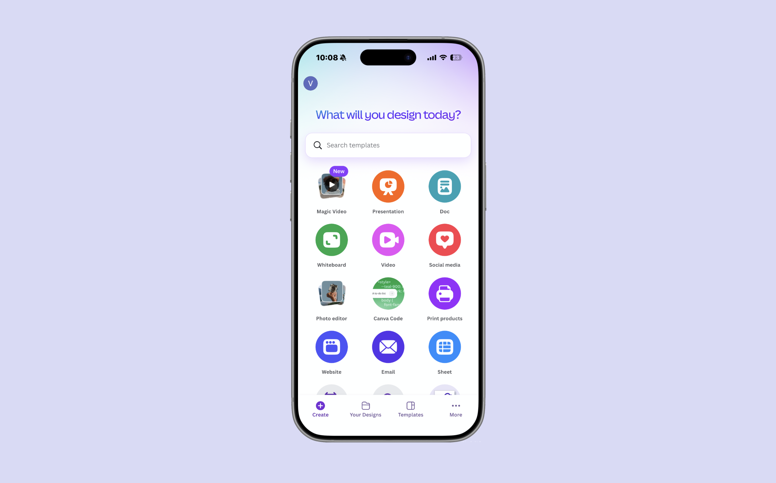
When users begin editing in Canva mobile, the interface clearly communicates how to get started. The prominent “Create” button functions as a strong signifier, signaling the primary action available. This supports good discoverability and a clear conceptual model, where users understand that pressing this button will initiate a new design.
The placement and labeling of this control align with common mobile app conventions, allowing users to rely on knowledge in the world rather than memorization. As a result, the gulf of execution is minimal at this stage, and users can confidently transition into the editing environment.
Selecting and Manipulating Design Elements
Once inside the editor, users can tap directly on text or images to select them. Upon selection, a bounding box with visible corner handles appears around the element. These handles act as clear signifiers, reinforcing the affordances of resizing and repositioning elements through touch.
This interaction is one of Canva mobile’s strongest design choices. Users immediately understand what actions are possible without instruction, reducing the gulf of execution. The interface supports direct manipulation in a way that feels natural and intuitive, particularly for quick edits.
Feedback and Spatial Alignment
As users drag elements across the canvas, Canva provides immediate feedback through alignment guides and snapping behavior. These guides indicate relative positioning and help users make informed placement decisions in real time.
This feedback helps bridge the gulf of evaluation, allowing users to easily interpret the system’s response to their actions. Rather than correcting mistakes after placement, users can adjust positioning as they work, which supports efficient and confident editing.
Text Editing and Modes
A common usability challenge arises when users attempt to edit text. Tapping a text element often selects it without immediately activating text-editing mode or bringing up the keyboard. As a result, users may accidentally move or resize text while trying to edit its content.
This interaction highlights an issue with modes. Canva operates with distinct selection and text-editing modes, but the transition between these modes is not clearly signaled. According to Don Norman, mode errors occur when users perform the correct action but the system is in an unexpected state. In this case, the user’s goal is clear, yet the interface does not immediately support it.
These errors are best described as slips, not mistakes, because users understand what they want to do but are hindered by unclear system state. Stronger signifiers for text-editing mode, such as immediate keyboard activation or clearer visual indicators, could help reduce the gulf of execution.
Hidden Tools, Constraints, and Cognitive Load
Canva’s bottom toolbar changes based on the selected element, demonstrating effective use of logical constraints. Only actions relevant to the current selection are displayed, which helps prevent mistakes and guides users toward valid interactions.
However, advanced actions such as locking elements or adjusting layer order are hidden within secondary menus. Because these tools are not immediately visible, users must rely on knowledge in the head rather than knowledge in the world, reducing discoverability. This increases cognitive load, especially on mobile where screen space is limited and many features are compressed into small areas. To improve discoverability without overwhelming the interface, Canva could surface frequently used advanced actions such as Lock and Layer Order as persistent, icon-based controls within the bottom toolbar when an element is selected. These icons would function as clear signifiers, allowing users to rely on knowledge in the world rather than recall.
Less commonly used actions could remain in secondary menus, preserving screen space while reducing cognitive load for core tasks. This approach balances logical constraints with visibility, ensuring that users are guided toward valid actions without requiring memorization or exploratory searching.
Conclusion: Blame the Design, Not the User
Canva’s mobile editing experience demonstrates strong human-centered design through clear affordances, immediate feedback, and effective constraints. However, issues with mode clarity, hidden tools, and limited precision introduce friction during more complex editing tasks. As Don Norman argues, these breakdowns should be attributed to design limitations rather than user error. Canva mobile excels at quick edits but struggles to support more advanced design workflows on a small screen.