
Chronic Insights is an empowering tool for individuals hoping to uncover patterns and insights in their health journey through tailored charts and analysis of symptoms, triggers, and medical concerns. The app offers flexibility through a wide range of support features designed to accommodate users’ needs without data collection. Through Chronic Insights, users can track and compare symptoms, vitals, medications, and mood, among other factors, across time with granularity and privacy.
Taking on the role of a new user, I explore the app’s features through a series of scenarios: (1) adding a symptom to the diary and identifying a factor that influences the symptom, (2) resolving an ongoing entry, and (3) customizing the homescreen.
Selecting a symptom for a diary entry
Upon selecting the “Add diary item” button on the homescreen, a bottom sheet with multiple options comes up, effectively addressing users’ conceptual models through a diverse selection of skeuomorphic icons. The labels, along with additional descriptions, signify the functions of each option.
Both the icons and descriptions minimize the Gulf of Execution and match the user’s perception of the features with their functions. It will not be time-consuming to understand the content shown in the interface, hence alleviating cognitive load for new users through employing recognizable conventions.
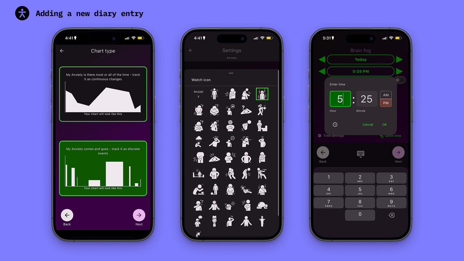
As I moved through the process, the app took me through interfaces with personalization options, in which I selected the chart type, a display icon for the Apple Watch screen, and set a duration for the symptom under consideration. The feedback following each selection was immediate, with clear contrast between selected and available options, along with cultural constraints that follow conventional designs (like the time setting), all of which effectively reduce the Gulf of Evaluation.
A potential point where evaluation requires more effort is selecting the display icon for the Apple Watch. The icon is only visible on the watch screen, so users will not receive immediate feedback on whether their selection is recorded properly until they check their watch.
**For more customization and detailed insights, the paid version includes a 3D body visualization tool that enables users to illustrate their pain on a figure and leverage natural mappings to help users visualize their health concerns and rate pain progression over time. That would be the final step, after users set a time duration for their diary entry. This evaluation will not include features exclusive to the paid version.**
Friction point:
Regarding visual perception, this symptom selection interface could benefit from stronger color distinction between already-selected and available options. Currently, there are 2 shades of grey used for identifying which symptoms have already been displayed/recorded. Users will also encounter a physical constraint to discourage them from selecting unavailable symptoms.
The low contrast between these signifiers can become a hindrance to users with visual impairment. This can increase the Gulf of Execution for users, confusing them about whether or not the options afford interaction.
Proposed solution:
The alphabetic dividers throughout the list eliminate clutter and reduce decision-making time. The additional ‘checked’ icon provides a stronger visual cue without crowding up the space of an already dense list. Combined with the existing physical constraint that refuses user interaction, the affordance will become more discernible. Meanwhile, the distinct visual hierarchy improves the Gulf of Execution while minimizing cognitive load as users browse through the list of symptoms.
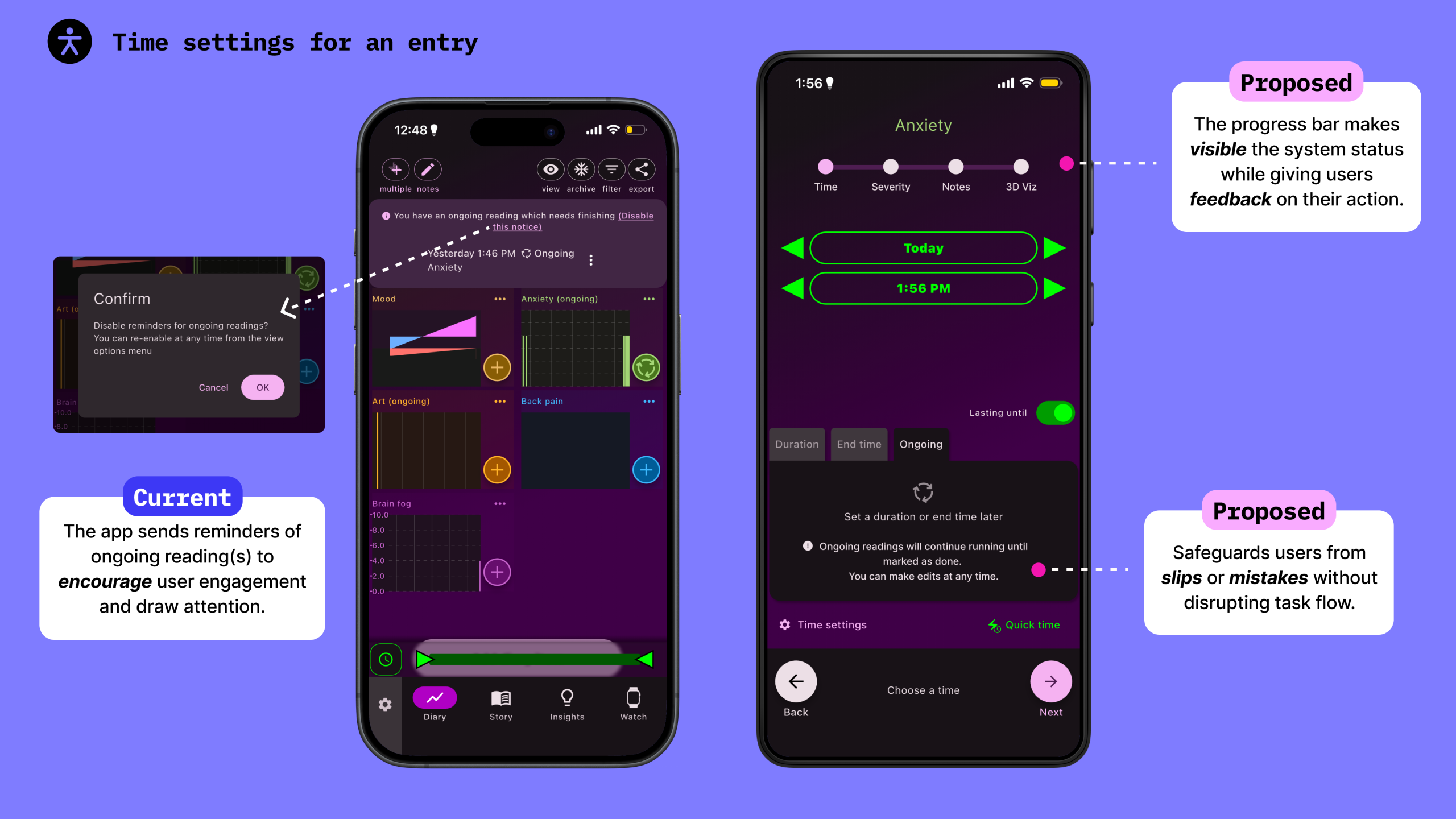
Resolving an ongoing entry
After the entry is finalized, it is displayed on the homepage as confirmation that the action was successful. When I created the ‘Anxiety’ example, I was not aware of the duration being set to ongoing. This prompted the app to send me a notification roughly 24 hours after the event was created.
The reminders about ongoing diary entries transform knowledge in the head into knowledge in the world, and simplify the memory task. This is also an effective application of prospective memory, employing visual cues to notify users of pending actions and encourage resolution using recognition rather than recall.
Friction point:
A new user unfamiliar with the interface, however, may find this distracting, leading to poor discoverability. While the app allows editing afterwards to minimize the impacts of error, users are notified only after the bid has been executed.
Proposed Solutions:
To prevent future confirmation messages from disrupting user flow while promoting learnability for first-time users, adding a description directly to the duration setting facet will inform users of potential outcomes, hence minimizing risks for capture slips or mistakes. Adopting error-preventive measures early on not only supports task performance but also benefits users’ conceptual model of the app (with little room for frustration or learned helplessness).
As mentioned by Don Norman in The Design of Everyday Things,
“Two of the most important characteristics of good design are discoverability and understanding.”
Additionally, introducing a progress bar to the diary entry enhances discoverability of the status system, providing users with immediate feedback on their actions and helping them predict the next steps. This is also useful for users with dexterity issues that affect their interaction with the product, as it eases the gulf of evaluation while maintaining physical constraints when directing users through each interface.
Customizing the Homepage
Once an entry is logged, the respective graph is visible on the homepage. Users can then edit the screen layout and appearance as they continue to add new items by selecting the ‘View’ button in the top right corner. On the bottom sheet, users can organize and decide on how items are displayed, adjusting elements such as sizes, spacing, and grid line preferences as needed.
Friction point:
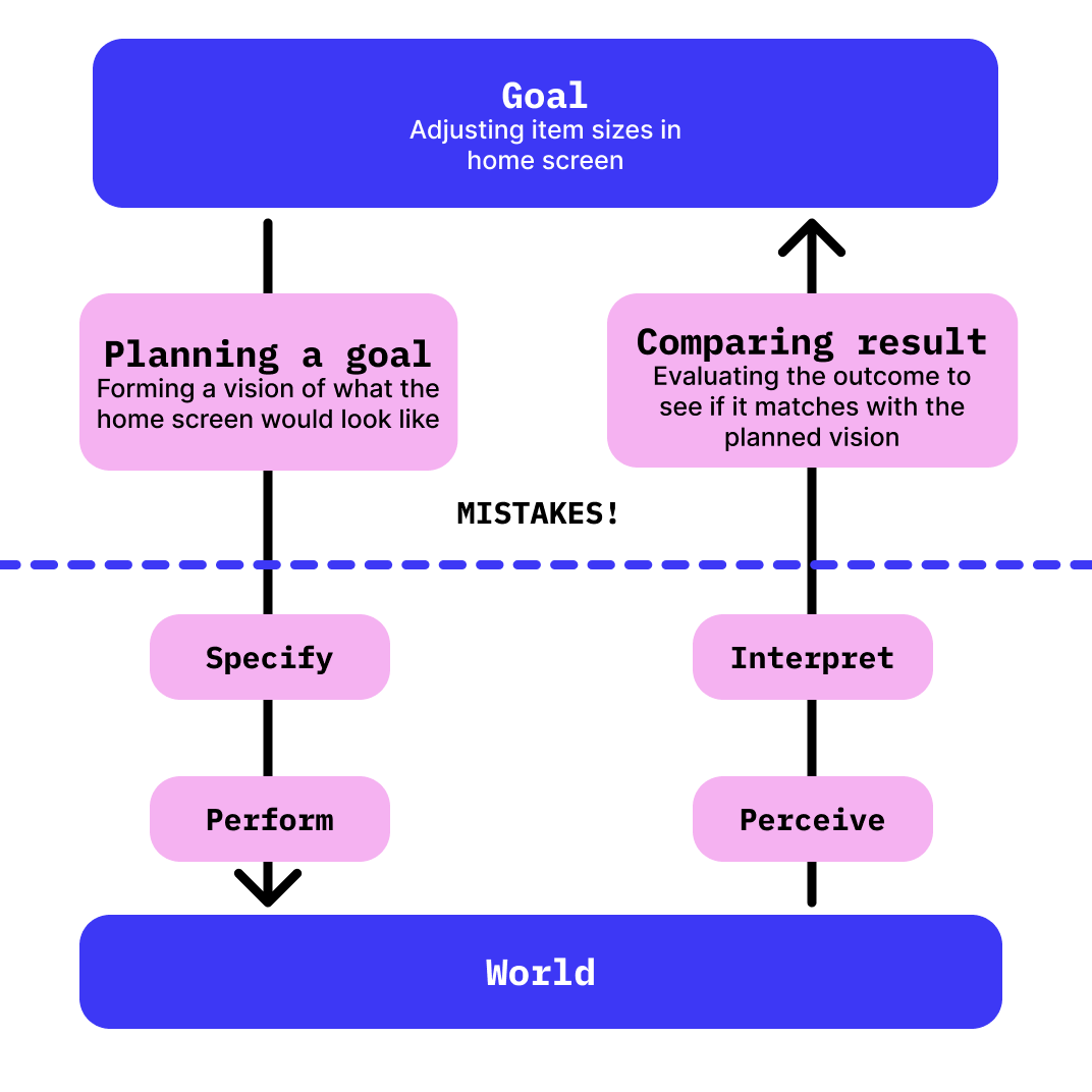
At first glance, it was not apparent that the bottom sheet could be moved to reveal the homepage in the back, since there were no clear indicators signifying such an affordance. I was making changes without knowing what adjustments were successful until I closed the bottom sheet. After some fidgeting, I then realized how to view the homepage as I worked with the settings.
In referencing the 7 stages of action, the implicit affordance of the bottom sheet introduces a risk for mistakes in the planning and comparing steps for users unfamiliar with such a system image. In addition, the unclear feedback after users’ actions widens the Gulf of Evaluation.
Proposed Solution:
To optimize user flow, providing more explicit instructions or directions can help users form their conceptual model for the application and improve the visibility of feedback. An alternative option could be having the bottom sheet move downward slightly (“wiggle”) when initially selected to encourage interaction.
Conclusion
Made by a person who deals with chronic pain daily and wishes to draw useful insights from their experience, Chronic Insights effectively leverages existing conceptual models and the importance of timely feedback to create a fairly intuitive and flexible digital diary for users. Despite a few minor drawbacks, this app is a gem for those who look to harvest health-centered insights through visualizations.