Chrono24 is an online marketplace for luxury watches. It hosts buyers, professional dealers and private sellers across the world, and showcases new, used and vintage products. For the purpose of this critique, I will be considering the user as a potential customer with average technology experience who may use the app to find watches they are interested in or might want to purchase. I will be critiquing the usability of the app through concepts from The Design of Everyday Things by Don Norman and How Artefacts Afford by Jenny L Davis.
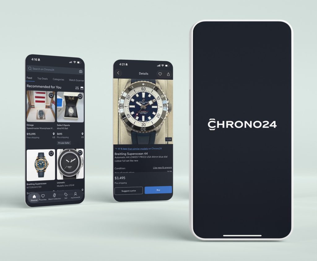
Feed Home Page
Chrono24’s app opens to a “Feed” home page that shows the users various products that are recommended to them. The app effectively utilizes signifiers and affordances, making possible actions clear. The text inside the search bar lets the user know they can look for their specific needs, and the highlighted tab “Feed” lets the user know where they are within the app. Product cards display images, brand names, and prices in a hierarchy familiar to users of e-commerce platforms, making it immediately apparent that items are interactive. Users also received immediate feedback when they click the heart in the corner of each card, which fills in and signifies that the item has been added to a favourites list. The bottom navigation bar also has highlighted icons, signifying which page the user is on currently, with easily recognisable icons (like a heart for “Favourites”).
However, there does not seem to be a clear option for the user to filter through the products being recommended to them, having to resort to going to a different page or searching for a specific model, which would not be the easiest to find for novice users. This missing signifier creates a “Gulf of Evaluation” as it is difficult to understand where the user should go for this.
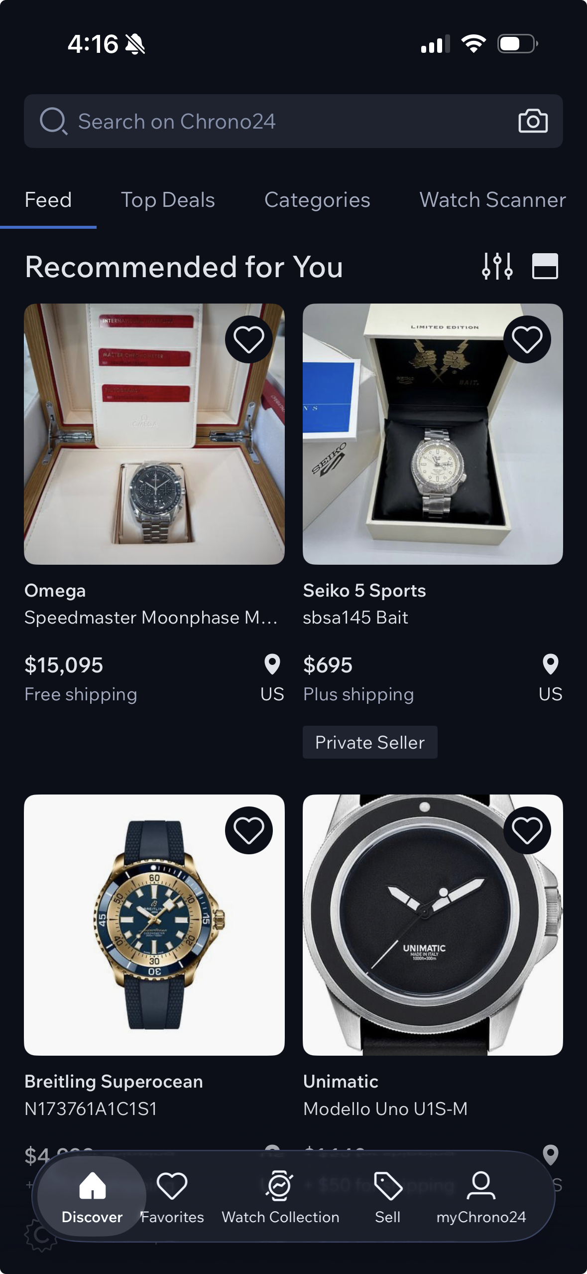
Categories Page
The “Categories” page allows the user to explore watches by brand, model, etc, creating clear mapping when using them. These filters also help providing constraints and error prevention, so users can find exactly what they are looking for. While these constraints are helpful for users to set preferences, there is an overload of information in each carousel which could overwhelm or confuse a novice user. The pages effectively uses cards, buttons and arrows signifying the action the user can take, and most of them show immediate feedback by taking the user to that particular category or swiping through the carousel. The user is also limited in their agency because they cannot look for a product that fits multiple categories (e.g. a men’s watch from the brand Omega). This creates a “Gulf of Execution” as it is unclear if the user can perform this task at all.
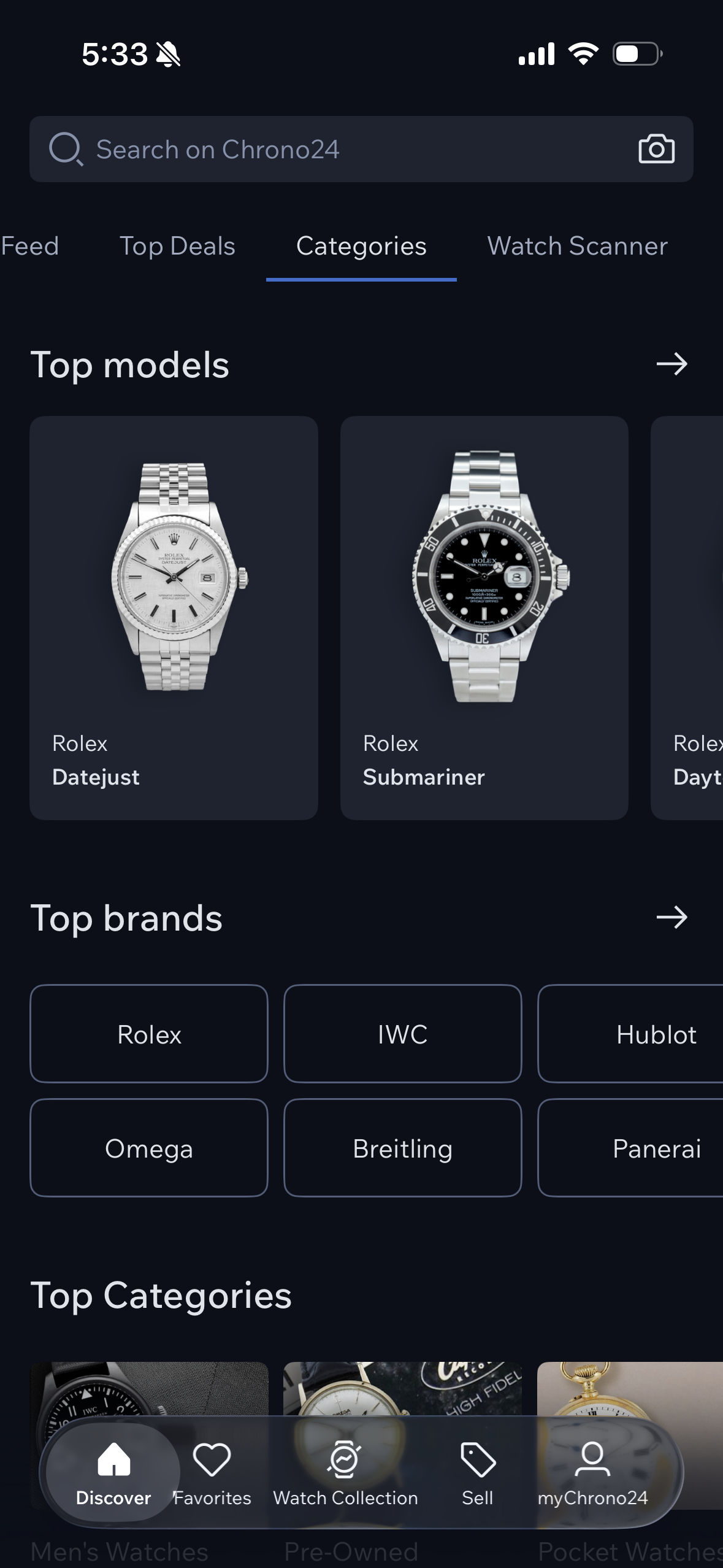
Making a Purchase
To make a purchase, the user is given two options at first, to “Suggest a Price” or to “Buy” the product. The first provides immediate feedback, opening a chatbox with the seller. This reduces the “Gulf of Execution” and the user understands that this is a negotiation tool. The latter adds the product to their cart and asks them to fill out their information, but the button at the bottom asks to “request an offer (non-binding). This can be confusing to the user, as this suggests that the user would still need to have some kind of dialogue with the seller to make their purchase. The lack of a clearly visualized progression provides little to no feedback to the buyer. A clearer transaction journey indicator could improve confidence and perceived safety, reducing uncertainty and friction. Contrary to the “Categories” page that has constraints and error prevention, users may misinterpret terminology or authencity guarantees as they are not clearly stated, increasing cognitive errors. Stronger constraints, such as clearer warnings or earlier cost estimates, could further reduce risk.
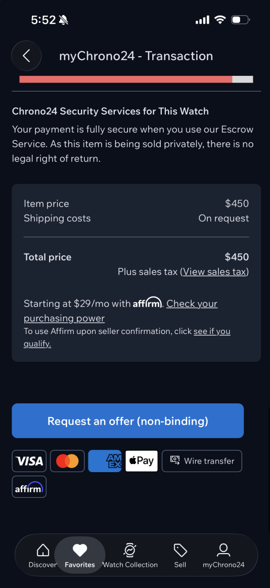
Adding a progress bar at the top indicating where the buyer is in the process of their purchase would help the user understand where they are in the buying process and how much longer they have to go, giving them immediate feedback.
Conclusion
Overall, the Chrono24 app demonstrates effective functionality and visual appeal, especially for an experienced user that is familiar with luxury watch marketplaces. However, applying design principles reveals opportunities to improve conceptual clarity and novice accessibility. The platform’s primary challenges are not the missing features but the gaps between user understanding and system design. Functionality alone does not guarantee usability, clarity of mental models and reduction of cognitive load are equally important. By strengthening and clarifying signifiers, improving discoverability of functional mechanisms, and aligning the conceptual model with user expectations, the app could enhance user confidence and broaden its appeal beyond expert audiences.