DICE is a ticketing app with the goal of making going out and creating plans feel effortless. Users can buy tickets in seconds and share them with friends in-app. DICE’s search features also help users discover shows relevant to their location and interests. My critique reviews DICE’s mobile iOS application using principles outlined in Don Norman’s The Design of Everyday Things.
Finding upcoming events
Finding an event on Dice feels easy and intuitive. From the moment I land on the Home screen, the app clearly communicates its available actions, minimizing cognitive load.
At the top of the homepage, the headline “Make Plans” acts as a signifier that frames the app’s primary goal. Directly beneath the headline is a horizontal navigation bar with various filtering categories. The mapping between selecting a categorical button and seeing an updated event page is instant, providing immediate feedback.
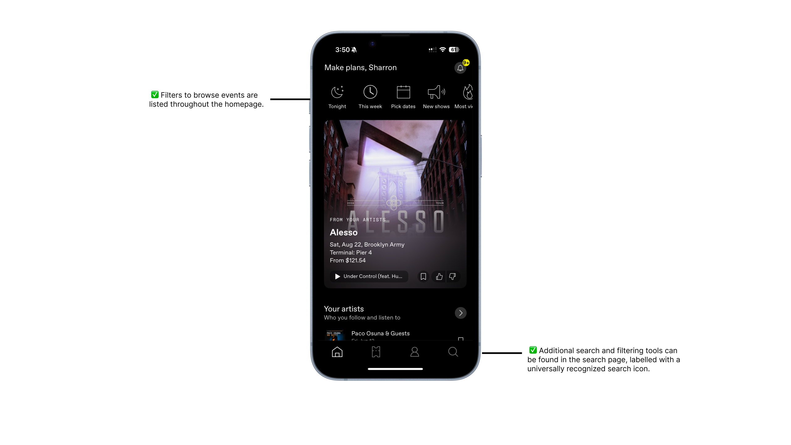
On the bottom navigation bar, the search icon on the right serves as a universally recognized signifier. Even without a text label, the icon leverages knowledge in the head, allowing me to predict its function. Tapping the icon leads to a dedicated search page with a search bar at the top. Right below the search bar, pill-shaped filter buttons are placed to filter by date, price, and city. These filters mirror how people naturally think about planning events, showcasing the app’s strong conceptual model.
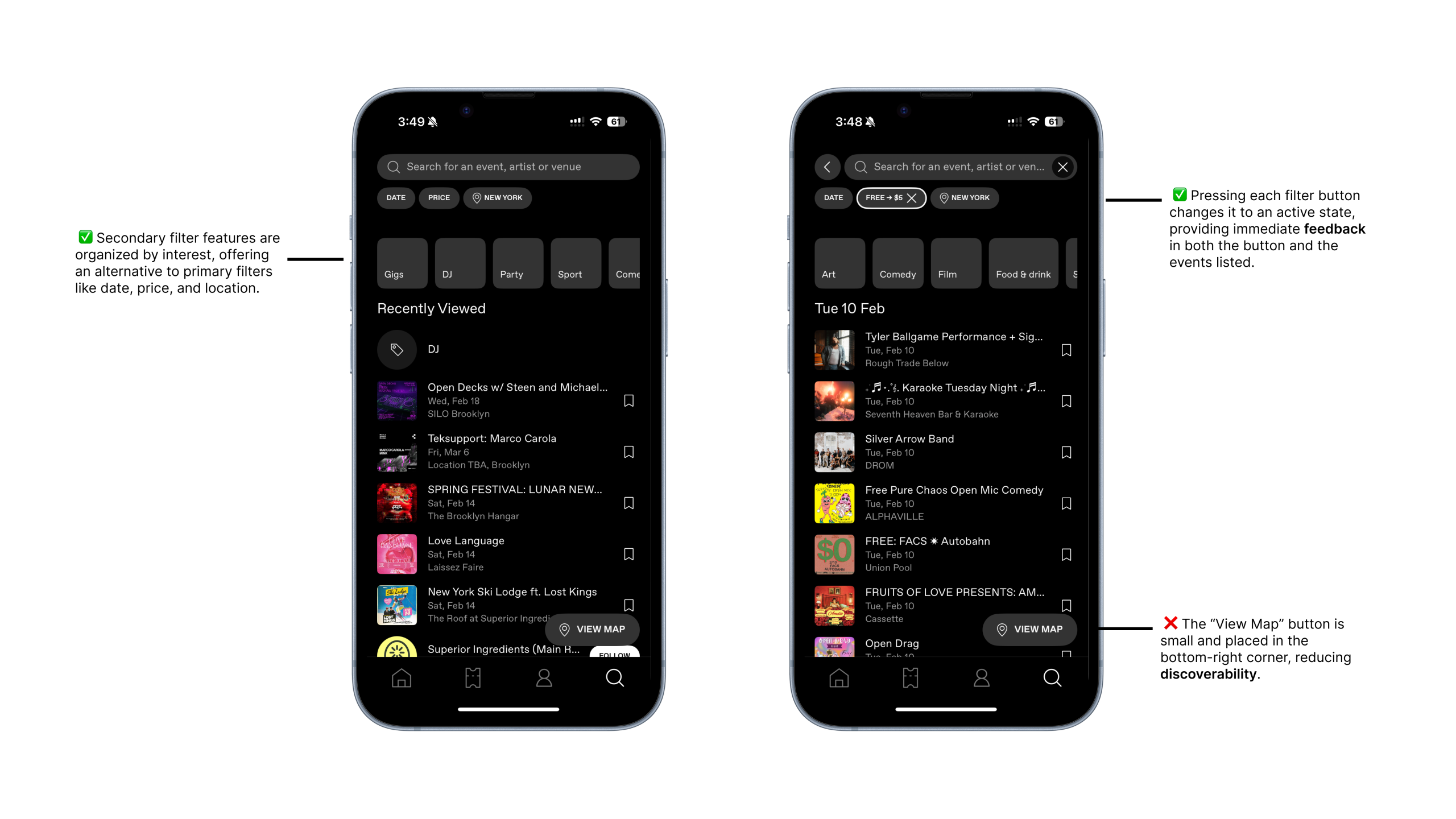
Further down the screen, event categories such as “Party,” “Sport,” and “Comedy” act as secondary navigation aids. These categories function as signifiers that help users filter and find events that match their interests.
One area of improvement I found is how the map is integrated into the search experience. Currently, the map is accessed through a small “View map” button in the bottom-right corner of the screen. The button blends into the bottom navigation bar and makes the map search tool feel secondary to other filtering options.
Something else I noticed was how the “Recently Viewed” section takes up most of the screen. This creates an unbalanced visual hierarchy that pulls attention away from other important filtering tools, such as the search bar. This disrupts discoverability as the interface suggests that revisiting past events is more important than actively searching for new ones.
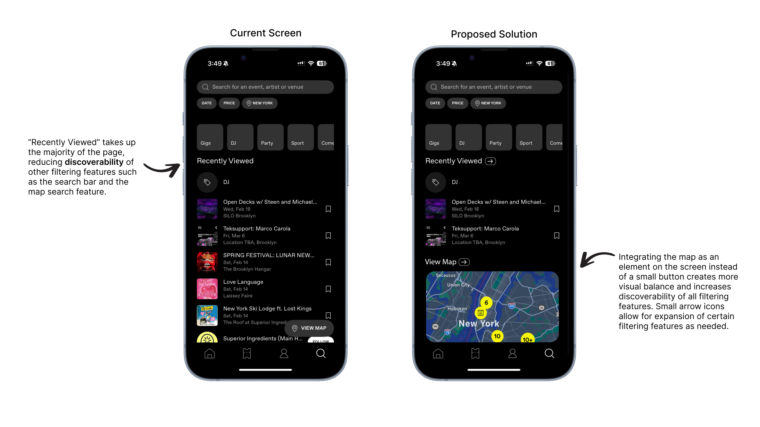
This could be improved by embedding a condensed map view directly into the search page, placed underneath a shortened “Recently Viewed” section. This way, each section on the page would have a more balanced visual weight. To maintain full usability of each feature, the “Map” and “Recently Viewed” sections could include a small arrow button next to its headline. Tapping this would open the section into a full-screen view.
Purchasing a ticket
Once I click into an event, the main event details are immediately visible. This includes the event title, banner image, date, time, and location, placed at the top of the page. The date and time are highlighted in yellow, which improves readability and acts as a strong signifier. This contrast in color allows me to instantly recognize important and time-sensitive details.
Below the main event information are buttons to save, play, share, like, or dislike the event. These buttons use simple, familiar icons paired with action labels. The combination of iconography and text strengthens the affordances of each button, making it obvious what actions are possible. I do not have to guess what each button does, helping bridge the gap between knowledge in the head and knowledge in the world.
Further down the page is the event description written by the organizer, followed by event policies. This content is visually separated from the main actions, reinforcing a clear conceptual model: high-level details first, and more in-depth information second.
At the bottom of the screen, a navigation bar displays the lowest ticket price along with a bright yellow “Get Tickets” button, communicating the next step to take. When I tap “Get Tickets,” the page expands to show ticket tiers, such as General Admission and VIP, each with different price points.
After checkout, I am taken to a completion screen confirming my purchase. This provides clear feedback, helping close the Gulf of Evaluation by making it apparent that the action was successful.
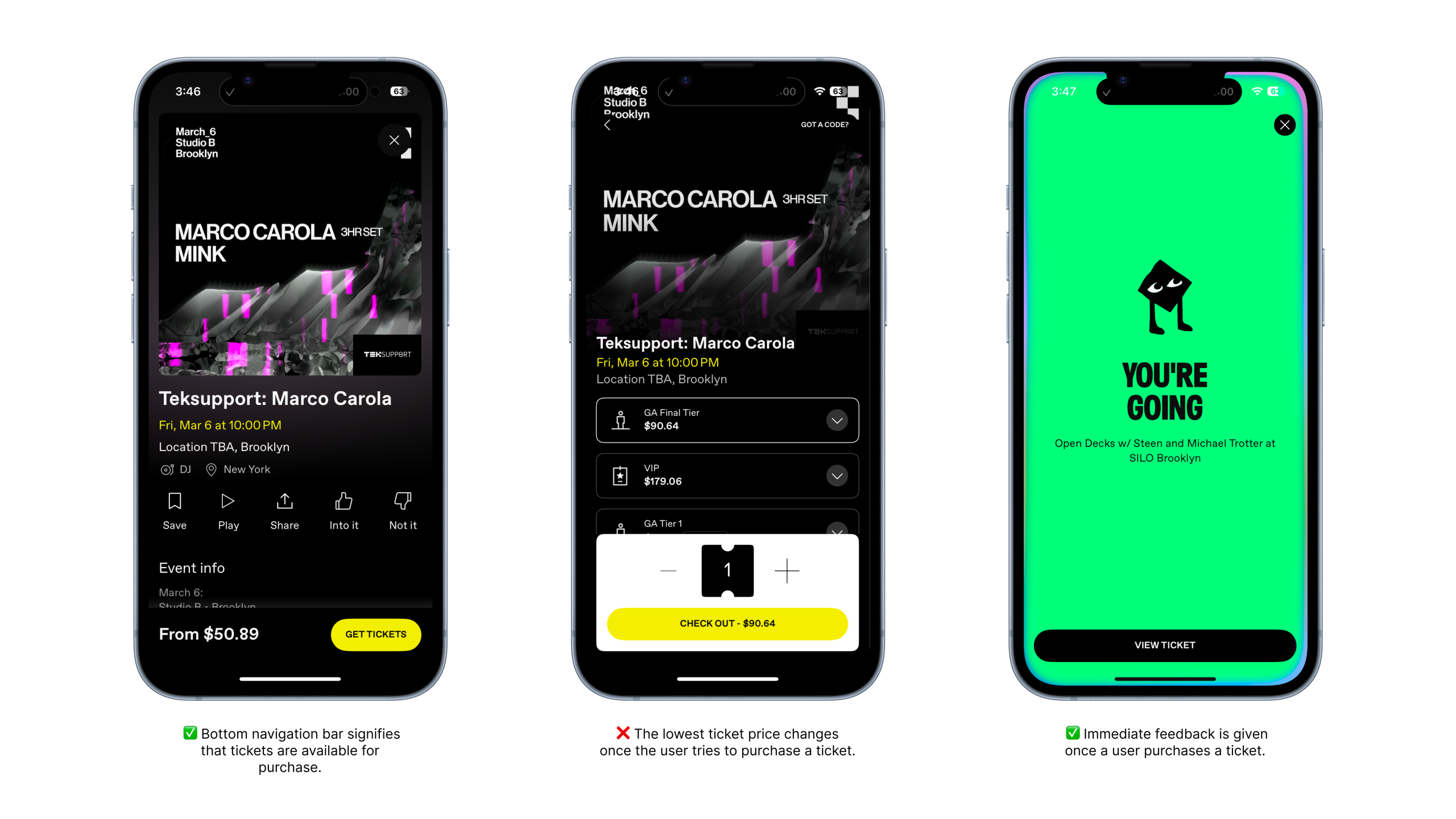
One issue that became apparent was the misleading price displayed on the initial event page. The app shows the lowest possible ticket price, even when that ticket tier is sold out. In this example, the event initially displays a ticket price of $50.89, but after tapping “Get Tickets,” the lowest available ticket option is actually $90.64.

A better solution would be to display the lowest available ticket price on the initial event page. Sold-out prices could still be shown upon expansion to all ticket tiers, but the initial price would better align with a user’s expectations.
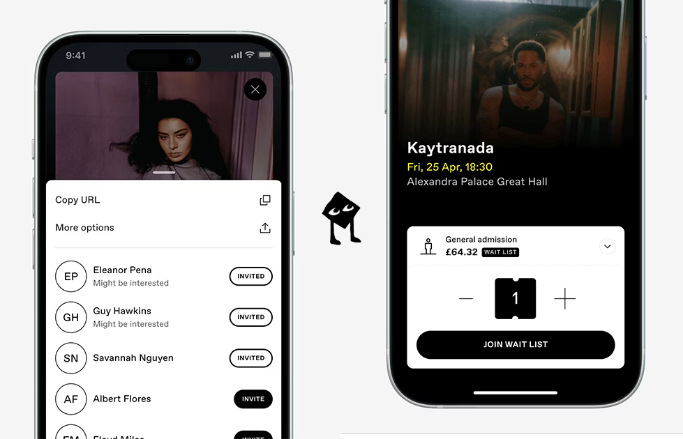
Sending a ticket to a friend
One of DICE’s strongest features is how easy it is to send a ticket to a friend. After purchasing a ticket, I can tap into the ticket details and view the “Send ticket to a friend” button placed directly below the ticket banner. From there, I’m taken to a search page where friends I’ve previously interacted with on DICE appear. I can also search my full contact list in the search bar since the app is connected to my phone’s contacts.
The experience becomes complicated when the recipient doesn’t have a DICE account. In that case, a popup appears asking me to invite my friend to register before sending the ticket. This shifts the task from sending a ticket to managing my friend’s onboarding, widening the Gulf of Execution.
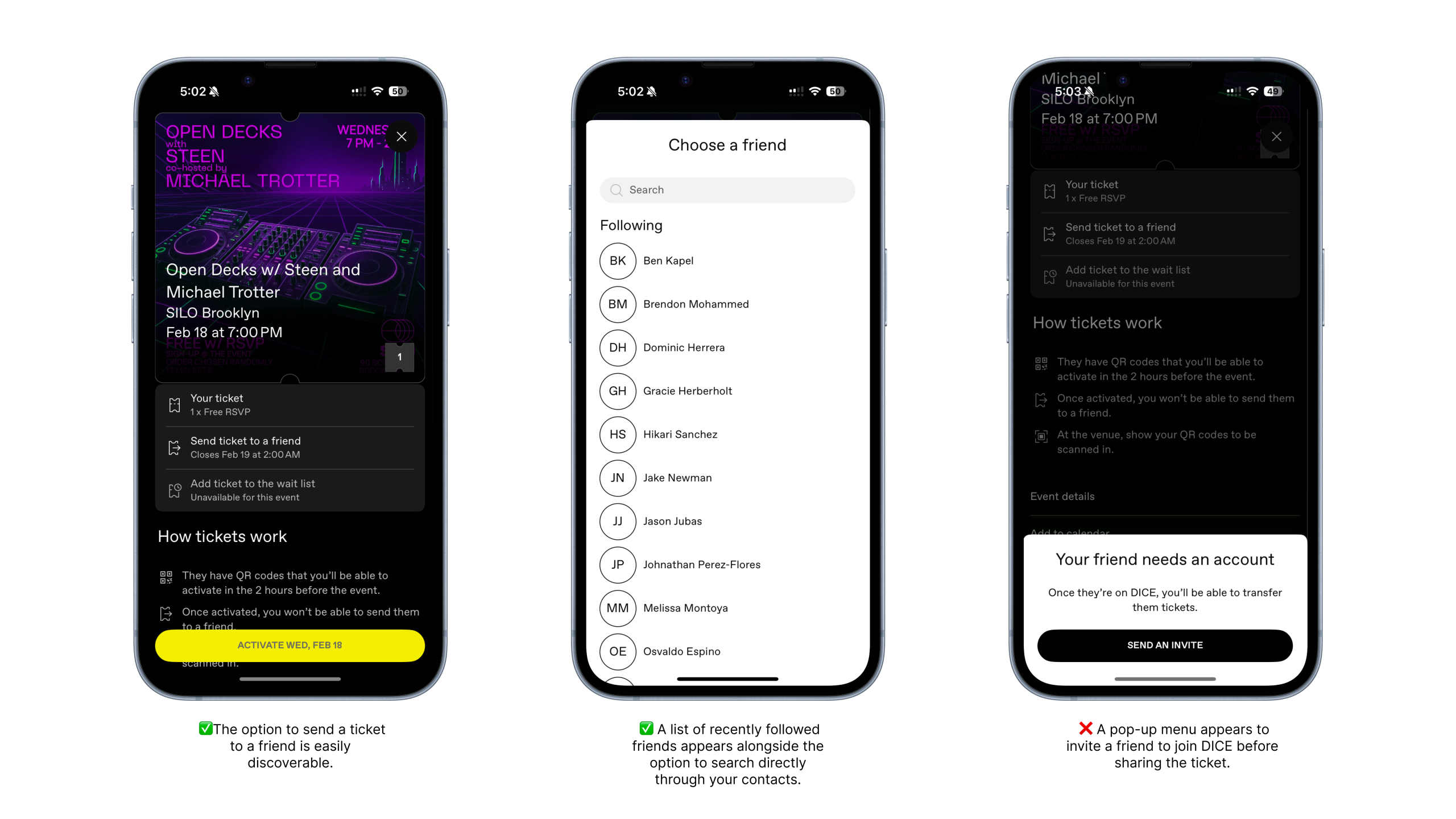
A better solution would be allowing users to send tickets as a shareable link via text. The ticket would still be reserved for that friend, but they could download the app and create an account on their own time, with the ticket automatically appearing once registration is complete. This approach reduces friction for the sender.

Conclusion
Overall, DICE does a great job at creating clear signifiers, intuitive affordances, and consistent mapping. Key actions are highly discoverable, and the interface clearly communicates what is possible at each step. However, small issues such as pricing clarity and ticket sharing introduce more friction and could be improved upon. Regardless, Dice’s user satisfaction is very high, reflected in its 4.9 App Store rating.