Endel is an AI-powered sound wellness app that creates generative soundscapes designed to help users focus, relax, and sleep. Unlike a static playlist, Endel’s “Endel Pacific” engine blends music in real-time, aiming to make the audio endless and never repeats exactly. Using Don Normans, Design of Every Day Things and chapters of How Artifacts Affords, this critique aims to explore how Endel’s design guides and confuses the users in their quest to focus.
Icons and Control Placement
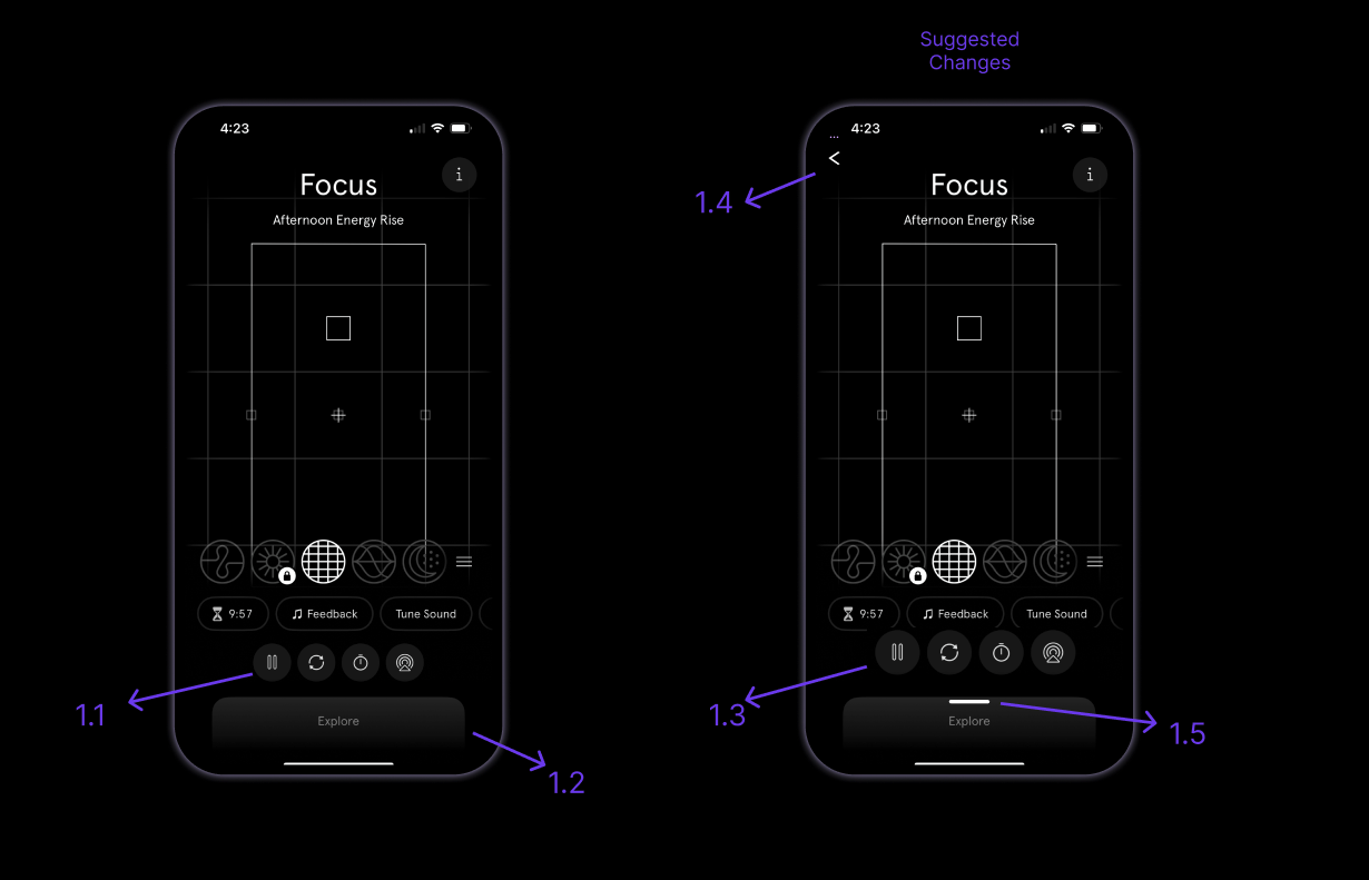
Endel uses familiar and visually appealing icons for primary controls such as play, pause, timer, restart, and AirPlay(IOS specific) (1.1). These icons function as effective signifiers, clearly communicating their purpose and improving usability for the users. The use of widely recognized symbols supports the user’s mental model, allowing users to understand functionality without additional instruction. However, in the soundscape screen, primary controls buttons are significantly smaller and less visually prominent. This reduces their visibility, making them harder to discover and use. Norman emphasizes that important controls must be visible so users can easily determine possible actions.
Additionally, the absence of a visible close button creates a discoverability issue. Instead, users must swipe up from the bottom of the screen which indicates “Explore” (1.2) to exit the screen. This interaction lacks a clear signifier, increasing the gulf of execution because users may not know how to return to the previous screen and assume “explore” indicates discovering something new rather than closing the current window. Users must rely on prior experience or trial and error, rather than visible guidance. This can also be considered a slip since the user may swipe down instead of us based on their habit that did not meet the app’s unique logic.
Adding a visible close icon or back button (1.4) would improve discoverability and provide better feedback about navigation. Creating the primary controls slightly more prominent assist with visibility (1.3). Also adding a clear indication that the “Explore” window is a swipe up (1.5) will avoid confusion. This would align the interface more closely with Norman’s principles by making available actions more visible and intuitive.
Interactive Exercises
This Exercises feature is a timed, guided activity designed to support breathing exercises, improving attention span, anxiety reduction and active listening. A typical user would be drawn to this feature to calm down, refocus or reset cognitively. This feature requires active engagement, which makes feedback, visibility and guidance very important.
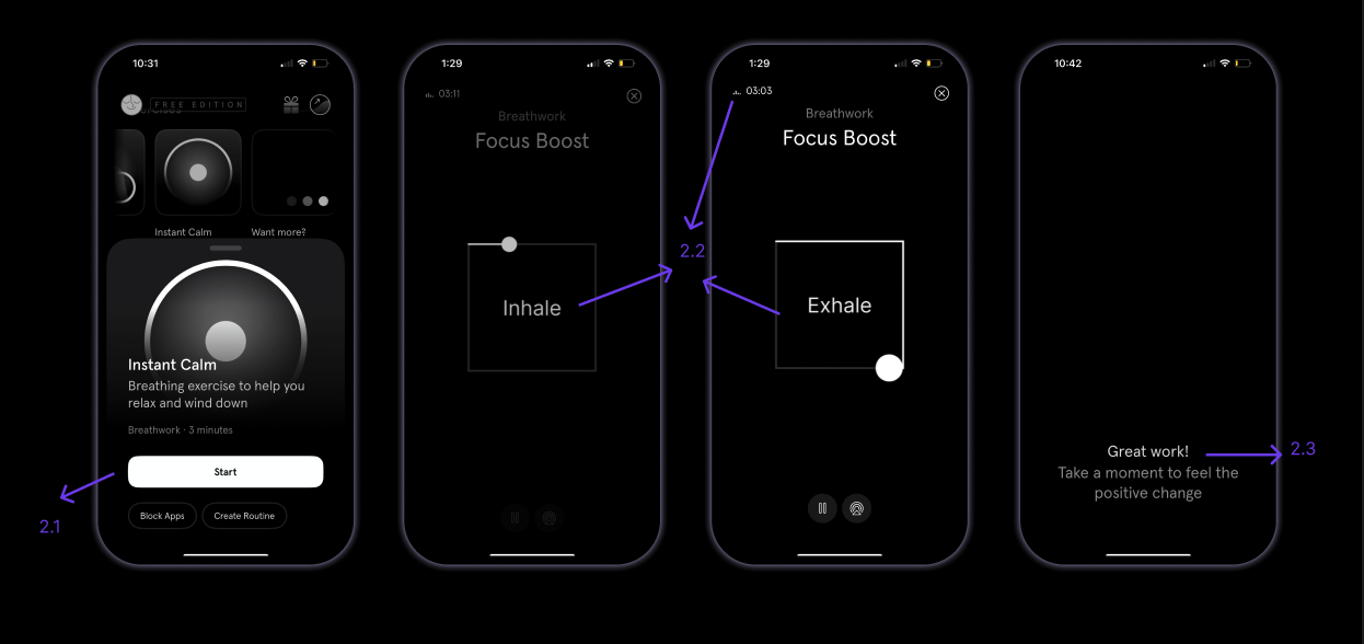
The Exercise feature is found in the homepage after scrolling a bit down and once an exercise is selected a short overview, duration, and a clearly visible Start(2.1) button.. The Start button functions as an effectivesignifier, clearly indicating where interaction should occur. Its visibility reduces the gulf of execution, allowing users to easily dive into action.
Once start is clicked the interface immediately responds with guided voice instructions and animated visuals (2.2) to help the user navigate through the exercises. Norman describes feedback as essential for helping users understand what action has occurred and what the system is doing. A combination of vocal and animated feedback, shows the user the steps are being conducted. This continuous feedback throughout the interaction reduces the gulf of evaluation, as users can clearly perceive the system state. The completion message (2.3) is also a clear feedback that lets the user know the task is complete.
The Freemium Paywall
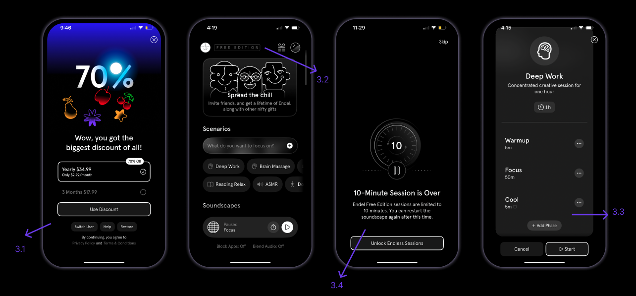
Endel’s subscription model introduces significant usability issues through restricted access and forced interruptions. Features such as extended soundscapes and scenarios, are limited to short durations (10 minutes) in the free version. For example, when selecting a “Deep Work” scenario, the app guides the user through a mandatory warmup, which is a minimum of 5 minutes and then stops playback after approximately 10 minutes (including the warmup), prompting the user to subscribe. This interruption disrupts the user’s primary goal of sustaining focus.
If a user’s goal is “Deep Work” for 50 minutes but the app’s 10-minute limitation (3.4) acts as a constraint that breaks the user’s “Flow.” By stopping the soundscape mid-task, the app forces the user out of their work and back into theGulf of Evaluation, wondering why the sound stopped.
At the same time, the app uses clear signifiers, such as “Free Edition”(3.2) banner on top and lock icons, to indicate restricted features. These signifiers communicate to the user that certain actions are unavailable to them. However, while clear signifiers are present, the 10 minute time limit is not indicated before the user starts, which creates friction by interrupting ongoing tasks rather than preventing them beforehand.
A more user-centered solution would be to communicate duration limits (3.4) before the session begins (3.3). Providing visible information such as “Free sessions limited to 10 minutes” would improve users’ experience, allowing users to form accurate expectations and reducing frustration. According to How Artifacts Afford, while the app requests a subscription through various banners, the 10-minute cutoff is a Demand. It Refuses the core utility of the product unless payment is made. Unlike many apps there is not a 7 day free trial period for users to decide if it is worth it to subscribe, which could be a.
Conclusion
Endel successfully applies some of Norman’s principles through strong signifiers, continuous feedback, and clearly guided interactions, particularly in the Exercises feature. These elements reduce the gulf of execution and evaluation, helping users confidently complete tasks.The unexpected 10-minute cutoff and unclear navigation controls disrupt users’ mental models and reduce discoverability. From the perspective of How Artifacts Afford, the paywall does not just limit access, it actively demands subscription by interrupting core functionality. Providing a short-term trial option and clearly communicating session limits beforehand would better encourage user trust and long-term adoption. Additionally, improving the visibility and placement of navigation controls would create a smoother and more intuitive experience. Overall I really enjoyed exploring the app and the guided breathing exercises were particularly effective!