Do you struggle to complete everyday tasks such as doing laundry or drinking enough water? Do you wish you had someone to keep you accountable for self care goals like journaling or daily yoga? An app you may consider to help you with these items is Finch, a self-care pet app that encourages users to take on daily tasks to meet their goals. The app does this through a virtual pet or “birb” that each user can customize. The birb can only progress as much as the user is able to meet their daily goals and with each “successful” day the user is able to uncover more about their birb’s personality. A “successful” day is ultimately up to the user as they choose their daily goals and are responsible for checking each off in the app throughout the day. The tasks range from something as simple as “stand up for 10 seconds” to more complicated tasks like “Plan out my meals for the next day”. Finch uses both gamification and personification to build a relationship with the user over time, hopefully increasing habit consistency and additionally app usage.
Onboarding Requires Consistency in Design Features
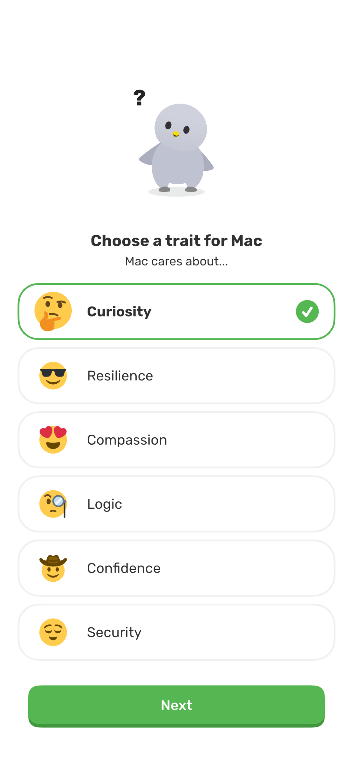
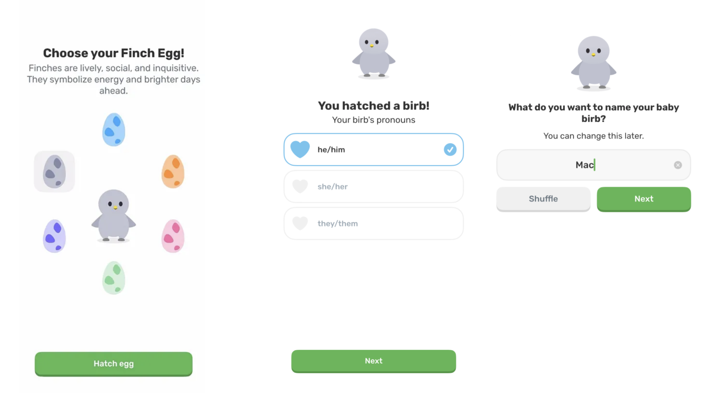
The birth of a user’s birb in the Finch app begins with choosing an egg color to hatch, the first of many customization options users are given. Then the user must designate pronouns and a name for their birb as well as core personality traits such as curiosity or compassion. In the onboarding stage the Finch successfully uses one of Don Norman’s key design principles, consistency. To proceed through the onboarding process, users click the green button at the bottom of the screen. While the text within the button may change, the size and color stay largely the same, allowing the user to know where to click on each screen. This also allows users to progress through the onboarding process with ease. While this design feature may appear simple it is essential that users face as little friction as possible during their initiation to the app. If an onboarding process has high friction, users may give up and abandon the app altogether.
Lack of Mapping is just as Important as Mapping
After users name and customize their birb, the Finch app has a series of additional onboarding questions the user must complete. At the top of the screen users can see a progress bar, marking their completion of this section of onboarding. This feature is highly useful and is an example of additional key principles discussed in DOET, mapping and feedback. Once a user completes a question such as “Have you used Finch before?” the user has a visual guide to where they are in the process. As they complete each section they receive clear feedback that they have progressed as they transition to the next screen and the progress bar appears more full.
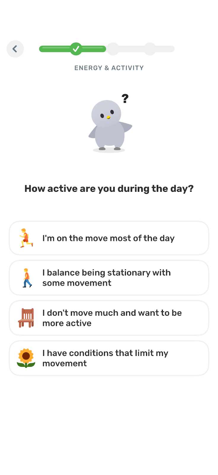
While these features prove useful a flaw in this design is in the lack of this type of mapping and feedback in the previous onboarding questions when the user first created their birb. This then has the potential to create a “gulf of evaluation” for the user. A gulf of evaluation is discussed in chapter two of DOET and is when there is a gap between an action a user has completed and their ability to clearly discern whether they successfully achieved their goal. In this case it may appear that the progress bar is enough information for the user to assess their success, however, because the previous section of the Finch app onboarding did not have this same progress bar or was not connected to this section visually, this could lead the user to wonder if after they complete this onboarding section, there will be an additional set of tasks there for them to complete.
Signifiers that (Could) Make a User Curious
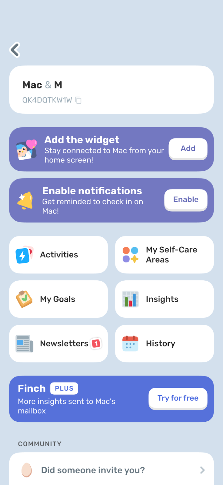

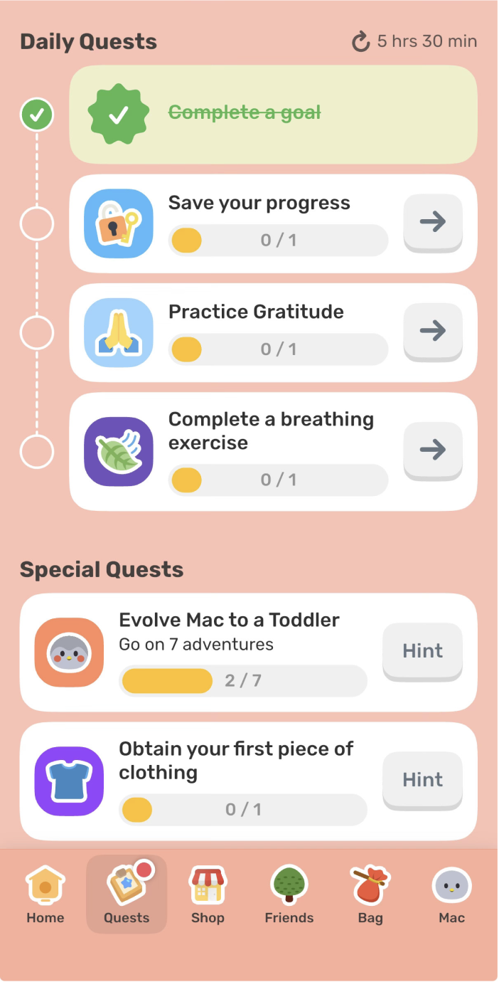
Signifiers are discussed in chapter four of Norman’s The Design of Everyday Things and are an important tool for showing the user what actions they can take and where they might take them. In the two screenshots below the myriad of actions the user can take are pictured. The first photo is of the settings page where users can access more technical features such as enabling notifications or adding a widget. In the second screenshot on the “Quests” tab users have a variety of ways they can interact with their birb. The issue with these two pages is that they have the potential to overwhelm the user with the plethora of action options presented. Users may encounter decision fatigue by the cluttered UI. While Norman’s discussion of signifiers noted their utility, poor use of them through an overwhelming display can counteract their potential function. Both pages could benefit from a more minimalist design and use of design techniques such as progressive disclosure where users are shown only essential items until they tap further to uncover more. This would significantly reduce cognitive overload and provide a simpler overall UI.
Additionally, these pages are an excellent example of concepts discussed in How Artifacts Afford: The Power and Politics of Everyday Things by Jenny L. Davis. Instead of arguing whether or not an object or feature affords an action, Davis argues instead how it is able to afford an action and that additional context shapes to whom and how it is afforded. For example, in the image on the far left, the app encourages users to upgrade to Finch Plus, a more premium version of the app with additional features. Other prompts on the page could be seen more as a request such as, “enable notifications”. The other Mechanisms of Affordances discussed by Davis include: demand, allow, discourage, and refuse.
Conclusion
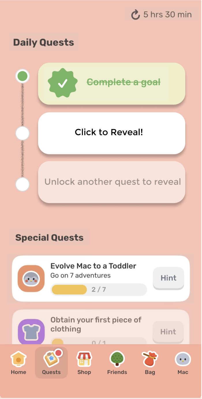
While the Finch app may work well for some in its goal of allowing users to develop and sustain healthy habits through their virtual companion, there are always improvements that can be made. It’s clear that many pages within the overall UI of the app can be cluttered, which can turn users away over time. To increase app retention and provide a more minimalist experience for the user, I chose to redesign the “Quest” tab page so users aren’t overwhelmed by the number of actions they can take on the page. In the redesigned page, I used progressive disclosure to hide away some of the actions a user can take until they completed the prior action. In this case, until a user completes the quest at the top of the list, they cannot move onto the next quest. This allows the user to focus on one task at a time reducing cognitive overload.