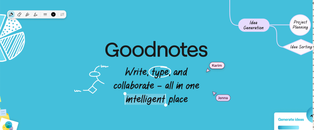
Goodnotes is a powerful digital notetaking and PDF markup app available on Android and iOS, known for its versatility. Popular with students, it allows users to create notebooks, upload and annotate existing documents, and organize files within folders. On the iPad, Goodnotes also supports Apple Pencil integration, enabling a more robust notetaking experience.
In this article, I will be critiquing three aspects of its design based on the concepts discussed in The Design of Everyday Things by Don Norman.
- Navigation Sidebar
The navigation sidebar found to the left of the screen includes four icons and copy indicating Documents, Favorites, Shared, and Marketplace. The icons and copy are great signifiers of the page each tab leads to, allowing for clear discoverability for the user.
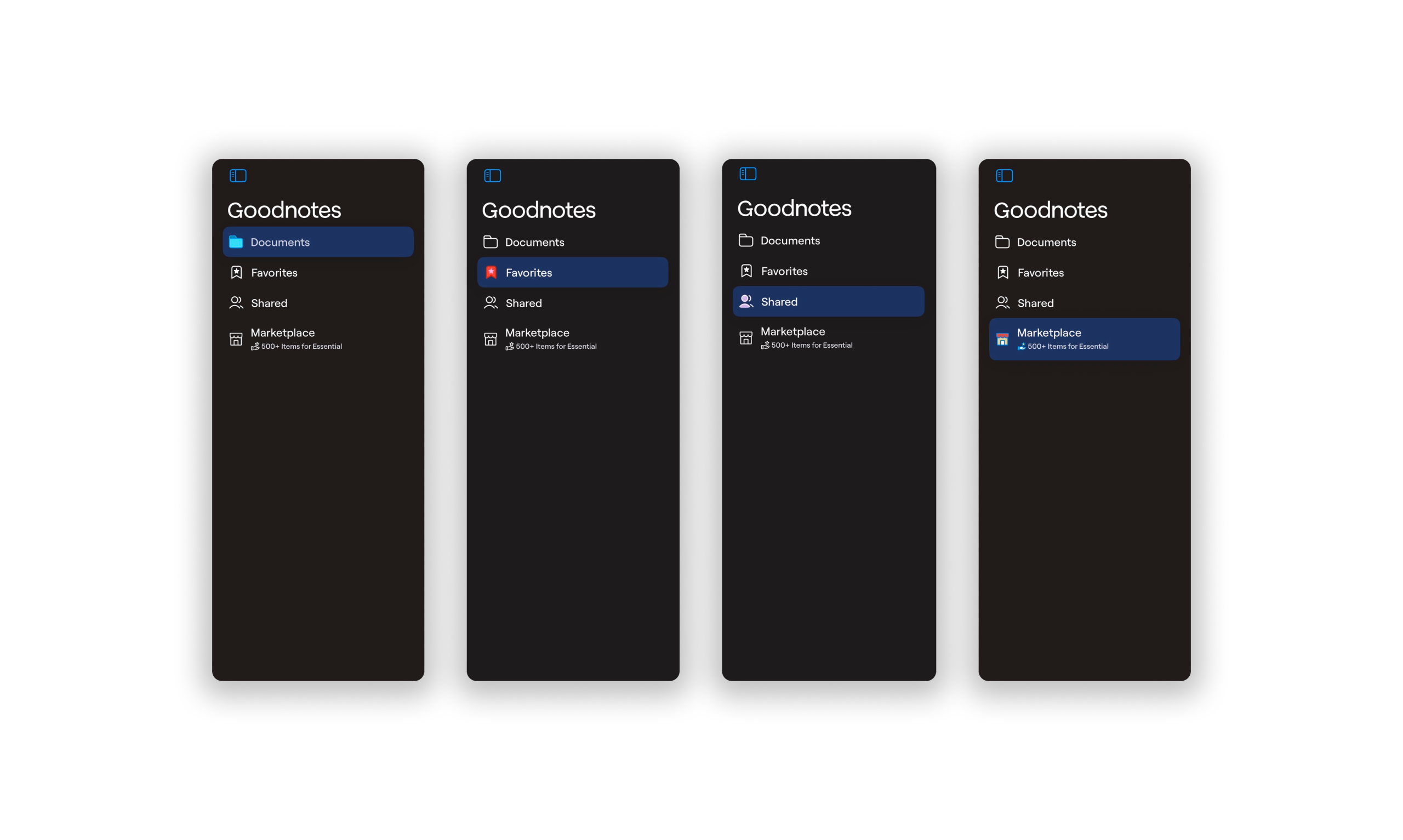
The sidebar utilizes effective conceptual models through its skeuomorphic icon designs. For example, the Documents tab is denoted by a folder icon, which matches people’s mental models where documents are stored within a paper folder. The Favorites tab is denoted with a starred bookmark, coinciding with common mental models on saving a page by placing a bookmark. (Having Favorites readily available in the sidebar also empowers the user to easily access a memory for the future to review important notes and documents.) The Shared tab uses an icon of two people, reinforcing the conceptual model of collaboration or shared access. Finally, Marketplace is indicated by a brick and mortar store, evoking the users’ conceptual model that the tab is where one might purchase goods. These examples of knowledge in the world makes it easier for users to navigate through the app.
The sidebar also provides great feedback as when each tab is selected, it is highlighted. This leads to a low gap in the gulf of evaluation. It also provides a constraint in that it only allows one tab to be selected or highlighted at a time. The sidebar has natural mapping, as the relationship between the controls and the object (in this case, the selected tab) to be controlled is obvious. Additionally, its placement on the left side aligns with users’ knowledge in the head, as navigation is conventionally located in a left sidebar.
2. Read Only Mode to Editing Mode
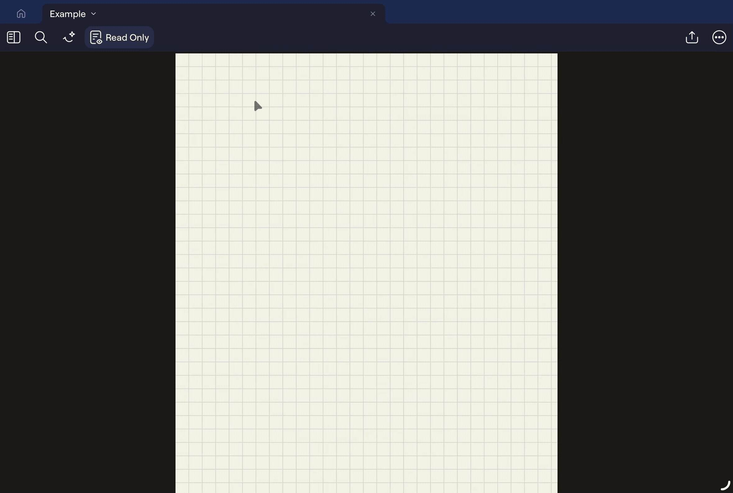
A new notebook opens automatically in the “Read Only” state, where it is uneditable. A user might use knowledge in the head from previous experiences with notetaking or writing apps to click on the page to begin typing. However, Goodnotes fails to match users’ conceptual model; a short press shows/hides the toolbar UI, while a long press yields a tool tip with the options to Zoom and Add Comment. This indicates a high gap in the gulf of execution, where it is not clear how a user might achieve their goal of taking notes.
After receiving feedback during their gulf of evaluation, the user is not able to achieve their goal of taking notes. At this point, the user may revisit the planning stage within the seven stages of the action cycle. Their goal remains the same, but scanning the screen again, they might notice knowledge in the world: an icon and copy that states “Read Only.”
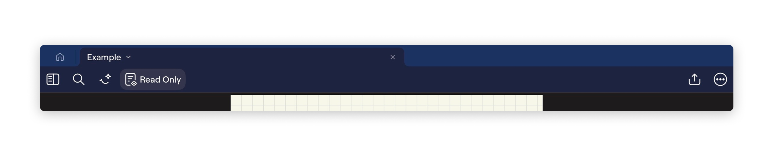
This button is a signifier for the Read Only mode. However, it has poor discoverability: it is unclear whether it functions as a button that activates Read Only mode or as an indicator that Read Only mode is currently enabled. However, as the recent feedback from the last seven stages of action is still within the user’s short term memory, they will likely be able to deduce that it is an indication that the document is currently on Read Only mode. This leads to a lower gap in the gulf of execution, where clicking on the button moves the document out of Read Only mode. In this case, the user is able to receive good and instantaneous feedback as the document moves into editing mode. As a result, the gulf of evaluation is low as the editing toolbar appears with one of its many tools clearly highlighted.
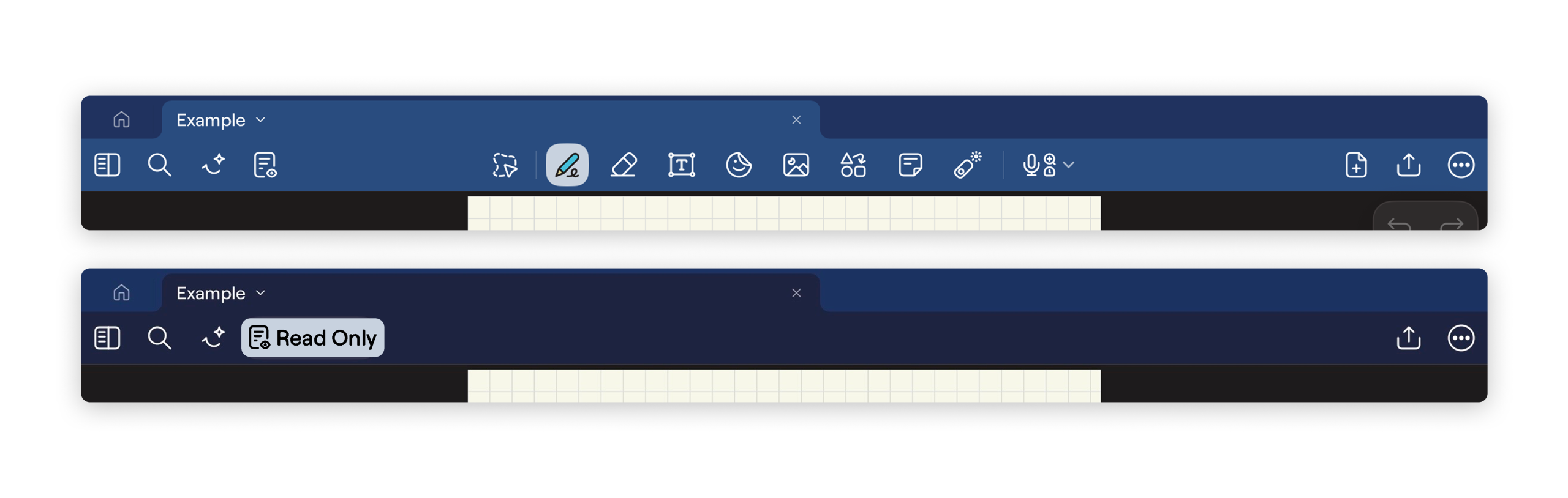
In order to increase the discoverability of the “Read Only” signifier, we can apply a lighter treatment to the background of the button, matching the treatment of selected options in the editing toolbar. Not only will this maintain consistency throughout the application, the greater contrast would also decrease the number of rule-based mistakes.
3. Editing Mode
The editing suite of Goodnotes is its standout feature, offering a wide range of tools that replicate the flexibility of traditional handwriting and annotation. Similar to the navigation sidebar, the editing toolbar relies heavily on skeuomorphic iconography, which is unsurprising for a platform seeking to digitize activities traditionally performed in the physical world. These icons leverage users’ existing conceptual models, allowing tools to feel immediately familiar and approachable.
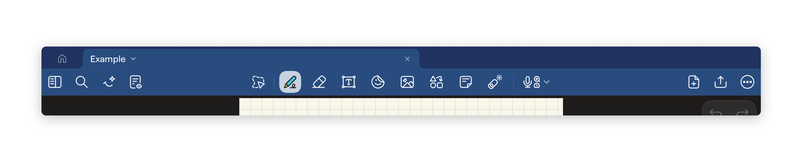
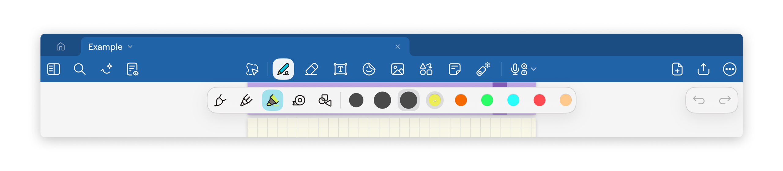
For example, the writing tools are represented by icons resembling real-world instruments, such as a pen tip with scribbled markings to indicate writing tools and an eraser icon to remove content. These signifiers effectively communicate each tool’s function through knowledge in the world, matching users’ knowledge in the head formed through prior experiences with physical writing instruments. As a result, users are able to quickly understand the available actions without needing additional instruction.
The editing toolbar also provides strong feedback. When a tool is selected, it becomes visually highlighted, clearly communicating the system’s current state. This reduces the gulf of evaluation, as users can easily determine which tool is active at any given moment. Additionally, adjustable properties such as pen size, color, and writing style further reinforce natural mapping. Larger stroke previews correspond directly to thicker lines, and color selections visually match the output on the page, allowing users to easily predict outcomes.
However, the text tool introduces a more significant mismatch between the system’s design and users’ conceptual models. To create a text box, users must long-press on the page rather than simply selecting the typing mode and beginning to type. This interaction contradicts common expectations established by other note-taking and document-editing applications, where selecting a text tool enables continuous typing until another mode is chosen. As a result, users experience a higher gulf of execution, as the steps required to achieve their goal of typing traditional notes are not immediately apparent.
Furthermore, users who primarily want to type must repeatedly reselect the text function each time they add new text. This increases cognitive load kept as knowledge in the head, as the system does not maintain the intended mode. In some cases, the interface may also inadvertently generate new text boxes, introducing slips that interrupt the user’s flow of action. A more effective solution would allow users to remain in a persistent “typing” mode, as in previous versions, or provide an option to pin “typing mode.” This would better align system behavior with users’ mental models and reduce unnecessary friction during note-taking.
Conclusion
Overall, Goodnotes demonstrates many strengths through its use of clear signifiers, effective conceptual models, and strong feedback mechanisms, particularly within its navigation sidebar and editing tools. Its versatile editing suite successfully translates familiar real-world writing interactions into a digital environment, allowing users to work intuitively with a wide range of tools. However, certain interactions, such as the discoverability of the “Read Only” state and inconsistencies within the text editing workflow, reveal opportunities for improvement. Small quality of life adjustments that increase knowledge in the world would further reduce gulfs in execution and evaluation, ultimately creating a more seamless and accessible notetaking experience.