Introduction
Headspace is a meditation and mindfulness app that helps people manage stress, sleep better, and find focus through guided sessions. The app offers categories such as “Sleep,” “Focus,” and “Meditate,” with audio and visual guidance designed to make mindfulness easy and approachable for everyone, even those completely new to meditation.
Critique
1. Mapping and Feedback: Mostly Smooth, but Not Always Consistent
Headspace does a great job of mapping most buttons and icons, and they do what you expect them to do. When you tap the “Play” button to start a session, you see calm animations and hear gentle transitions, giving instant feedback that your action worked. This makes the app feel reliable and easy to use.
However, navigation is not always consistent. Sometimes swiping sideways shows more options; other times it takes you to a new page. This can make users pause and wonder where they are, breaking the sense of flow Norman emphasizes.
Fix: Standardize navigation gestures to help users build a clear mental model. Predictability reduces effort and improves confidence.
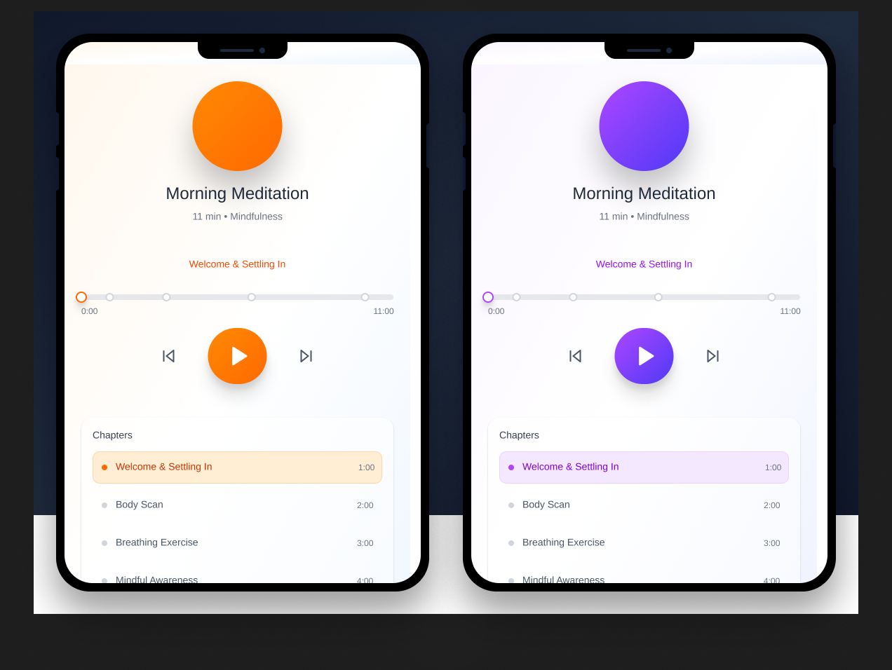
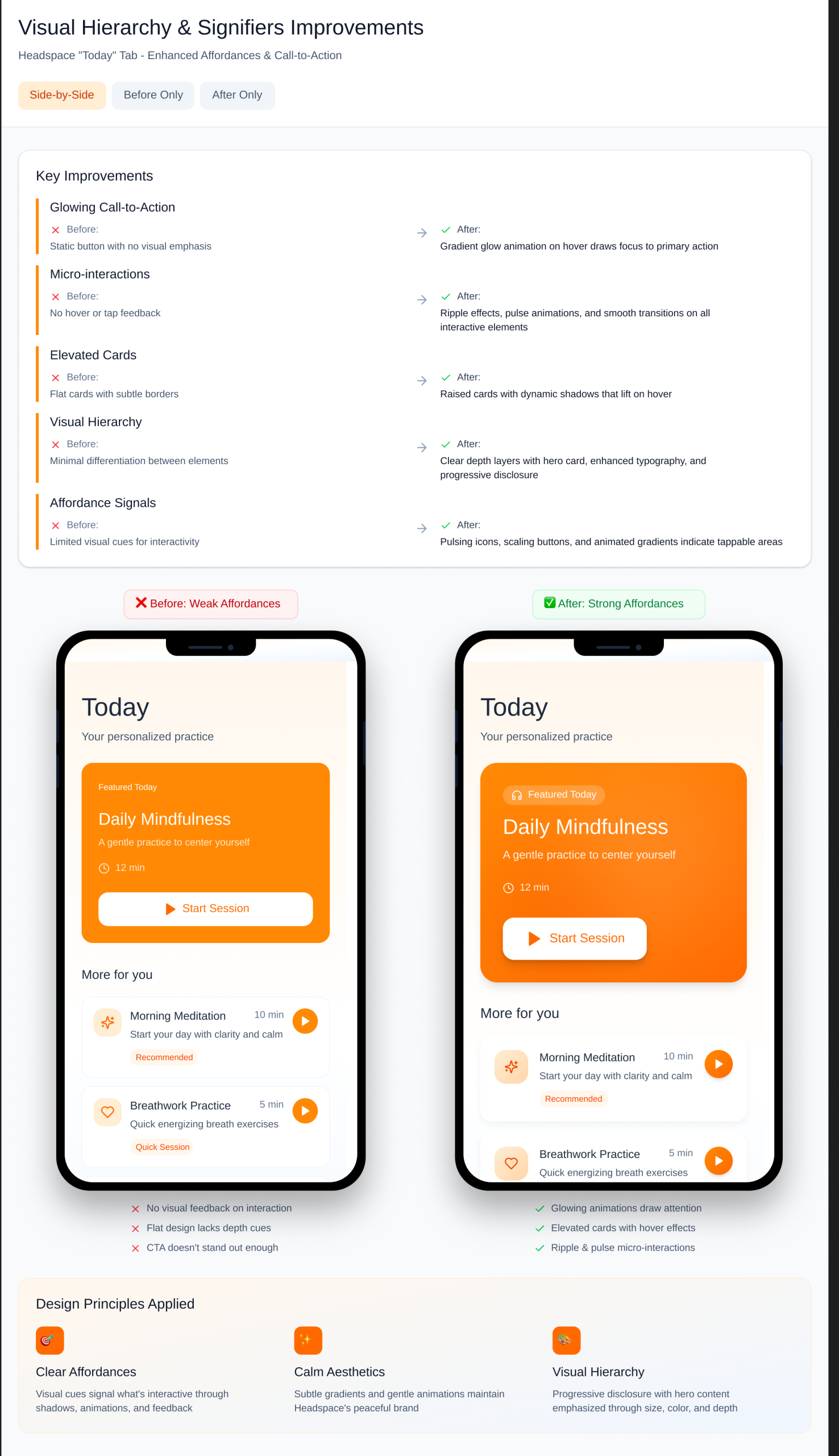
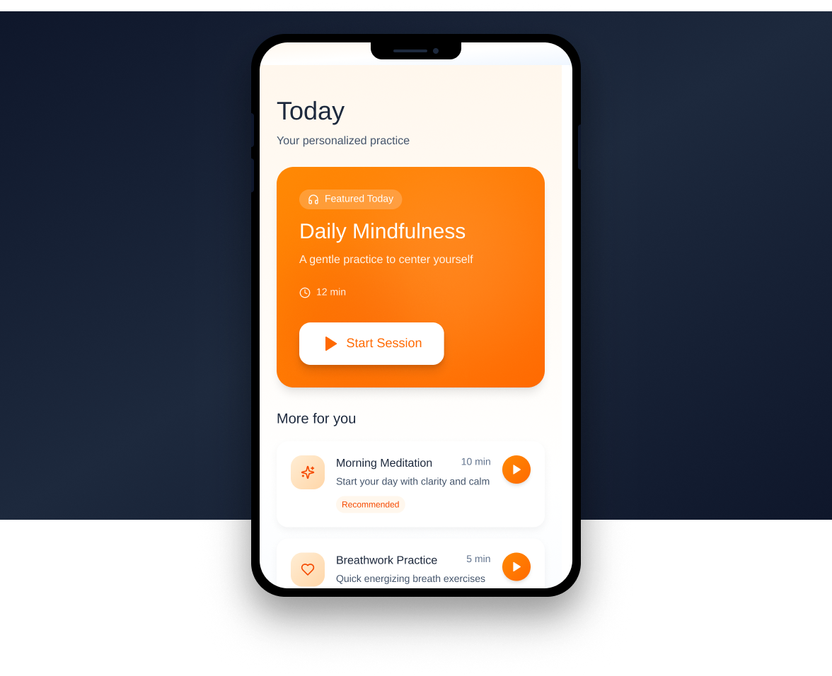
2. Affordances and Signifiers: Calming Aesthetic, but Sometimes Too Subtle
The overall look of Headspace supports its goal. Soft shapes, gentle colors, and simple layouts help create a calm and focused feeling. Icons and buttons generally communicate what you can do next.
Still, some areas, like the “Today” tab, are too minimal. The “Start” button often blends into the background, and new users might miss it. Norman says signifiers should show clearly where actions are possible, but some here are too subtle.
Fix: Add subtle cues such as color contrast or gentle animations to make active buttons stand out without disrupting the calm design.
3. Conceptual Model: Very Strong for Beginners
Headspace builds a great conceptual model for beginners. The onboarding process explains what the app does, how sessions work, and sets clear expectations. Friendly characters, smooth animations, and guided voices create emotional connection and engagement.
Progress tracking and “Run Streak” visuals reinforce learning by showing growth, not requiring users to remember their progress. This helps maintain motivation.
4. Constraints and User Control: Too Restrictive at Times
Limits can help prevent mistakes, but some are too strict here. During guided meditations, you often can’t pause, go back, or skip parts. It assumes users want to listen straight through, which can be frustrating if you want to repeat or skip sections.
Fix: Add playback controls like pause, rewind, or skip. Norman emphasizes giving users freedom to interact naturally.
5. Feedback and Reflection: Calm, but Could Go Deeper
Headspace provides effective feedback through animations and gentle congratulatory messages when sessions finish, creating a sense of accomplishment without being overwhelming.
However, after a session ends, it moves on too quickly. Adding a short reflection prompt like “How did that feel?” or a journaling question could deepen emotional engagement.
Fix: Include an optional quick check-in or mood rating after each session to let users track emotional patterns over time.
Conclusion
Headspace successfully turns meditation into something approachable, digital, and emotionally engaging. It’s peaceful, simple, and friendly, especially for beginners. Still, inconsistencies in navigation, overly subtle buttons, and limited playback controls hold it back slightly. Fixing these areas would create a smoother, more user-centered experience aligned with Norman’s design principles.
How Artifacts Afford
Headspace transforms your phone, normally a source of distraction, into a tool for calm and mindfulness. It exemplifies Norman’s idea that artifacts can afford new actions and experiences, reframing technology from something that scatters attention into something that restores it.