Headspace is an app on mobile that is used to assist users in managing stress, improving their focus, or building regular and routine meditation through guided audio recordings, courses, and sleep aids. It interacts with structured programs, attractive graphics, and follows the progress to make the mental wellness approachable and quantifiable.
How a Typical User Approaches Headspace
The default usage of Headspace by an average user is with the intent to calm down (unnecessarily), create a meditative routine, or sleep. These objectives are important since good design, according to Norman, must cross over the Gulf of Execution and the Gulf of Evaluation. The Gulf of placement of the intentions into actions and the Gulf of decoding of the system feedback are discussed by the Gulf of execution and the Gulf of evaluation, respectively. Headspace performs well when it reduces these gulfs and fails when it extends them. Knowledge of these user goals will thus show where the interface actually fulfills human requirements and where it provides needless hindrances to human beings.
Strong Conceptual Model Through Structured Courses
Figure 1 illustrates the vertically structured course progression interface.
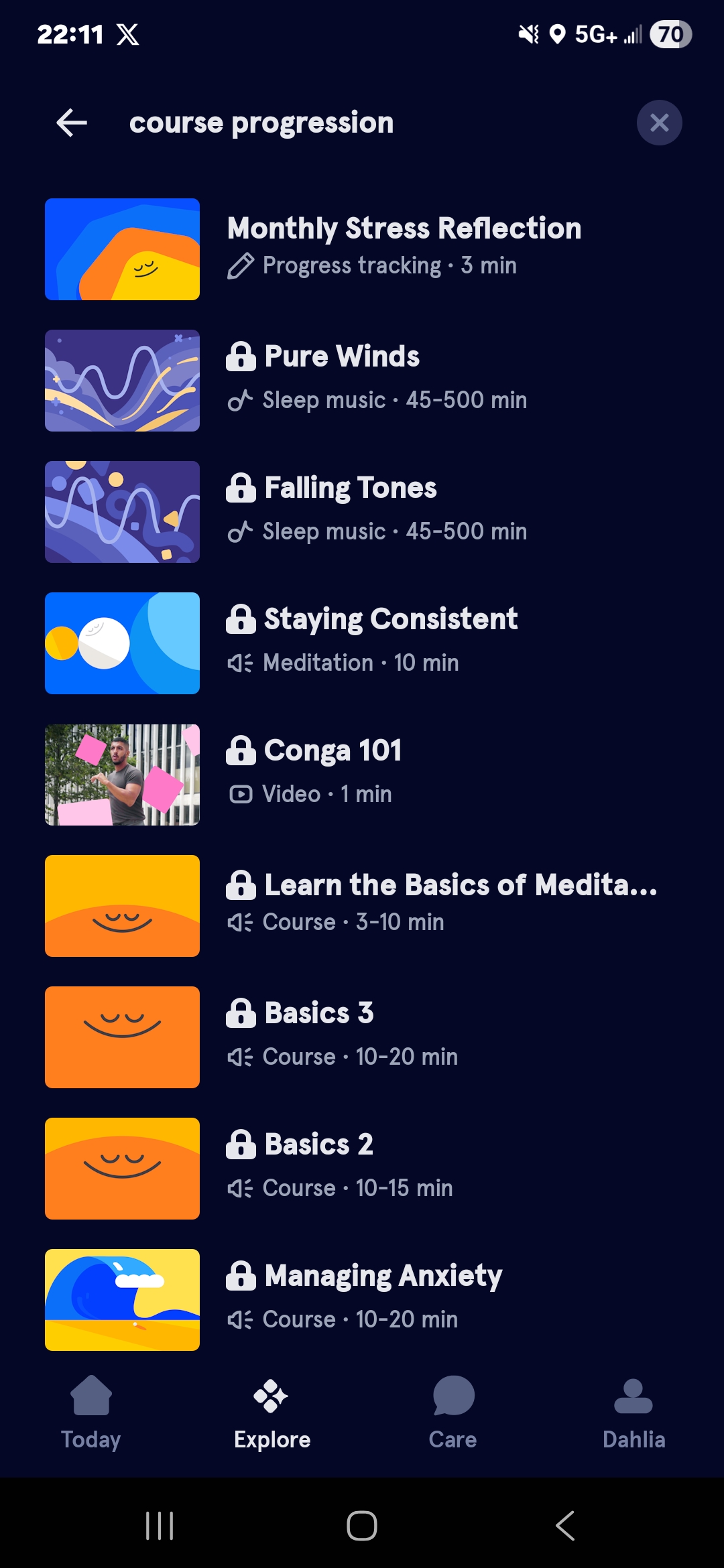
The meditation programs at Headspace represent a linear course, and this approach gives some great conceptual framework that dictates the use of the system. Instead of displaying a library of content so overwhelming, the sequenced layout conveys a single message: meditation is a journey that you will go through step by step. The progress bar offers real-time feedback, which reduces the Gulf of Evaluation since users never wonder where they are. It works well as mapping too; the visual layout of sessions directly aligns with the time flow, and thus users do not require instructions to discern the order. The perceived affordances are also high in the session cards; size, contrast, and spacing indicate tappability, and the possible actions can be seen. Cumulatively, the system image is consistent with the model of the designer, i.e., the interface is self-teaching by structure.
Ambiguous Discovery in the Content Library
Figure 2 shows the Explore interface, where multiple content types are presented with similar visual weight.
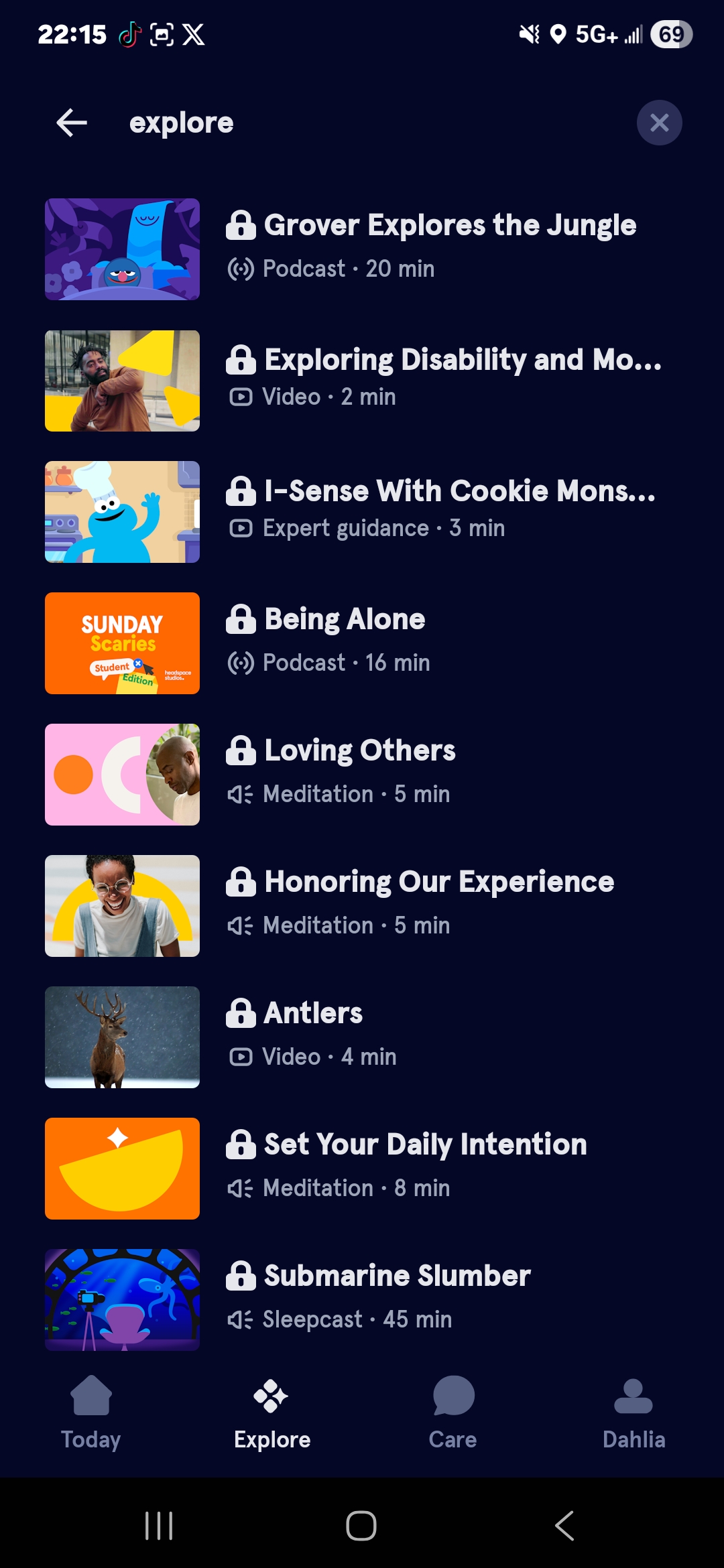
After the user has gone past beginner courses, the interface is visually cluttered and hard to navigate. The “Explore” section has various categories that have overlapping carousels with equally weighted visuals, which dilute signifiers and heighten cognitive load. According to Norman, good design is what makes actions visible and comprehensible. In this case, all items appear equally significant, and users need to scan and compare to take action – expanding the Gulf of Execution. When a user is in a vague state of feeling anxious before a meeting, he or she needs to put the feeling into a category then a particular session. A solution supported by Norman would add contextual constraints.
Figure 3 presents a proposed redesign that introduces intent-based primary actions.
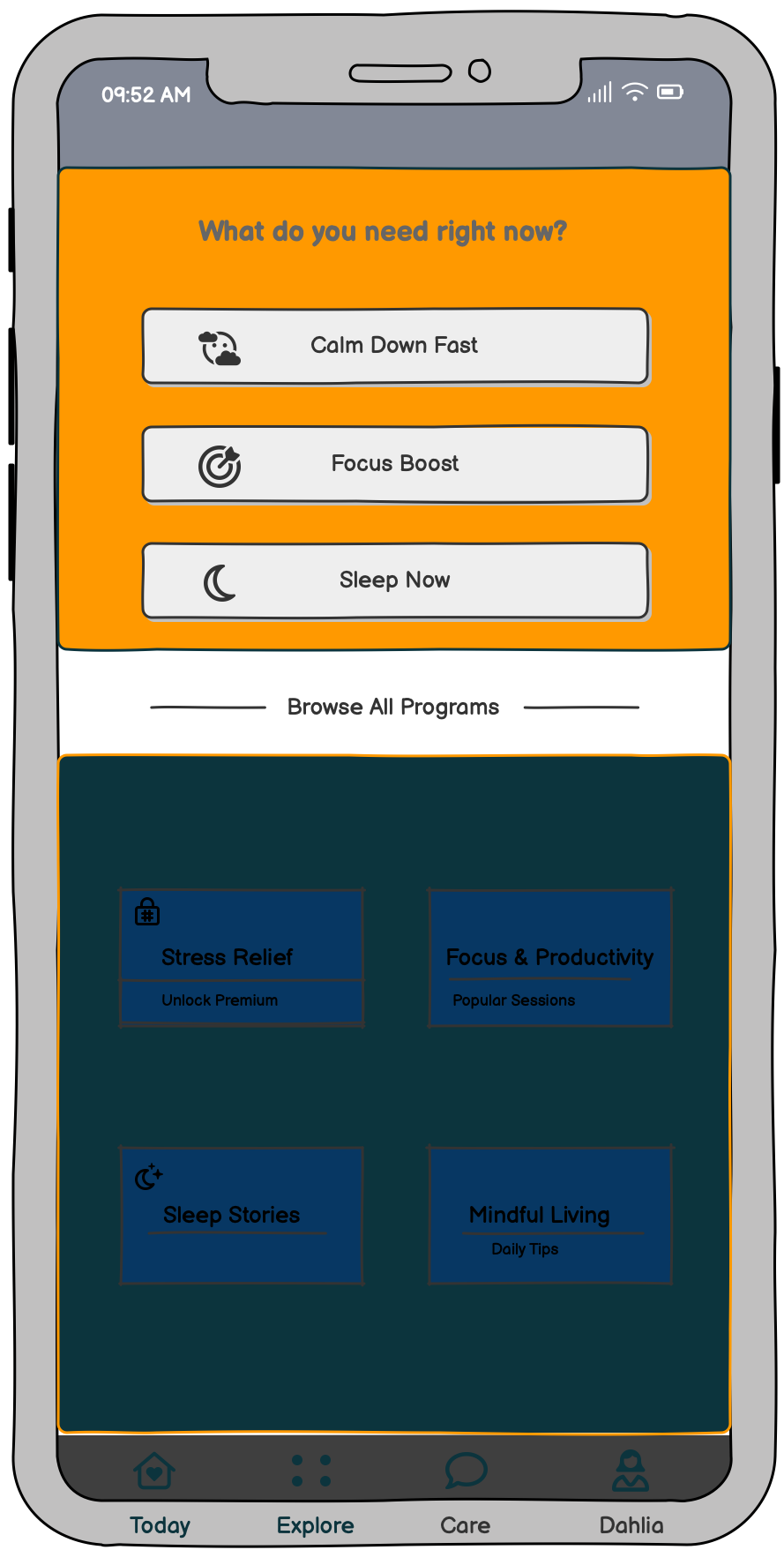
in the upper part of the screen; three large buttons would be named “Calm Down Fast”, “Focus Boost”, and “Sleep Now”. Limiting the number of visible options simultaneously would limit decision fatigue and would bring the interface into the same cognitive state as actual cognitive states, particularly when stressed (where mental bandwidth is constrained).
Feedback, Habit Reinforcement, and Motivational Tension
Headspace takes the form of streak counts and completion animations to reinforce a consistent behavior, which is indicative of strong use of immediate, informative feedback. Upon a session completion, the user is given visual confirmation in the form of subtle animations and gratifying checkmarks, as identified by Norman as the necessary action-evaluation loop. But streak systems add a little but significant motivational pressure. They transform the user’s conceptual model of “I meditate to feel better” to “I meditate to protect a number.” This redefines intrinsic motivation as extrinsic tracking, which may eventually damage long-term well-being and the autonomy of the user. One such refinement would be to make streaks visible on command, as this would be consistent with a human-centered design and respect the various motivational models, as well as user autonomy.
Subscription Friction and Visible Constraints
Figure 4 shows the subscription screen that appears after users have engaged with content.

The paywall frustrates users because it appears after they have used their time navigating the content. Users establish an access model in their mind, and they are then violently shaken when the model collides with a subscription screen. According to Norman, good design employs knowledge in the world, not requiring users to rely on surprise discovery. The answer lies in clear signifiers, such as little lock icons or labels of “Premium” right on the thumbnails, before the user even opens the content. Visible constraints minimize user frustration since the user’s expectations and system rules are set at the outset. Design expectations on all levels result in trust, and in the case of a wellness product, trust is all.
Conclusion
Headspace has numerous good design options that make meditation appear organized and available. It is based on proven mental models of wellness apps to help users develop habits. Nevertheless, it should optimize its content discovery, paywall indicators, and streak system to align the interface with the cognitive and emotional requirements of the users.