HYPE by Hypebeast is a mobile news app that curates global culture through editorial articles on design, music, art, and fashion. It follows a dark, minimalist image-driven design layout that lets people find inspiration and follow the latest news on contemporary street culture.
Login Screen
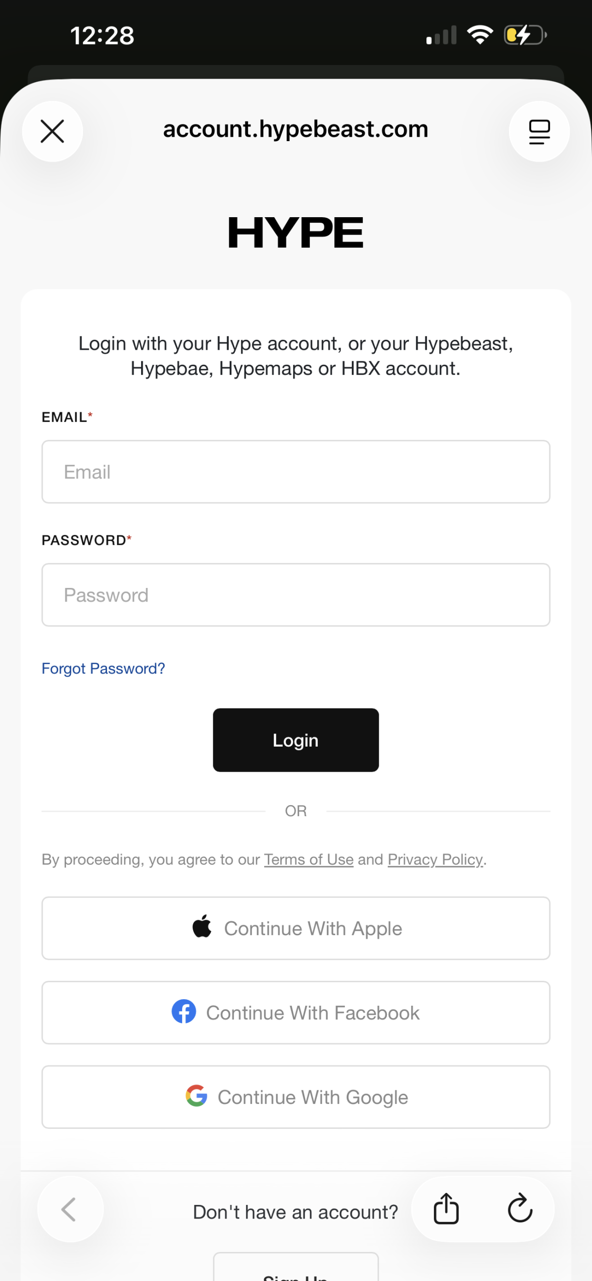
HYPE has the conventional login structure found in most mobile apps, making the process intuitive for the majority of users. By following patterns that most people know, the users are able to sign in with minimal effort, also known as the “knowledge in the world” concept mentioned by Don Norman. The “Login” button functions as a signifier, letting the user know where action should occur and that the app affords logging in. Additionally, it includes the most common standard third-party options such as “Continue with Apple,” “Continue with Facebook,” and “Continue with Google”. These options rely on existing mental models and reduce the Gulf of Execution because most users understand how these authentication methods work. However, the feature assumes users are comfortable linking third-party accounts and can raise privacy concerns. A solution could be to include an information icon near each option explaining what data will be shared, building trust and reducing uncertainty for users.
Home Feed Screen
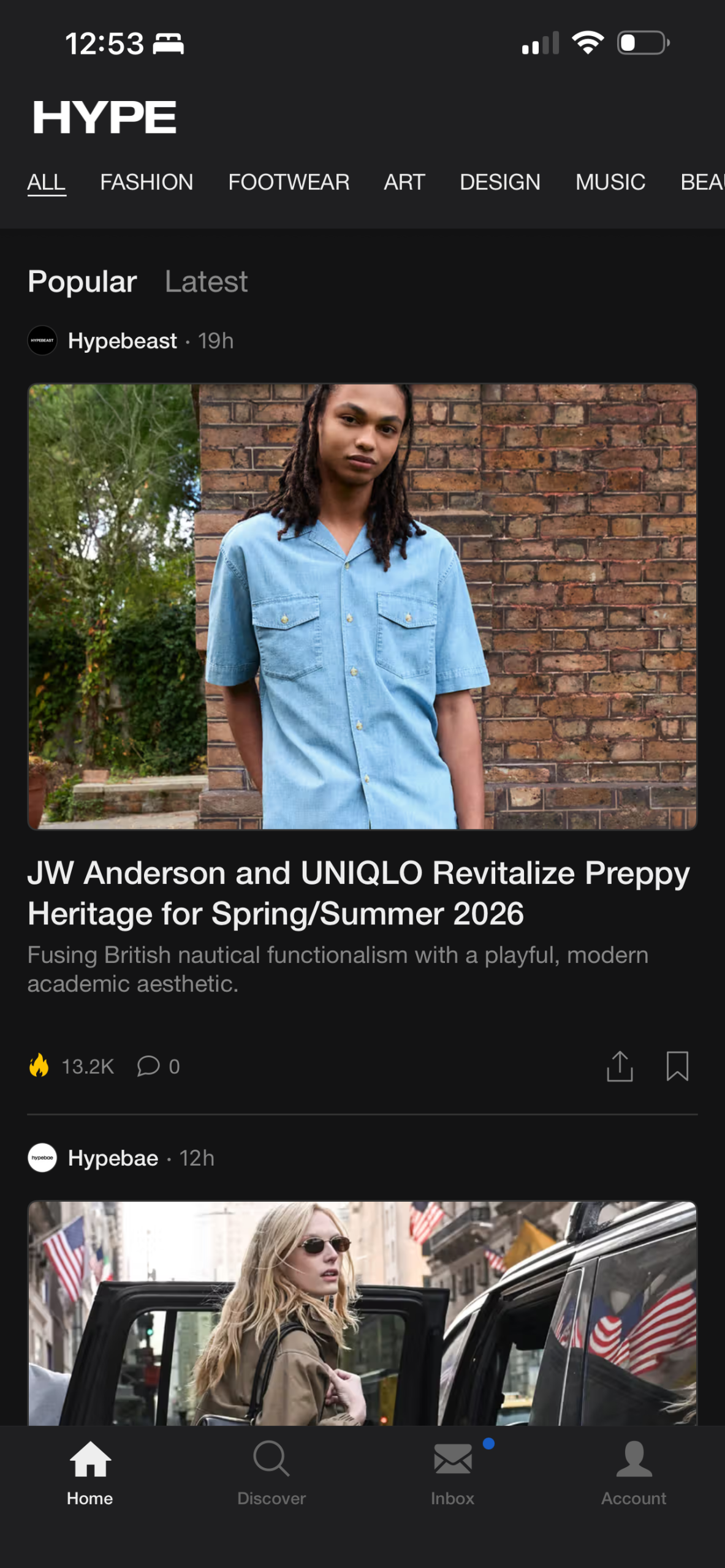
HYPE’s home feed follows the familiar vertical scrolling structure that most social media, content driven apps use, making navigation intuitive for most users. With vertical navigation and alinign with existing mental models, has strong natural mapping reducing the Gulf of Execution because the action directly corresponds to discovering more content. Furthermore, the large images featured function as signifiers, indicating tappable articles. As for the negatives, the engagement icons (flame, comment, share and bookmark) lack some context and rely only on recognition of symbolic meaning. For example, the flame icon has weak natural mapping to “popularity” in some contexts. This can cause cognitive load and widen the Gulf of Evaluation, as some users might not immediately understand what the icon means. A good solution might be changing this icon to “📈” as most users might interpret this as an article that has a lot of engagement. Another solution to increase feedback could be to animate the icon signifing that an action has taken place.
Discover Grid Screen
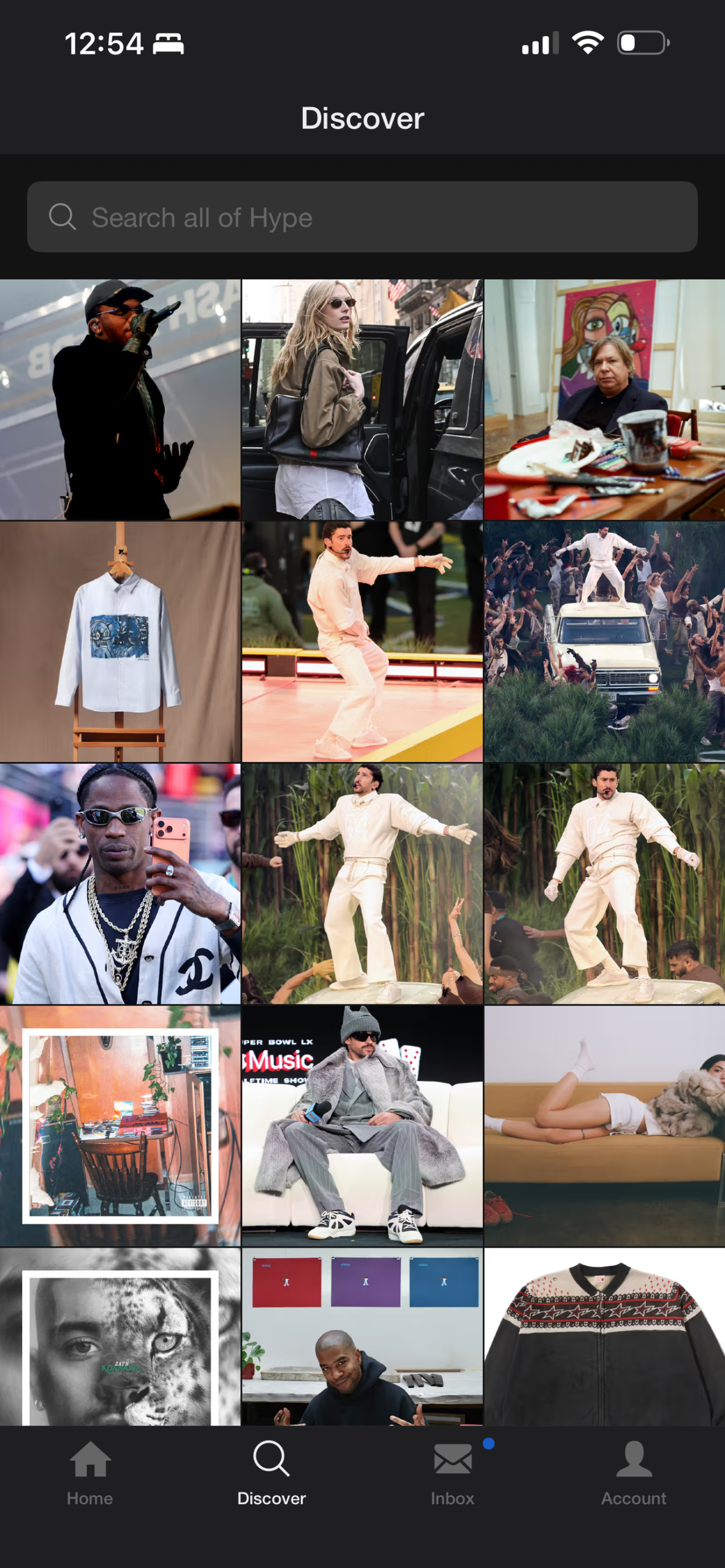
The Discover Grid Screen has a grid-based layout that supports visual browsing. The image tiles afford tapping (similar to Instagram), showing strong affordances and supporting the app’s visual-first conceptual model. This interface also leverages knowledge in the world because users can navigate effortlessly without explicit instruction.
However, the grid doesn’t include contextural information such as category labels, reducing semantic constraints. Users must guess the topic of the article based only on the image, which can definitely be left up to interpretation. This design widens the Gulf of Execution because users might not find specific content like art or music news. Additionally, while the search bar does include a description of what the users can do (“Search all of Hype”). Its design is visually subtle and may not signal that it is clickable, reducing discoverability and limiting user interaction. A solution to this issue could be to make the search bar more prominent with a more contrasting background and changing its placeholder to hint functionality, e.g., “Search for music, art, or design,” reinforcing discoverability.
Conclusion
Overall, HYPE has a visually cohesive design that aligns with its cultural identity. The app has familiar patterns and follows some metal models. However, its minimal design can sacrifice clarity and understandability. By adding stronger signifiers and semantic cues, Hype would be able to improve usability while maintaining its core brand values.