A Critique of Apple’s Journal App (iOS 17.2+)
Apple’s Journal app, released with iOS 17.2, aims to make reflective journal writing easy and convenient by combining journal entries with photos, locations, workouts, and other daily data already captured by an iPhone. As someone who uses the app regularly (187-day streak), I find that the Journal app’s interface illustrates examples of both strong human-centered design and some missed opportunities. Using Don Norman’s principles and additional ideas from The Design of Everyday Things, this critique discusses four specific features of the interface, in order from strongest design features to weakest, highlighting how the weak points can be improved.
1. Natural Mapping and Discoverability
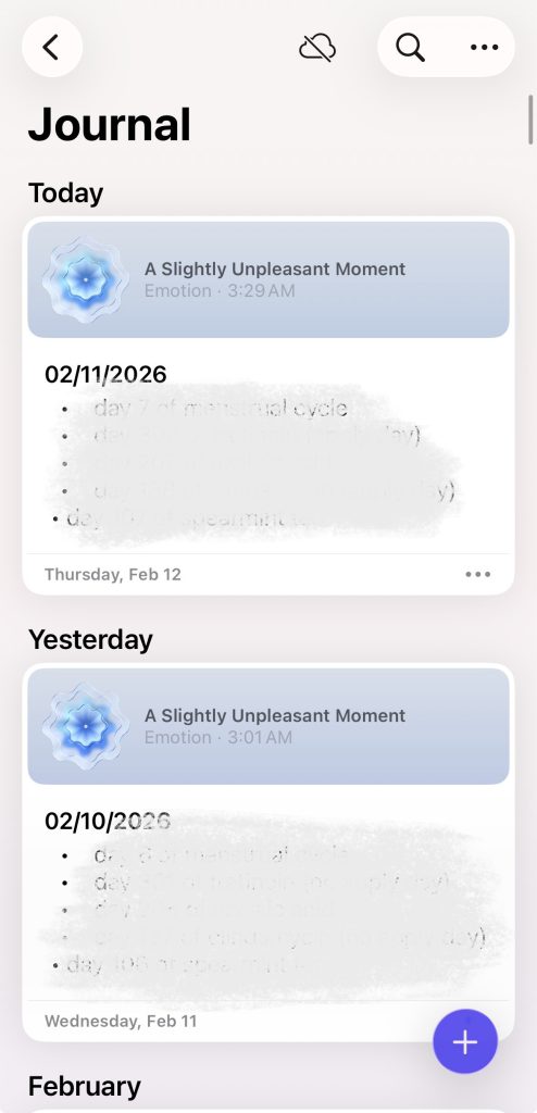
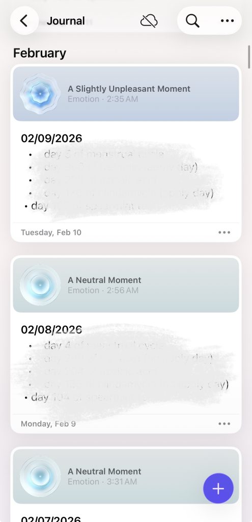
One of Journal’s strengths is its application of natural mapping, specifically in its main timeline view. The first screen a user sees upon opening the app are their entries, and they are displayed in a vertical chronological list, mapping directly to users’ mental model of time progression. Tapping an entry opens it; swiping returns you to the list. This aligns well with Norman’s idea that good mappings reduce the need for instructions.
However, discoverability when creating a new entry is slightly weak. The small “+” button in the bottom toolbar lacks sufficient signifiers. Experienced iOS users can assume what its function is, but new users may not immediately recognize that this is the primary action of the app. According to Norman, discoverability depends on visible cues that indicate possible actions.
Potential Fix: Increase the prominence of the “+” button by pairing it with a text label such as “New Entry” or by using a larger floating action button. This would strengthen the signifier and better communicate the system’s intended action without adding clutter.
2. Feedback and System Status
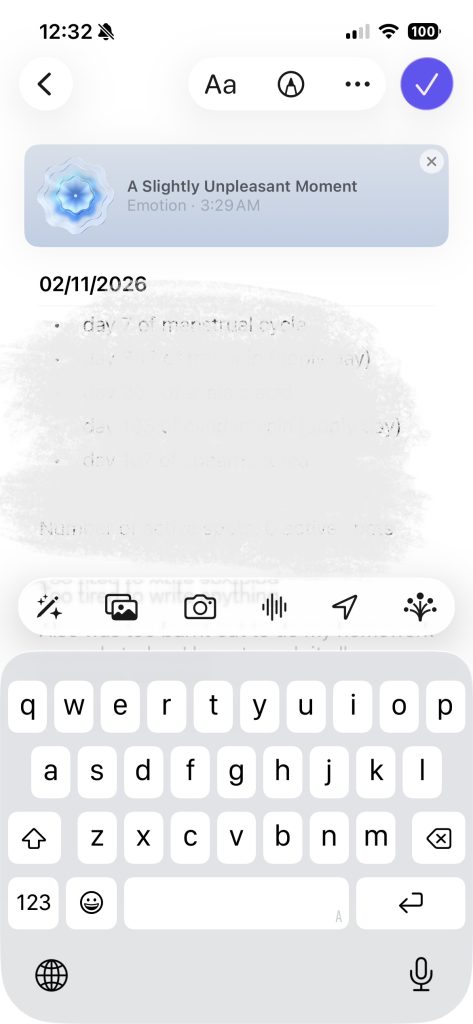
Journal usually provides clear feedback, especially when saving entries. As users type, their text is automatically saved, and exiting the entry does not trigger anxious thoughts about whether an entry has been saved or not. This supports Norman’s principle of reducing memory load and aligns with the concept of knowledge in the world rather than knowledge in the head.
In some areas though, feedback becomes less clear when adding suggested content (such as photos or locations). Once an item is added, it subtly appears in the entry, but there is no explicit confirmation that this item will be present when you leave entry view. Users may wonder whether their action was successful, violating Norman’s guideline that every action should have an immediate and perceivable result.
Potential Fix: Add a brief animated transition or microcopy (e.g., “Photo added”) to reinforce feedback. This would make the system state more visible without interrupting the journaling flow.

3. Constraints and Over-Automation
Journal relies heavily on algorithm suggestions (when Journal Suggestions setting is enabled), prompting users to write based on recent activities. While this may reduce the gulf of execution by helping users decide what to write about, it also introduces a problematic constraint of over-suggesting. Suggestions dominate the entry creation flow, subtly nudging users toward certain types of content (photos, workouts, locations) over true free-form reflection.
This design risks undermining user agency. Norman warned in his book that automation can become intrusive when it shifts control away from the user and obscures alternative actions.
Potential Fix: Allow users to toggle suggestion prominence or default to a blank entry view. This respects different mental models, some users want prompts, others want a blank page, and restores user control while still keeping suggestions accessible.

4. Broad Conceptual Model and Visibility of Features
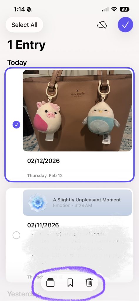
Journal’s minimal aesthetic, while visually appealing, hides several features such as filters, bookmarks, and insights. These features exist but are buried behind icons with weak signifiers, making the app’s conceptual model unclear, especially to new users of the app. Users may assume Journal is “just a simple list of entries,” without ever realizing its broader capabilities.
According to Norman, a good conceptual model helps users predict what the system can do. Here, the lack of visible affordances prevents users from forming that model.
Potential Fix: Introduce a short onboarding walkthrough or contextual tips that cover advanced features at appropriate moments. This adds knowledge in the world without overwhelming first-time users.
