
A Norman-Informed Critique of LinkedIn’s Mobile Job Search
As an active job seeker, I regularly use the Jobs feature on the LinkedIn iOS app. With it being a primary tool used by professionals, I am often frustrated with its UI, and examining it through Don Norman’s framework gave me more clarity as to why. Through this exercise I was able to see how certain design decisions support user goals while others introduce unnecessary friction. This critique applies Norman’s six design principles alongside additional concepts from The Design of Everyday Things to evaluate the mobile experience.
Discoverability
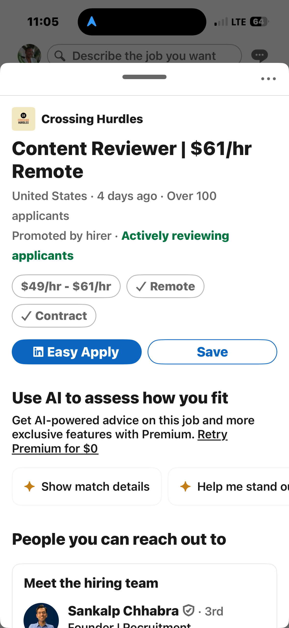
LinkedIn’s job search feature is easily discoverable as an icon on the right of the bottom navigation menu, clearly labeled as “Jobs” with an briefcase icon, which displays a black top-border when clicked.
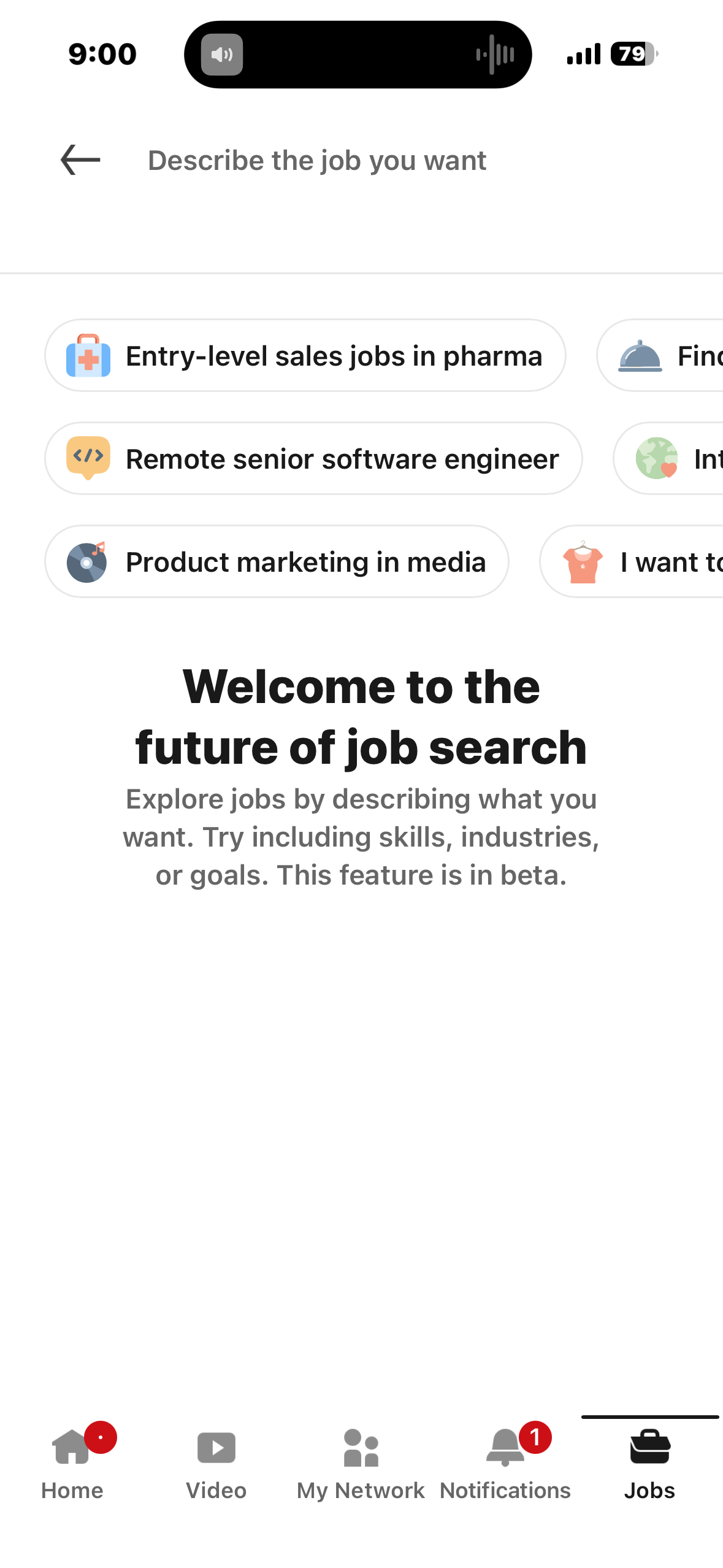
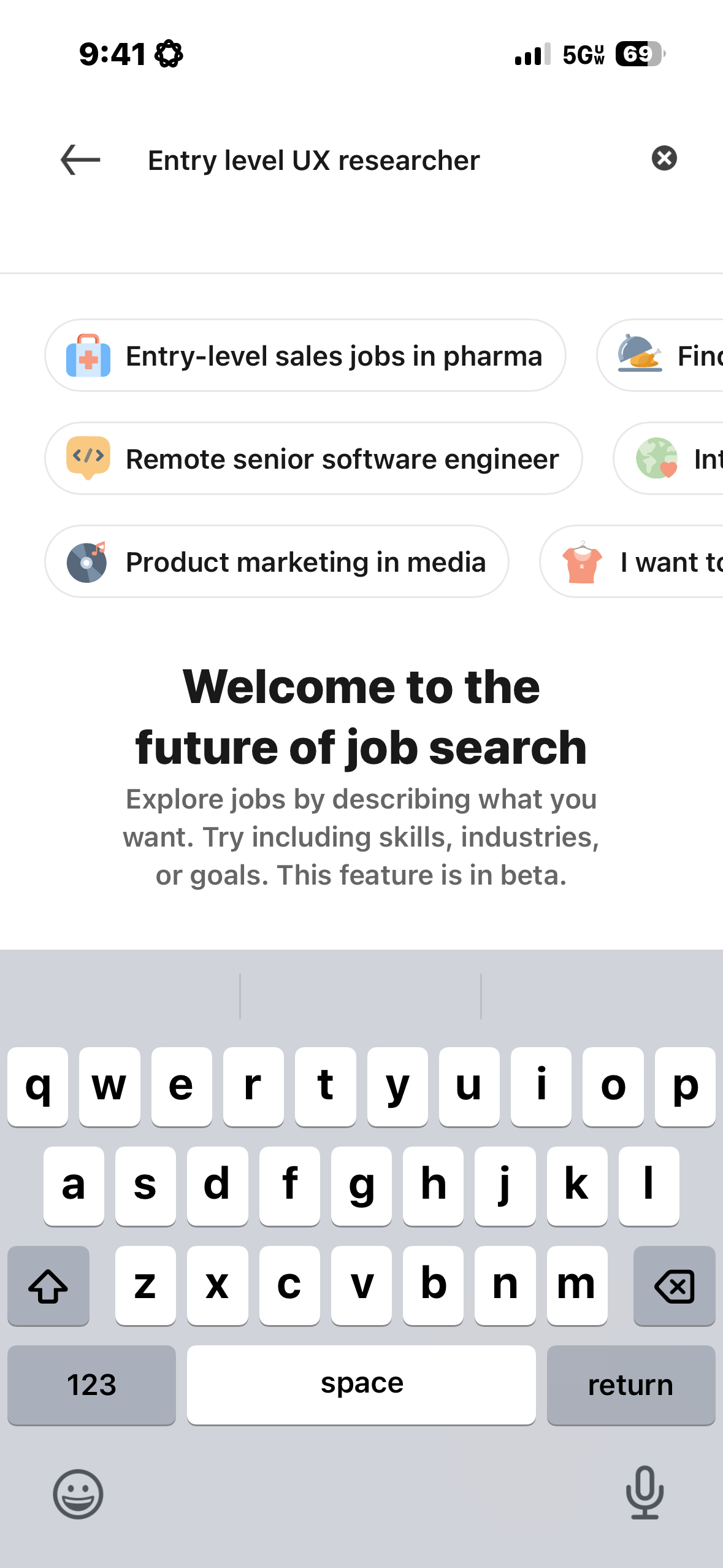
Once navigating to the jobs portion of the app, there is a prominent search prompt, at the top of the screen with the words, “Describe the job you want,” another example of discoverability. Its conversational language and visual prominence act as a clear signifier, communicating that users can search using natural language rather than rigid keywords. This could lower the barrier to exploration and support novice users, however users like myself who would rather browse jobs through filters will have a much harder time figuring out how to use the search. The new update that includes AI search makes it difficult for a user to, for example, simply browse part time jobs in their area. Before, a user could easily navigate filters like “Part-time” and search in their map radius. Now, a user must put what they are looking for into specific words.
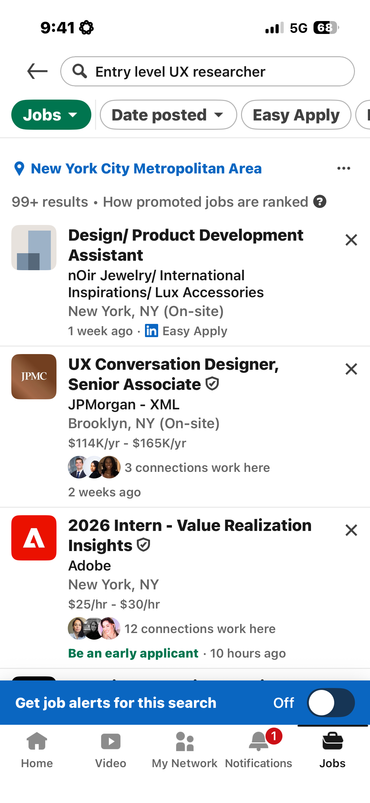
Filtering and refining results is such an important feature of the app and unfortunately proves to be far less discoverable than ideal. In order to reach any type of filter through search, the user is forced to describe the job they want first. After completing this step, the user is shown a list of jobs with no clear understanding on how they are ranked (although there is a small indicator to learn more about how promoted jobs are ranked).
From here, you are shown the geographic area you’re searching in, as well as a list of filters placed in a horizontal scroll above the listings. It isn’t immediately clear that it is a horizontal scroll, but when that does become discoverable, there is a list of filters, in this order:
- Date Posted
- Easy Apply
- Remote
- Design
- Research
- Research & Development
- UI
- AR/VR
- Experience level
- Employment type
- Company
- Under 10 applicants
- In my network
This is a clear example of widening the gulf of execution, where the most relevant filters are less discoverable at the end of a horizontal scroll without clear signifiers. Overall, the system places too much knowledge in the head, requiring users to remember or infer functionality rather than making it visible in the interface.
To fix this, I would make the AI search optional, create a clear signifier for filtering, and reorganize the filters to be most relevant for job seekers.
Affordances and Feedback
When viewing a job listing, The “Apply” and “Save” buttons on the are strong examples of effective perceived affordances. Their size, color contrast, rounded shape, and placement directly beneath the job title signal that they are interactive elements meant to be tapped. According to Norman, affordances describe what actions are possible, but what matters in interface design are perceived affordances–whether users can see those possibilities. In this case, LinkedIn succeeds. Both buttons clearly invite action without requiring prior knowledge or guesswork.
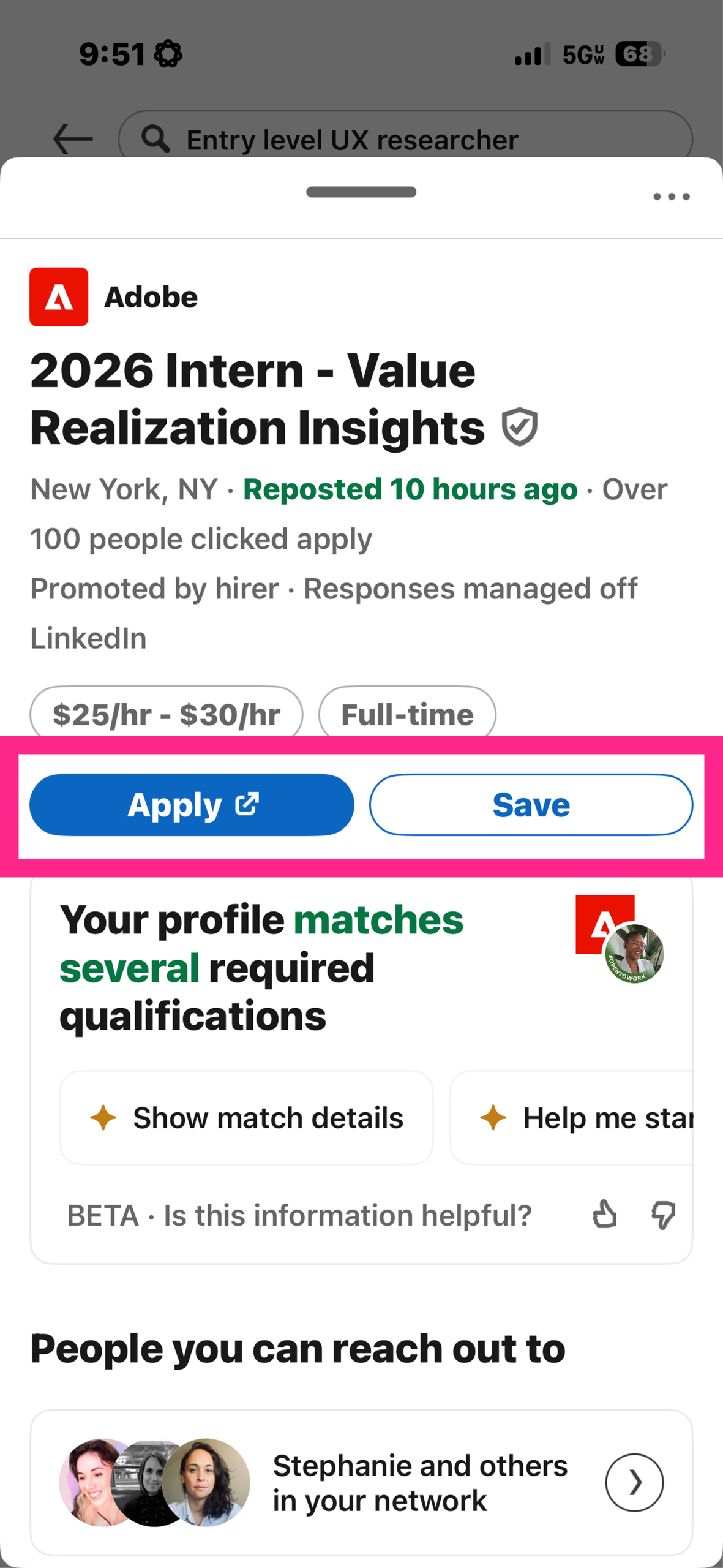
The “Apply” button uses a filled blue style, making it visually dominant and signaling its importance as the primary action. The “Save” button, while secondary, still maintains a clear boundary and label, ensuring users understand that saving the job is also available. These visual properties act as strong signifiers that communicate the affordances of each control.
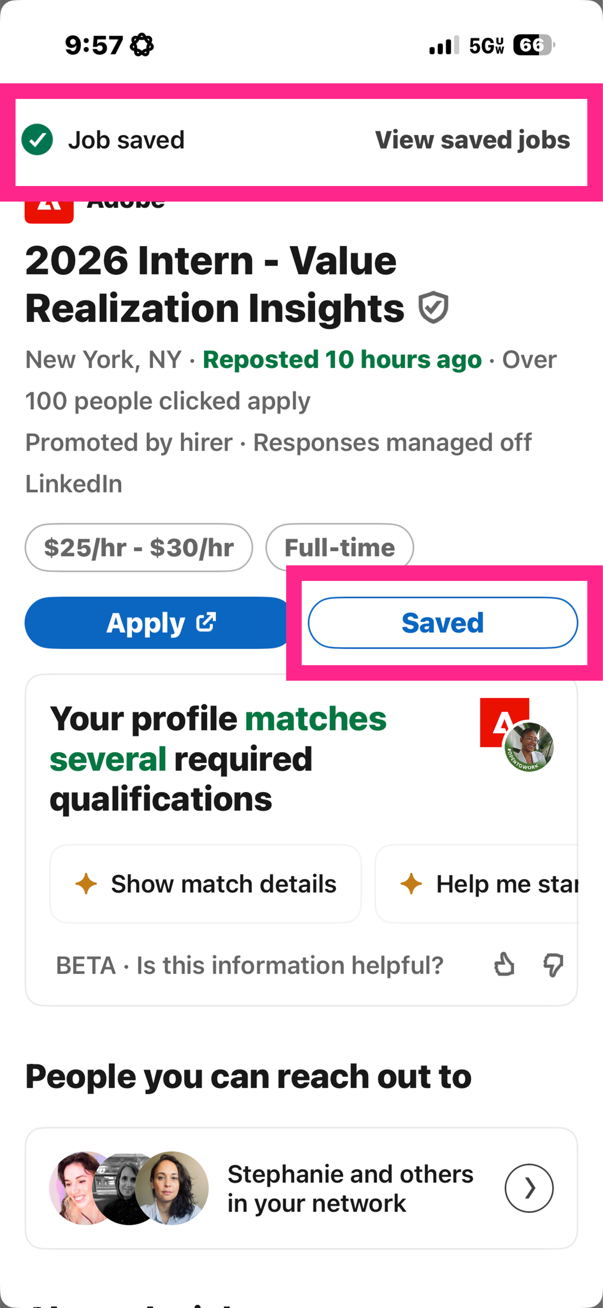
These affordances are especially effective because they are immediately supported by strong feedback. When the “Save” button is tapped, the interface responds in two clear ways:
- The button label instantly changes from “Save” to “Saved,” showing a visible state change.
- A confirmation banner appears at the top of the screen reading “Job saved,” along with a checkmark icon.
This immediate response closes the gulf of evaluation, as users don’t have to wonder whether their action worked. The state is clearly communicated, completing a strong feedback loop. Instead of relying on working memory, or knowledge in the head, the interface provides visual confirmation, helping to reduce cognitive load.
Signifiers
Semantic text like “Based on your profile…” and “Recent job searches” are strong signifiers that help users understand why certain content appears. They build context and support users’ mental models.
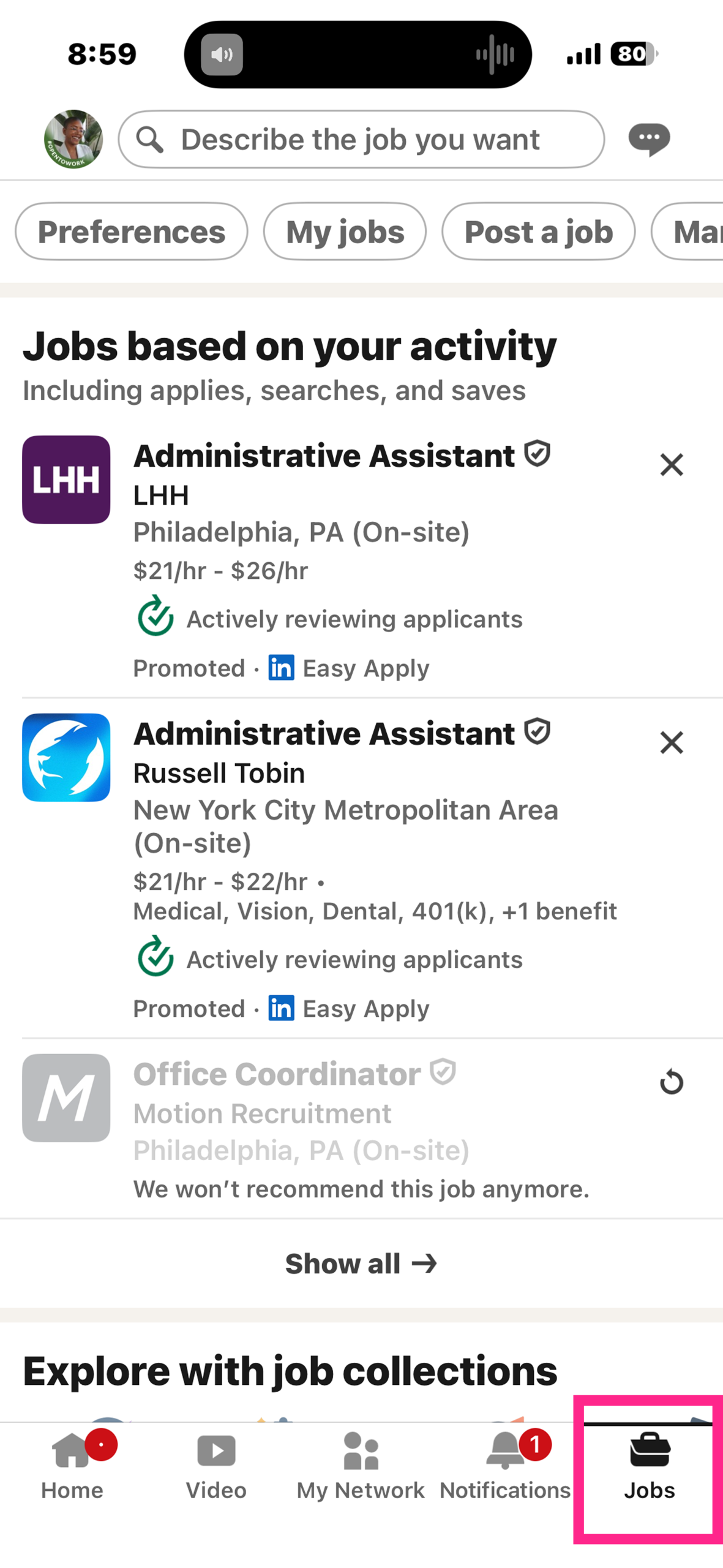
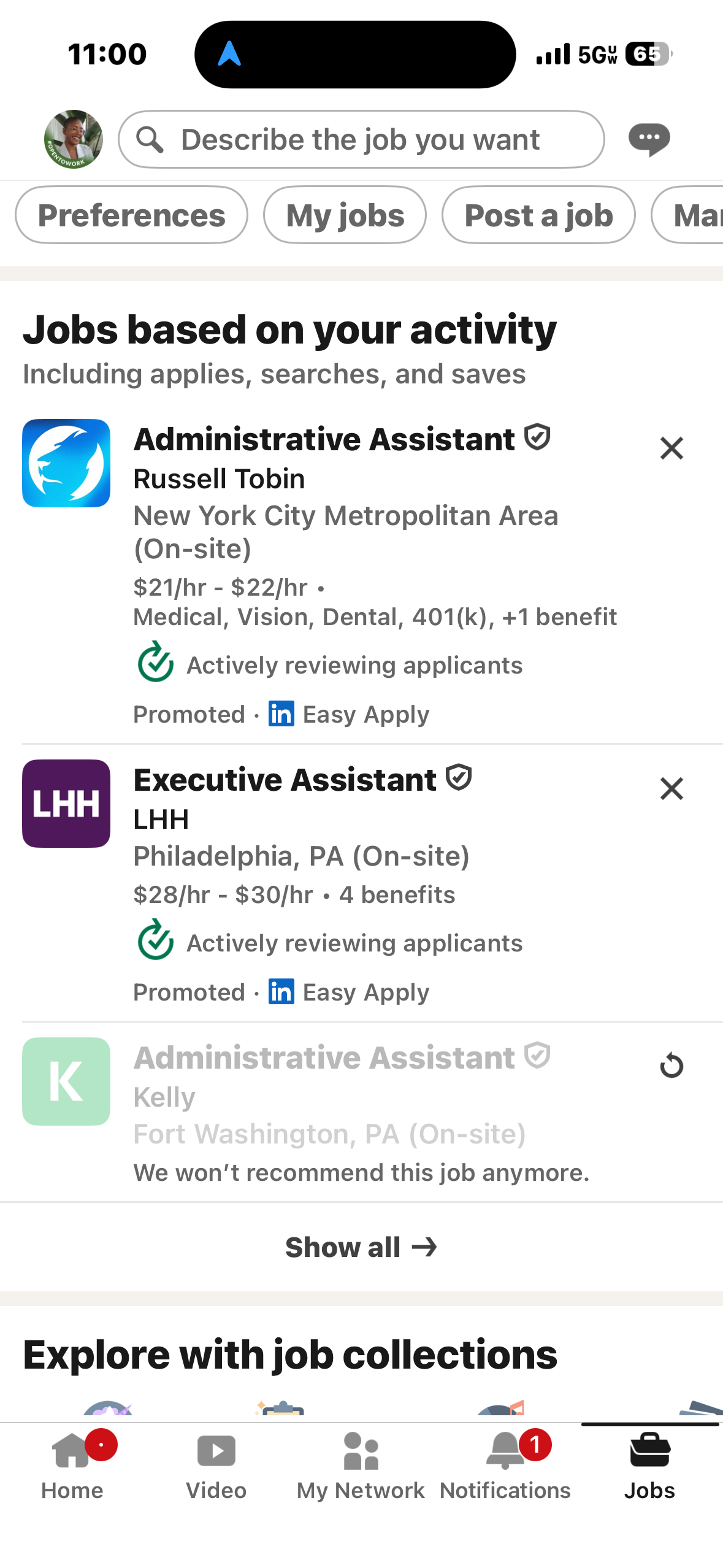
Additionally, when browsing listings, a small but clearly visible black X is displayed on the top right corner of each listing block, signifying a dismissal or rejection of the listing. When clicked, there is immediate feedback: the listing grays out and a message below it displays: “We won’t recommend this job anymore.” Unfortunately though, the feedback loop seems to stall when the listing doesn’t go away. For example, in the screenshot below, I attempted to dismiss this listing weeks ago, yet it still displays, just with the dismissal message. This would be a simple fix: give the user an option and set amount of time to undo their decision (maybe 5-10 seconds), and then have the listing disappear after that amount of time, closing the feedback loop.
Constraints
LinkedIn uses constraints well in several places within the app. The “Easy Apply” feature available with certain job listings constrains users to an in-app flow, preventing them from getting lost on a third-party site. Likewise, the “Recent job searches” list limits input choices to previously valid terms, reducing errors and minimizing effort.
These constraints guide users toward successful behaviors by narrowing choices and preventing incorrect actions.
Conclusions
LinkedIn’s iOS job search interface is a nuanced blend of thoughtful design with significant areas of friction. It succeeds most when it makes actions visible, like the discoverable search bar, demonstrates clear affordances as with the Apply/Save buttons, and gives immediate feedback like with the Saved banner. It falters when it fails to complete feedback loops leading to gulfs of execution, complicated important controls like filtering, and leaves users wondering about outcomes.
By applying Norman’s principles and understanding concepts like gulfs of execution and evaluation, perceived vs. real affordances, feedback loops, and conceptual models I can see how small interaction details either support or frustrate users like myself. Making affordances more discoverable, signifiers more explicit, and feedback more consistent would help support users and create less frustration.