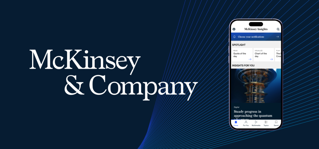
The McKinsey Insights app is a mobile platform that delivers research, articles, podcasts, and explainers on major business and technology trends. It is designed to help professionals explore curated thought leadership, personalize their feed, and save content for later reading or listening across topics like AI, sustainability, leadership, and corporate strategy.
It is one of those interfaces that feels polished and credible from the moment you open it. The app is clearly built for busy professionals who want to quickly access high quality insights without friction. Overall, it does many things well, but there are also a few usability gaps where Don Norman’s concepts help explain why certain moments feel less intuitive than they could be.
Strong Hierarchy, Clear Signifiers, and Feedback
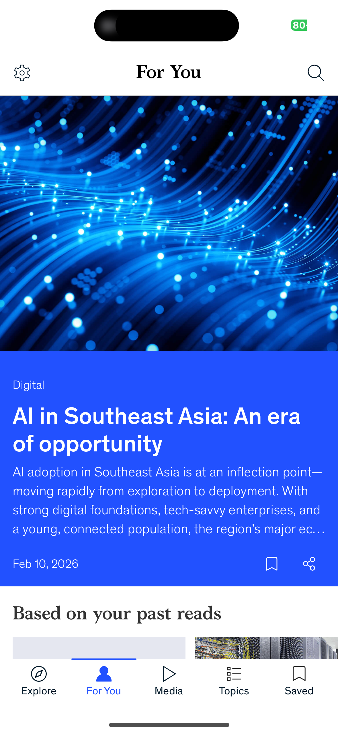
One of the best parts of the app is the Explore feed. The interface uses a clean visual hierarchy where the most important content is immediately visible. The featured article appears with a large image and bold headline, which acts as a strong signifier that this is the primary story to engage with first. The card layout also creates a clear affordance. As a user, I can instantly tell what is tappable and what will lead me deeper into the content.
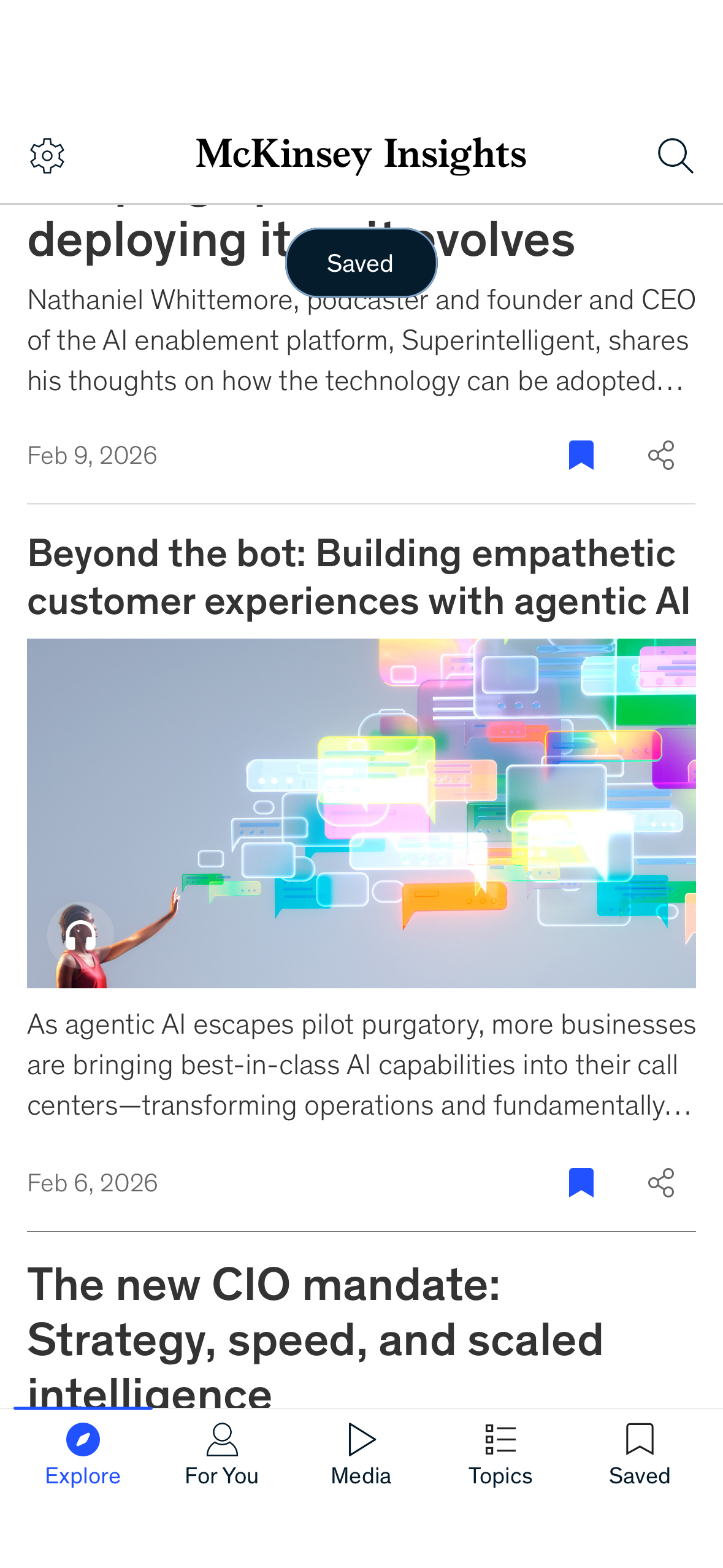
The save interaction is another strong example of good design. When I bookmark an article, the app provides immediate feedback through a floating toast message that confirms the action. This helps bridge the gulf of evaluation because I do not have to wonder whether the system registered my input. The share icon works similarly. It is visible, familiar, and supports the natural workflow of sending an article to a colleague or friend directly from within the app.
In many ways, the Explore feed matches the conceptual model users bring with them. Open the app, browse thoughtfully curated insights, and quickly store what you want to return to later.
Problem 1: Spotlight Carousel Lacks Discoverability
At the top of the Explore page, the Spotlight section introduces the first usability issue. The content is presented in a horizontal carousel, but it is not immediately obvious that the section is scrollable. Only part of the next item is visible, and there are no strong signifiers such as pagination dots or directional cues.
This creates a gulf of execution. The app technically affords swiping, but the interface relies heavily on knowledge in the head. Users must already assume that this is a carousel based on prior experience. For a design that otherwise prioritizes clarity, this moment feels slightly hidden.
A simple fix would be to introduce stronger signifiers, such as a visible “View all Spotlight” button or clearer visual cues that more content exists off screen. This would improve discoverability without adding clutter.
Problem 2: The Media Tab Relies Too Much on Knowledge in the Head
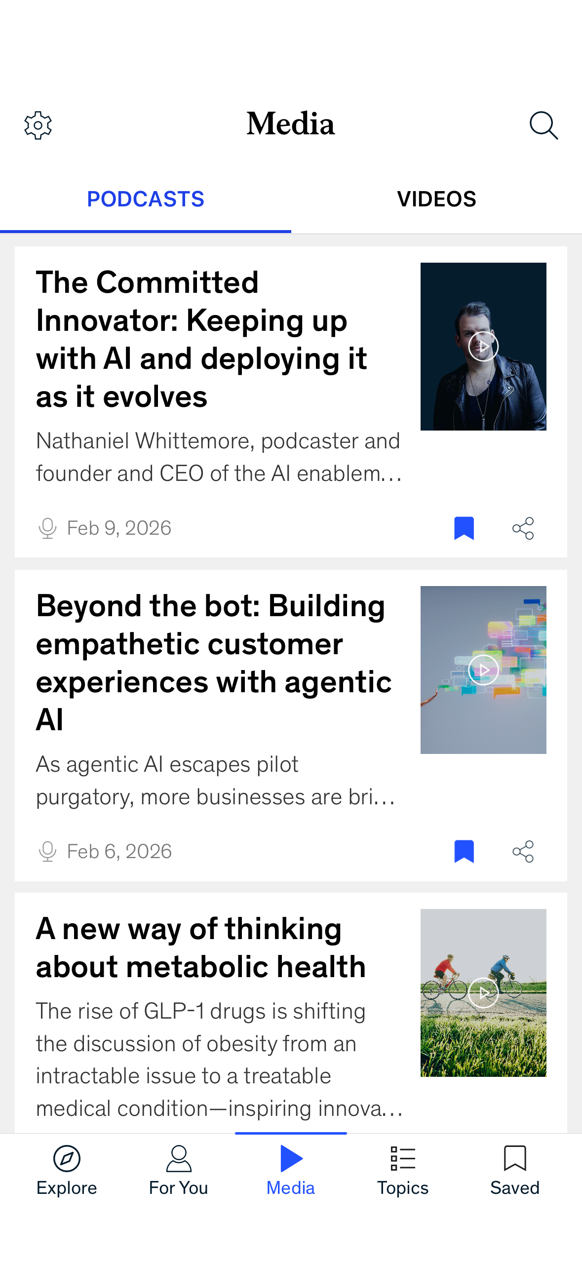
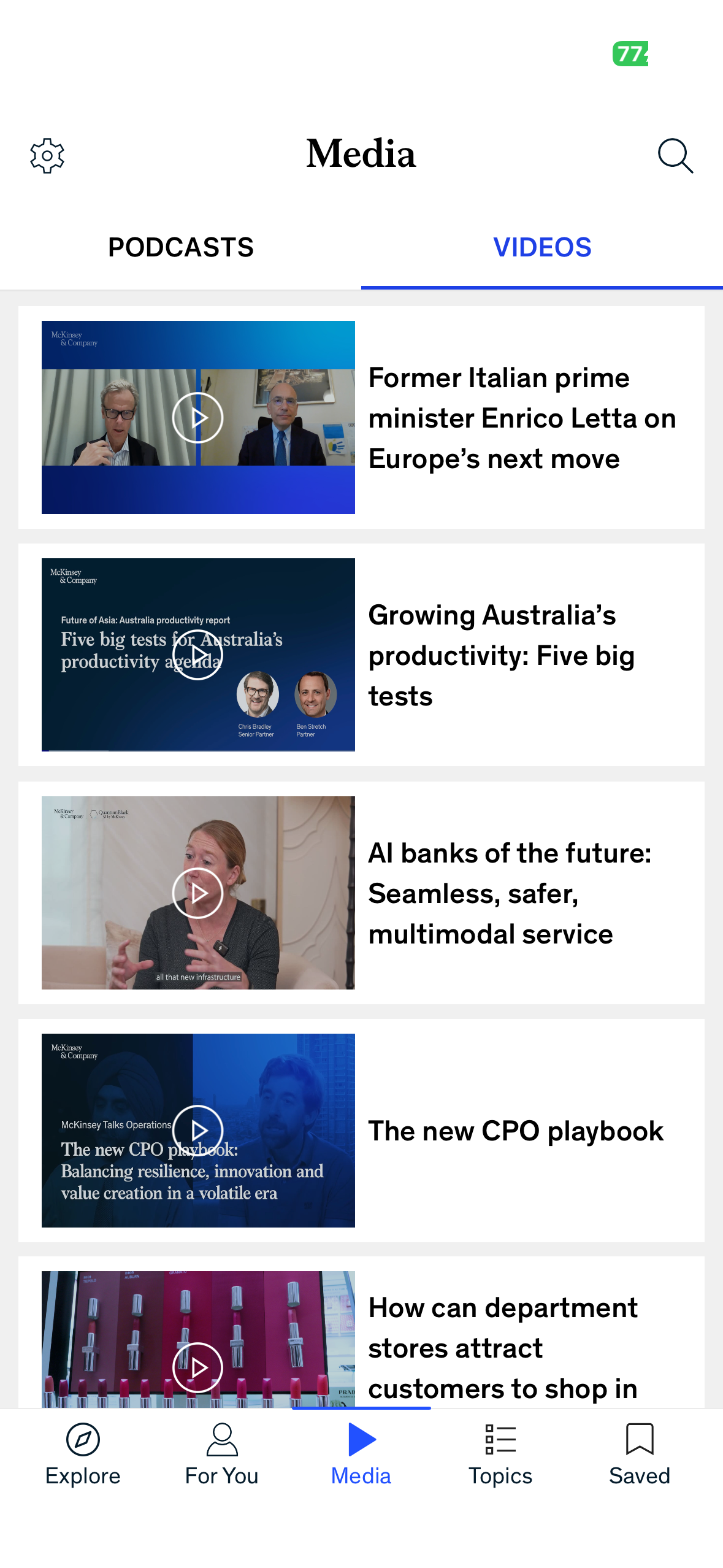
Another area where the app feels slightly less intuitive is the Media tab. On paper, this section is a great idea because McKinsey offers podcasts and videos alongside written reports. However, the way the Media page is structured creates a small disconnect between what users expect and what the interface provides.
When I tap into Media, I see a list of large content cards with titles, dates, and thumbnails, but there is no visible media player or clear indication of what will happen when I click. As a user, I have to infer that selecting a card will open a listening or viewing experience somewhere else. This requires knowledge in the head, because the interface does not fully provide knowledge in the world through an immediately recognizable playback control system.
In many consumer media apps, the presence of a persistent mini player or clear play controls acts as a strong signifier. It helps users build the right conceptual model that this is not just an article list, but an active media experience. In the McKinsey Insights app, the Media tab feels visually similar to the reading feed, which weakens the mapping between the user’s goal, such as “I want to listen to something,” and the system’s presentation of content.
This can also create a small gulf of execution, since the next action is not fully obvious. Users may hesitate because they are unsure whether tapping will immediately play audio, open a new page, or simply show another article style view.
A potential improvement would be to introduce clearer signifiers specific to media, such as a persistent play bar, visible duration labels, or an embedded preview player within the list itself. This would make the Media tab feel more aligned with user expectations and reduce the need for interpretation. By making the playback affordances more visible, the app could better support users who want to switch from reading to listening without friction.
Problem 3: Explore vs For You Creates Conceptual Model Confusion
The third issue relates to personalization and the overall mental model of the app. The bottom navigation includes both Explore and For You, suggesting two different content experiences. However, it is not always clear what the distinction is. Explore already feels curated and personalized, so users may not understand what changes when they move to For You.
This is a conceptual model problem. When the system’s organization does not match the user’s expectations, it can create a slow gulf of evaluation over time. Users may struggle to interpret why certain articles appear, how recommendations are generated, or where they should go for specific needs.
A fix here could be a brief onboarding explanation or microcopy that clarifies the purpose of each tab. For example, Explore could be framed as “Editor’s Picks” while For You could be labeled as “Personalized Recommendations.” Small language shifts like this help align the interface with the user’s mental model and reduce confusion.
Conclusion
The McKinsey Insights app succeeds in delivering high quality content through strong hierarchy, thoughtful signifiers, and excellent feedback mechanisms. At the same time, moments like the hidden Spotlight carousel, the Media tab’s reliance on knowledge in the head, and the conceptual model ambiguity between Explore and For You reveal opportunities for improvement. Applying Don Norman’s ideas makes it clear that even polished professional products can benefit from stronger discoverability, clearer mappings, and interfaces that better align with how users think and act.