Measure is a pre-installed utility on the iPhone that enables users to quickly gauge the size of real-world objects, measure a person’s height, and automatically detect the dimensions of rectangles. This article critiques the Measure app through the lens of Don Norman’s The Design of Everyday Things, analyzing its interface against key usability principles.
First Impression
Upon launching the Measure app, the interface is strikingly minimal, prioritizing visual cleanliness over explicit instruction. This design choice immediately impacts Discoverability. Without text labels, a new user must rely entirely on Knowledge in the Head to understand what the icons do.
A positive example of overcoming this is the dynamic Feedback mechanism: if the user hovers for too long without action, a “Add a point” tool-tip appears. This acts as a temporary Signifier, effectively bridging the Gulf of Execution (the gap between wanting to measure and knowing how to start).
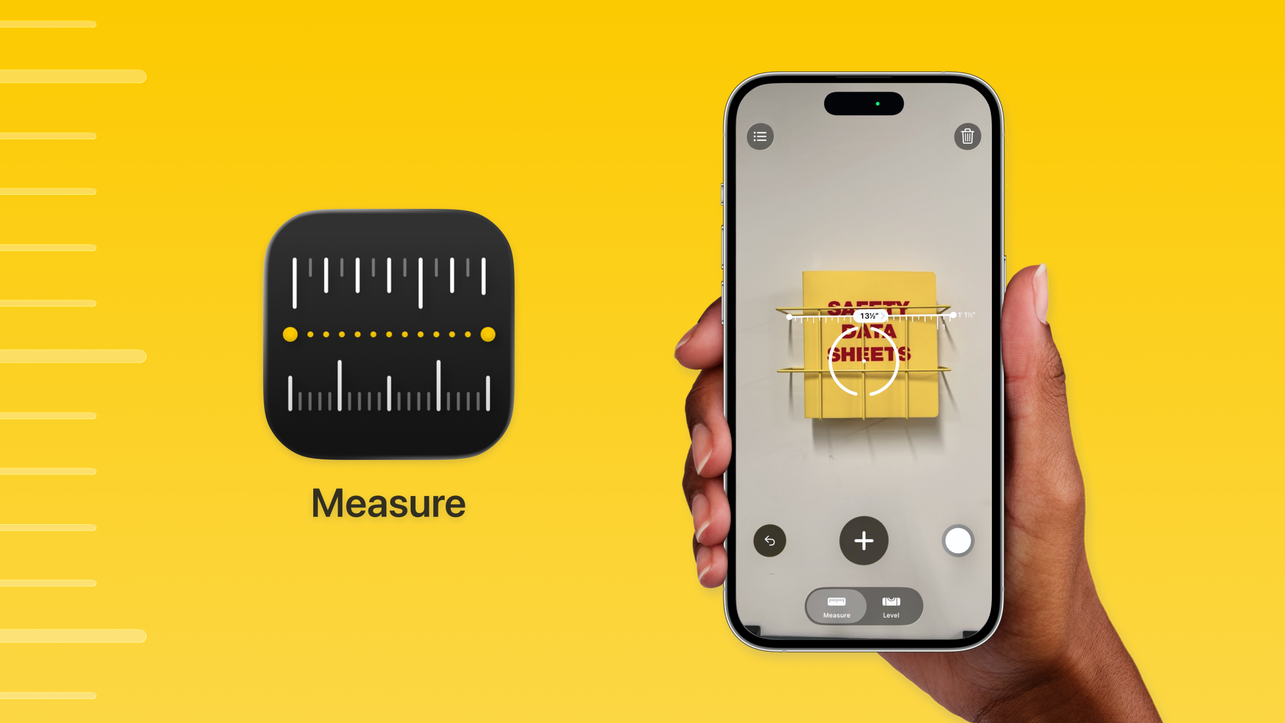
However, the white circular button on the bottom right presents a problem. To a long-time iPhone user, this button relies on Rule-based Behaviour with the native Camera app, users possess a Mental Model that connect this white circle with “capture.” For a novice or non-iOS user, this button lacks a clear Signifier. It is simply a white circle. It does not afford “saving” or “documenting” a measurement. Consequently, a user might hesitate, unsure if pressing it will take a photo or save the data to a file.

To reduce the cognitive load and shift the requirement from Knowledge in the Head to Knowledge in the World, the design should utilize explicit labeling. Replacing the abstract circle with a standard “Shutter” icon or adding a text label reading “Save Photo” would provide a clear Signifier. This would ensure that even users without prior iOS experience can instantly understand the button’s Affordance.
Interacting with the Environment
The central reticle serves as the primary Signifier, indicating the measurement’s starting point. It employs Natural Mapping effectively: as the user tilts the phone, the reticle rotates in 3D space to match the perspective of the physical world. This provides continuous visual Feedback that the sensors are active.
However, a critical usability issue arises when measuring in cluttered environments or near edges. The visual difference between a reticle mapped to a Horizontal Plane and a Vertical Plane is often subtle, users need to rely solely on perspective skews. This creates a Gulf of Evaluation when the surface (e.g., “I am measuring the floor”) does not match the System Image (e.g., “I have locked onto the wall baseboard”). If the user starts a measurement on the wrong plane, the resulting data will be inaccurate, leading to a Mode Error.
To resolve this ambiguity, the interface could utilize distinct color for orientation. For example, the reticle could display a blue outline when locked to a vertical surface and a yellow outline for horizontal surfaces. This would allow the user to instantly verify the orientation, ensuring the device is oriented correctly before they commit to an action.
Exporting the Data
After completing the measurements, the user can access a list view via the top-left icon. A positive aspect here is the simultaneous display of Imperial and Metric units, which respects the diverse Mental Models and Cultural Constraints of different users.
However, the “Copy” function suffers from a lack of Feedback. When the user taps “Copy,” the entire menu sheet slides down and disappears, returning to the camera view. In standard iOS design, a disappearing sheet often signifies “Cancel” or “Dismiss.” Because the visual response to “Copying” is identical to “Closing,” the user is left in a Gulf of Evaluation. The user is forced to leave the app and paste the text elsewhere just to verify the action, creating unnecessary friction.
The solution is to provide explicit Feedback. When “Copy” is tapped, a transient confirmation label such as “Copied to Clipboard” should appear, or the button itself should briefly change to a checkmark. This visual confirmation allows the user to instantly evaluate that their goal has been met before they dismiss the menu.
This deep dive reveals that even a seemingly simple product, which users operate almost subconsciously, relies on a complex framework of usability principles. As Don Norman famously noted, “Good design is actually a lot harder to notice than poor design, in part because good designs fit our needs so well that the design is invisible.” Our job as designer is to build that invisibility; not by removing features, but by refining the experience until using the tool feels like second nature.