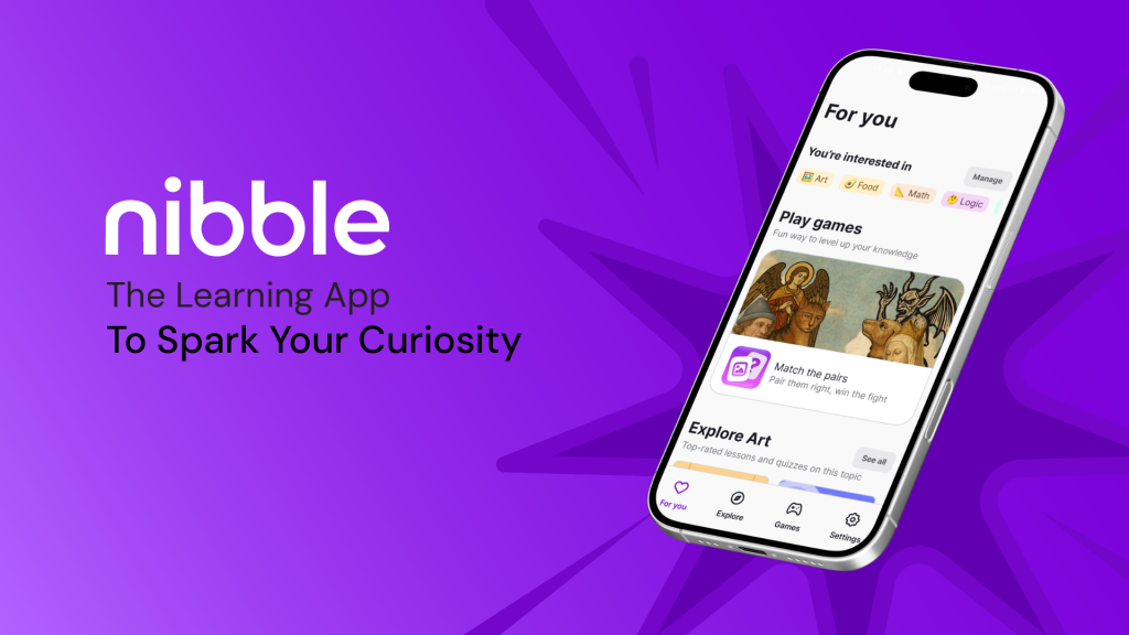
Nibble is a microlearning app offering short, interactive lessons across topics ranging from math to art, designed to help users learn more in manageable, bite-sized sessions. This critique examines the journey of a young, full-time professional with limited free time who uses Nibble to replace doomscrolling with meaningful learning. Drawing on Don Norman’s The Design of Everyday Things and Jenny Davis’s How Artifacts Afford, this analysis explores how the app’s design enables the user’s goal of building a daily learning habit within a hectic routine.
Onboarding & Registration
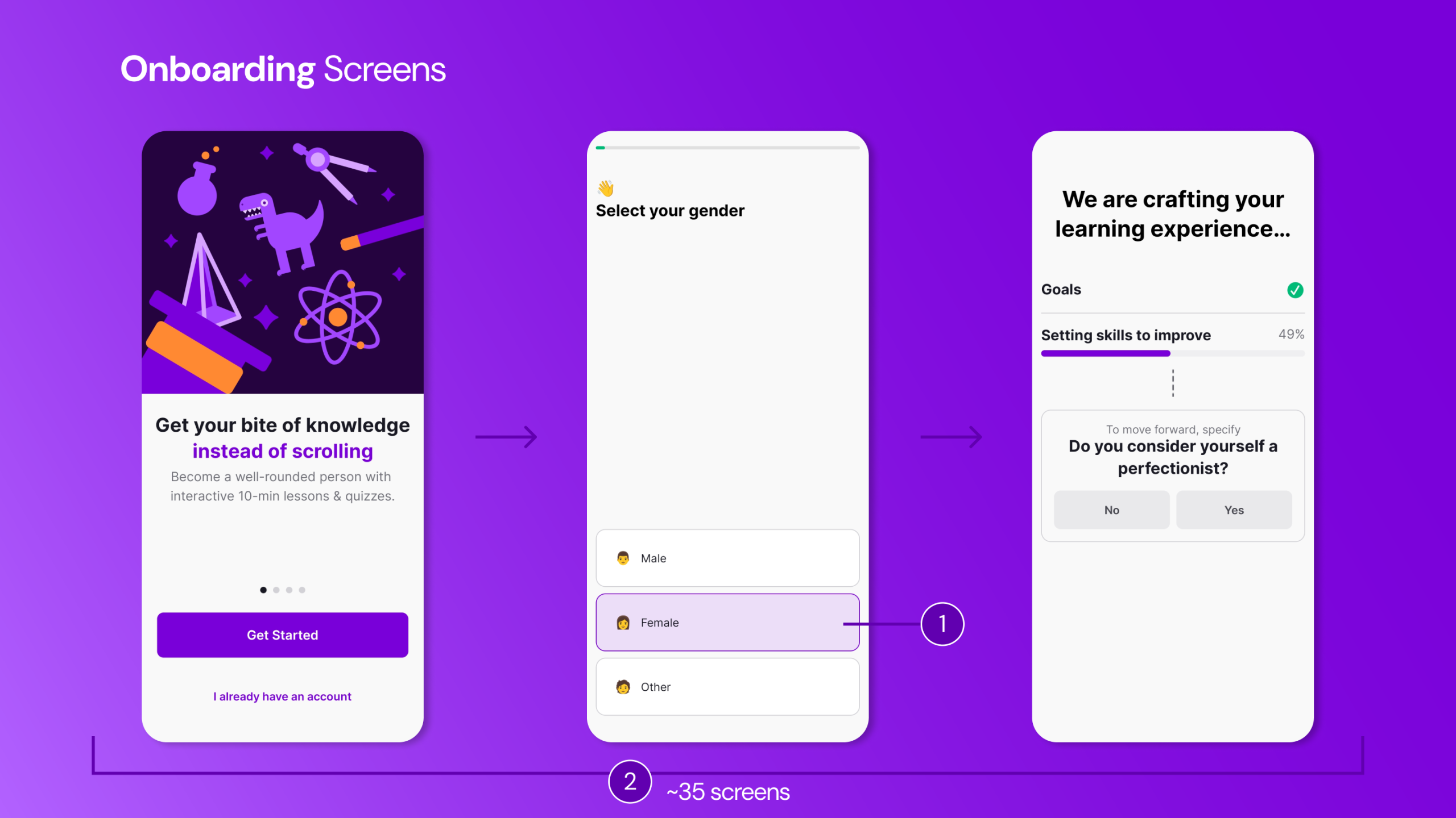
The user approaches Nibble with the simple goal of learning something new and quick while waiting for a bus or during a lunch break. Upon downloading the app, the interface appears fun and minimal, with clear signifiers indicating what is clickable through visual states (1). This reduces the initial Gulf of Execution, as the available actions are immediately visible.
However, as the onboarding process unfolds, the user is required to complete a lengthy (~35 screens) questionnaire (2). This process effectively demands engagement before access, increasing friction within the user’s limited spare time. The long process widens both the Gulf of Execution and the Gulf of Evaluation, as progress toward actual learning feels distant.
The onboarding flow includes a somewhat unclear progress indicator (3) that does not indicate the number of steps or questions left to answer. It nonetheless provides continuous feedback about the system state, which helps reduce Gulf of Evaluation. The questions aim to personalize content (4) and establish daily goals, offering subtle feedforward about future personalized content feeds. Yet, the questionnaire does not allow the user to review or verify (6) their choices before automatically advancing to the next screen. As Don Norman emphasizes, good design should anticipate mistakes rather than punish them – this lack of revision control fails to accommodate potential slips. This can be rectified by including a Continue button that would allow the user to confirm choices, improving error prevention and strengthening the user’s conceptual model of the system. This recommendation may create tension with Nibble’s apparent design goal of maintaining onboarding momentum by increasing completion time. However, Norman’s principle of error prevention suggests this is necessary friction.
After the user completes the questionnaire, analysis screens (4) emerge, showing the development of the personalized profile. The analysis screens provide visibility of system state (5), which indicates what to expect when the application opens. The processing delay, rather than feeling like data extraction, feels intentional and personalized. From Davis’s perspective, the interface requests trust: it makes the user to believe that this temporary friction will yield a better, more tailored outcome.
Between questionnaire screens, the app integrates promotional explanations (7) of the value of the app. These screens reinforce the user’s conceptual model by explaining benefits and maintaining motivation levels during what might otherwise feel tedious.
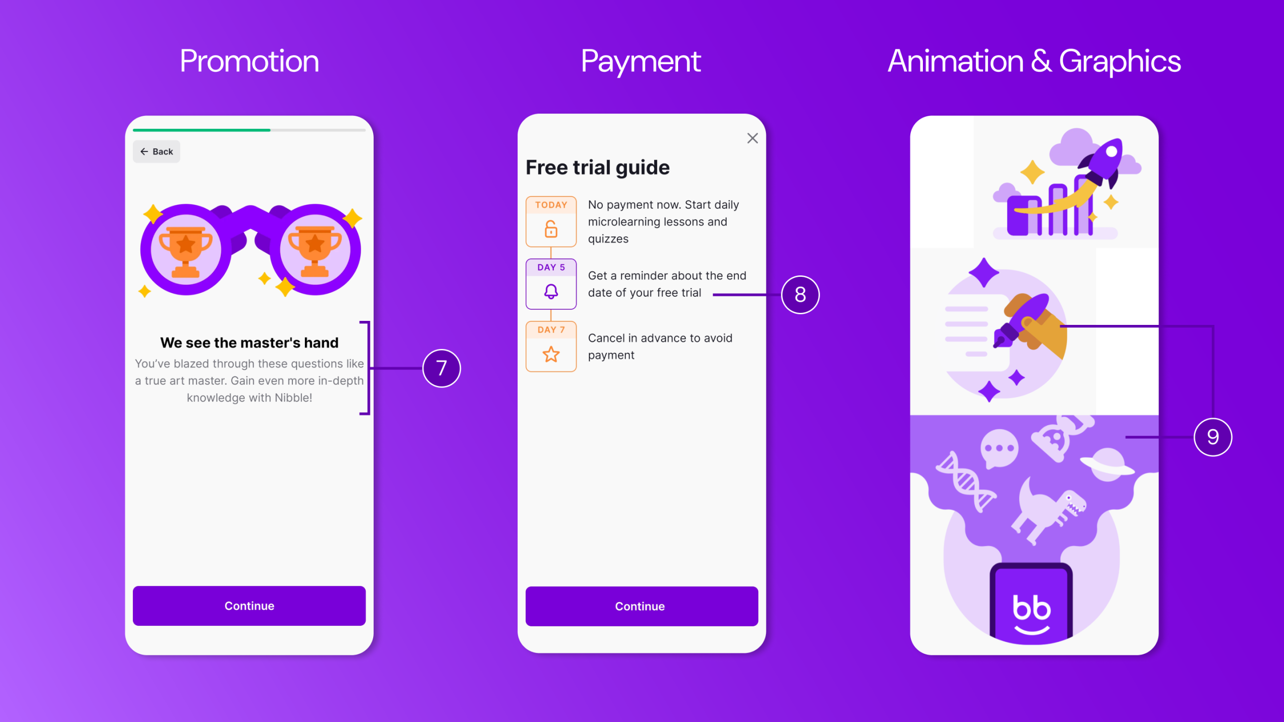
The final onboarding screen prompts payment or a free trial (8), though a subtle close icon allows the user to bypass and enter the app. However, this surface-level access is limited and any attempt to engage with lessons or quizzes immediately triggers the paywall. This delayed forcing function operates as a hook: the interface encourages browsing to build curiosity, then demands payment and refuses meaningful interaction. Although highly persuasive in strategy, this approach may have the negative effect of undermining trust, especially for users who have invested time and effort in the onboarding process. Throughout onboarding, quirky animations and graphics (9) provide continuous feedback, maintaining engagement. After completing registration and subscription, the app moves to the For You page, where the user can adjust preferences and refine personalization.
Home Screens
For You Page
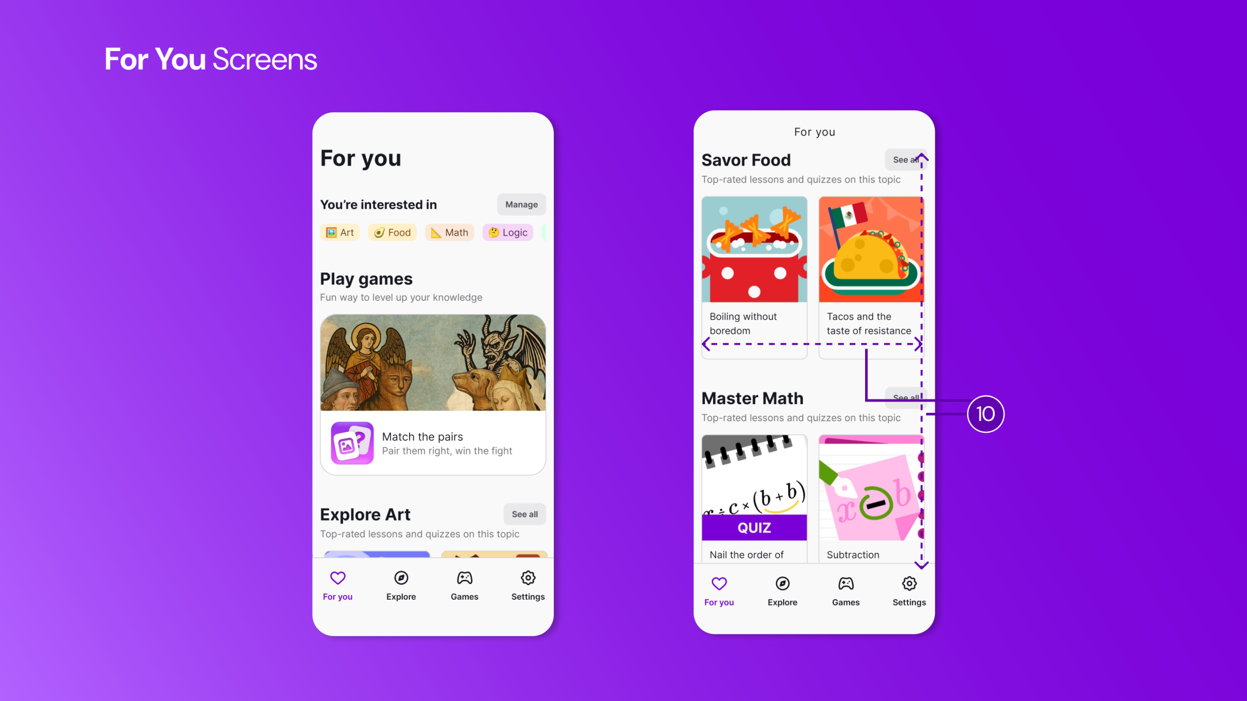
On the For You page, the user encounters tailored topics aligned with previously selected interests. Familiar scrolling and swiping interactions (10) commonly seen in social media, use existing cultural conventions, strengthening the user’s conceptual model. This reduces cognitive effort through recognition rather than recall.
However, the screen does not clearly communicate overall learning progress. Returning users lack visibility into whether they have met daily or weekly goals, widening the Gulf of Evaluation. As Norman emphasizes, users require clear information about system state in relation to their goals. The lesson cards also lack essential feedforward details necessary for quick decision-making during micro-learning moments. Currently, lesson cards display only four elements: a colorful thumbnail image, the lesson title, the topic category. This means every card requires tapping to discover whether a lesson fits the user’s short window.
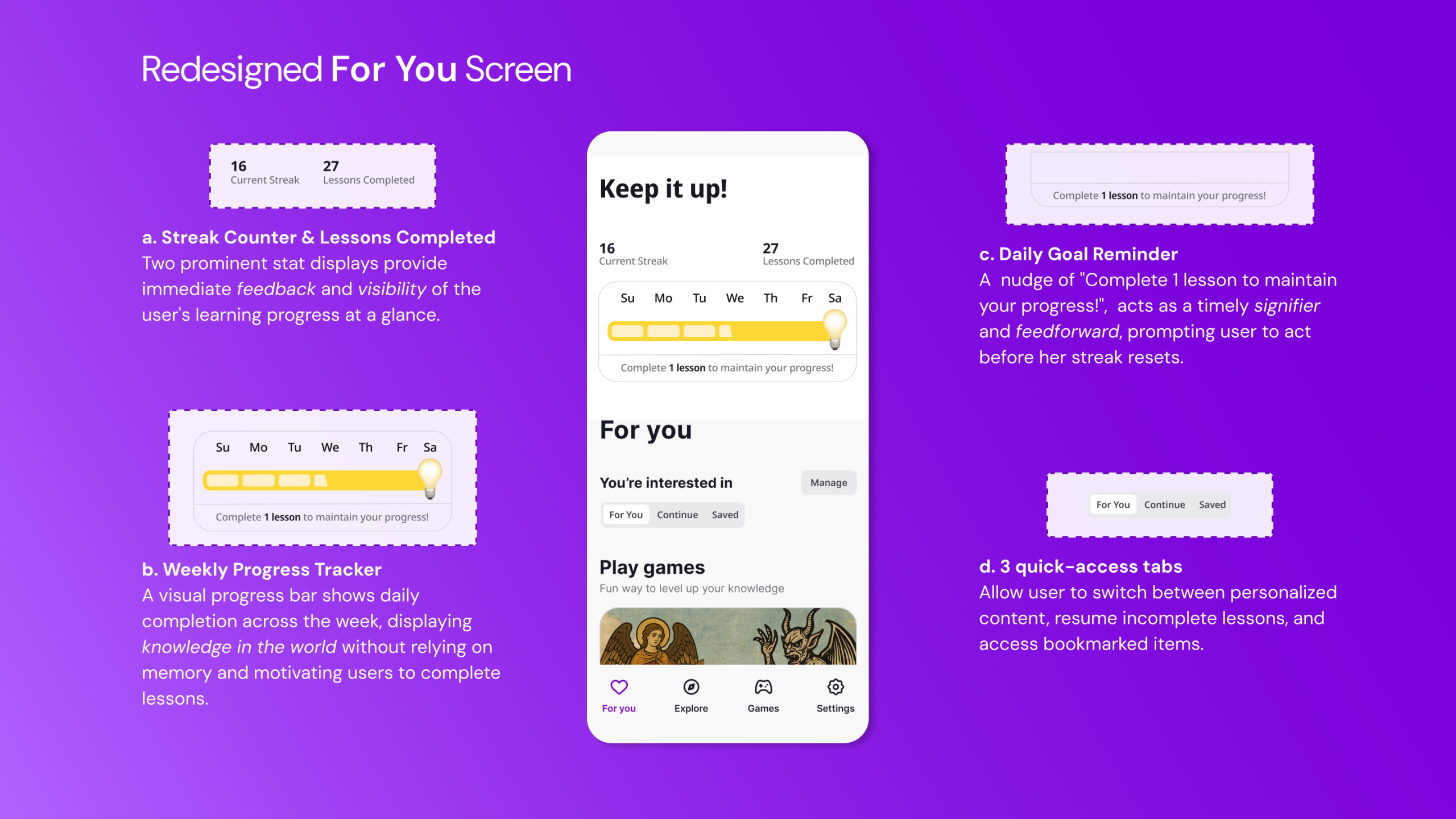
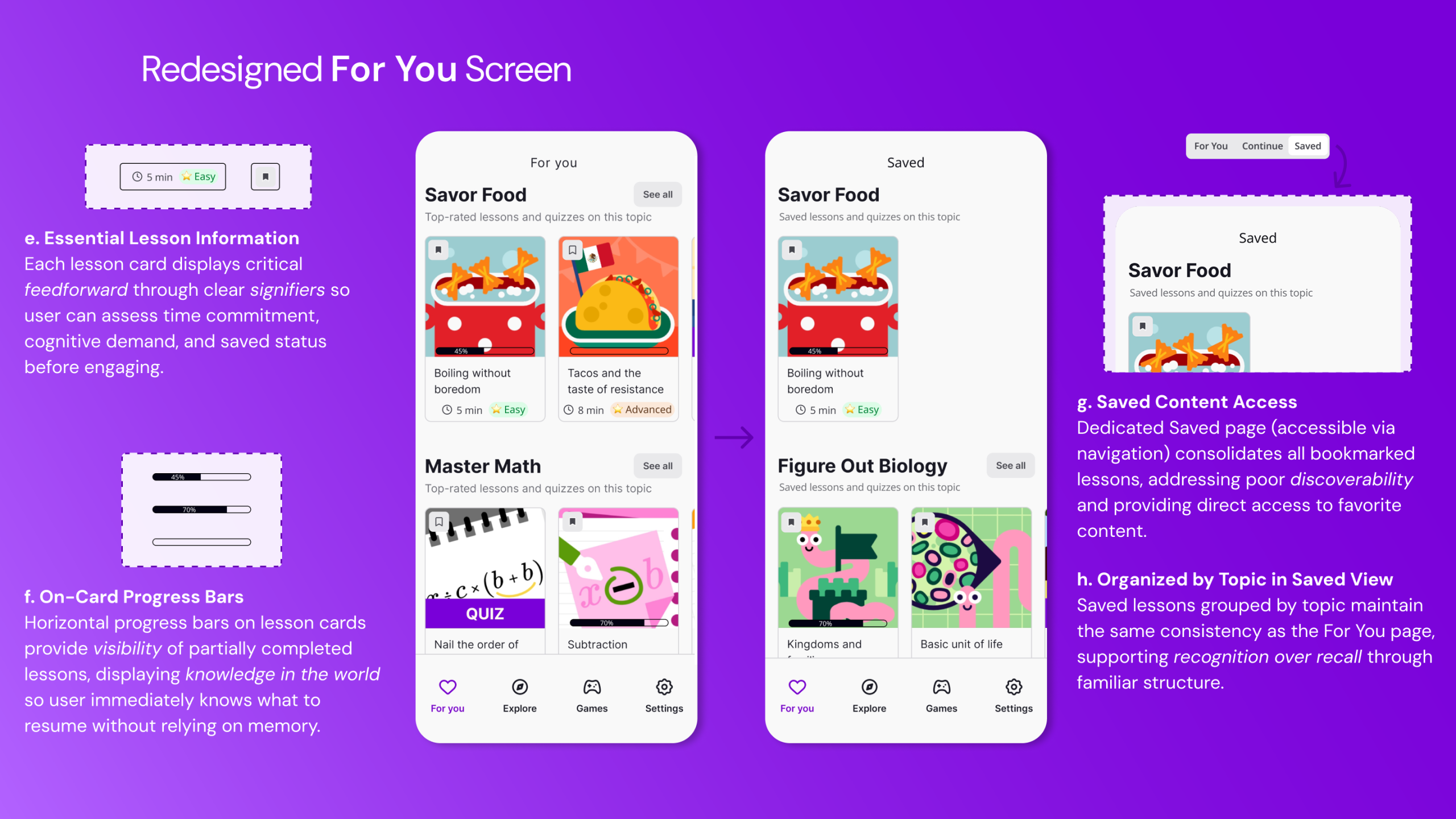
The redesigned interface includes a gamified progress bar at the top of the For You screen, enhancing visibility and providing continuous feedback. This will also support habit formation crucial for behavior change. The redesign also introduces three quick-access tabs: For You, Continue, and Saved at the top of the screen, enabling the user to switch seamlessly between personalized recommendations, ongoing lessons, and bookmarked content. These tabs function as strong signifiers, clearly communicating available pathways and reducing reliance on memory. Additionally, lesson cards include display time estimates, difficulty indicators, progress markers, and bookmark status – transforming invisible system states into clear, actionable information. These additions would reduce reliance on knowledge in the head and instead place critical information in the world, narrowing the Gulf of Execution and supporting efficient decision-making.
Explore Page
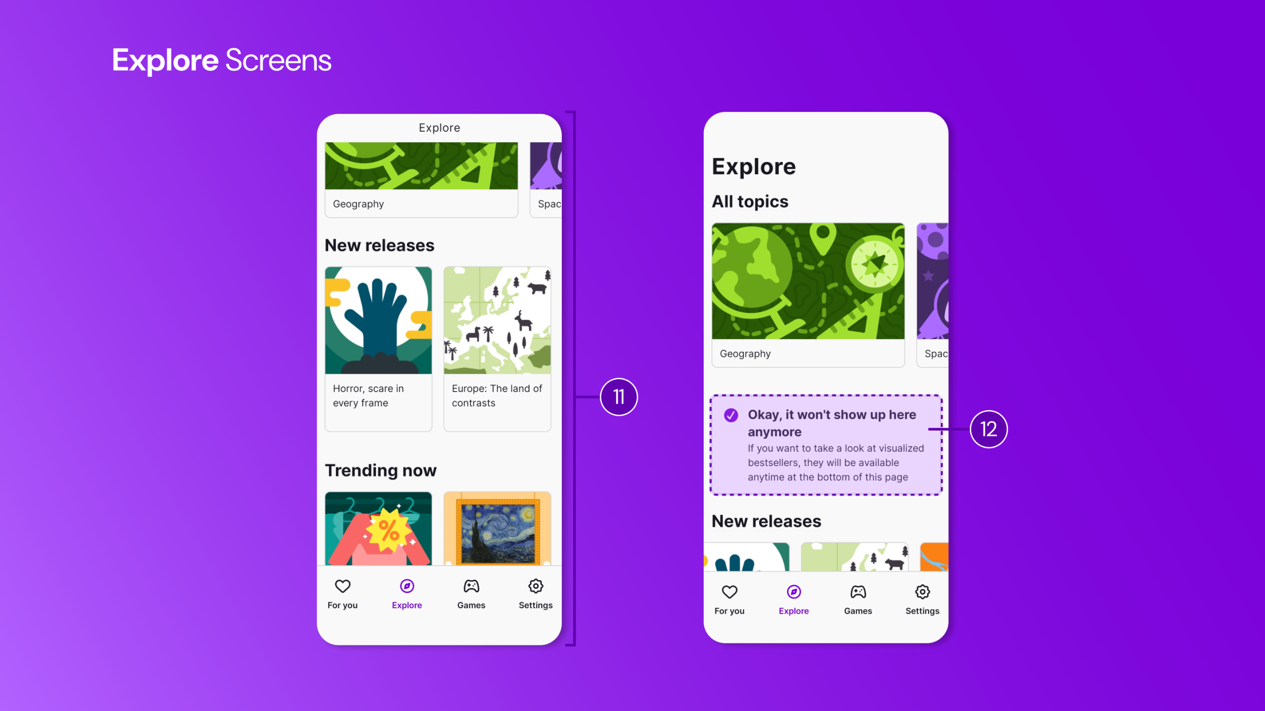
The Explore page (11) maintains visual and interaction consistency with the For You page. This consistency reinforces the user’s conceptual model, and supports usability through recognition over recall. Uniform layout and predictable element placement serve as effective logical constraints, guiding navigation intuitively.
Promotional upgrade prompts (12) appear occasionally, but importantly, they include a Hide option. This respects user freedom and aligns with Norman’s principle of user control, allowing the user to prioritize learning over interruptions.
However, the absence of a search function presents a significant usability issue. Given the volume of available content (~25 categories), the lack of this essential affordance widens the Gulf of Execution, making discovery unnecessarily difficult. Although the Explore page organizes lessons effectively by topic and supports broad exploration, it does not support targeted retrieval. The absence of search and filtering (by time, progress, or difficulty) makes it difficult to locate specific lessons. This forces the user to rely on manual scrolling and often results in failing to locate the desired content – an especially problematic outcome for busy professionals who require efficient, goal-directed access to learning materials. Adding a visible search bar with options to sort and filter by theme or keyword would place discovery-related knowledge in the world and better align the interface with the user’s goals.
Individual Lessons
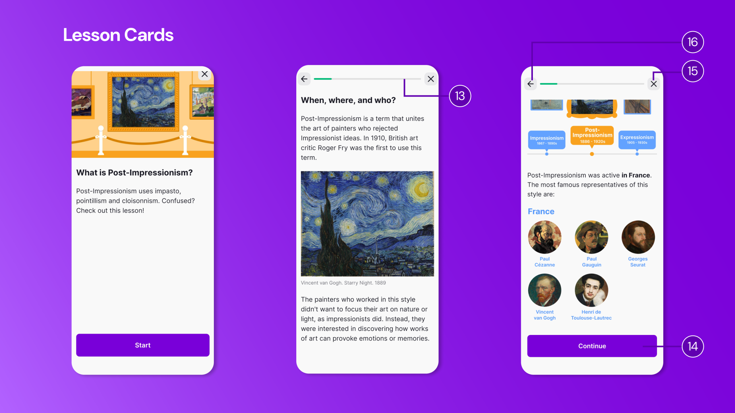
Within individual lessons, the interface provides stronger usability. A visible progress indicator (13) offers clear feedback and displays knowledge in the world, motivating continued effort. The use of progressive disclosure – dividing text into sections with Continue buttons (14) – manages cognitive load effectively and supports incremental learning.
However, lessons do not automatically resume from where the user left off. This design does not support memory-related slips or interruptions. The system neither saves nor communicates position, effectively demanding single-session completion. This goes against the app’s core value proposition of micro-moment learning.
Navigation further complicates the experience. Both the Back Arrow (16) and the Close icon (15) appear visually similar but perform different actions: the arrow returns to the previous screen, while the close icon exits to the Explore page. The signifiers are ambiguous: both iconography types usually mean “leave this screen”. Neither clearly communicates whether progress is saved. This resembles what Norman describes as a description-similarity slip, where similar-looking controls invite errors.
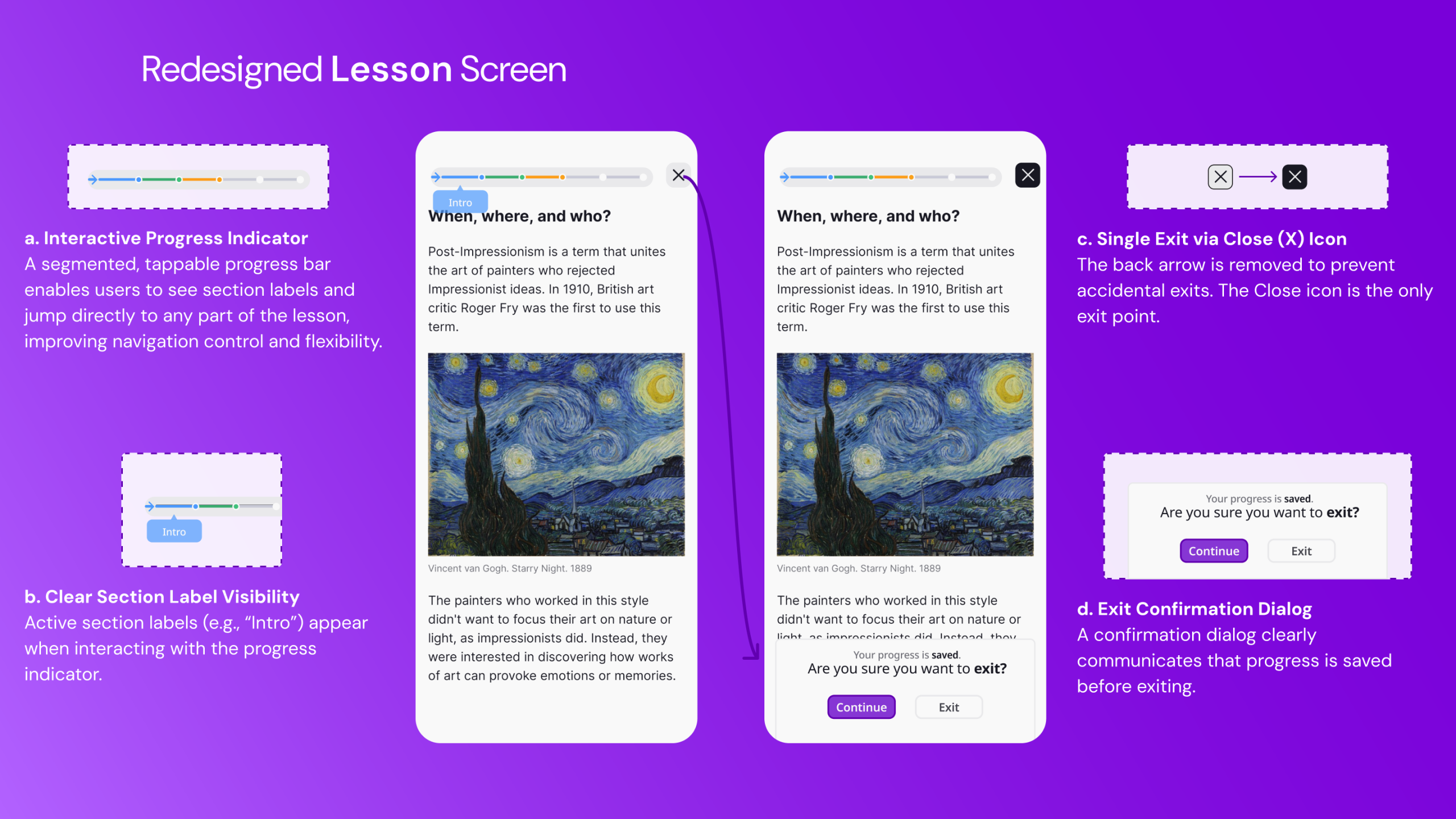
This confusion could be resolved by removing the back arrow and incorporating an interactive progress indicator that allows users to jump between sections. The Close icon should remain the only means of exiting, accompanied by a confirmation dialog that clearly communicates save status. This would improve error prevention, reduce ambiguity, and narrow both the Gulf of Execution and Gulf of Evaluation.
Conclusion
Nibble positions itself as a comprehensive knowledge app designed to transform curiosity into a daily habit for busy professionals. While it succeeds in delivering personalized content through familiar interaction patterns and effective progressive disclosure, it falls short in critical areas of visibility, feedback, and error recovery. The minimalist aesthetic sometimes sacrifices essential signifiers and communication, requiring the user to rely on knowledge in the head rather than knowledge in the world.
As Norman notes, good design is often invisible because it aligns seamlessly with user needs. At present, Nibble’s design remains visible precisely where friction emerges. With targeted improvements grounded in error prevention, clearer mapping, and stronger feedback, the app could better support the busy professionals it aims to serve and more effectively translate intention into sustained learning behavior.