The NYC Ferry app is a hub for riders to plan trips, view schedules, and purchase mobile tickets for the NYC Ferry service. Due to its novelty and limited routes, most New Yorkers aren’t fluent in the ferry system as they might be the subway or bus. The ferry is also commonly used by tourists. This makes it especially important for the NYC Ferry app to be as usable and understandable as possible; however, based on the design principles and concepts from Don Norman’s The Design of Everyday Things, some of the app’s features have opportunity for improvement.
Home Screen
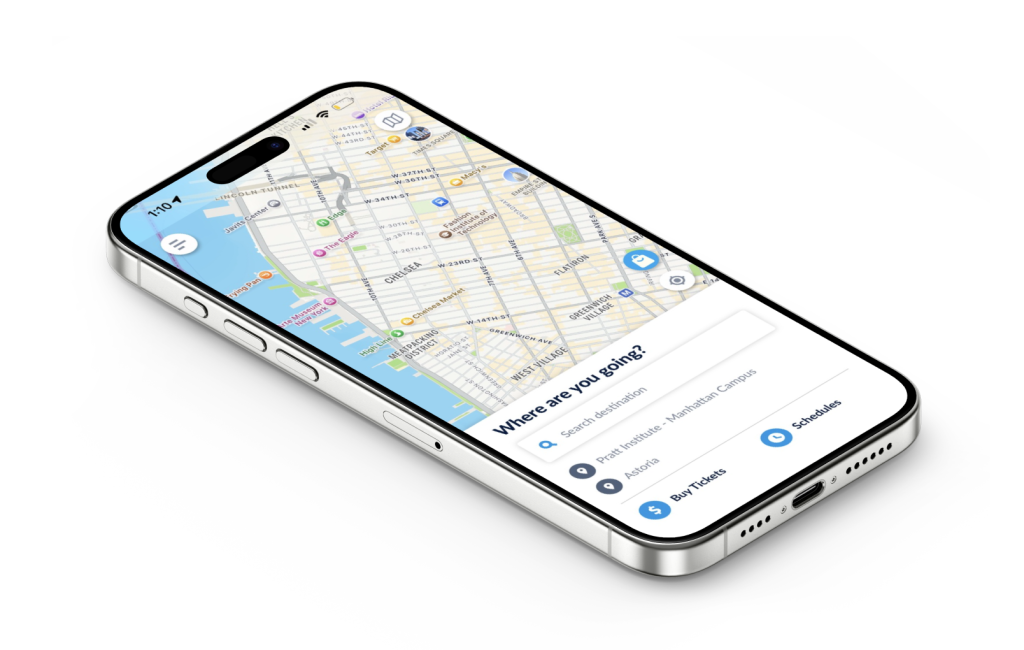
For the most part, the homepage satisfies the discoverability principle. At first glance, users can understand the main actions they can perform from this screen:
- Get directions: The map, search bar, and “Where are you going?” header signify that the user can access directions from this screen by inputting their destination. The required actions and expected results are intuitive because of users’ knowledge in the world – the interface is similar to commonly used applications like Google Maps and Apple Maps.
- View schedules: Clearly signified by the text and clock icon.
- Buy tickets: Clearly signified by the text and dollar sign icon.
- Access other actions via menu: Signified by the “hamburger” menu icon, which is consistent with many other digital interfaces.
Other functions are not discoverable at first glance:
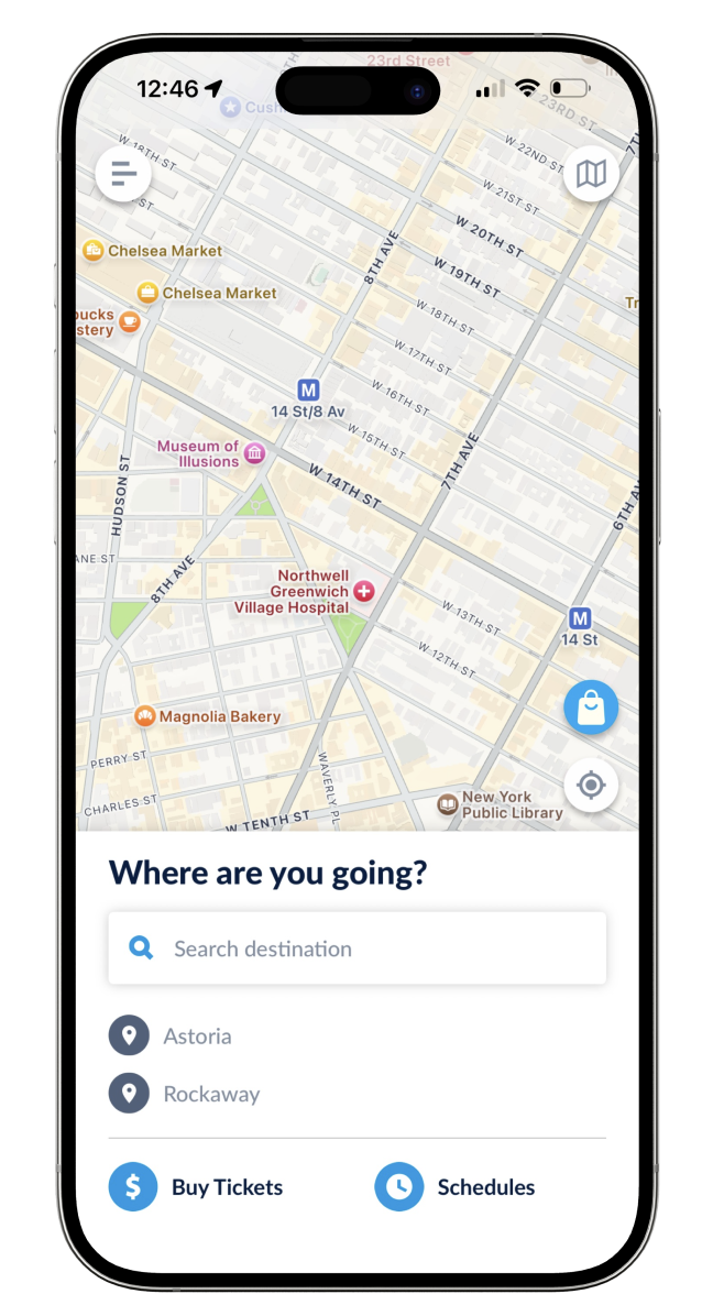
- The shopping bag icon on the right is an ambiguous signifier, and its mapping that would suggest that this button will yield a result within the app (instead, it leads to a new screen for pre-ordering concessions). This conflicts with the user’s conceptual model in which tickets and concessions would be purchased at or around the same time and place (based on knowledge in the world and their experience performing these actions in person, such as at a movie theater).
- Improvement: Change icon to a food/beverage item to signify concessions. Move the button to the bottom of the screen next to “Buy tickets”, or combine both actions into one flow.
- The map icon in the upper right corner is also overlaid on the map, suggesting another map feature or setting. Though the icon is recognizable as a map, it doesn’t work as a signifier of what the button will do. How is it different from the map the user is already looking at? Clicking this button leads to a separate diagram of the ferry routes.
- Improvement: Move the button to the bottom of the screen adjacent to “schedules”. Change the icon to more specifically depict a route map (such as multiple dots connected by a line). Alternatively, leave the button where it is and change its function so that it displays the ferry routes directly on the home screen map.
Schedules
If users are considering taking the ferry but are flexible on timing or don’t need directions to/from the ferry landing, they may choose to browse schedules rather than search for directions. In this example, the user goal is to find out what days and times a ferry goes to Rockaway, and from which ferry stops.
Schedule Screen 1
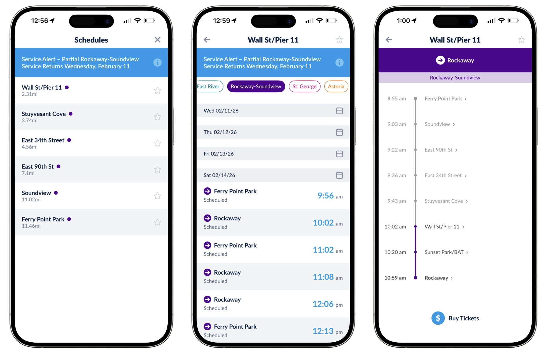
There are very few signifiers on the first schedules screen (fig. 2, far left) to help the user understand what action is needed. Instead, there are semantic constraints: tapping the service alert only results in more details about the alert, and the star icons suggest favoriting or saving a stop; neither action is meaningful towards the user’s goal. The only option left is to tap one of the ferry stops (a logical constraint). Still, there’s no feedforward information to indicate what selecting a stop will do – is the user providing the origin or the destination? The user is in a Gulf of Execution because they don’t understand what steps they need to take and where they will lead.
The user may have a conceptual model similar to how they would use a Subway or bus schedule: identify the line (signified by a color and letter or number) and a direction (uptown/downtown or terminal station) to see times and stops along that route. That would suggest the purple dot indicates a particular line, but which one? Why isn’t Rockaway listed as an option? Has the user made an error, are all of the routes other than purple suspended, or something else? The user is simultaneously in a Gulf of Evaluation because they don’t understand the meaning behind the information (or lack there of) provided by the system. Because the user is locked in this screen until a stop is selected, the only option is to guess and see if any answers can be found in the next screen.
Schedule Screen 2
The next screen (fig. 2, middle) includes colored badges across the top, suggesting the colors do correspond to ferry lines (and that Rockaway is part of the purple line). The purple arrow icons pointing towards the stop names signify that these stops are destinations, and the stop selected on the previous screen must be the origin. Here, the system image doesn’t match the user’s conceptual model or goals, which would have them choose their destination first (the goal is to go to Rockaway, not to travel somewhere from Wall St). The user also comes across another constraint: there are no options to choose from prior to Saturday (even though the service alert says that the line resumes service on Wednesday).
Schedule Screen 3
Next, (fig 2, right) the user finally finds a route diagram. It shows that Rockaway and Ferry Point Park are terminal stops, suggesting the subway conceptual model was correct to an extent (though the system image is out of order). If the user had been trying to go anywhere else, they would still be stuck in the Gulf of Execution on the previous screen (unless they had knowledge in the head of each stop along the ferry route).
Suggested Improvements
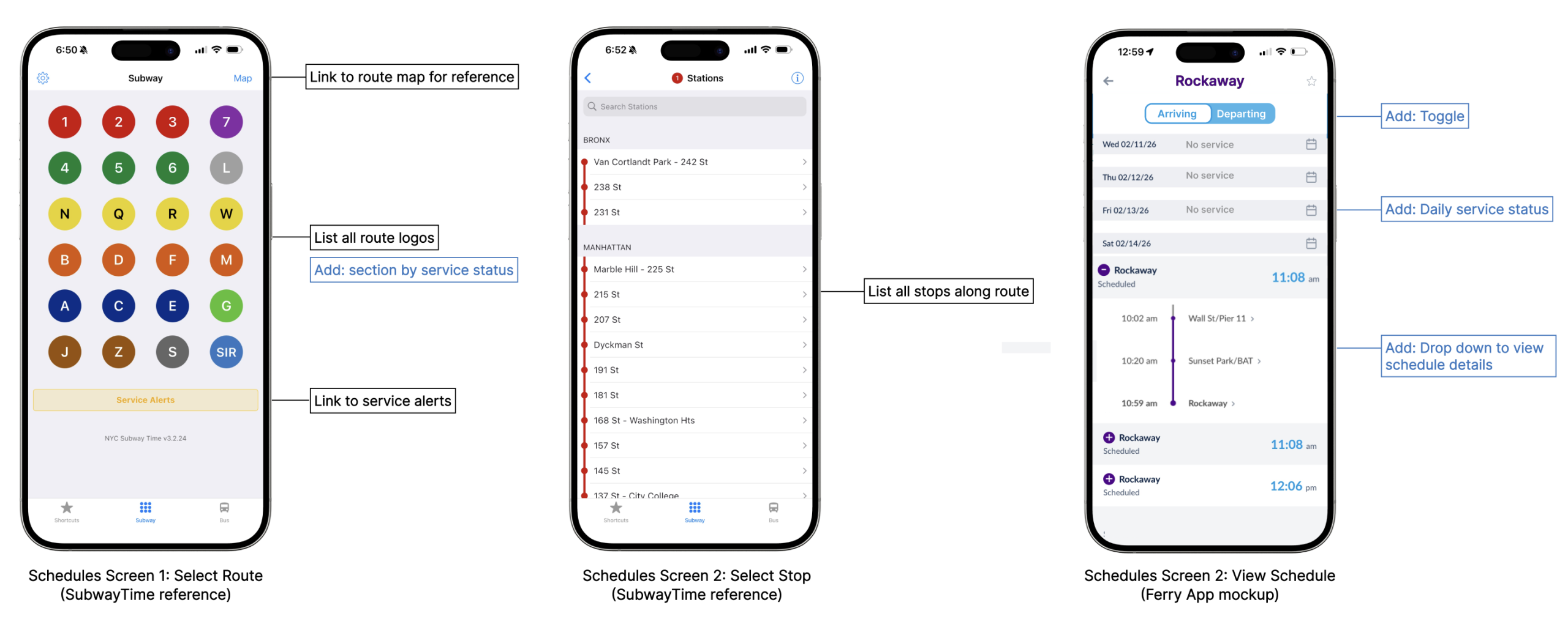
Follow a similar design to the Subway Time app, with some adjustments (indicated in fig. 3).