OMNY is a contactless fare payment system introduced by the NYC Metropolitan Transportation Authority (MTA) in 2019 to modernize New York City’s public transit network. Replacing the long-used MetroCard, the system enables riders to pay fares using mobile/digital wallets, contactless credit and debit cards, and wearable devices, reflecting a broader shift toward a more seamless and digitally integrated transit experience.
For the user, the interaction is intentionally simple: approach the turnstile, tap a payment method against the reader, and proceed when a visual signal confirms acceptance. Although this interaction appears effortless, it is shaped by intentional design decisions that guide user behavior in fast-paced transit environments. As Don Norman explains in The Design of Everyday Things, successful design communicates clearly, minimizes cognitive effort, and helps users turn intention into action.
Making Contactless Payment Immediately Understandable
While OMNY’s physical interface demonstrates several strengths aligned with Norman’s principles, particularly in the use of signifiers and immediate feedback, the broader ecosystem highlights areas where user understanding may vary. By examining attributes of the OMNY system, this critique evaluates how effectively the design supports user understanding and where opportunities for improvement might be introduced.
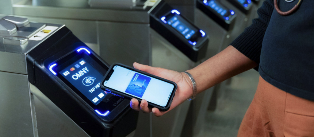
One of the strongest aspects of the OMNY system is its use of clear signifiers that provide immediate discoverability at the point of interaction. The OMNY reader clearly displays a universal “tap” symbol, visually signaling where and how the user should present payment. According to Don Norman, signifiers communicate to users what actions are possible and where those actions should take place. In the context of a busy subway environment, or a crowded bus stop, where users navigate time pressure to access transportation, the clarity of this visual cue significantly reduces hesitation and error. Even first-time users are able to successfully complete the interaction without having to review any instructions. This shows that the perceived affordance of the reader aligns well with the users’ expectations of tap-to-pay technology. However, while the signifier itself is effective, its visibility can be compromised during peak hours, mainly when multiple bodies obstruct the reader. Increasing contrast, scale, or lighting brightness around the tap symbol could further strengthen discoverability and ensure consistent usability.
Communicating Success and Failure at the Turnstile
The OMNY reader demonstrates highly effective use of immediate feedback to communicate the outcome of the user’s action. When a payment is accepted, the screen turns green and displays the word “GO”, signaling payment success and prompting the user to proceed. As Don Norman emphasizes, timely feedback is essential for maintaining a user’s sense of control, especially in environments where actions must be completed quickly. In the context of a crowded subway station, the interface’s clear visual response reduces hesitation and encourages continuous movement by providing the user with an immediately visible result.
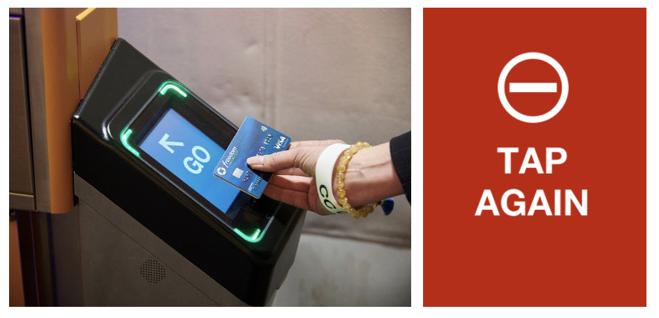
However, while OMNY provides some explanatory error messages, the level of detail and clarity can vary. In fast-paced transit environments, riders may not have sufficient time to read and interpret those messages, which can widen the gulf of evaluation. When payment fails, the reader typically displays a red “TAP AGAIN” message. This lack of explanation can widen the Gulf of Evaluation, forcing users to question whether the issue is related to funds, payment method compatibility, or a system malfunction. Further improving the visibility and the scannability of these messages would reduce uncertainty and help users more efficiently. Improving the clarity of the error feedback would further align OMNY with Norman’s principles by providing successful feedback not only in moments of success, but also in moments of failure.
Understanding Fares Beyond the Tap
The OMNY system introduced a new conceptual model for fare payment for public transportation riders. For decades, the MetroCard established a clear mental model: swipe the card, confirm the remaining balance, and understand exactly when a fare was deducted. OMNY replaced this familiar interaction with a system in which charges may be processed later, and fare caps are applied automatically. While this transition improves efficiency, it can also create uncertainty when the system behaves differently from what users expect. As Don Norman explains, conceptual models help users form accurate explanations of how a system operates; when these models are unclear, confusion becomes a design outcome rather than a user error.
This disconnect often appears when riders attempt to review charges or understand fare timing, leading them to the OMNY website for clarification. Although the website provides written explanations regarding fare processing and fare caps, the information relies heavily on text and may require users to actively search for answers across multiple pages. As a result, while the physical OMNY reader supports quick and confident interactions, the website introduces friction at the moment users seek clarity. When information is not immediately visible or clearly organized, users must exert additional cognitive effort to understand what occurred. Reorganizing the dashboard to prioritize recent rides, fare cap status, and pending charges could better align the interface with the users’ primary questions. Additionally, incorporating simple diagrams and/or onboarding visuals could reduce cognitive load, and allow riders to review their transactions more efficiently.
The OMNY system illustrates how interaction design shapes everyday urban experiences, particularly in environments where efficiency and clarity are essential. The reader’s use of signifiers and immediate feedback supports seamless action, while the broader ecosystem highlights the importance of maintaining clarity beyond the initial interaction. As Don Norman suggests, effective design enables users not only to act but also to interpret and understand system behavior. Looking at OMNY through this lens shows that interaction design must remain consistent across both physical and digital touchpoints. Continued attention to visibility, clarity, organization, and user understanding can help support the users’ confidence and create a more cohesive transit experience.