OpenTable is a dining reservation app that allows users to explore local restaurants and make reservations with ease and better communication. It provides both diners and restaurants with an open communication platform that replaces the traditional, messy reservation process with a streamlined, informative network.
Signing-in: Onboarding
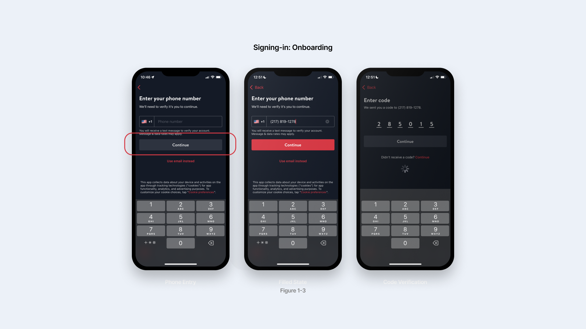
The sign-in pages (figure 1-3) utilized the classic phone number verification system. However, the interface here is a good example of how feedback and signifiers play an important role in bridging the gulfs of evaluation. When you finish typing a number, the Continue button turns red as an active state, signifying executable action next, and the system automatically load when you enter verification code with an loading icon on the screen, both are effective change in perception that makes it easy for users to compare the result with their goal: logging in. The automation of the process also serves as a physical constraint that prevents the users from distracting from signing up with the app.
Homepage: explore new restaurants
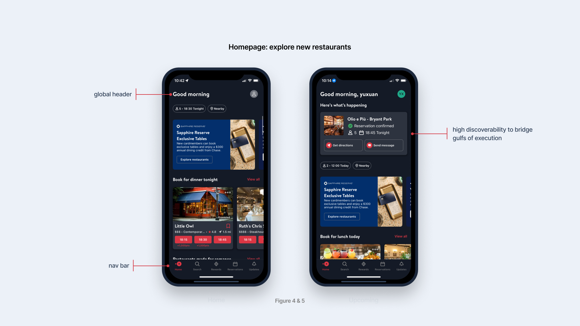
Figure 4 & 5 show the difference between new users and existing users’ homepage. First of all, the global header, identified as “Good morning” established the conceptual model of the app, which is a personalized assistant that is aware of the user’s needs. OpenTable follows a traditional hierarchical app design that features a consistent nav bar that directs users to Home, Search, Rewards, Reservations, and Updates.The use of red color on Home icon and text provides feedback for users to quickly understand their current location within the app.
Homepage: Top restaurants this week
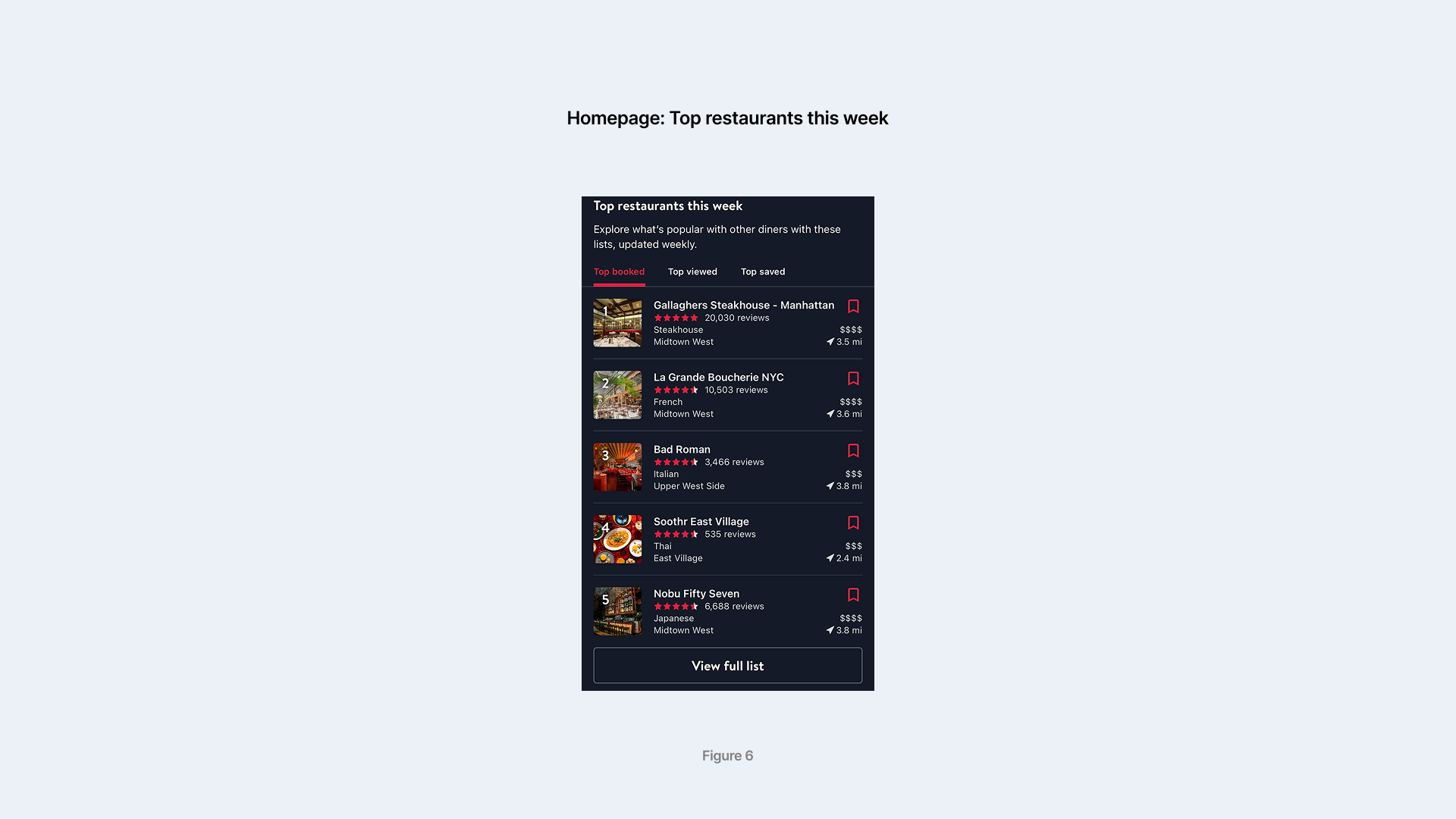
As a part of the homepage, Top restaurants this week (figure 6) features a scrollable vertical display that is built based on natural mapping, as the top restaurants are placed at the top of the list, and the vertical stack design is culturally relevant to the concept of ranking, employing the knowledge of the world. The ratings shaped in stars serve as natural signifiers that represent the general popularity, as the users are used to that conceptual model. The number of reviews in proximity to the stars serves as a secondary signifier that helps bridge gulfs of evaluation, as the user can quickly decide if the star ratings are trustworthy based on the volume of feedback. The top tabs that specify the category of the ranking list also serves to better bridge gulfs of evaluation, as users better understand the nature of evaluation in the ranking.
Main user flow: Making a reservation
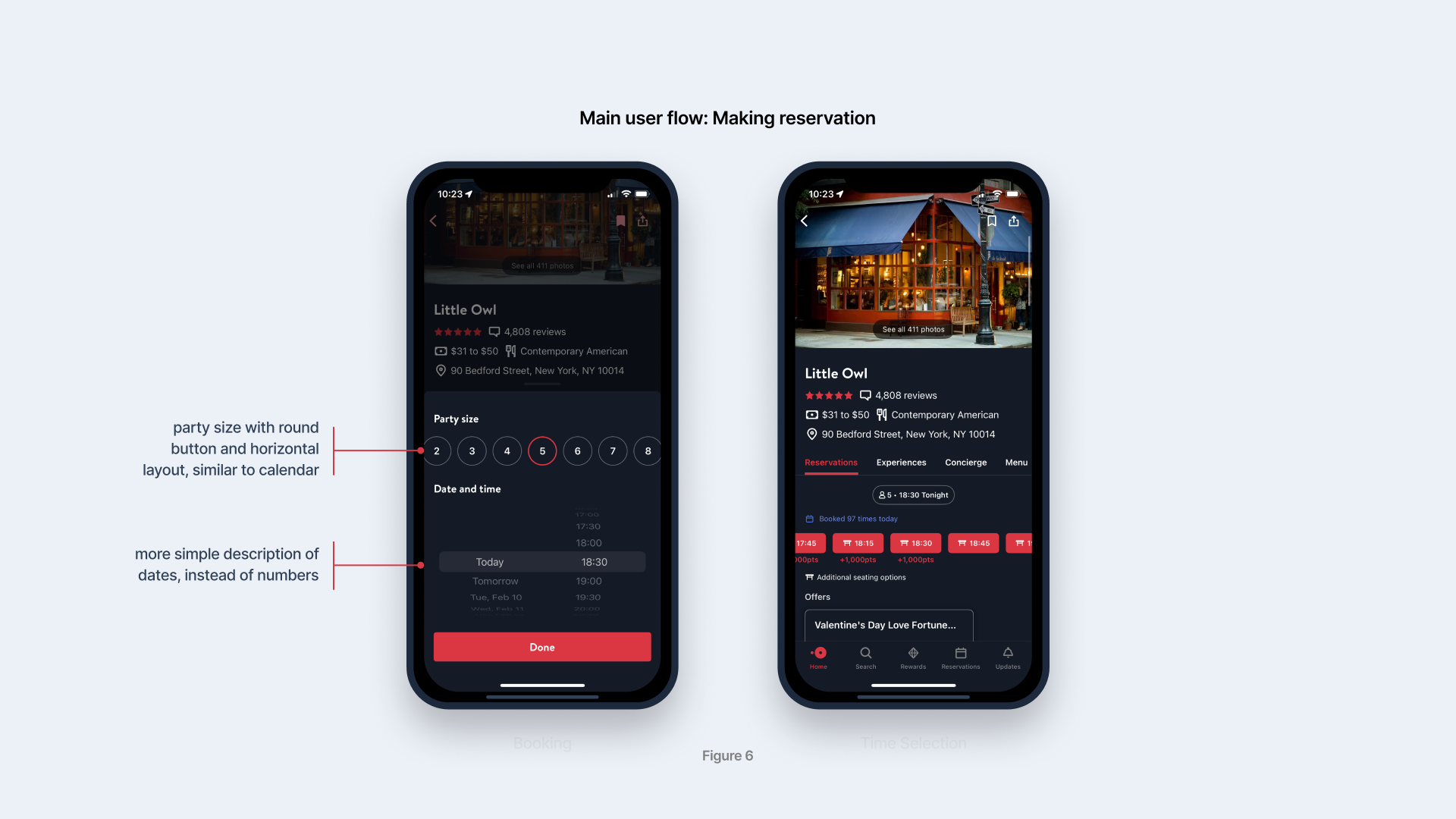
Figure 7-8 shows the reservation interfaces for diners, which is where the main interaction happens in this app. One of the smartest designs is the fixed party size and time on the top of the available time slots, which is pre-entered by the diner before they start searching. It significantly reduces the user’s workload because they don’t have to manually enter their information every time they click into a reservation page. In Norman’s theory, this is a good example of physical constraints to prevent slips or mistakes, which could happen if they repetitively enter the time and party size. Another good logical constraint is that available dates are shown in terms like “today” and “tomorrow” instead of calendar dates, which prevents slips as users may miscalculate calendar dates.
However, when I was entering party size, I mistakenly thought the vertical scroll bar consisted of numbers in circles as calendar dates instead of party size. It happened because I used knowledge in the head when performing the task, which convinced me the party size picker was a date picker. To solve this problem, it is better to have a signifier such as icons of a table for the title of Party Size, and an icon of a calendar for the title of Date and Time.
Conclusions
OpenTable excels in interface design that caters to rich affordance and information density. It utilizes abundant signifiers and feedback to bridge gulfs of evaluation and execution. Despite its main user flow being complex and prone to slips, it removes repetitive user input to add constraints (physical and logical) that prevent slips and mistakes. However, the design of the party size picker causes a slight gulf in evaluation when the user uses knowledge of the head to perform the task. The solution is also very simple: adding signifiers to distinguish it from the date picker, or place date picker prior to party size.