Preply is a language-learning platform that connects students with live tutors.
A typical student’s goal is to find and book a language tutoring session that fits their schedule. They need to quickly identify available times across dates and book a timeslot. They might also engage with any additional language-improvement features to improve their skills. To reflect this goal, my critique examines the student experience across onboarding, tutor discovery, booking, and practice features using Don Norman’s design principles and concepts from How Artifacts Afford by Jenny L. Davis.
Onboarding
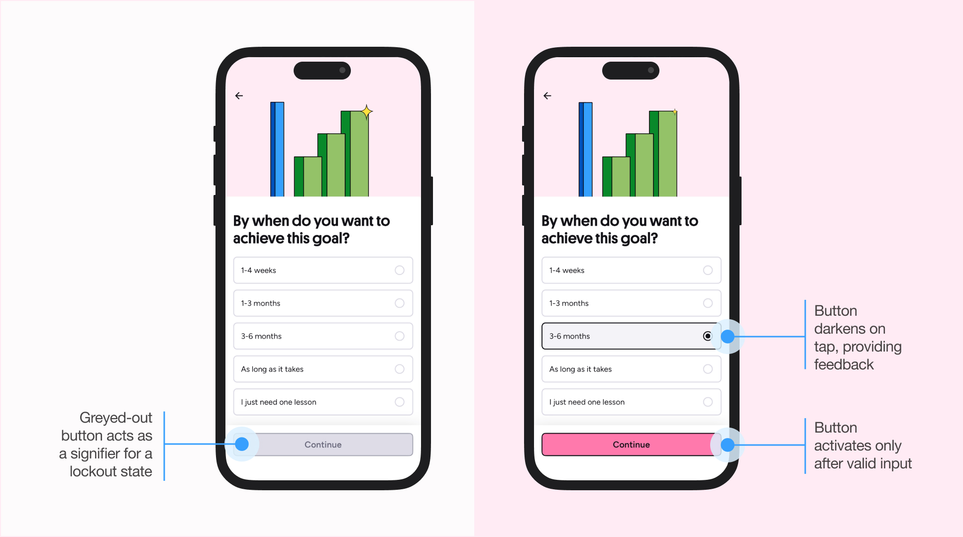
Preply engages users at the visceral level through bright pinks and bold neo-brutalist elements. Microanimations reinforce this experience: selecting a goal triggers a representative illustration that animates on entry, followed by a second image that reflects the chosen outcome, supporting the user’s conceptual model.
Button taps trigger multimodal feedback (visual, auditory, and haptic), and selected states darken when pressed, confirming that the input was received and bridging the gulf of evaluation.
The onboarding experience is a success: it feels intuitive, and the questions asked matched my overall mental model: starting with the language I want to learn, identifying my goal, topics to focus on, my current skill level, my tutor’s accent (and second languages they speak), availability, and price range.
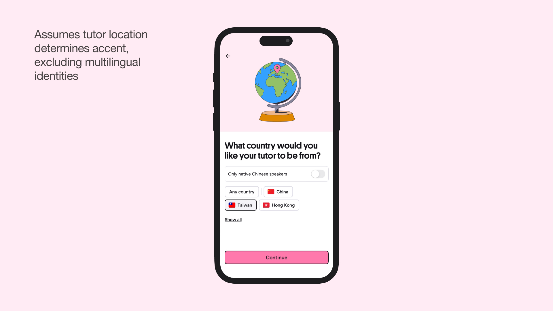
The only problem I had is with the question “What country would you like your tutor to be from?” This conflates geography with linguistic identity, assuming that a tutor’s birthplace directly impacts their accent. But from my personal experience, I can tutor Chinese with a Taiwanese accent, yet I might set my location to Canada since that’s where I’m based and where I consider my primary linguistic context. Where should I set my location? Canada or Taiwan? The system would demand I choose one, but my linguistic identity can exist across both.
Finding a Tutor
After onboarding, I’m led to a filtered list of tutors matching my selections: Chinese speakers from Taiwan, who speak English as a second language, and charge under $20/session. This matched my conceptual model: my inputs directly tailored the results, and this feedback bridged the gulf of evaluation by showing the system’s current state.

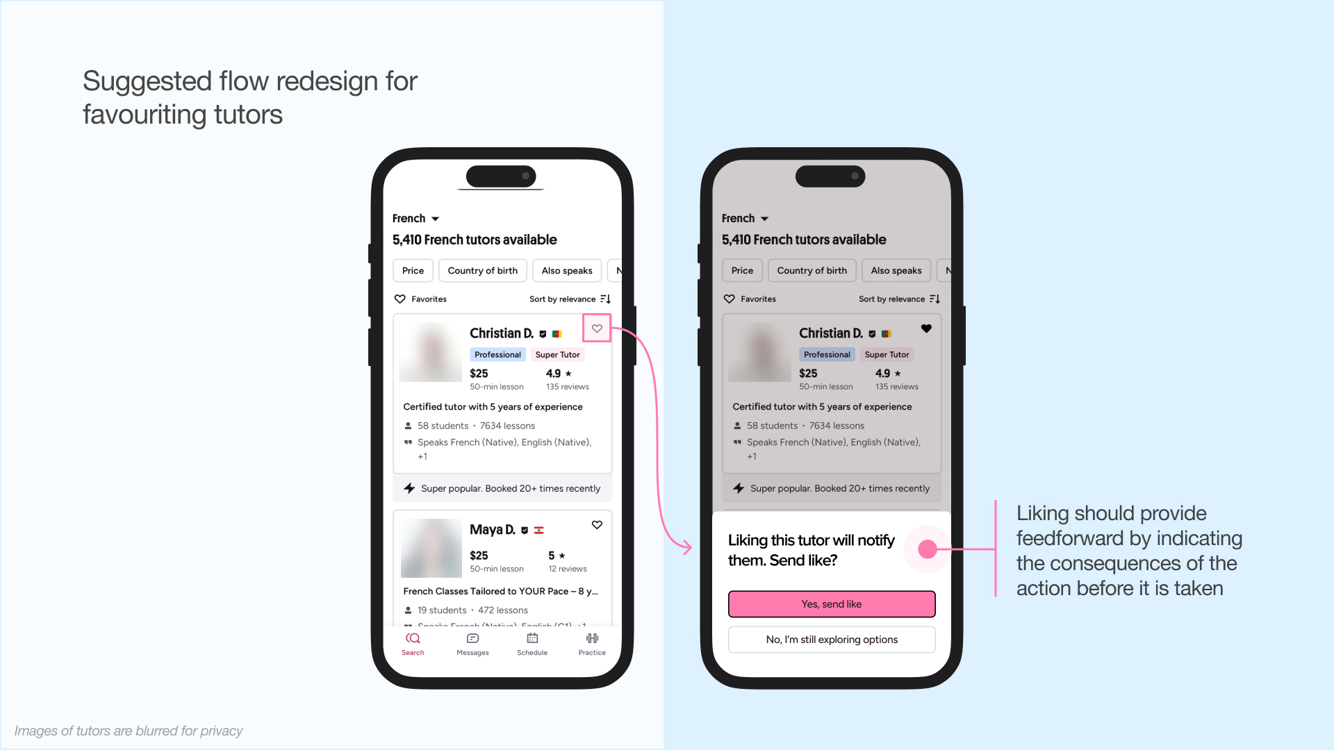
I tried favouriting a tutor to save them for later. In marketplace apps—like Airbnb, Amazon, or job boards—favouriting is usually a private organizational tool, just for me. It appears to be a low-pressure action that allows possible actions: neither encouraged nor discouraged, which decreases the perceived risk.
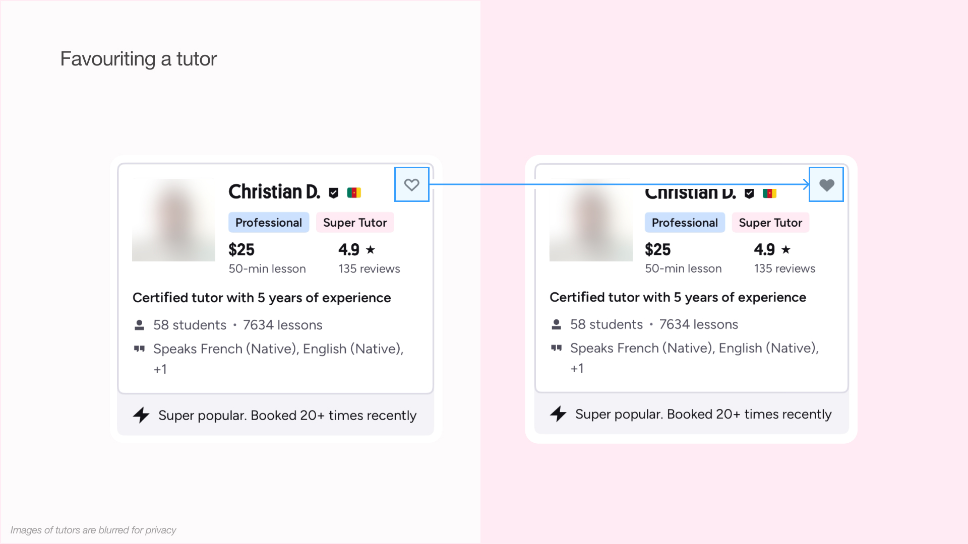
But I unexpectedly received messages from two of the three tutors I’d “favourited,” and they now populate the messages tab. This felt intrusive, as users may reasonably expect favourites to function as a private bookmarking tool. What the feature actually demands is “notify this tutor of your interest,” which poses a higher social risk than merely allowing a favourite list to be curated.
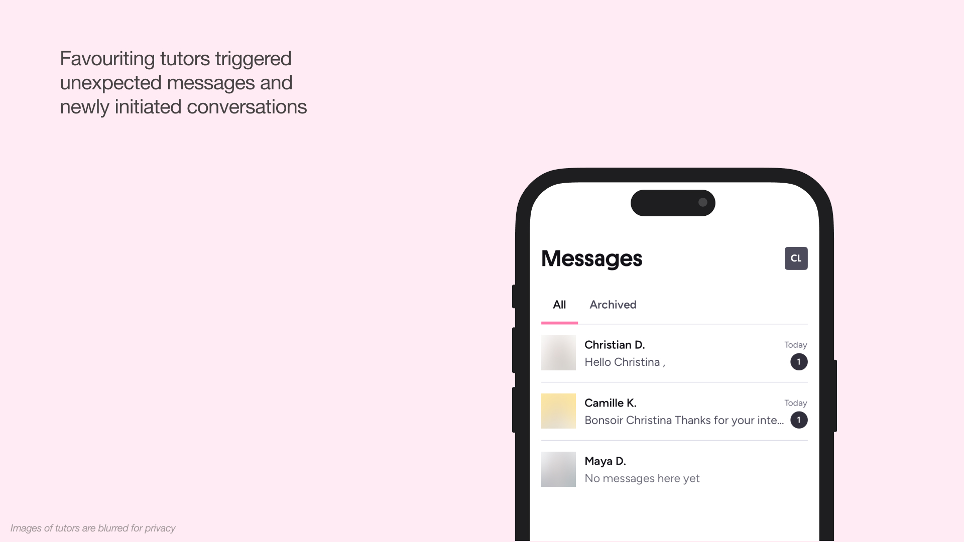
This violated my mental model of how favourites work in marketplace contexts. The heart icon was an ambiguous signifier: it could mean “bookmark for later” (private) or “express interest” (public). The system image provided no indication that this was a social action. There was no written signifier like “Follow” or “Send Interest,” nor was there any warning about notifying tutors.
A well-designed feature should provide feedforward, bridging the gulf of execution by signalling consequences before I click. For example, the button could say “Follow & Notify Tutor” instead of just showing a heart icon, or a confirmation pop-up could appear as a request, rather than a demand: “Liking this tutor will notify them. Send like?” This would help prevent errors and mismatches in cultural conventions.
Booking Sessions
After selecting a tutor, you can view their schedule and book lessons. Redundant call-to-actions support multiple paths into the scheduling flow, which improves discoverability.
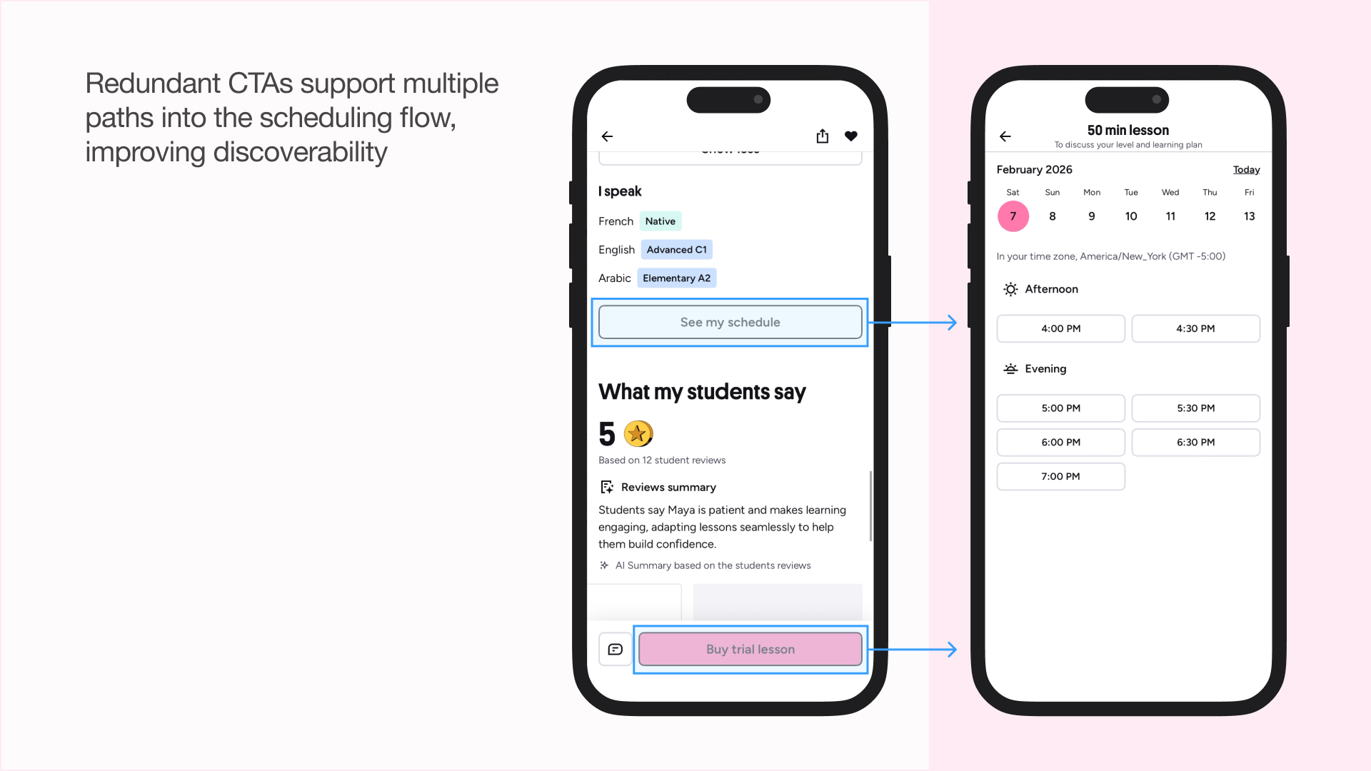
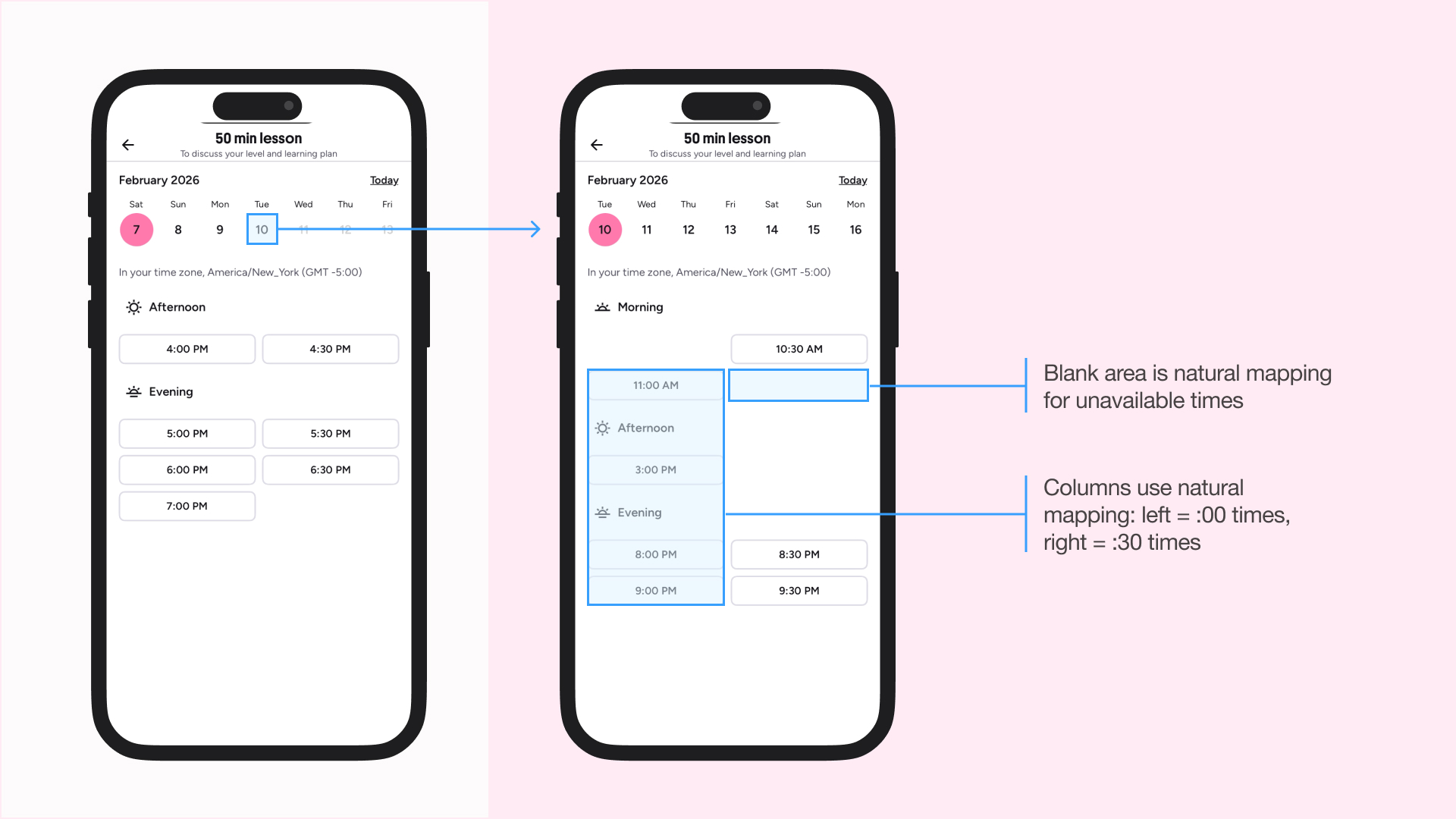
The schedule selector displays availability in your time zone, with gaps serving as signifiers and logical constraints; the visual space directly maps to the tutor’s availability. Time slots are organized into two columns: all “:00” times on the left, all “:30” times on the right. This spatial mapping makes scanning efficient; I can quickly find on the hour slots by looking left, or half-past slots by looking right, without reading each individual time.
As I go through the date selector, the selected date moves to the far left to show the subsequent week. You can only book up to 2 weeks in advance, and the tracking only starts moving toward the right-most position once you approach this limit. This lockout function creates a digital constraint that refuses bookings far in the future. The date selector at the top provides a natural mapping for Western cultures, since they read time from left to right.
These conditions privilege users with flexible schedules while marginalizing those who need long-term planning (e.g. students who want consistent practice). That said, since Preply appears to target casual language-learners seeking conversational practice and allows easy tutor switching, this constraint aligns with the goal of encouraging flexible engagement rather than rigid commitments.
Practice Words
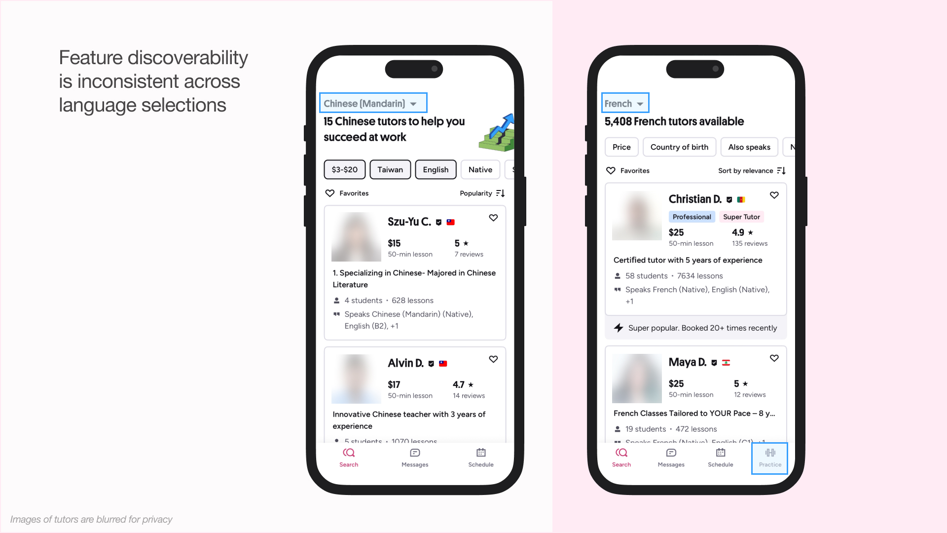
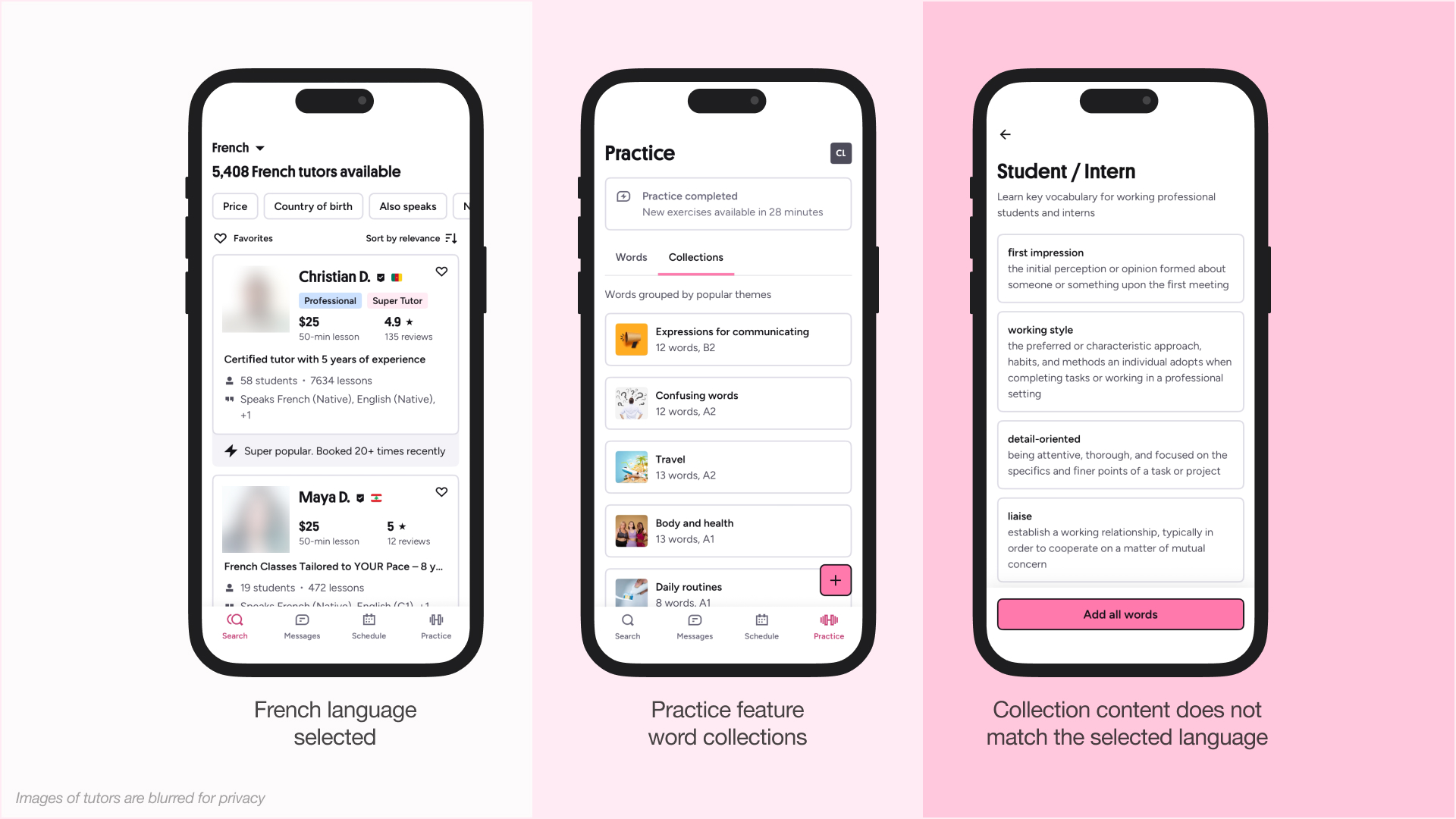
When I first downloaded the app, I chose to learn Chinese. In this view, I saw three navigational tabs at the bottom: Search, Messages, and Schedule. You can easily change the language you want to learn in the filters, so I decided to look at French tutors next. In doing so, Preply added a fourth feature: Practice.
Tapping this button brought me to a Words page, and I had 0. This also didn’t match my conceptual model; I expected Words to be resources that I could add, provided by the app. Especially confusing was pressing the “+” icon to add a word. While the signifier clearly communicated an add action, the affordance (the only available input) was manual text entry. This demands heavy reliance on knowledge in the head, which can be problematic in a language-learning context, where users may not yet know the words they are expected to enter. As a result, beginners might see this as a useless feature.
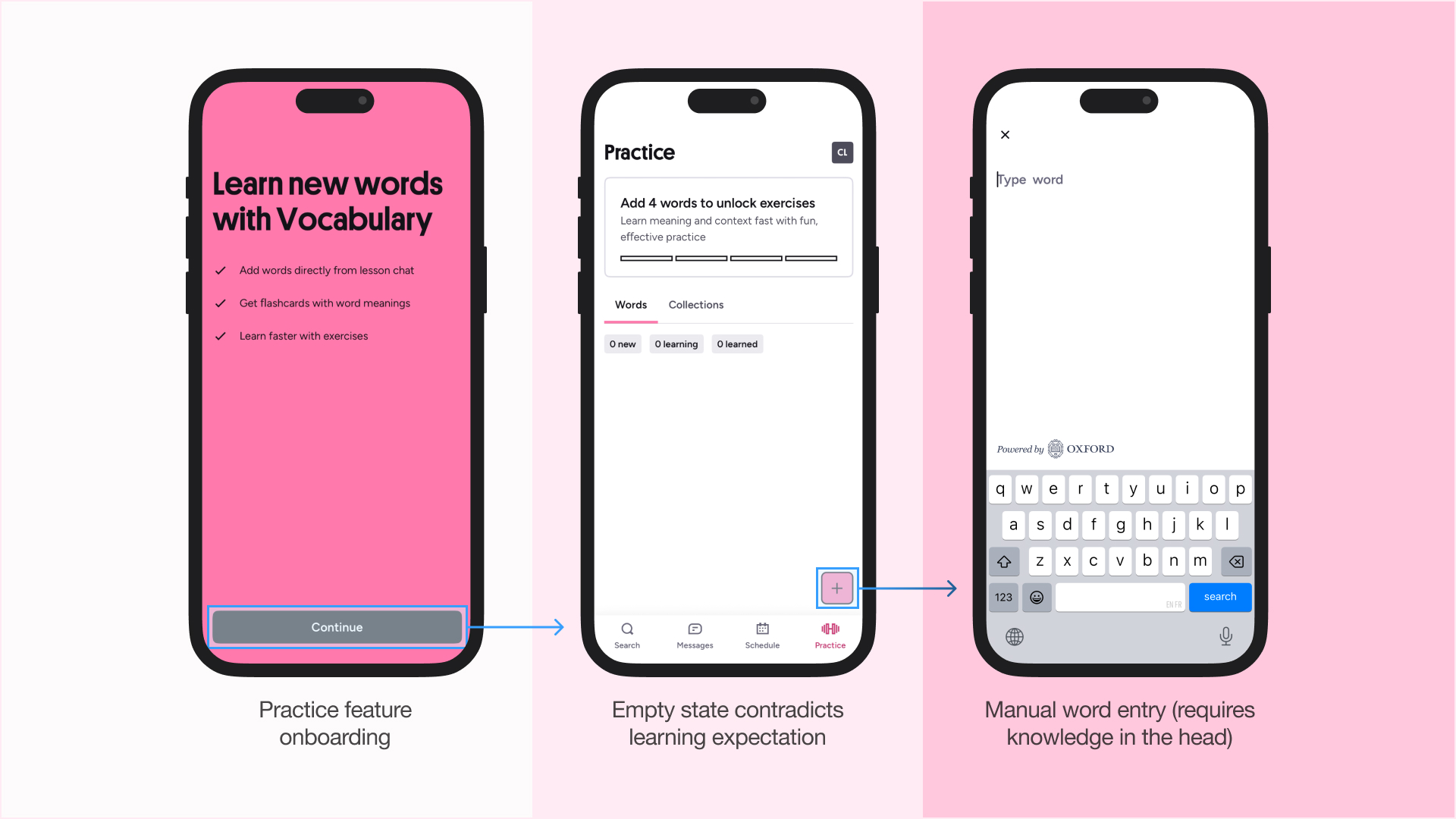
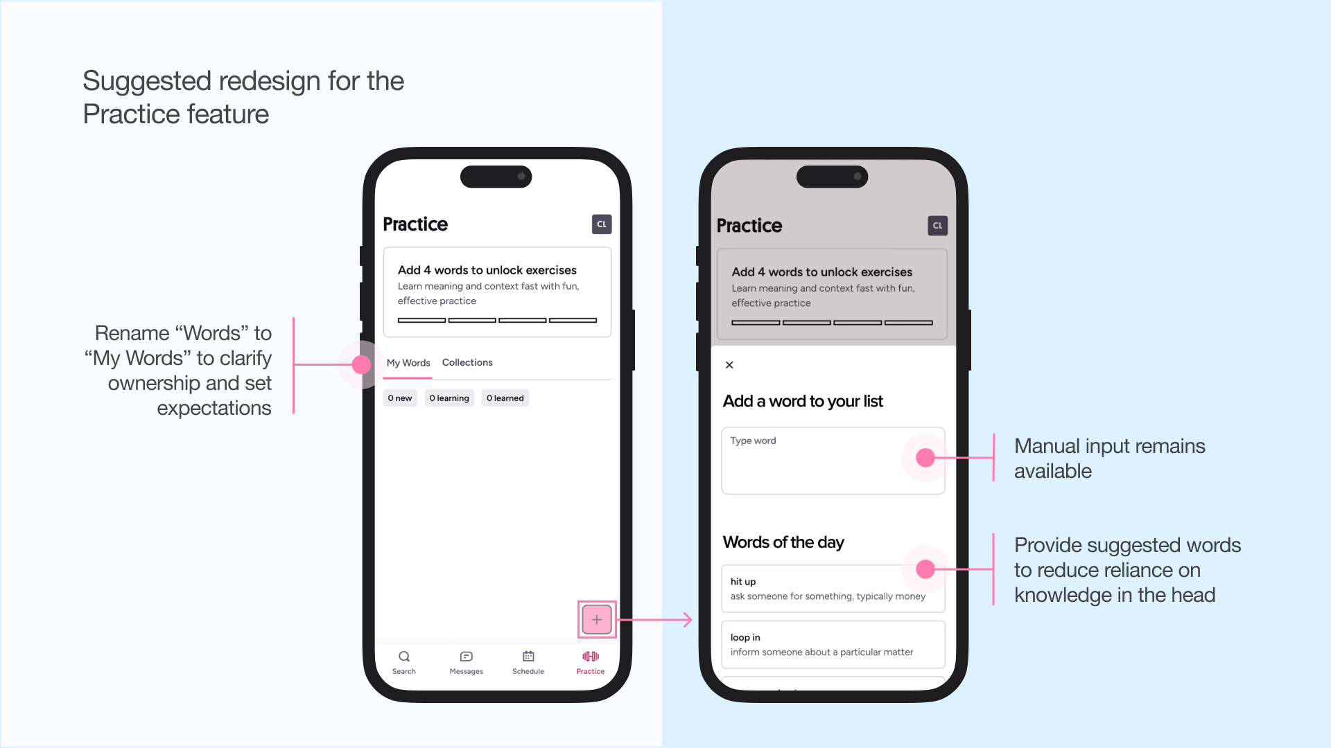
Instead, the app could provide knowledge in the world through suggested words, a dictionary search, or a shuffle feature to support discovery (putting knowledge into the world). Renaming “Words” to “My Words” would also better signal that the list is user-generated, helping set expectations for an initially empty state.
Tapping on Collections brings me to a catalogue of words. But it confused me further because all the words were in English when I selected French. This is a language inconsistency and a mapping failure that didn’t align with my conceptual model. Why doesn’t the feature appear for learning Mandarin, if it didn’t show me any French words to learn? The practice feature isn’t universally discoverable, yet its appearance and disappearance seem unnecessarily inconsistent.
A solution would be creating an empty state for Practice when a language is unsupported, while keeping core navigation consistent (including all four features: Search, Messages, Schedule, and Practice). It could then request the student to find a tutor, which is Preply’s key selling point.
Concluding Thoughts
Preply excels at visceral processing with clean visuals, delightful micro-interactions, and playful branding. At the reflective level, strong tutor experiences—the app’s core value proposition—shape users’ overall perception of the product. These positive outcomes can help reduce annoyances caused by minor interface friction at the behavioural level of processing, such as in the Practice feature. Overall, user satisfaction for this app is high, as reflected in its 4.8 App Store rating (Preply, 2026).
However, when evaluating whether Preply’s features support the goal of learning a new language, gaps emerge. Language-learning needs 1) consistent habit-building, 2) structured progression, and 3) accountability, none of which Preply fully supports. The tutor-matching feature enables valuable conversation practice and personalized feedback, but doesn’t facilitate structured progression or habit-building since students must actively book new lessons every week or two. Messaging allows quick questions between sessions, but doesn’t support habit-building, structured progression, or accountability unless tutors proactively track progress through these messages. The Practice feature offers vocabulary reinforcement, though in isolation from a broader learning context, and lacks an accountability system. Together, those features work well as supplementary tools but don’t make up a complete learning system.
For example, Preply could better support long-term student-tutor relationships. The current 2-week booking window creates uncertainty for students who want consistent sessions with the same tutor. If that tutor becomes popular, students might need to try another tutor, which adds switching costs and social risk, and they need to spend time searching for options again. Preply could address this by introducing recurring session bookings or priority scheduling for long-time students. Both user groups benefit: tutors gain a steady income and improved retention, while students gain habit-forming motivation, accountability, and structured progression from a tutor they already trust.