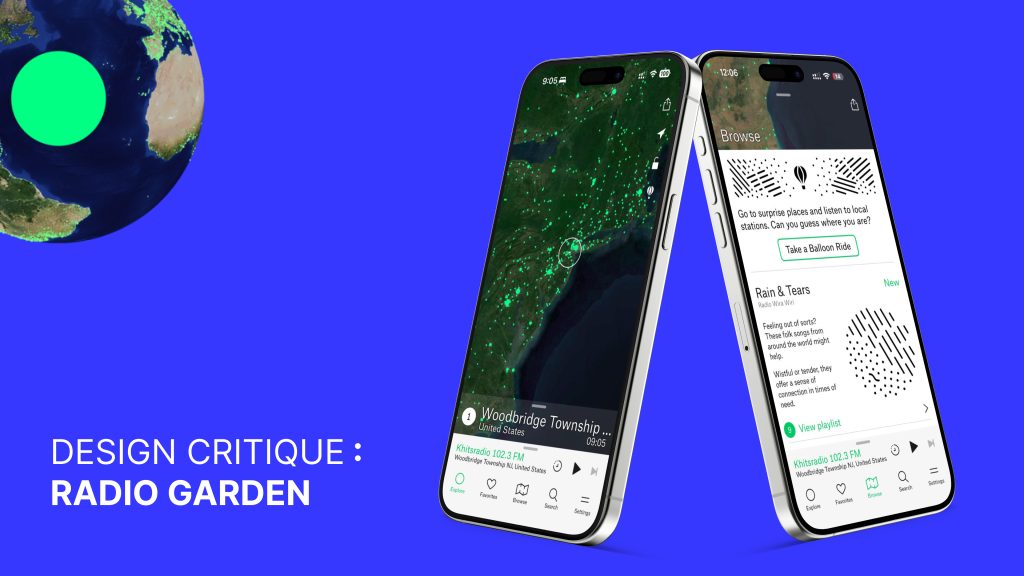
Radio Garden is a mobile application that allows users to listen to live radio stations from around the world through an interactive globe. Each glowing dot represents a real station broadcasting in real time. Rather than focusing on artists or playlists chosen by algorithms, the app encourages users to explore sound through geography. A typical user may open the app with no clear goal, move across the globe out of curiosity, or return to familiar stations they have saved over time.
The Onboarding Experience
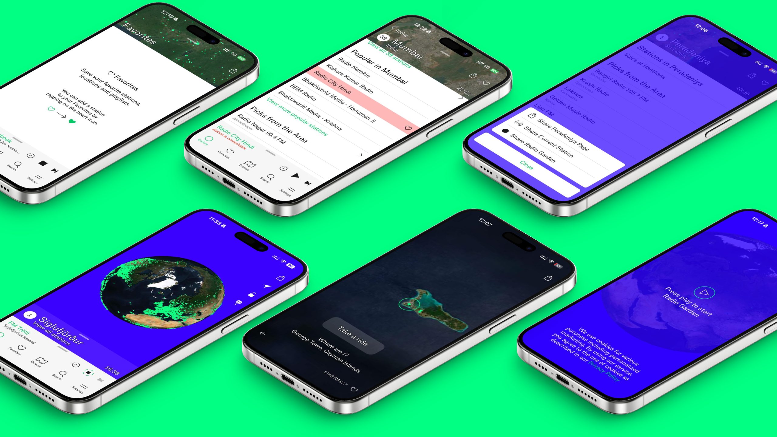
The first interaction immediately sets expectations. Users are greeted with a simple prompt – “Press play to start Radio Garden.” This onboarding moment works well because it removes ambiguity and clearly signals what action is expected. The large play button acts as a strong visual cue, and audio begins immediately after tapping, providing instant feedback that confirms the system is active. Short loading messages such as “planting seeds” soften waiting time and reinforce the app’s exploratory tone without requiring explanation.
Once audio begins, the globe becomes the primary interface. Its form strongly suggests interaction: users naturally drag, zoom, and tap without instruction. Green dots communicate where stations are available, making the system’s possibilities visible. Moving across the globe directly changes what the user hears, creating a clear and intuitive relationship between action and outcome. Features like “Take a Balloon Ride” further encourage discovery by removing the need to choose deliberately, allowing the system to surprise the user instead. Information such as station name, location, and local time helps users understand what they are listening to and where it comes from, supporting interpretation and reducing confusion.
Everyday Use and Core Features
As users spend more time listening, additional features shape the experience. The Browse section introduces curated playlists organized by mood, genre, or theme. Each category includes descriptive text explaining what kind of listening experience it offers, and accompanying doodles visually convey the emotional tone of the playlist. These illustrations act as visual signifiers, helping users decide what to explore before committing to listening. Each playlist also includes context about station locations and why they fit the category, adding narrative depth to discovery. A clear visual distinction between free and premium features further helps users understand which actions are available to them, setting expectations without interrupting flow.
Saving stations is handled through a heart icon, which works effectively. The visual change from an outlined heart to a filled heart provides immediate feedback, making the action easy to understand without text. The Favorites tab reinforces this clarity by explaining how to save stations when the list is empty. However, as users save more stations, the lack of structure becomes noticeable. Favorites appear as a flat list, making it harder to return to specific content over time. Allowing users to create optional folders or custom playlists—such as by mood, geography, or purpose—would support long-term use and reduce reliance on memory without changing how saving currently works.
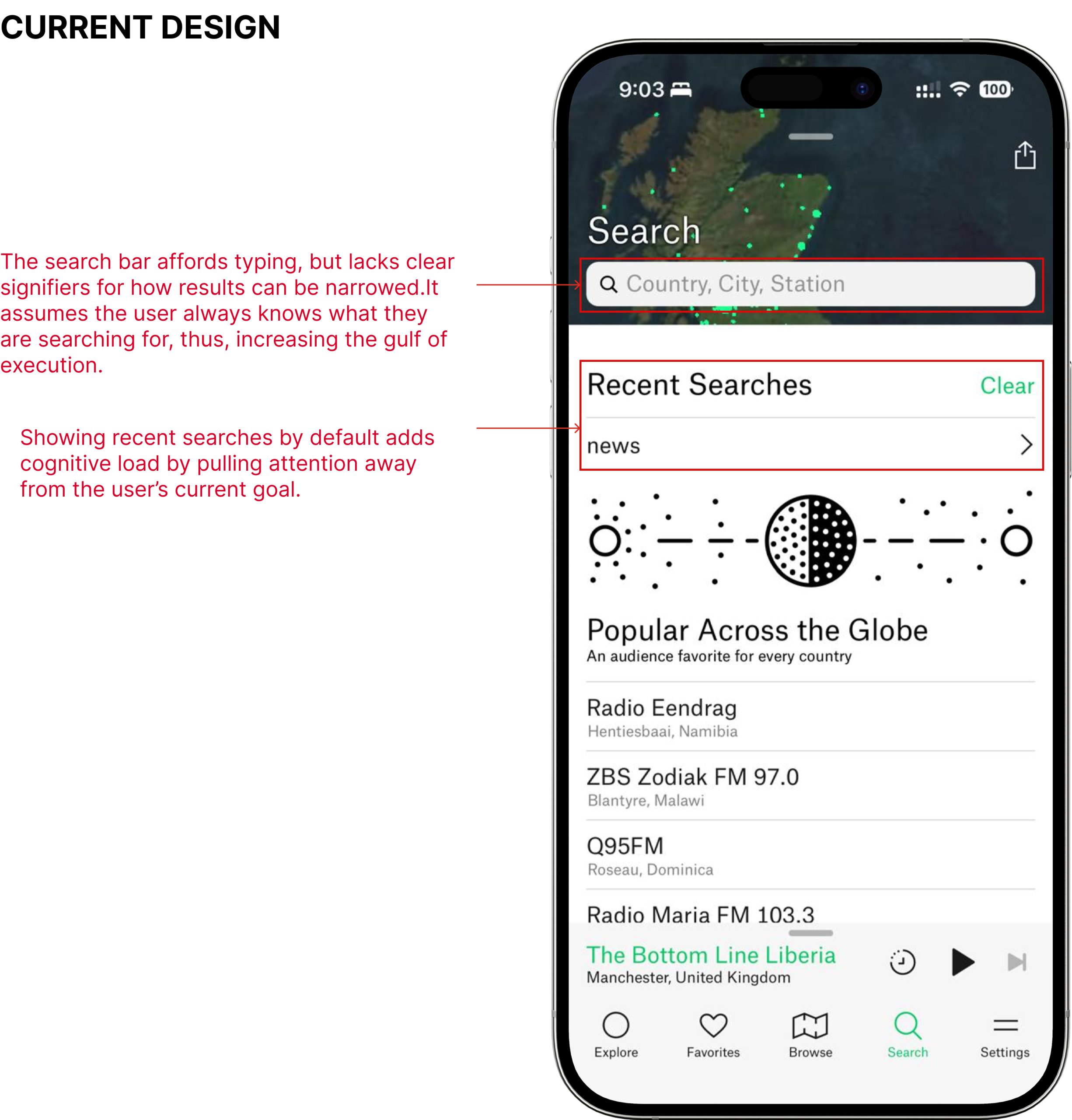
Search supports users with more specific goals, allowing stations to be found by country, city, or name. In its current form, search assumes users already know what they are looking for. Recent searches occupy prominent space even when no longer relevant, and results require extended scrolling. There are no visible filters or sorting tools to help users understand how results are organized, making exploratory search more effortful than necessary.
The app also offers a range of customization options through the Settings tab. Users can adjust language, dark mode, contrast, globe quality, dot size, vibration, and motion. These settings allow the interface to adapt to different contexts and accessibility needs, supporting a wider range of users and reinforcing the app’s flexibility.
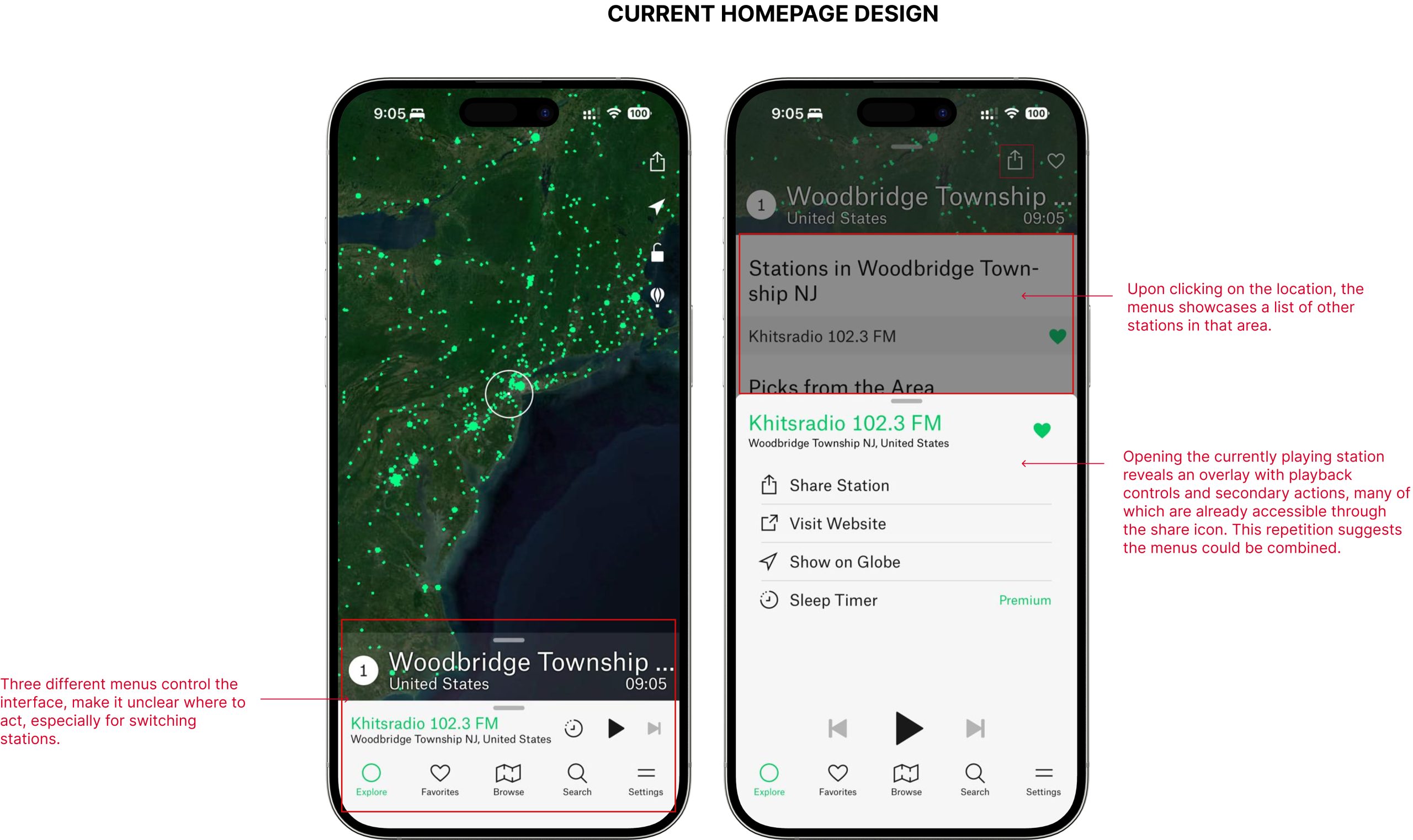
Over time, some usability tensions emerge, particularly on the home screen. Control over the currently playing station is split across multiple menus: one for nearby stations, another for station-specific actions like sharing or visiting a website, and separate playback controls anchored at the bottom. Although each menu works individually, their separation makes it harder to understand where to act. Similar actions appear in different places, increasing cognitive effort and slowing down frequent tasks like switching stations or sharing.
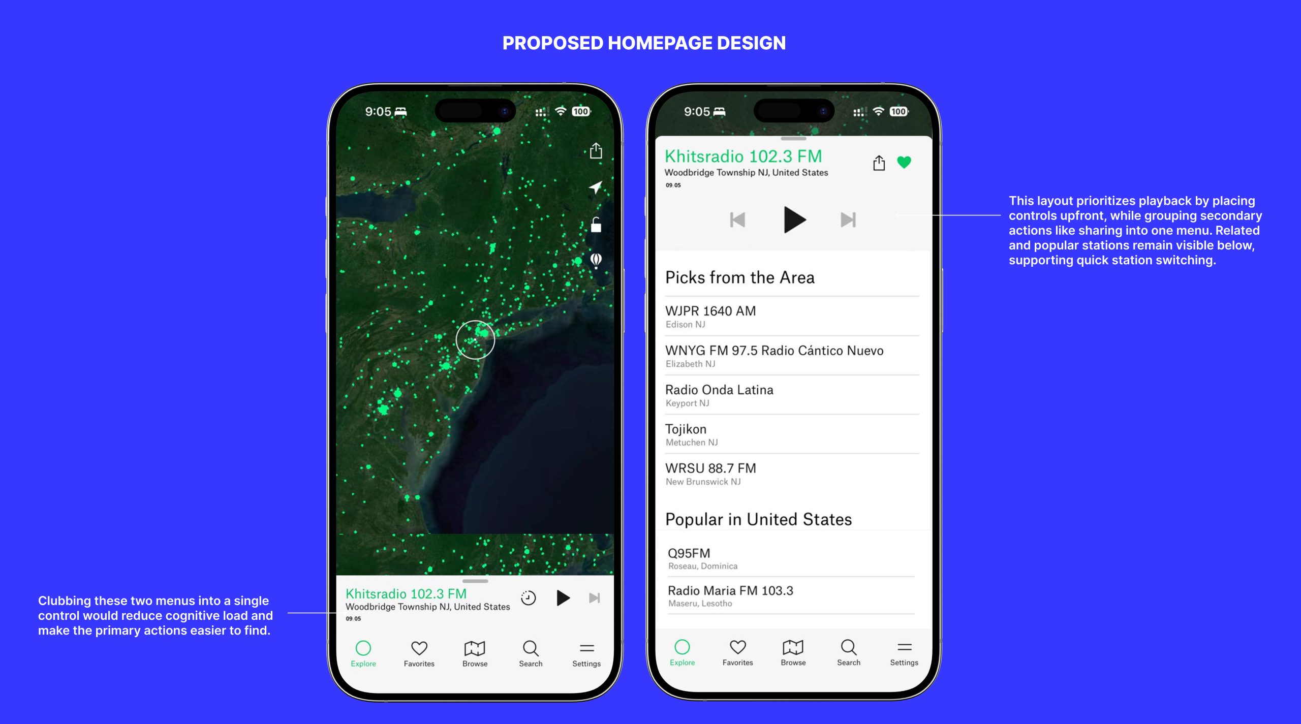
The proposed home screen redesign responds by consolidating station information, location, and time into a single, unified control area. Playback controls are given visual priority, while secondary actions such as sharing or saving are grouped together behind a single entry point. This reduces duplication, clarifies hierarchy, and makes the system state easier to understand at a glance. Nearby and recommended stations remain visible below, allowing users to switch quickly without navigating away.
A similar opportunity exists in search.
The current search assumes users know what they are looking for and relies heavily on typing. Recent searches take up space even when the user’s goal is discovery, and there are no visible tools to narrow results.
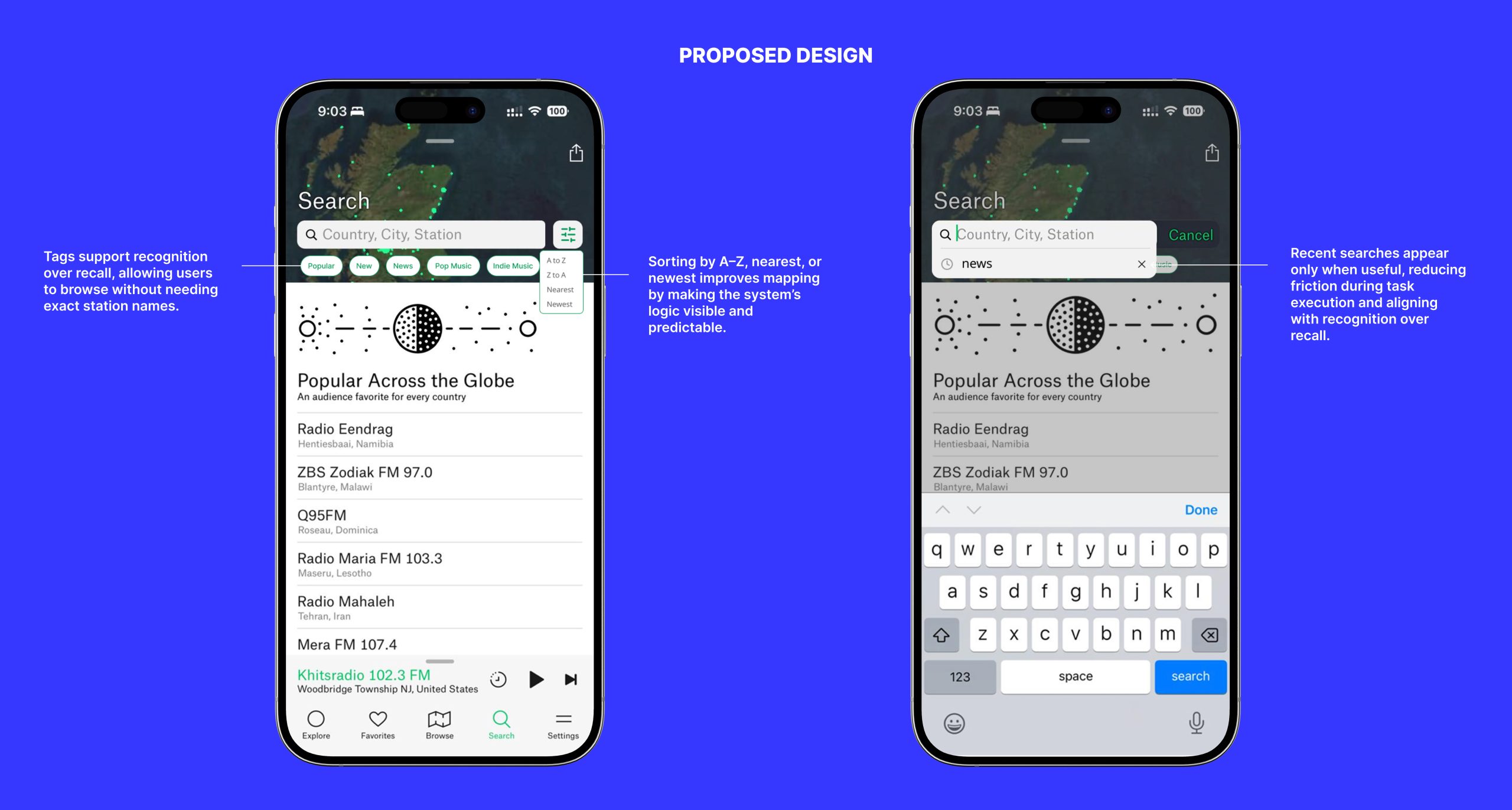
The redesigned search introduces lightweight filters and sorting options such as alphabetical order or proximity. These additions make the system’s logic visible and allow users to browse without needing precise input. Recent searches appear only when relevant, reducing clutter and keeping focus aligned with the user’s goal.
Conclusion
Overall, Radio Garden succeeds in creating an engaging and exploratory listening experience through clear feedback, intuitive interaction, and a strong connection between sound and place. The proposed changes do not alter what the app is meant to be. Instead, they refine structure, improve clarity, and support both casual exploration and long-term use. By grouping related actions, reducing cognitive load, and making system logic more visible, Radio Garden can better meet user expectations while preserving its unique identity.