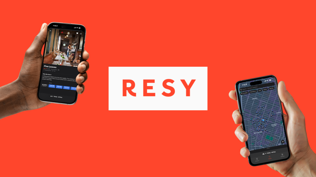
Resy is a restaurant reservation app simplifying the reservation process. In the app users can find reservation options, access guides, connect with dining companions, and curate customized lists of places to eat, drink, and experience all in one place. Let’s explore what the app gets right and places it falls short using Norman’s design principles.
Personalized Search Through Clear Filtering

When opening Resy on mobile, the app opens directly to the search page. This page essentially serves as the homepage. A map of available reservations at nearby restaurants and bars based on your current location displays on the search page. At the top of the page filter options (Available, Collections, Lists, Events, Seating) appear below the search bar. After an option is selected the filter’s active state (white/highlighted vs. dark) provides immediate visual feedback about which filters are active. Results reload instantly, confirming the user’s action by showing updates on the map.
The filter options also minimize the gulf of execution by displaying options to narrow search results through their button-like appearance. The action required (selecting a filter) is straightforward and requires minimal effort to accomplish the goal. The immediate reload of results helps bridge the gulf of evaluation, allowing users to quickly assess whether their filter selections produced the desired outcome.
Reducing Cognitive Load: Navigation with Familiar Patterns and Dual Signifiers
Navigation items (Discover, Search, Account) on the bottom navigation bar include both icons and labels. The labels associated with icons function as signifiers in the navigation to clearly communicate each page’s purpose helping users understand the function of the navigation item even if they’re unfamiliar with the icon. Discoverability of the app’s main navigation is enhanced so users don’t have to guess the icon’s intended meaning. Once a navigation item is selected, it displays an active state indicated through color to provide immediate feedback about the user’s current location within the app.

Additionally, the placement of the bottom navigation bar creates an effective conceptual model that aligns with users’ existing mental models from other mobile apps. By following this established convention, Resy reduces cognitive load and allows users to focus on their primary goal of finding and booking restaurants rather than learning a less familiar navigation system.
When Constraints Confuse: The Reservation Scheduling Problem
When attempting to make more than one same-day reservation, Resy blocks the booking and displays a pop-up asking if users want to cancel their existing reservation. This restrictive system constraint creates extra barriers for users.
I attempted to book dinner at 5:00pm and then a bar reservation at 7:30pm I was promoted with this pop-up:

While these constraints protect restaurants from lost business due to no-shows or timing conflicts, the implementation demonstrates poor signifiers, leaving users unclear on why they can’t execute an intended action. The message in the pop-up doesn’t clarify why both reservations can’t coexist, creating a significant gulf of evaluation. Users cannot determine what went wrong or how to fix it from this lack of clarity. These constraints could potentially communicate to users that Resy doesn’t allot them autonomy or independence in managing their own dining plans.
To remediate these usability gaps, my recommendation would be to display a screen (not a pop-up) as part of the reservation process. This screen would offer a clear explanation of the time restriction (e.g. “Reservations must be at least # hours apart”). Users can then understand why they can’t book and make informed decisions. The button labels should also be explicit about their consequences. For example, “Cancel [Restaurant Name] Reservation” and “Keep Restaurant Name] Reservation” removes any ambiguity about what will happen next. In my own research I could not find any official documentation from Resy clarifying these constraints. Making these constraints visible and understandable transforms a frustrating limitation into a reasonable guardrail. Applying the same transparency to constraints would create a consistently intuitive experience that respects both business needs and user autonomy.
Concluding Thoughts: Designing for Understanding

Resy excels where clear signifiers and immediate feedback guide users. By extending the same thoughtful design approach used in navigation and search to its constraint systems, Resy could create a consistently user-centered experience that balances business needs with user autonomy throughout the entire reservation journey.