Splitwise is an expense-sharing application designed to help groups track and settle shared costs efficiently. While it serves various collaborative scenarios, it is a mobile-only application. This article critiques its interface through the lens of Don Norman’s The Design of Everyday Things.
1. Color-coded Balances
Splitwise provides a great example of bridging the Gulf of Evaluation. While many apps can split a bill and calculate the amount, Splitwise makes it easy to understand. The transaction details, including dates, amounts, and payers, are clearly displayed on the screen (Figure 1). It also uses color as a strong signifier: green indicates money owed to you, while red signals money you owe others.This design uses knowledge in the world by relying on cultural constraints (conventions), which Don Norman describes as information already available in our environment. Although new users may not be familiar with this app, they already know that green is represented as positive and red as warning. Therefore, users can quickly perceive and interpret their financial status without much effort.
This design uses knowledge in the world by relying on cultural constraints (conventions), which Don Norman describes as information already available in our environment. Although new users may not be familiar with this app, they already know that green is represented as positive and red as warning. Therefore, users can quickly perceive and interpret their financial status without much effort.

2. The Add Expense Flow
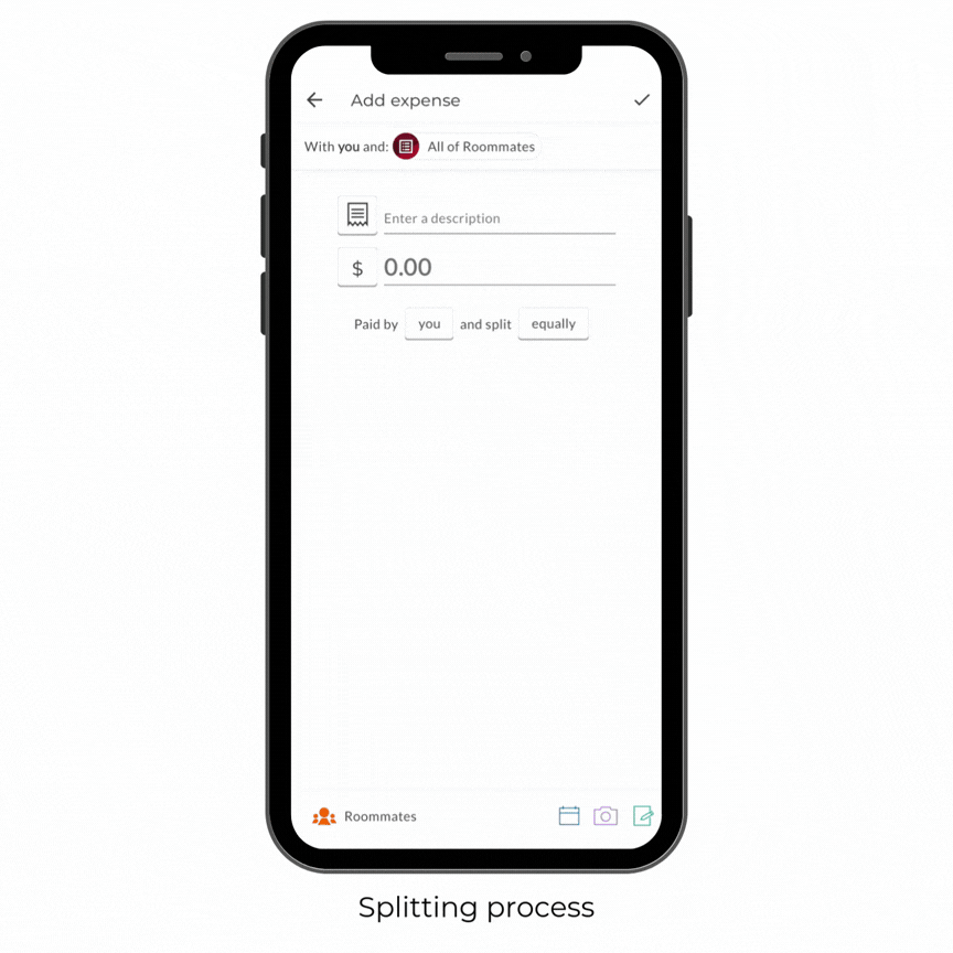
In the ‘Add Expense’ screen, the date selector has poor discoverability. While buttons for currency and payers have clear box outlines, the date is just a small, plain icon in the bottom right corner, lacking a clear signifier (Figure 2). To solve this problem, Splitwise should move the date selector to the center and give it a border, matching the style of other buttons (Figure 3). This ensures that the perceived affordance matches the actual affordance, making it obvious to users that the date is a clickable element.

Moving further into the splitting process, Splitwise uses logical constraints to prevent user errors and guide the user toward the correct outcome. According to Norman, logical constraints rely on reasoning to guide actions. When the total of individual shares does not match the total expense, the app displays a warning at the bottom highlighted in red (cultural constraints). If a user tries to save this expense, a message pops up to prevent the error.
3. The Balances Summary
On each group’s main page, the balance summary uses green and red text as clear signifiers. However, when there are multiple currencies or more members, the interface displays a label like “Plus 2 other balances” (Figure 4). This design creates a conflict with the user’s mental model; because the text summarizes hidden information, users naturally expect to be able to expand it to see more details.
The main issue is a mismatch between the semantic meaning and the actual affordance. While the text implies there is more to see, the app provides no actual affordance as the text is not clickable. This creates a gulf of execution, as users cannot access the information the text promises. To improve this, I suggest making the text clickable and adding an arrow icon as a signifier to align with the user’s expectations (Figure 5).

4. The Settle Up Flow
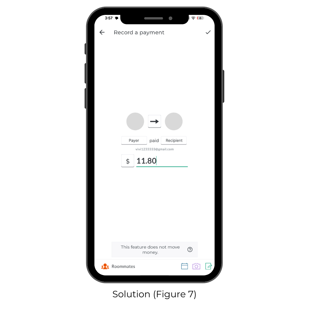
The Settle Up screen (Figure 6) uses excellent natural mapping. By placing profile pictures on opposite sides of a central arrow, the interface creates a clear spatial relationship that represents the flow of money.

However, the More options flow breaks this mapping. It takes the user away from the visual diagram and asks them to pick names from separate text lists. This leads to poor mapping because the direct link to each person’s role in the transaction is no longer visible, forcing the user to rely on knowledge in the head to remember their choices across screens. A better solution would be to retain the arrow diagram and allow users to tap the profile pictures directly to change the people involved (Figure 7). This would preserve the natural mapping and eliminate the need for users to repeatedly navigate back and forth between lists.
Overall, Splitwise successfully bridges the gulf of evaluation through strong mapping and constraints. While minor issues in perceived affordance exist, the app provides a coherent conceptual model that simplifies complex group finances. Addressing these small interaction gaps would further refine the stages of action for all users.