Spotify has dominated the Music Streaming space since its inception in 2008. Since then, it has revolutionized the personalization of listening to music, audiobooks, and podcasts by curating playlists, providing an AI DJ, or releasing the yearly “Spotify Wrapped” that listeners anxiously wait every year to find out. As someone who has been using Spotify’s interface since the beginning, I have witnessed its evolution through features I’ve loved a lot and loved not-so-much. With the extensive set of features and option Spotify now offers, this post analyzes how Spotify juggles designing with clarity while handling large amounts of information.
1. Immediate Feedback: Quick Visual Actions
One of the most successful parts of Spotify’s interface is the ability to use a series of quick actions to navigate the application. What makes this successful is the immediate feedback the user gets with the action. For example, on the “Now Playing” screen, users can swipe the album cover of the song left or right to skip to the next or previous song. As they swipe, the album cover for the next song starts to appear and signifies the action taking place.
This feature is also prevalent when adding songs or queueing them. With a right swipe over a song title, the queue icon appears with a dark background. As the user continues to swipe, the background turns green signifying intentional action. The same occurs when swiping left. In this case, A plus sign shows up on a dark background that turns into a check mark with a green background as the user continues to swipe left. When the action is released with the icon on the green background, a message pops up at the bottom signifying completion of the action.
These quick actions and feedback not only make the app quick, easy, and efficient to use, but also prevent confusion by indicating completion of a the task the user set out to do.


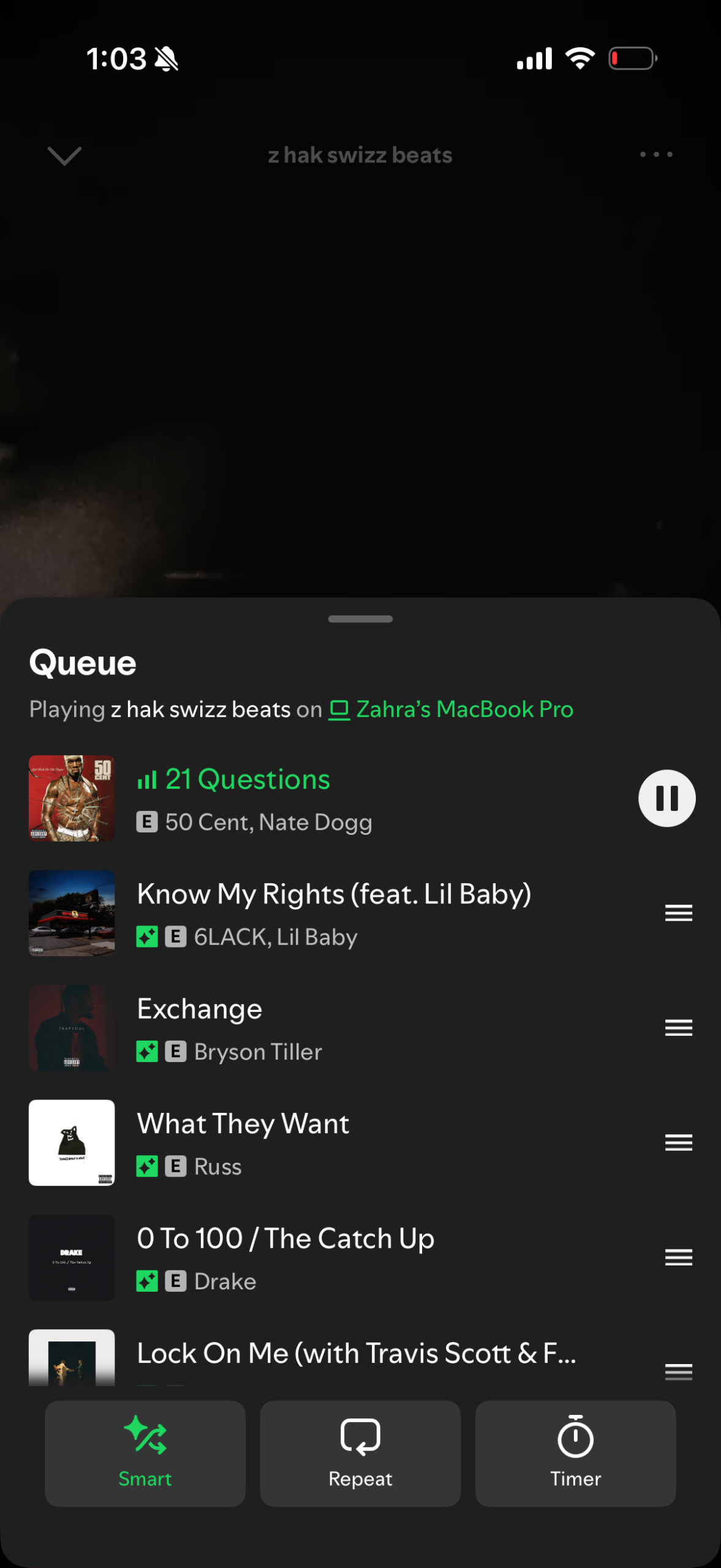
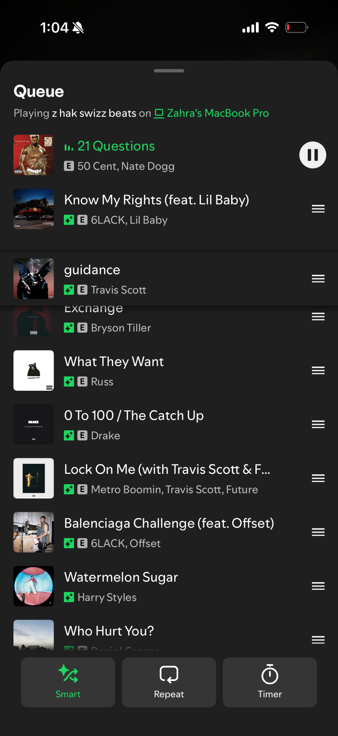
2. Slips: The Tricky Queue
The queue can be a sensitive thing, especially depending on the event, but it one “slip” to mess it all up. The process of moving a song around to the top or bottom of a queue requires a click and hold over three horizontal lines on the right. Once the user presses on these lines, the song becomes adjustable.
The issue with this, however, is that the icon to conduct this action is already small and off to the side. So, if the user taps anywhere else, that song will automatically begin to play. That’s not all! The queued songs that were intentionally curated before the selected song will vanish. The other issue with the queue is that a quick downward swipe can also be used to make the queue disappear. So if the user ambiguously swipes downwards, holding down for a second too long, the action can change up the queue when the user might be intending to just make the queue go away (and vice versa).
Although the design of the queue has improved significantly from before, in order to prevent these design “slips”, I think it would be worth considering adding constraints to limit the range of possibilities available within the queue. Should users even have the ability to play a song in the queue by tapping on it? Should there be another reinforcing action to ensure the action was intentional?
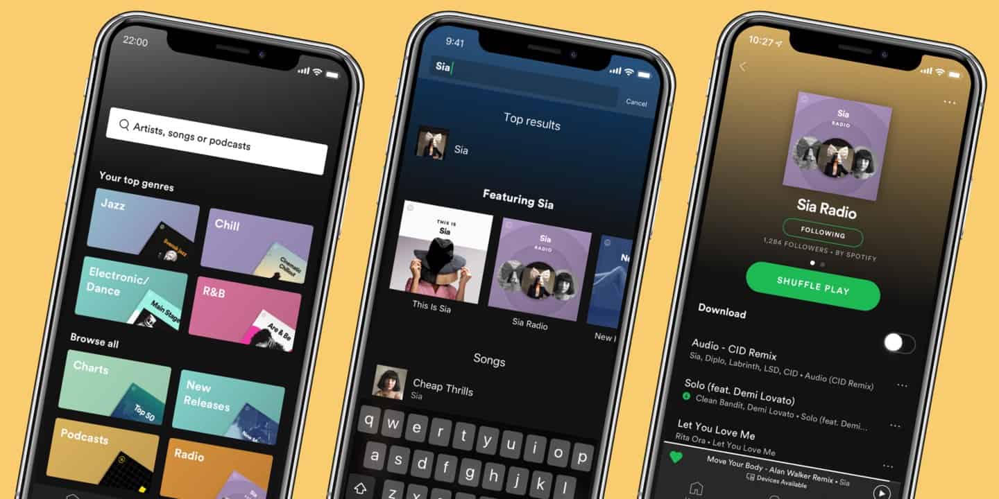
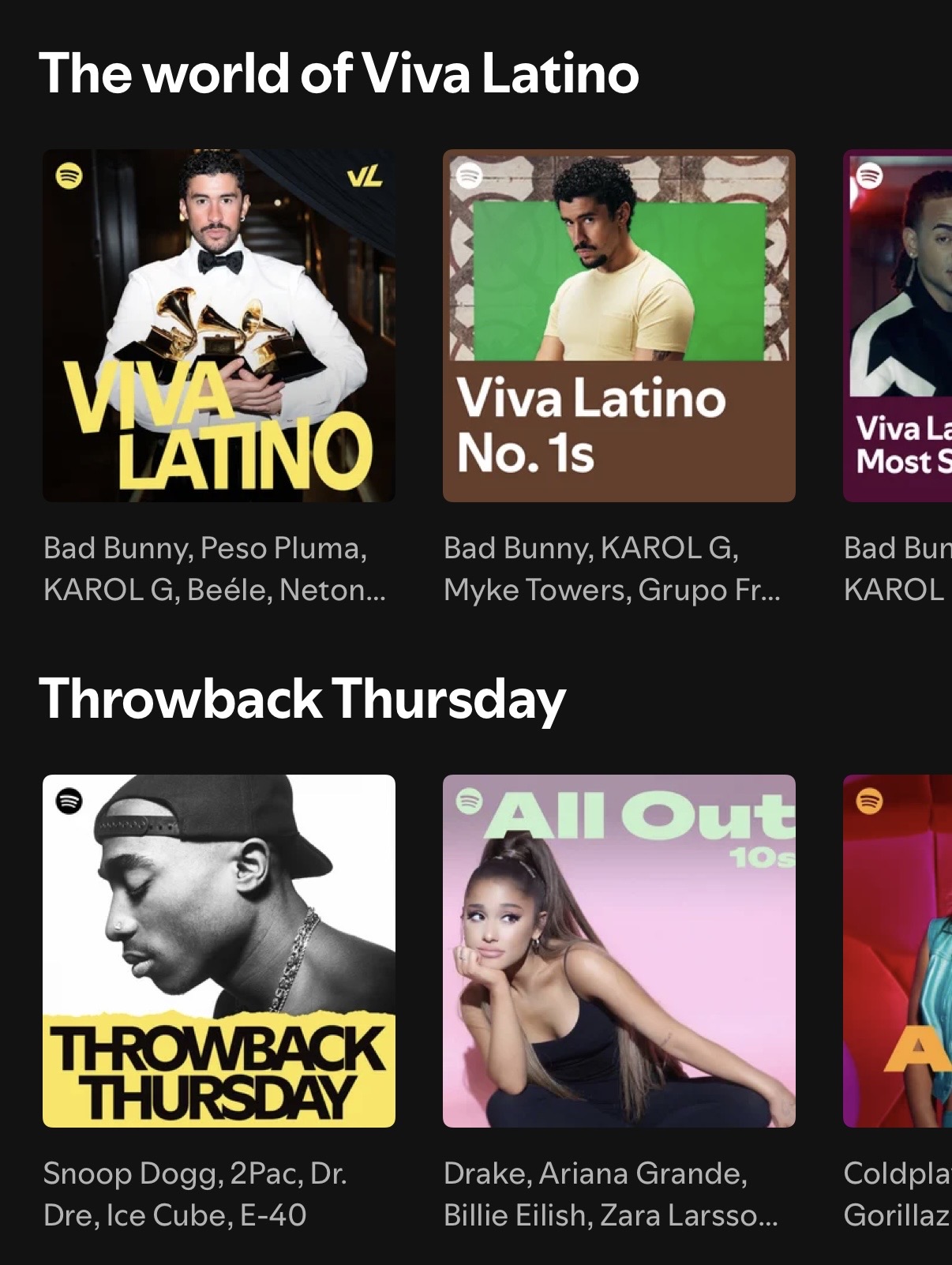
3. The Paradox of Choice: Information Overload
The first thing the user interacts with when they open the application is the home page. At first glance, it’s great! It has all the most recently played playlists/albums up top with a personalized mix and soundtrack session to follow. You would think that maybe that’s all, but no. It keeps going.
The rephrasing and rewording sections with labels that all mean the same thing is one part of the equation. The other part is the visual hierarchy. The two paired together diminish the app’s discoverability. Each section has the same size header with the same horizontal scroll over the same square-shaped graphics/icons. The mapping within the app with its sheer amount of similarly-presented information widens the gulf of execution and the gulf of evaluation, confusing the user when it comes to finding particular information or even knowing what they’re looking at.
To improve this home page, variability in text sizing (headings and subheadings) and graphics (shape and size) could help in differentiating categories and encouraging the user to understand the world of choice they have available with Spotify.
Conclusion
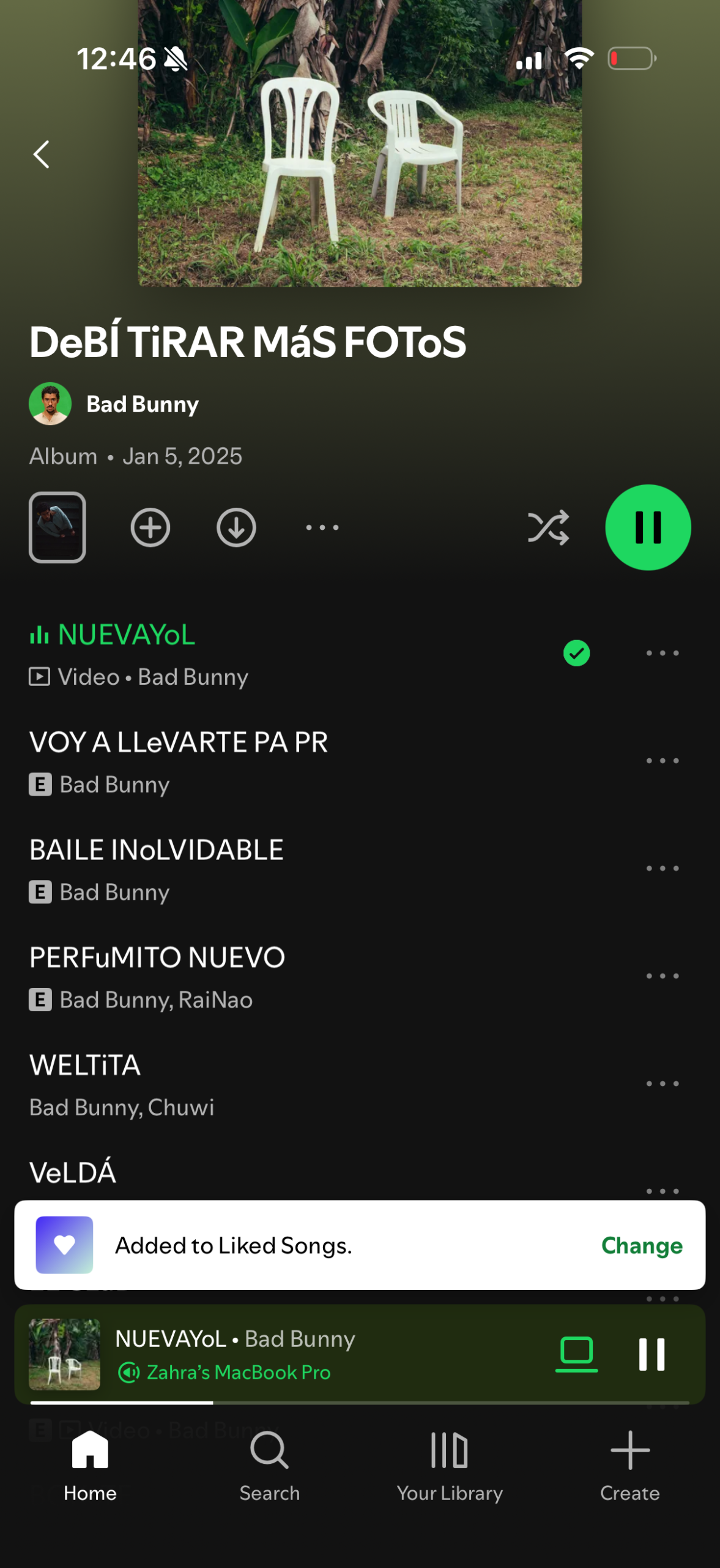
Although I ended up pointing out a few of the flaws that still exist in Spotify’s user interface, I actually realized how far it’s come from where it was. As I was toggling through it’s features, I realized a lot of things that once bothered me are a lot easier to use. The queue is much easier to navigate than what it once was, adding songs to specific playlists is also much easier, and the app does a good job of indicating completed/previous actions. Spotify listens to its users and the UI is proof of that.