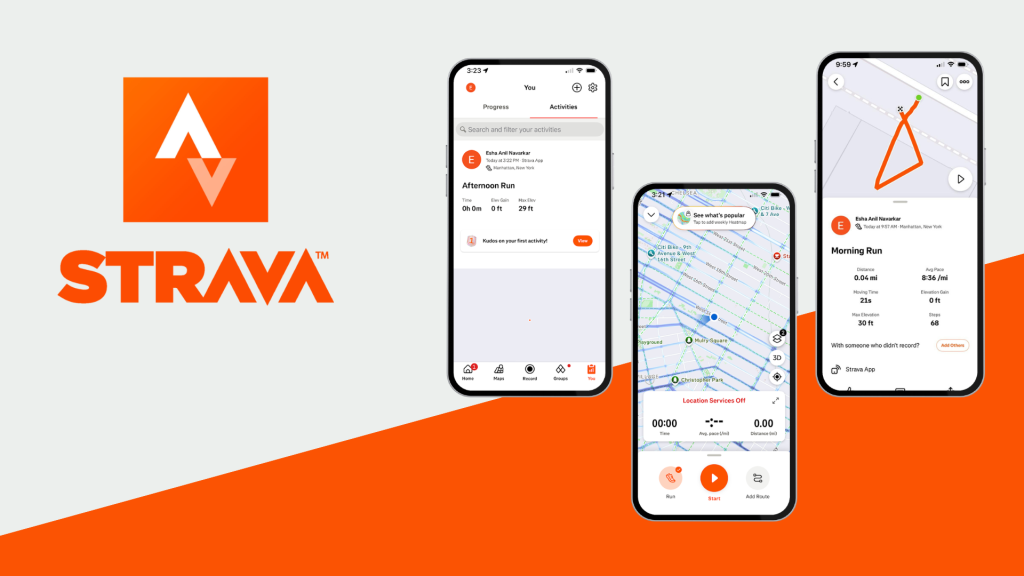
Strava is a performance centered fitness tracking app that transforms physical activity into measurable data rather than only recording workouts, it structures exercise around metrics, competition and visible improvement charts. For runners and cyclists who are motivated by progress tracking, personal records and social comparison this app provides a clear system for documenting effort and evaluating growth. At the same time, certain features assume prior knowledge and some tools are difficult to discover without exploration. Users who simply want effortless tracking may find themselves navigating features built for competitive athletes.
Strava’s Recording UX
The central recording interface in Strava provides a strong perceived affordance, it indicates that pressing the primary button will begin tracking an activity. There is little uncertainty about what action is possible. Once recording begins, it provides continuous feedback through live metrics such as time, distance, pace and heart rate. The user does not have to wonder whether tracking is active or functioning correctly, the interface constantly communicates its state. This feedback loop reduces the gulf of evaluation, the gap between perceiving system output and understanding what it means because performance data updates in real time, users can immediately adjust their behavior like increasing pace or slowing down. The mapping between effort and numerical feedback is natural and intuitive such as if you run faster, the pace metric reflects it instantly. In this context, Strava demonstrates strong visibility, feedback and alignment between action and outcome, making it an excellent example of effective interaction design.
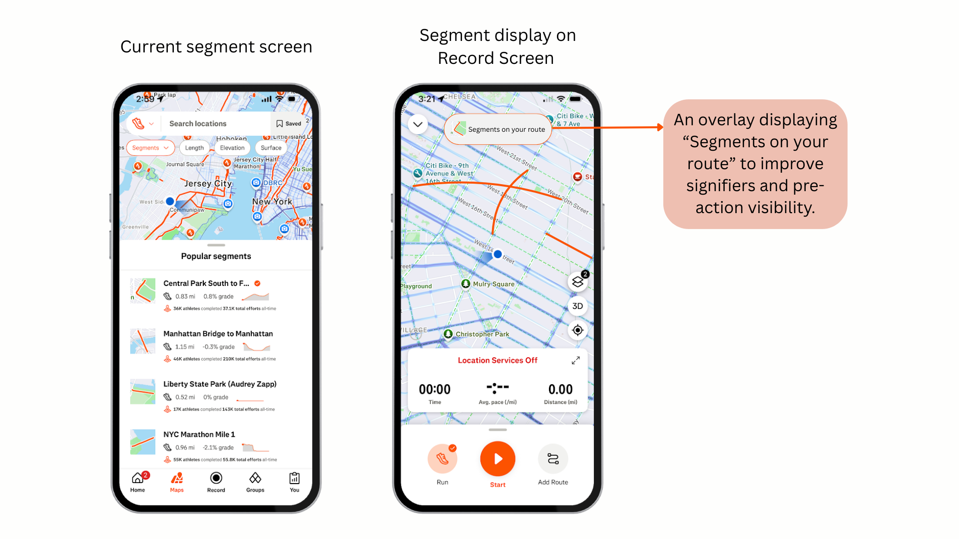
The Conceptual Model of Segments in Strava
Strava’s one of the most distinctive feature ‘segments’ reveals a complex usability challenge. Segments allow users to compete on predefined portions of a route, comparing their time against others. Functionally, this is a powerful motivational tool. However, for new users, the feature is not immediately discoverable. These segments are often encountered after completing an activity rather than before starting one. This creates a gulf of execution, users may want to compete or improve but the system does not clearly signal how to intentionally engage with that goal. According to Norman, a good conceptual model allows users to predict the effect of their actions. In Strava, the interface shows what the users see before starting their run just the route which is selected or just a live location does not clearly communicate that segments exist or will activate automatically. The conceptual model “you are entering timed competitions during your run” is not made visible at the right moment. As a result, engagement with segments feels accidental rather than intentional.
Solution: Clarifying Segment Discoverability
Instead of adding of new features, the redesign reframes the existing segment functionality to improve clarity and feedforward.
Introduce “Segments on your route” preview: On the record screen, visible route overlays would show upcoming segments before the activity begins. This strengthens signifiers and reduces uncertainty about participation.
Add pre-activity segment panel: A collapsible panel listing nearby segments with distance elevation information, reinforces the conceptual model that competition is route-based and automatic.
Provide Feedforward messaging: Microcopy such as “Segments activate automatically when you cross the start point” reduces the gulf of execution by clarifying how the system behaves.
Enhance In-activity feedback: A subtle banner announcing “segment starting in 100m” will strengthen visibility of system status and create anticipation.
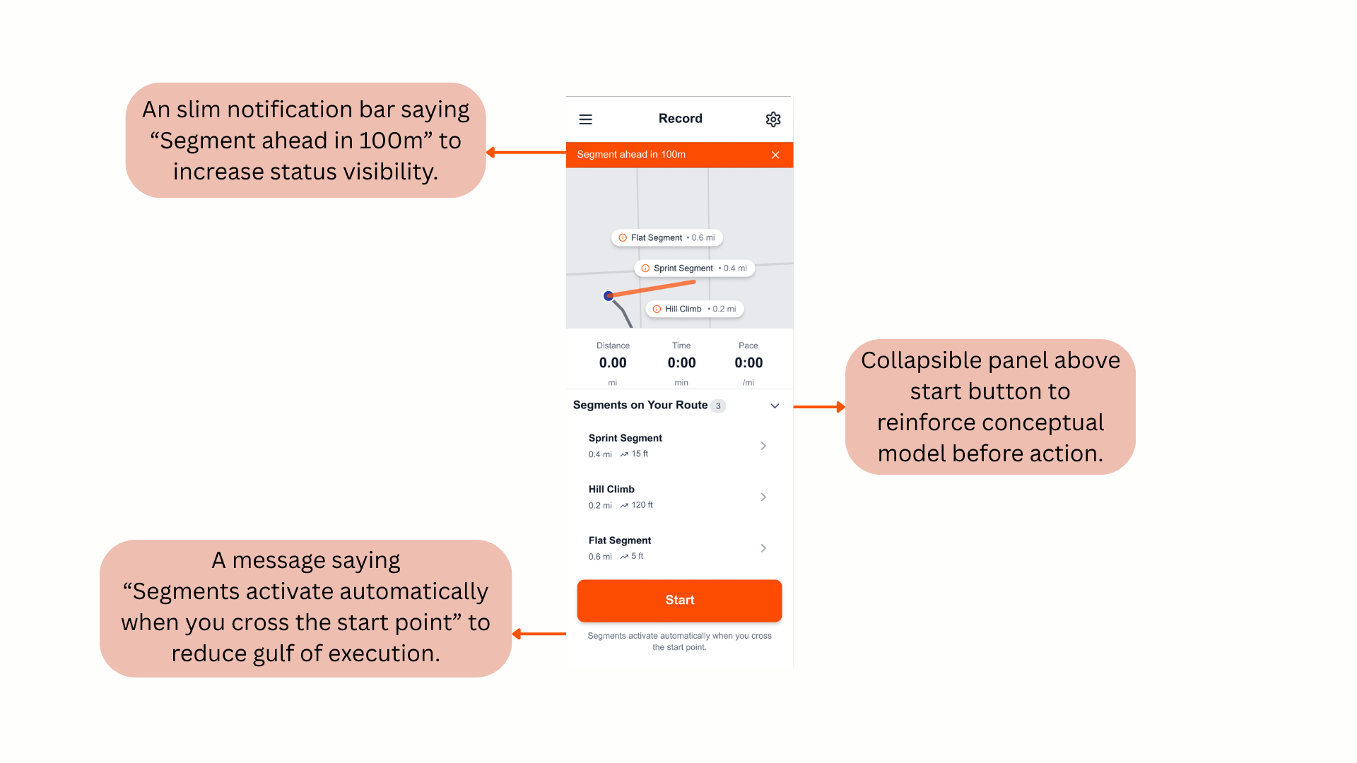
By adding particular signifiers, feedforward, visibility and conceptual model alignment will support intentional participation rather than accidental discovery.
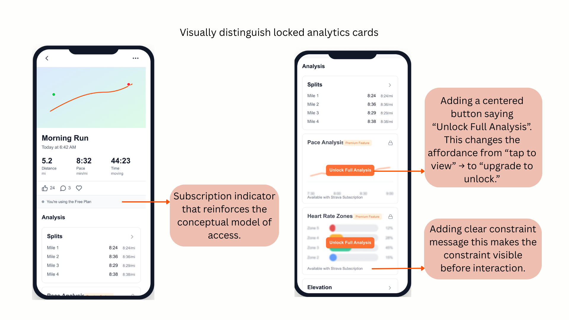
Premium Constraints and False Affordances
Strava’s premium feature where certain analytics appear available but become inaccessible only after interaction. This creates a false affordance. Good constraints should guide behavior before effort is invested, not after. When a user attempts to access deeper analytics and encounters a paywall, the experience increases friction and disrupts the trust. A clearer constraint system that visually distinguishes locked features before interaction that would align expectations with system capabilities and reduce the user frustration.
Strava as a Motivational Artifact:
From the perspective of How Artifacts Afford, Strava does more than just tracking exercise. It shapes behavior.
What it allows: Users can measure progress, compare performance and build competitive motivation. It affords goal-setting, discipline and social-accountability.
What it constraints: Strava gives the privilege of measuring activities like running and cycling and quantifiable success. Casual movement or non-competitive fitness becomes less visible within its structure.
Social Impact: The app promotes communities and shared motivation but also reinforces performance hierarchies. Leaderboards and public comparisons redefine exercise as competition rather than personal well-being. Strava encourages persistence, improvement and achievement but it is not neutral. Its design frames fitness as something to optimize and compare.
Conclusion
Strava demonstrates application of Norman’s principles in its recording flow, feedback systems and data mapping. But there are a few inconsistencies in segment discoverability and premium constraints reveal gaps between system image and conceptual model. By clarifying feedforward, strengthening signifiers and making constraints visible earlier, it could improve usability without compromising its performance-driven identity.