
Strava is a fitness application that allows users to record, analyze, and share physical activities. While Strava can function as a standalone recorder, my experience with the app is shaped by the fact that I use it with a Garmin watch. Because activity recording happens on my watch, Strava primarily serves as a space for reviewing metrics and using it as social platform with friends who record activities as well. This caveat is important, as it directly affects my mental model of the app and my design critique for Strava. Using concepts from Don Norman’s The Design of Everyday Things, this evaluation examines how Strava’s interface supports and sometimes conflicts with this mode of use.
Recording-Centered Design
Strava’s main navigation includes several key buttons, one of which is the Record button (Figure 1). It demonstrates clear affordances and signifiers through its familiar “record” icon, found on other devices, and its placement at the center of the navigation bar, both of which indicate that it can be tapped to start an activity. Because the Record button is widely recognized from other apps and devices, it provides knowledge in the world, allowing users to understand its function immediately without needing instructions. For users who record directly in the app, this supports the gulf of execution by making the correct action discoverable and easy to perform by the user.
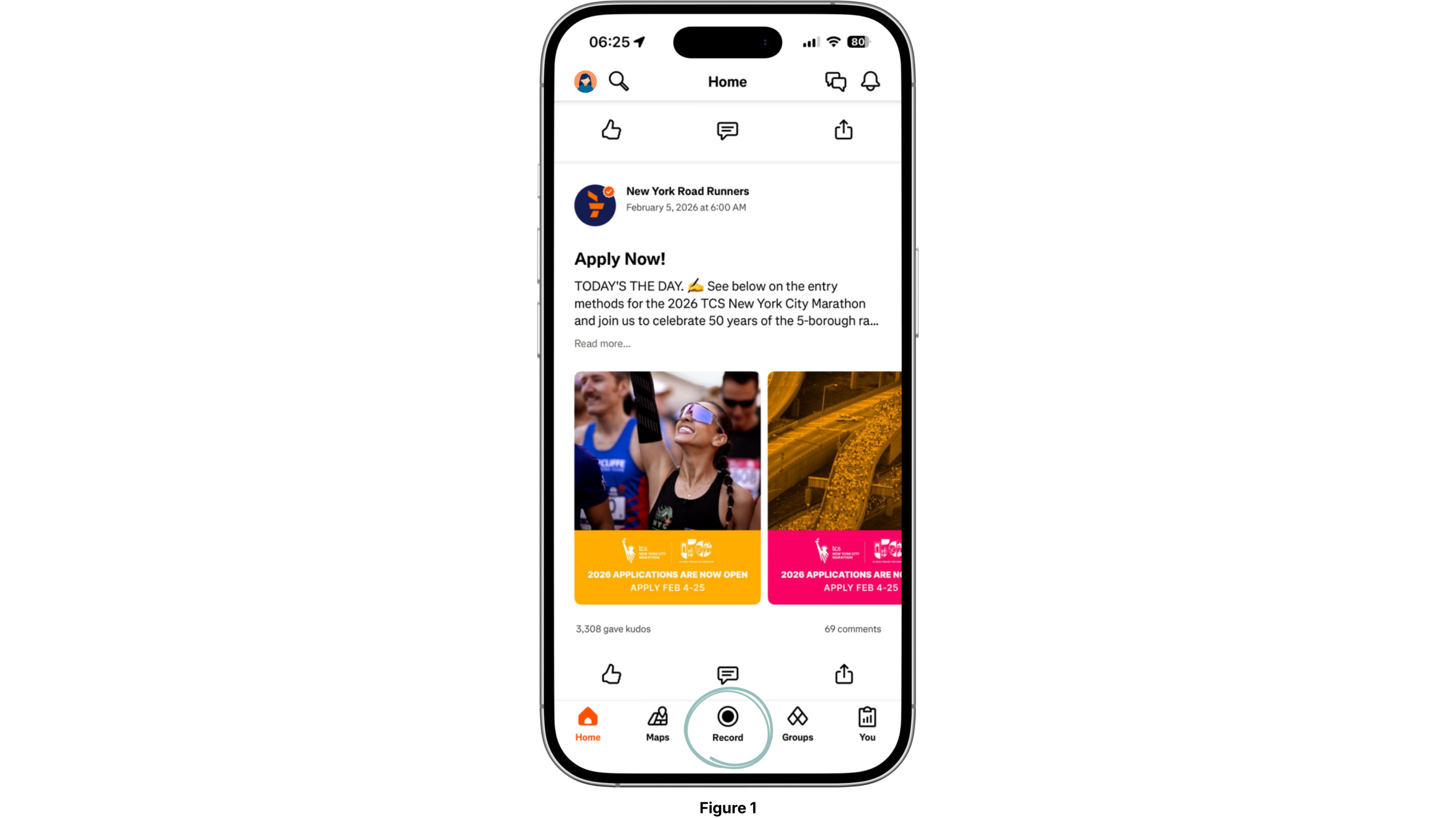
However, for users who use a connected watch, recording is no longer the primary goal. In this context, the Record button remains visually dominant but functionally irrelevant. While the affordance is still clear, it no longer aligns with user intent, forcing users to mentally ignore one of the interface’s prominent elements. This increases cognitive load and reveals a mismatch between the system’s conceptual model and the user’s mental model.
Recommendation: Strava could allow users to customize or reorder navigation elements so that the most relevant actions, such as reviewing recent activities or analyzing metrics, are prioritized over recording. This would better align the system image with user intent.
“Home” vs. “You”
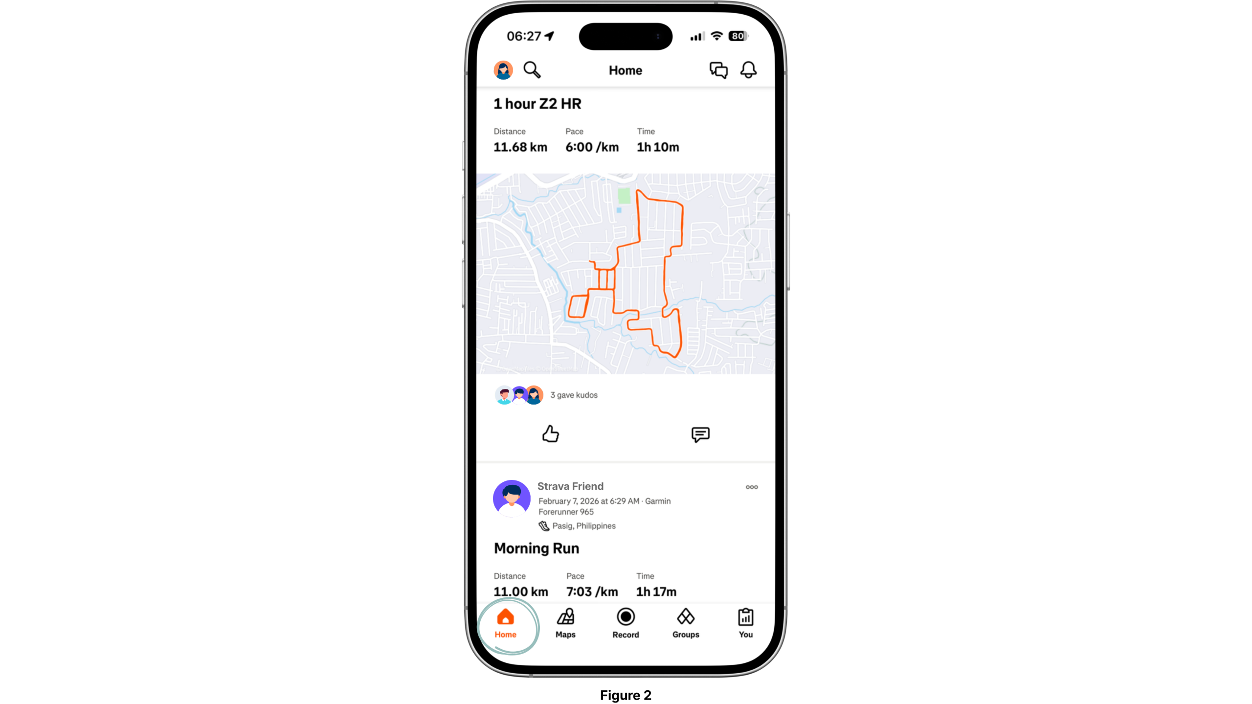
Strava’s bottom navigation plays a significant role in shaping how users interpret the app. The Home tab functions primarily as a social feed (Figure 2), displaying other users’ activities and interactions. As a label, Home acts as a signifier that supports a social media conceptual model, which is similar to platforms where shared content is the primary focus.
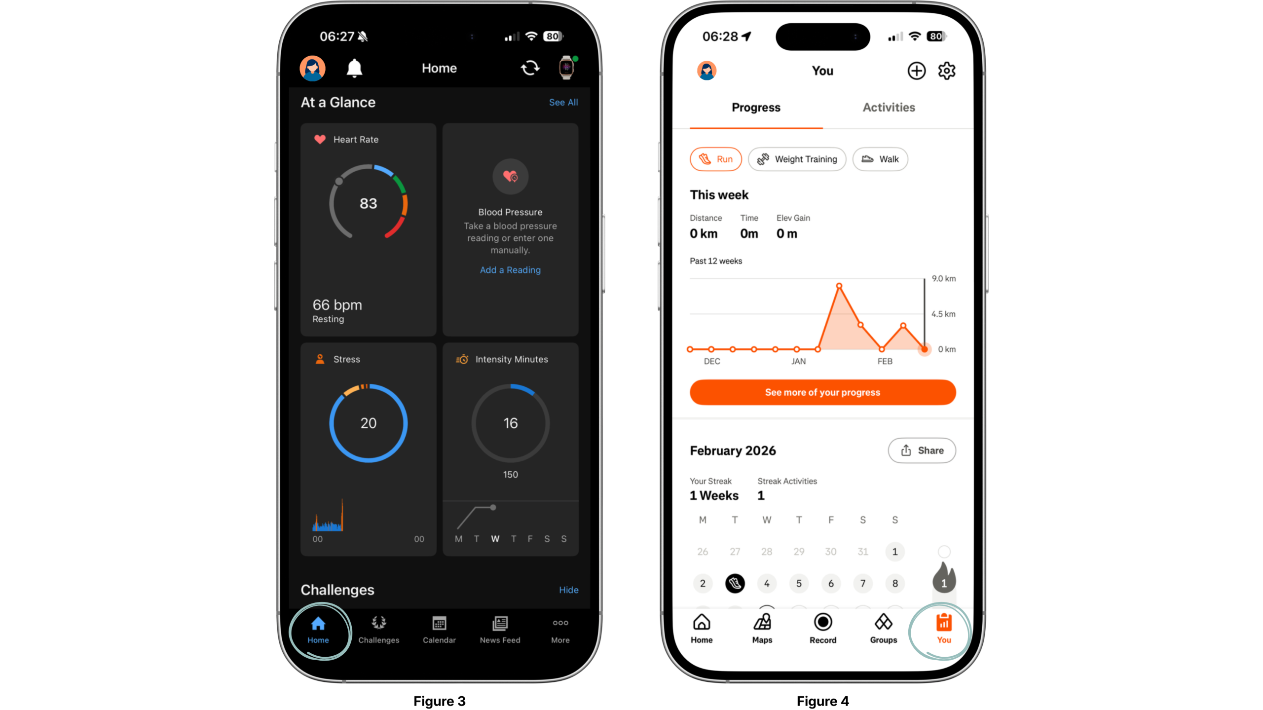
This differs from apps like Garmin, where Home typically centers on personal metrics and performance summaries, reinforcing a self-tracking mental model (Figure 3). In Strava, those personal metrics are instead located under the You tab (Figure 4). Although You does function as a personal dashboard, the distinction between social and personal spaces requires users to learn Strava’s specific conceptual model through use, especially if they have previously used other fitness tracking applications.
Overall, this structure demonstrates thoughtful mapping where Home aligns with social behavior, and You aligns with self-reflection. However, there is a minor breakdown in clarity. The You section is accessible both through the bottom navigation and via the profile icon in the upper left, creating redundancy that can blur the relationship between navigation elements and their outcomes (Figure 5).
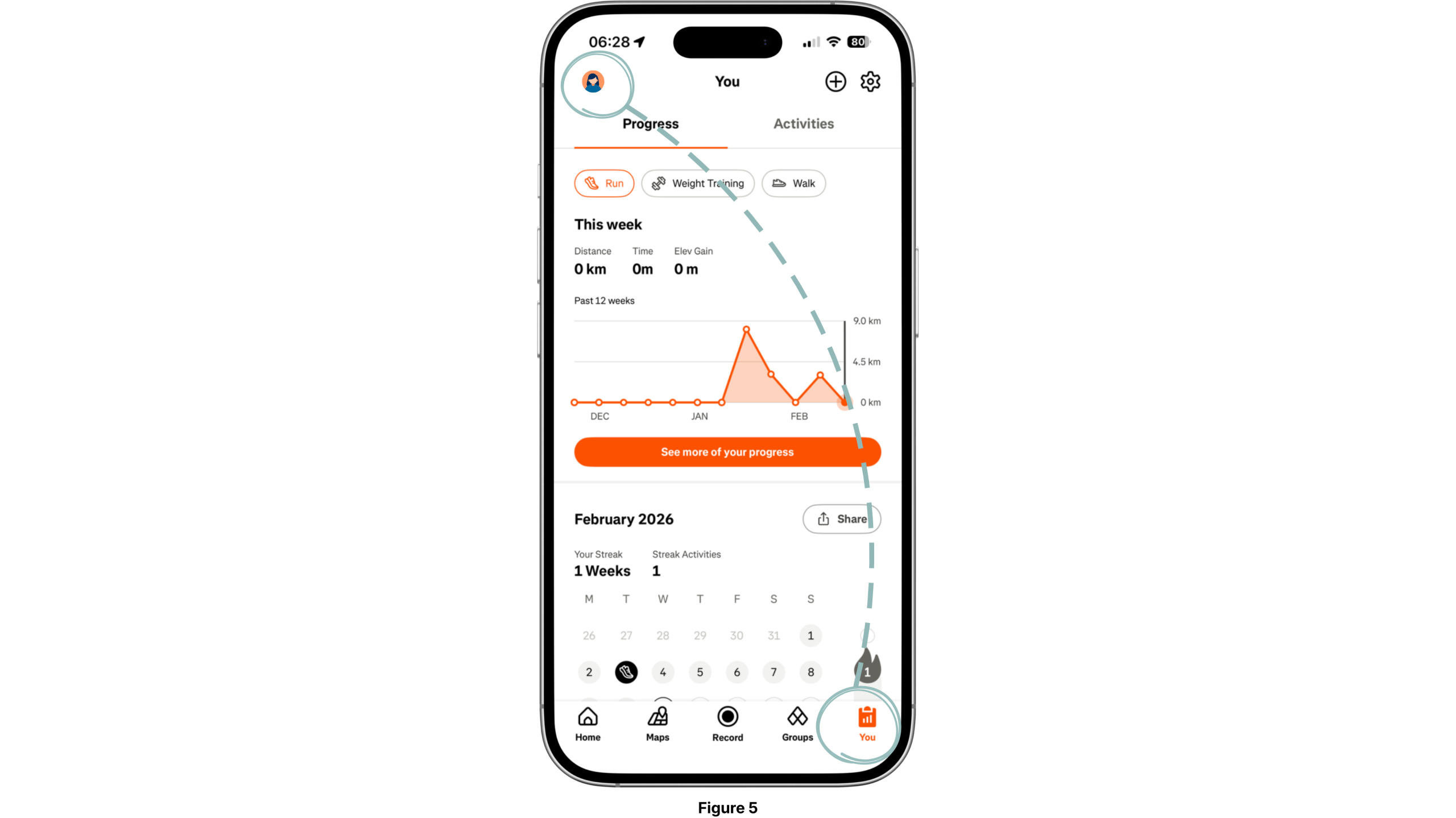
Recommendation: Replacing the “You” icon in the bottom navigation with the user’s profile photo would strengthen signifiers and improve natural mapping. This would visually reinforce that the tab leads to personal data and identity, while also eliminating redundancy with the profile icon in the top-left corner.
Watch Data and Strava Metrics
Strava often shows slightly different results such as distance, pace, elevation, heart rate etc. (Figure 6), compared to native watch apps like Garmin (Figure 7). For example, a 5 km run recorded on a watch may appear as 4.97 km in Strava. This happens because Strava applies its own analysis on the raw data uploaded from another device.
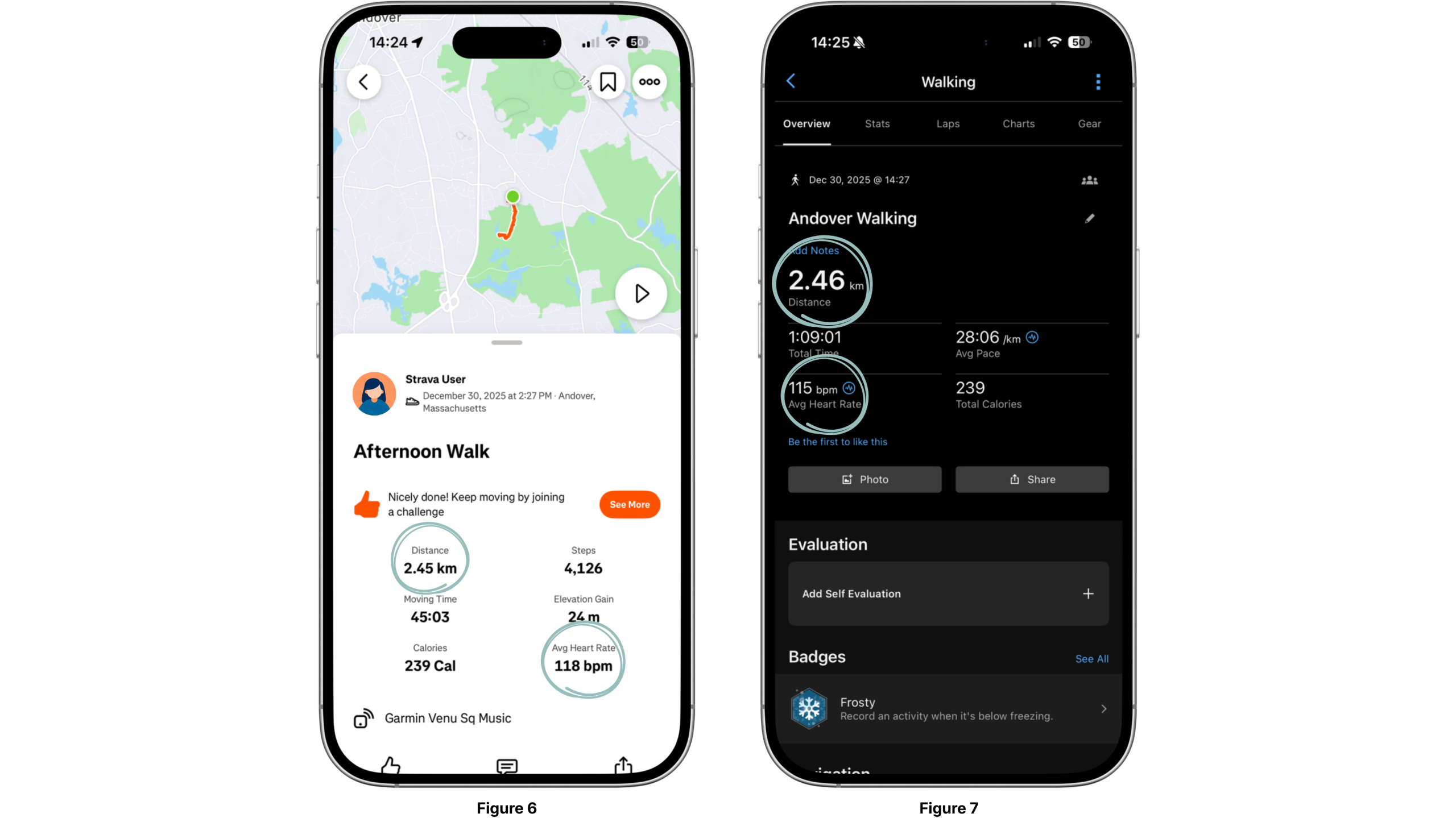
From a Norman perspective, this creates a gulf of evaluation: the numbers displayed in Strava do not always match the user’s mental model formed by the watch metrics. Interestingly, repeated discrepancies can subtly influence user behavior. Runners may consciously run slightly farther to ensure Strava records a “full” 5 km, and because Strava is a social platform, displaying a round or aesthetically pleasing number can be motivating and enhance social visibility.
Over time, this pattern highlights how the feedback and reflective layers of the interface influence behavior beyond simple comprehension. While some users may initially feel frustrated, others adapt, turning the discrepancy into a motivational tool rather than a source of learned helplessness.
Recommendation: Strava could provide a brief signifier or note explaining how metrics are adjusted during upload. This would help users interpret differences between the watch and Strava more accurately while preserving the motivational and social benefits of rounded numbers.
Privacy Defaults
Automatically synced activities can also introduce user mistakes, particularly around privacy. Activities may be shared publicly by default, even when the user’s intent is only to review imported data. These are not simple slips, but errors enabled by insufficient constraints in the privacy controls for activities (Figure 8).
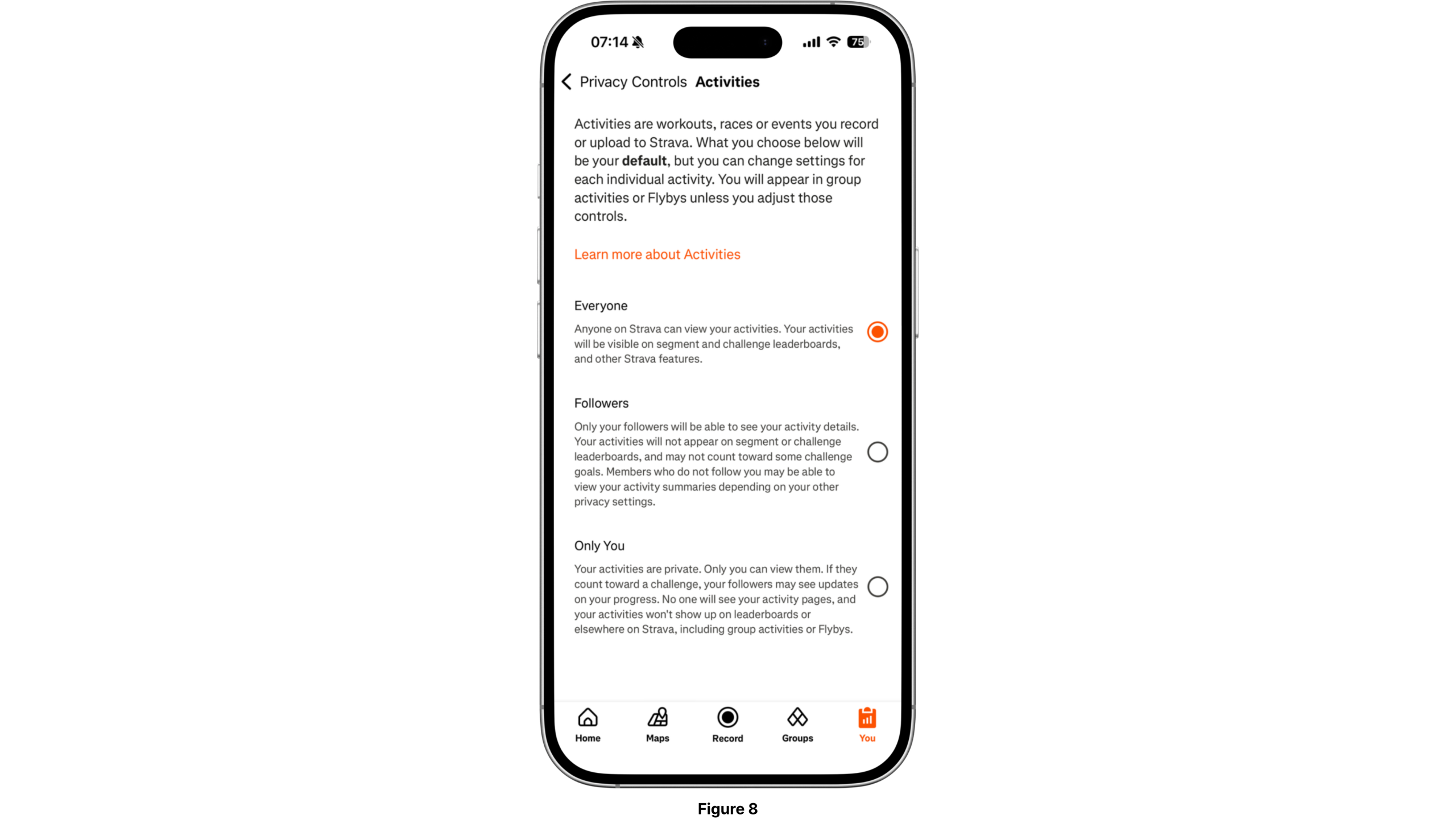
Recommendation: Stronger logical constraints, such as having the option to confirm each activity before publicly sharing imported activities, would prevent these mistakes and align with Norman’s emphasis on error prevention over error recovery.
Conclusion
Although Strava is a single application, it supports multiple modes of use that shape users’ mental models in different ways. When Strava is used alongside a connected watch, its role shifts from recording tool to reflective and social platform. Don Norman’s concepts, particularly mental models, signifiers, mapping, feedback, and constraints, help explain why design choices that work well in one context may introduce friction in another. Recognizing and designing for these differing mental models would allow Strava to better support the full range of its users.