
Substack works best as a straightforward, creator-focused publishing platform that prioritizes direct communication with readers. Instead of emphasizing algorithms, viral reach, or advertising revenue, it centers on email distribution and subscriber relationships. For writers who value independence and want control over their content and audience, Substack offers a simple, accessible way to publish and monetize their work.
At the same time, its minimalist design can be limiting. Users seeking rapid audience growth, detailed analytics, or advanced marketing and automation features may find the platform lacks these capabilities. As a result, many creators supplement Substack with other tools, such as social media, SEO strategies, or external marketing platforms, to expand their reach and strengthen audience development.
Substack Subscriber UX
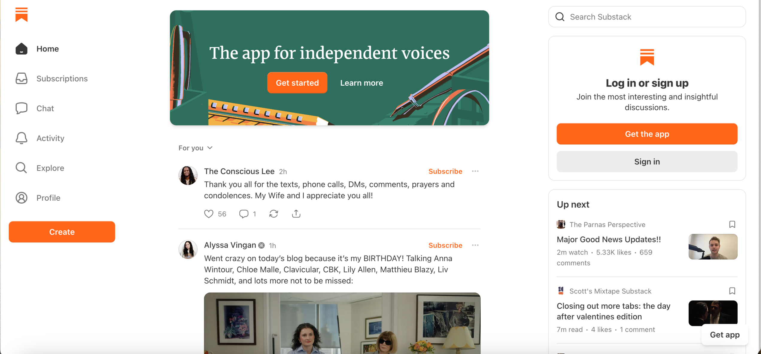
One of the clearest examples of Don Norman’s design principles on Substack’s homepage is the use of its bold orange buttons (e.g., “Get started”, “Get the app”). Through a Norman lens, these buttons function as powerful signifiers by visually communicating where action should take place. Their high contrast against the otherwise minimal interface immediately draws the user’s attention, reducing uncertainty about what to do next.
The buttons also demonstrate strong mapping. When a user clicks “Get started,” the outcome is direct and predictable as they are taken into the account creation flow. This clarity narrows the gulf of execution, the gap between wanting to act and knowing how to act. The system makes the next step obvious. Additionally, the consistent use of orange for primary actions creates a visual constraint system. By reserving that color for key actions, Substack reduces cognitive overload and establishes a clear hierarchy. Users don’t have to evaluate multiple competing buttons because the interface guides them toward the intended path.
From Norman’s perspective, the orange buttons are not just stylistic branding choices. They are carefully designed behavioral cues that make action visible, understandable, and easy to execute, creating a hallmark of good design.
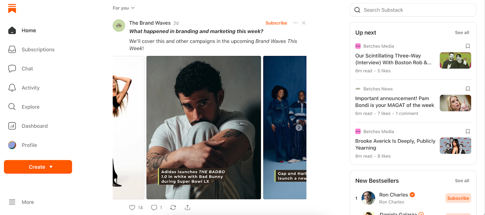
Once you log in to Substack, the homepage shifts from a marketing page to a personalized feed. At first glance, it resembles a social media timeline with posts stacked vertically, short-form Notes interspersed with newsletters, and recommended content mixed in. While visually familiar, this layout subtly shifts the conceptual model away from Substack’s core identity as an email-first newsletter platform.
Don Norman reminds us, “a good conceptual model allows us to predict the effects of our actions.” If the interface looks like a social feed, users may unconsciously expect algorithmic virality and engagement, rather than curated email subscriptions. The system image, or what users see, no longer aligns with the actual conceptual model.
Mockup Solution: Clarifying Substack’s Inbox
Rather than introducing new features, this redesign reframes Substack’s existing content to emphasize its publishing purpose. By doing so, the interface more clearly communicates Substack’s core identity, reduces user confusion, and aligns expectations with the system’s actual functionality.
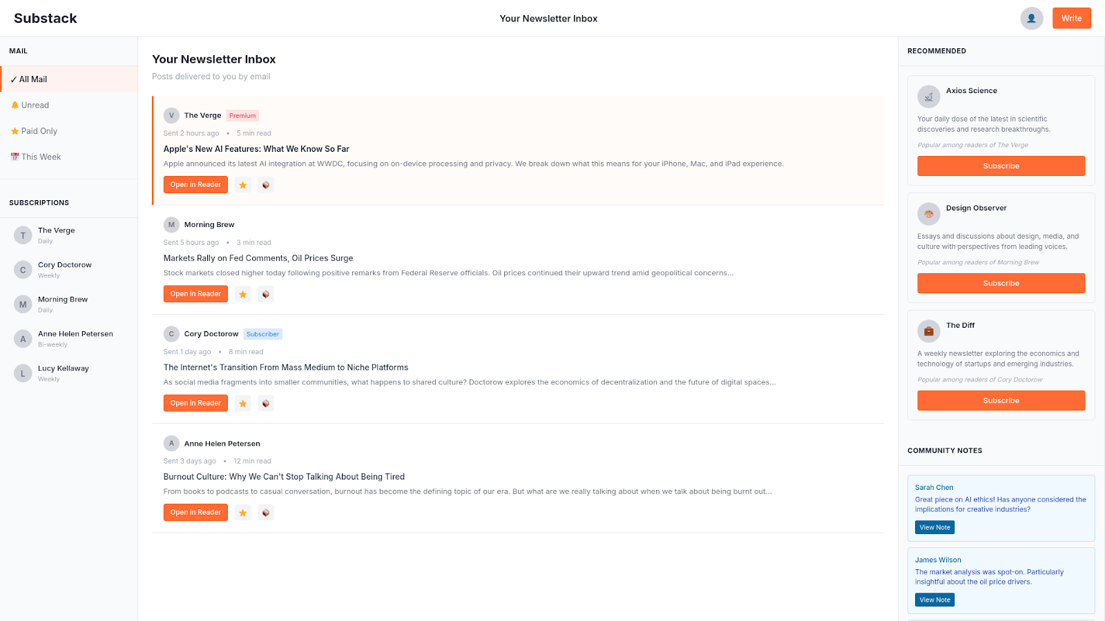
Rename “Home” to “Your Newsletter Inbox”: This simple change signals that the space functions as an inbox, reinforcing the platform’s intended conceptual model.
Show Email Delivery Status: Each newsletter card displays timestamps like “Sent to your inbox 3 hours ago”. Making this system behavior visible helps reduce the gulf of evaluation, allowing users to quickly understand what content is new.
Introduce Inbox Filters: Filters such as Unread, Paid Only, and This Week mirror familiar email patterns, minimizing the learning curve and leveraging users’ existing mental models.
Separate Sections Clearly: Structurally dividing Subscriptions, Recommendations, and Notes ensures that different content types are visually distinct. These constraints guide interpretation and reduce potential confusion.
Explain Recommendations: Contextual notes like “Popular among UX designers” provide immediate feedback about why content appears, increasing transparency and user understanding.
Highlight Commitment Actions: Primary actions such as Subscribe or Write remain visually prominent as orange buttons. This maintains hierarchy without overwhelming the interface.
By applying these principles, the redesign creates a more intuitive and coherent experience, helping users navigate Substack with confidence while reinforcing the platform’s newsletter focused identity.
Substack Creator UX
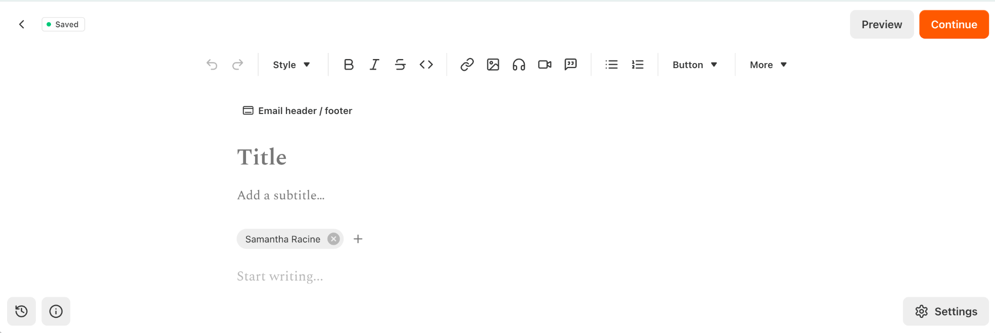
Finally, Substack’s article editor is clean, simple, and distraction free, allowing creators to focus on writing immediately. Features like auto save and a prominent Publish button provide essential feedback, keeping users informed about the system’s status. Yet, through a Norman lens, some design challenges become apparent. The editor has minimal constraints, offering few safeguards against errors such as empty titles, broken links, or oversized images. Additionally, many advanced tools and media embedding options are hidden behind subtle icons, making them less discoverable.
While Substack excels at simplicity, applying Norman’s principles highlights opportunities to enhance clarity, improve feedback, and prevent errors, making the writing experience even more intuitive and reliable. By applying Norman’s principles such as clarifying the conceptual model, enhancing feedback, introducing subtle constraints, and making affordances more visible, Substack could improve usability while maintaining its minimalist, creator-focused approach. For designers and educators, Substack serves as an instructive case study in balancing simplicity with clarity, highlighting both the strengths and the limitations of minimalist interface design.
Bonus: How Artifacts Award Analysis
What it allows: Writers have full control over their content, can monetize through subscriptions, and build direct relationships with readers. It’s a platform that empowers independent, niche, and professional writing outside traditional media gatekeepers.
What it constrains: Substack makes discoverability a challenge and depends on its own infrastructure, meaning writers are tied to its rules and design. Content formats are mainly text-based, and success often relies on regular, audience friendly writing.
Social impact: Substack fosters closer author-reader connections and small topic focused communities, but subscription paywalls can limit access and create economic divides.
Substack’s design encourages autonomy, entrepreneurship, and niche engagement but it also subtly shapes what “successful” writing looks like. It’s a powerful tool, but not a neutral one.