Introduction
Subway Time is a mobile app that uses data from the MTA to predict the arrival times for subways in NYC. It has over 14,000 reviews on the App Store, making it one of the most popular transit apps used in the city. The app is designed for simplicity so that users can focus on getting to their destination.
Feature #1: Shortcuts
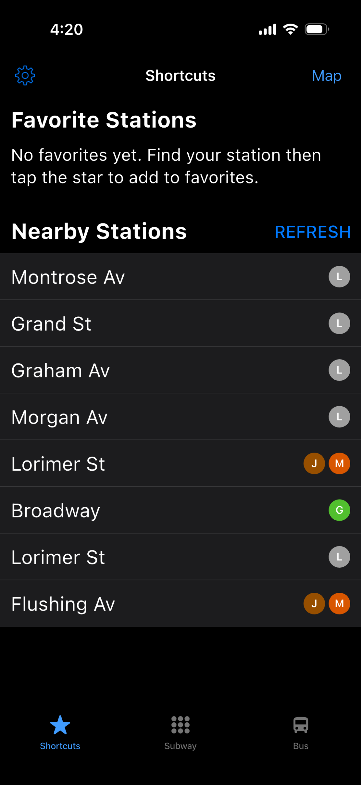
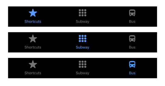
The app immediately takes the user to the “Shortcuts” tab. The navigation bar on the bottom screen uses natural mapping. It gives a clear idea of what pages will appear when a user taps the icons. Since the user is on “Shortcuts,” the icon is blue, and the other icons are gray, which provides clear feedback that the user is on the corresponding page.
What Works:
There are clear signifiers on this page. The blue “REFRESH” text and “Map” text signifies the user to tap to refresh the nearby stations and open the map respectively. The blue icons and text affords tapping to change the state of the page. The settings icon also employs knowledge of the world, as many apps have the settings page to be designed with the gear icon. The stations also require knowledge in the head, as the user may need to recall the stations that are near their location. The instructions to add your favorite stations bridges the gulf of execution with clear instructions.
What Doesn’t:
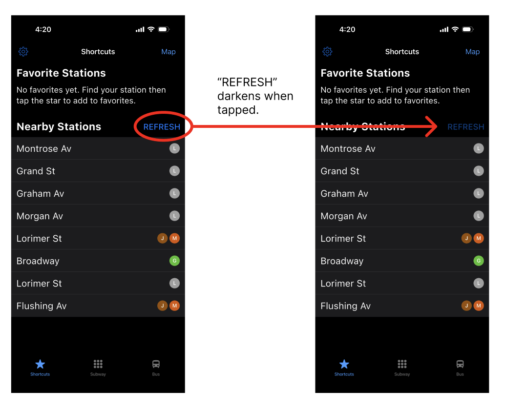
Unlike the settings icon and Map text, which provides feedback when these are tapped, when “REFRESH” is tapped, there is no feedback as to whether or not the text is tapped. This creates a gulf of execution, as the user will not know if the REFRESH text is tapped unless the stations change when the user moves to a different stop.
Solution:
REFRESH should change to a darker color when it is pressed, and return to its original color when the user releases their finger, giving the user feedback that the text has been pressed and released.
Feature #2: Subway
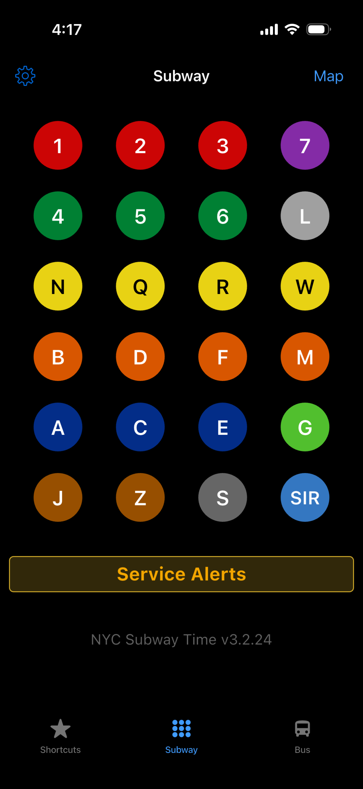
What Works:
This design is effective in that it uses both knowledge in the world (different colors for different subway lines) and knowledge in the head (memorizing the subway lines). The screen also shows a logical constraint, that each circle corresponds to one subway line, while also taking advantage of a conceptual model: the system image (circles) look like buttons that can be pressed (user model).
What Doesn’t:
When the user taps on a subway line, there is potential for a slip. Users with smaller hands might have trouble reaching across the screen while navigating the subway station and accidentally tap on a line that is the same color with the incorrect letter or number.
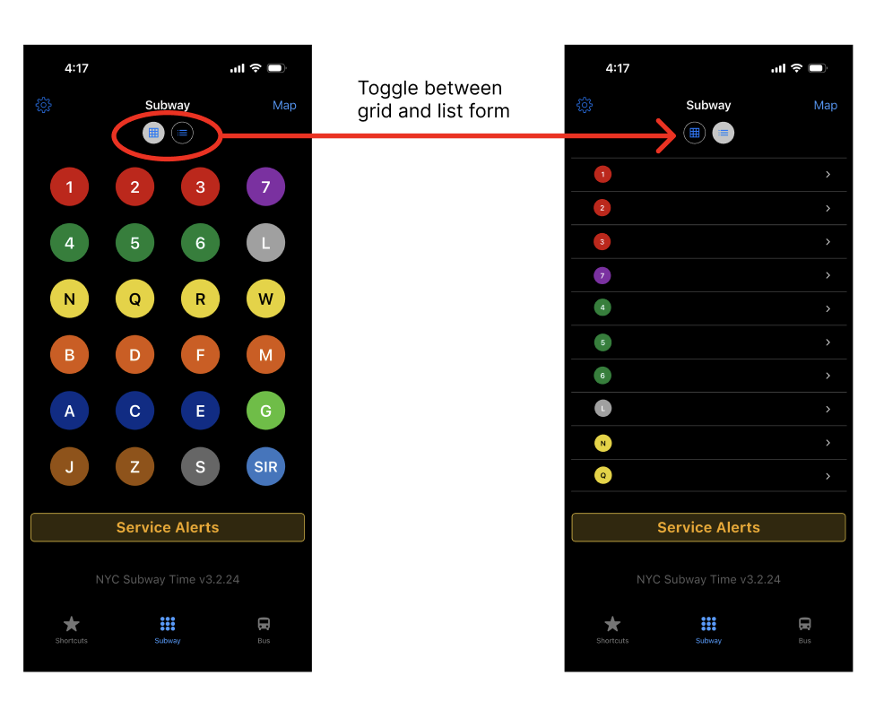
Solution:
One solution would be to offer an alternative display format. In addition to the current layout of the subway page, the subway lines could be presented as a list so that users with smaller hands could select the station without reaching over the screen. The user then can toggle between the grid and list format.
Feature #3: Map
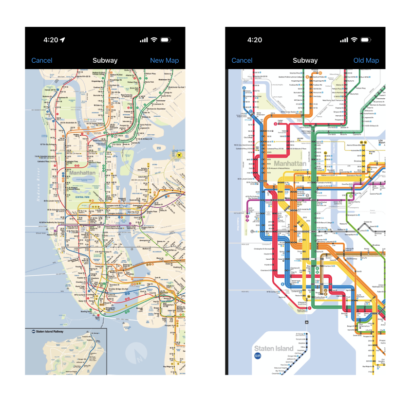
What Works:
The map is easily discoverable; since parts of the map is hidden from the screen, users can pinch to zoom in and out. The “New Map” text affords tapping, and provides clear feedback when the screen switches to the new map and the text changes to “Old Map.”
What Doesn’t:
Users may experience a gulf of evaluation when using this map. The map appears overwhelming and the user might experience learned helpenessness when finding the correct subway line for their station and become frustrated.
Solution:
A feature for users to show and hide individual subway lines would make the map page more useful. This would bridge the gulf of evaluation and help users understand the NYC subway system while finding their desired line. This would also reduce the chance of learned helplessness, if users focus on visualizing one subway line at a time.
Conclusion
Subway Time contains designs that are helpful and clear, with room for improvement. Overall, this app does a great job in providing clear signifiers and affordances, making the experience of finding the correct subway efficient. However, the app could be improved with bridging both the gulf of evaluation and execution in several features as well as acknowledging and fixing slips. Nevertheless, the simplicity of Subway Time makes it a useful app for regular subway riders.