
Design Critique: Too Good To Go (iOS App)
By Annie Huang / February 9, 2026 / Design Critique
Too Good To Go is a mobile app designed to reduce food waste by connecting users with surplus food from local vendors at discounted prices, and has become a widely adopted platform for everyday sustainable consumption. This critique focuses on the order confirmation and pickup workflow, which is the most crucial part of the entire user experience.
Step 1: Before Ordering — Why Users Feel Confident Enough to Commit
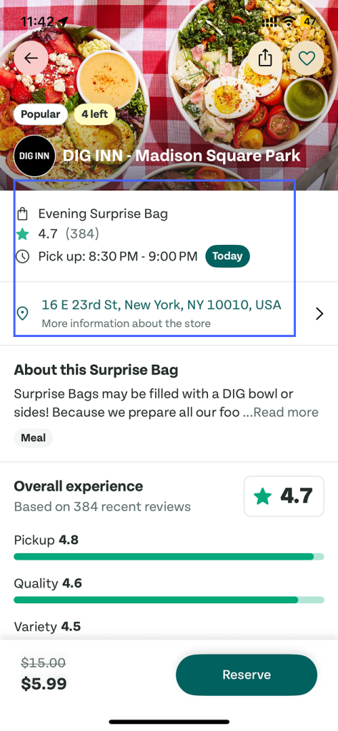
Figure 1
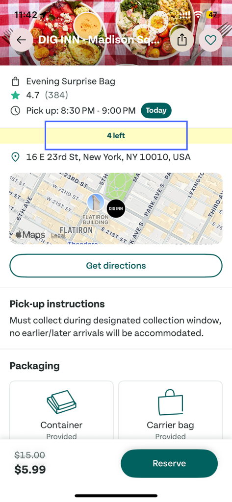
Figure 2
The application supports users before they place an order by making key decision-making information highly visible . Pickup time and location are clearly presented(Figure 1), and the number of left remains accessible as users scroll, appearing in a persistent hover position at the top of the screen(Figure 2).
Users are more willing to take action when the system makes the consequences of that action easy to evaluate. By clearly communicating detailed information, these designs reduce decision uncertainty. This reflects visibility and signifiers, allowing users to accurately form a mental model of what will happen if they proceed.
Step 2: After Ordering — A Lack of Feedback During the Waiting Period
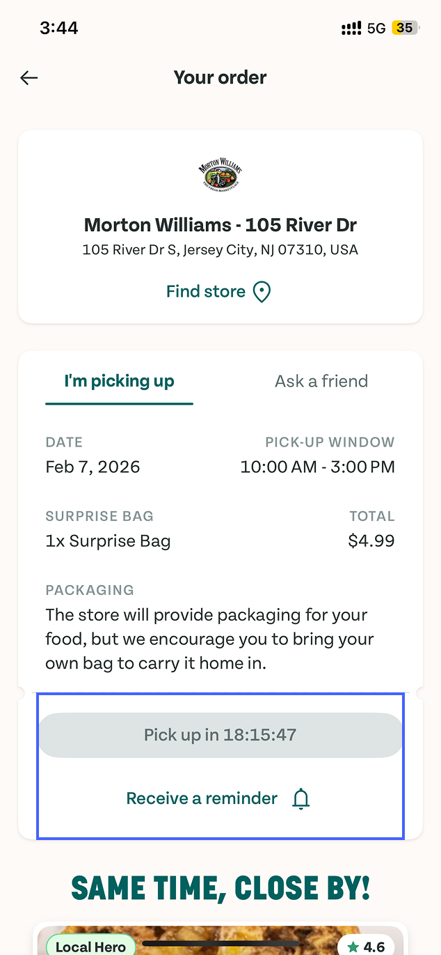
Figure 3
After an order is placed, users can revisit their order and view detailed information. At this stage, the pickup button is disabled with a countdown indicating when pickup will become available. During this waiting period, the reminder option is the only actionable element on the screen(Figure 3). This design effectively applies constraints to prevent users from picking up too early, and the button clearly communicates what actions are not yet available.
However, the system doesn’t indicate whether the vendor has accepted the order, started preparing, or is ready for pickup. This creates a Gulf of Evaluation, as users lack sufficient information to assess the current state of their order.
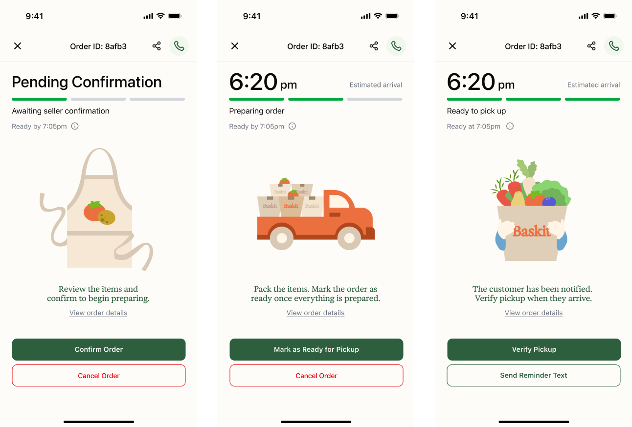
Figure 4
In our team’s previous project, Baskit, we added simple status updates and timeline to address a similar issue(Figure 4). Applying the same approach here could improve clarity and trust during the waiting period.
Step 3: During Pickup — Supporting Clear and Deliberate Action
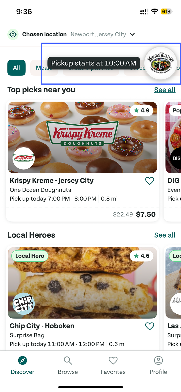
Figure 5
During pickup, the most recent order appears as a floating shortcut with a small prompt that shows the pickup time(Figure 5). This system has visibility by bringing the most time-sensitive information to the surface instead of forcing users to dig through pages.
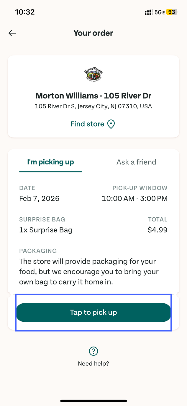
Figure 6
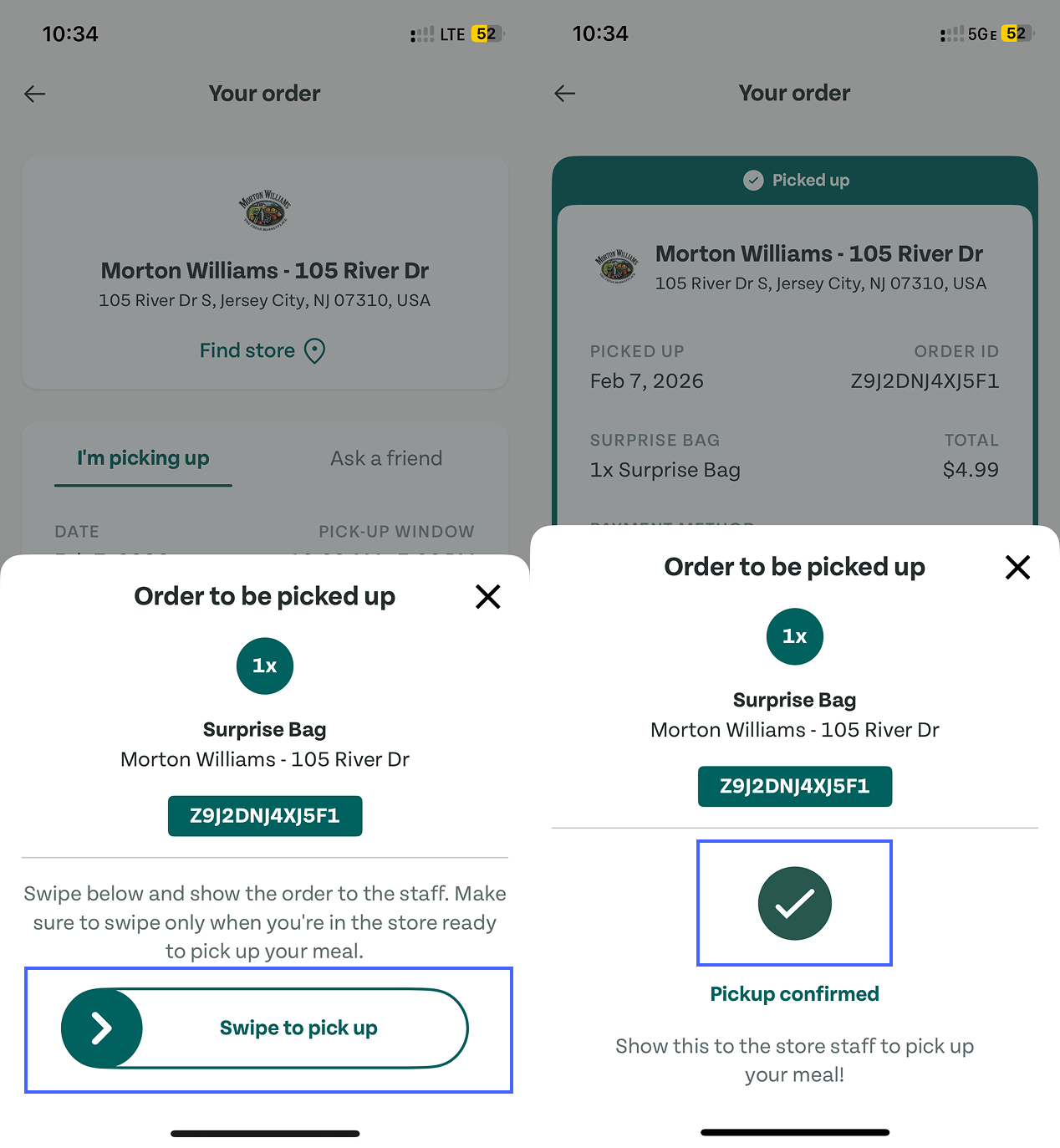
Figure 7
Once you arrive, the interface uses a highly obvious primary CTA “Tap to pick up” button(Figure 6), so the user doesn’t have to guess what to do next. Tapping it triggers a bottom sheet, revealing the order ID and an explicit instruction to complete verification by swiping(Figure 7).
This swipe interaction is a combination of signifiers and constraints. The arrow and swipe affordance guide the gesture, while the required swipe reduces accidental taps, which is an example of designing against slips. Besides, it also reinforces the app’s conceptual model: pickup is a confirmable handoff, not just a screen you show to staff.
Step 4: After Pickup — Looking Back at Past Orders
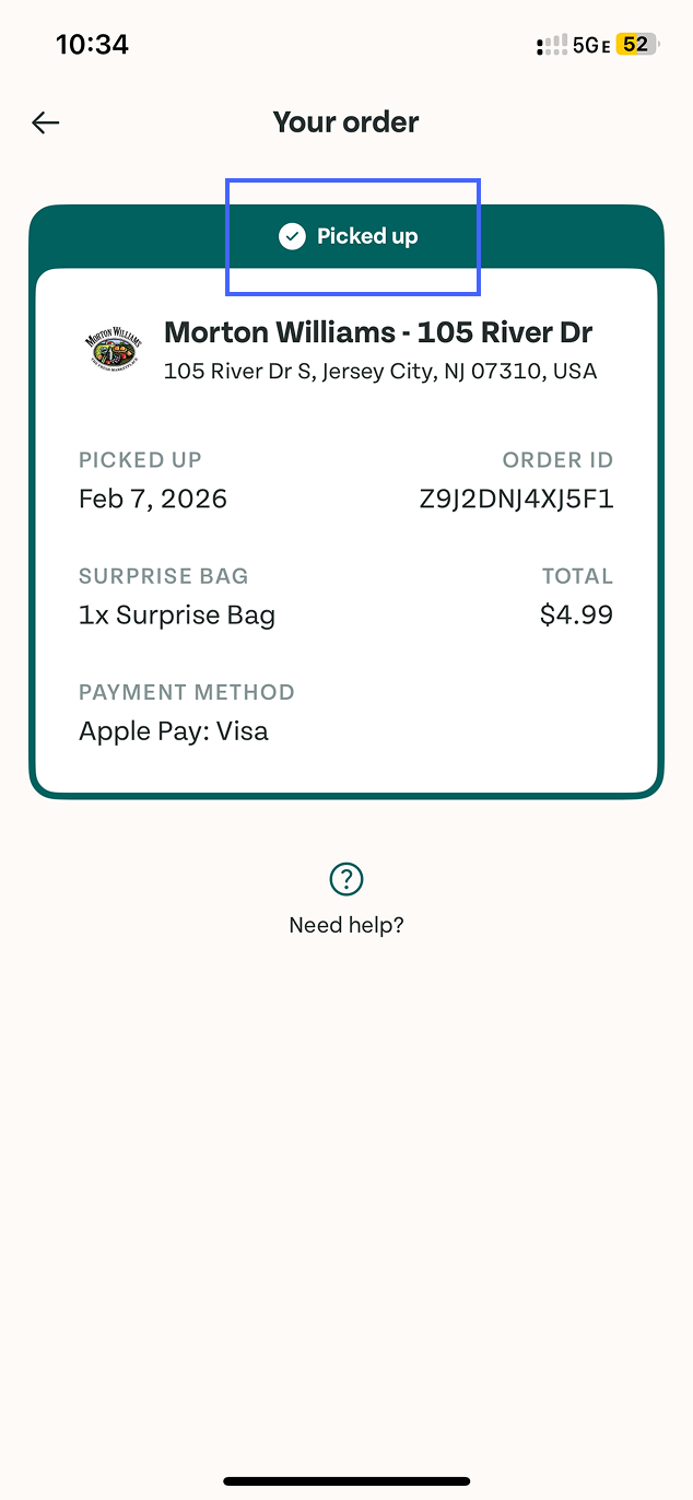
Figure 8
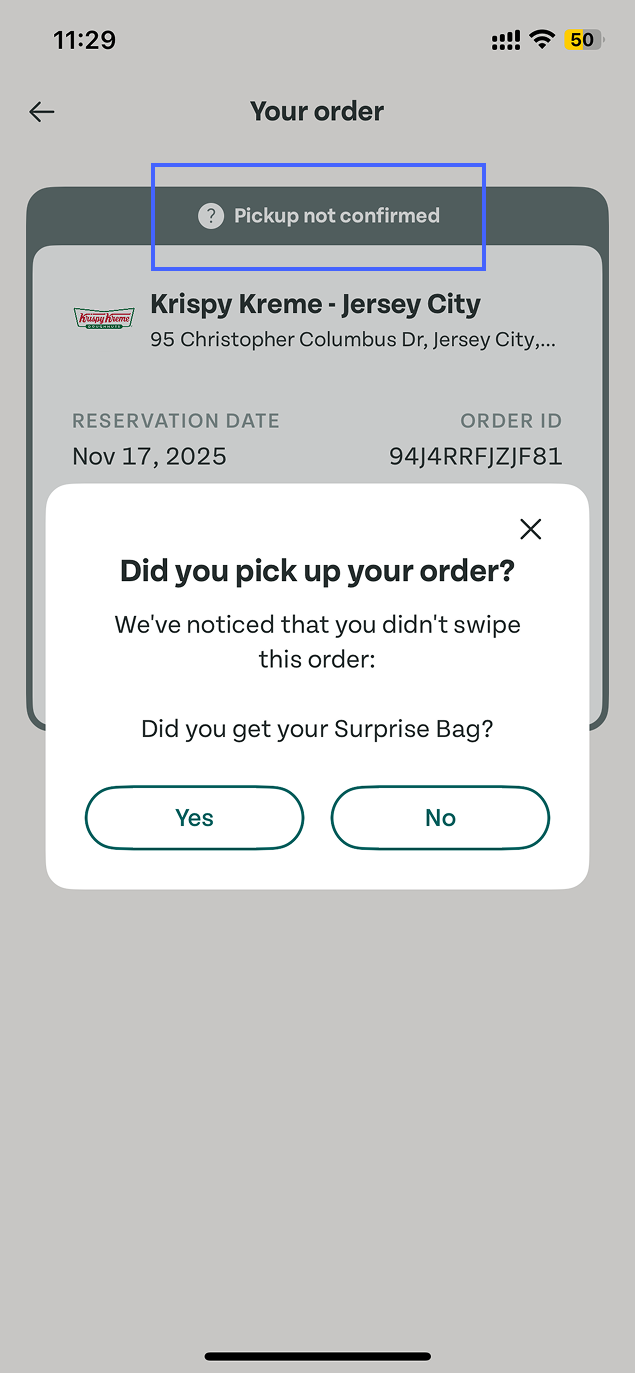
Figure 9
When a pickup is completed, the corresponding order card is marked as “Picked up”(Figure 8). In contrast, if a pickup cannot be verified in the app, the order card displays a “Pickup not confirmed”, accompanied by a confirmation pop-up(Figure 9). This distinction is an effective feedback which helps avoid the Gulf of Evaluation, making it easier for users to understand whether their intended action was successfully carried out.
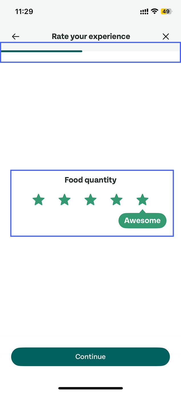
Figure 10
In addition, the app includes a pickup experience rating feature that invites users to reflect the process. The flow consists of multiple questions, guided by a progress indicator that shows how many steps remain(Figure 10).
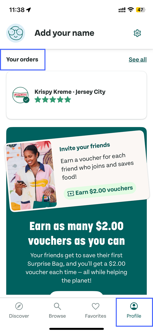
Figure 11
If users want to review past orders, navigation becomes a challenge. Order history is located within the Profile section(Figure 11). However, “Orders” is not a function closely related to personal identity. Placing order history inside Profile reflects a mismatch in mapping between the system’s structure and users’ mental models. Separating “Orders” from Profile would better align the conceptual model with user expectations.
Conclusion
Overall, Too Good To Go supports users in completing the ordering and pickup process smoothly, and the workflow is functionally complete. However, the system doesn’t always provide continuous confirmation. Improving feedback, clarifying key cues, and better aligning structure with user expectations could help reduce uncertainty and make the experience feel more reassuring.