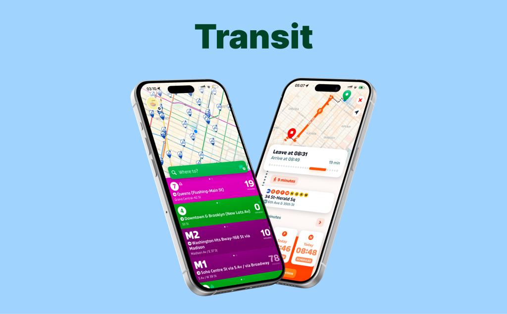
Transit is a mobile app that helps people commute around their city using public transportation. The app provides transit arrival time, alerts for delays and disruptions, suggested routes from point A to B, and allows users to compare transit options and save their favorite trips. For this critique, I evaluate the Transit app through the lens of a novice user trying to find the fastest route from home to work or campus.
Onboarding flow
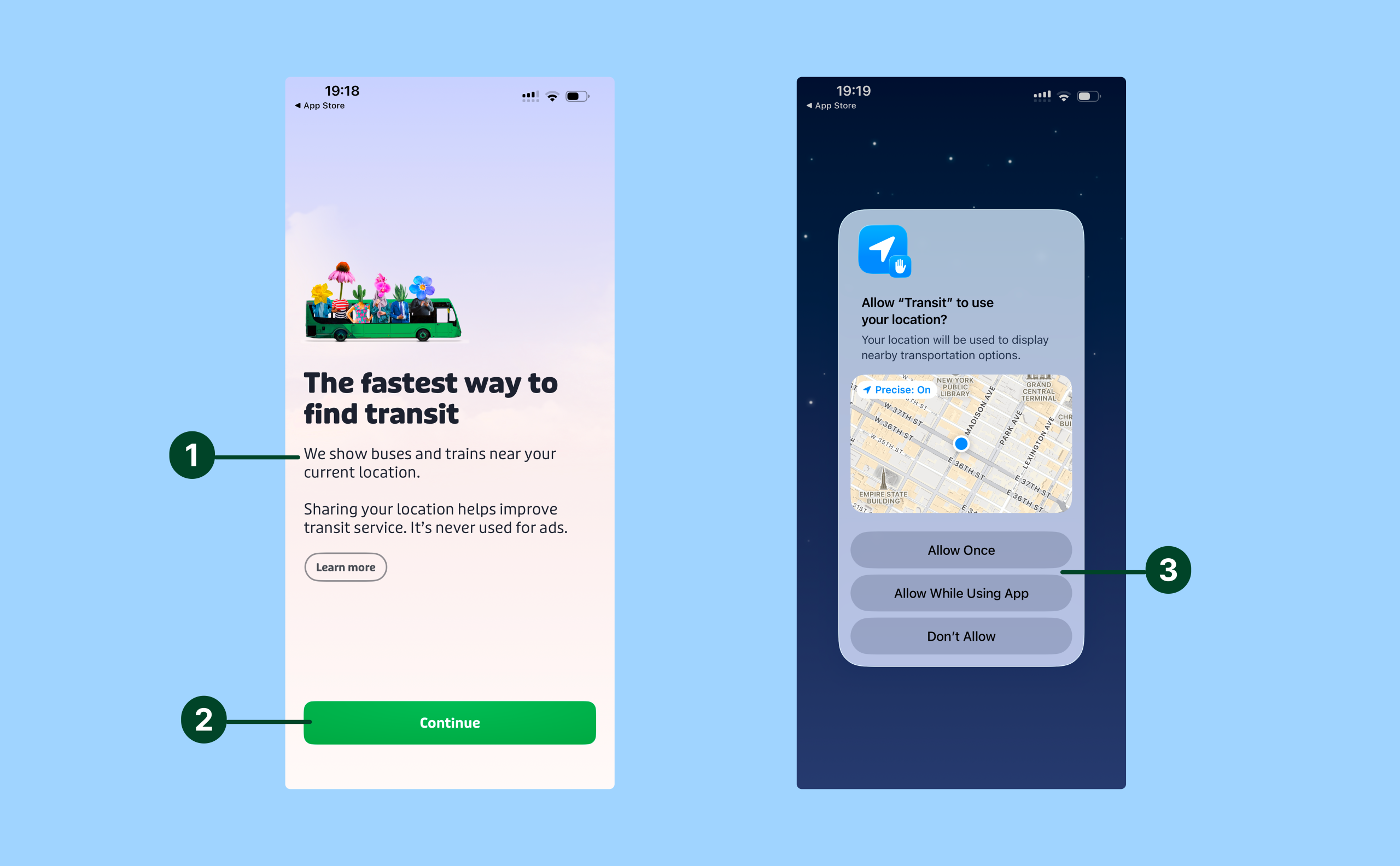
Transit’s onboarding flow is a quick two-step flow that is easy to understand because it establishes the app’s conceptual model immediately. The message “we show buses and trains near your location” tells the user what the app is for (finding nearby transit) and how the app will do that (by using your location) (1). The large green “Continue” button is a strong signifier that supports discoverability and reduces the gulf of execution by making the next action obvious to the user (2). Tapping the button triggers the familiar iOS location sharing pop-up, which provides immediate feedback and constrains the decision to three clear choices (3). The interface encourages location sharing by presenting the two “allow” options before “don’t allow”, thus making the preferred action easier to perform whilst still giving the user a choice.
Home screen
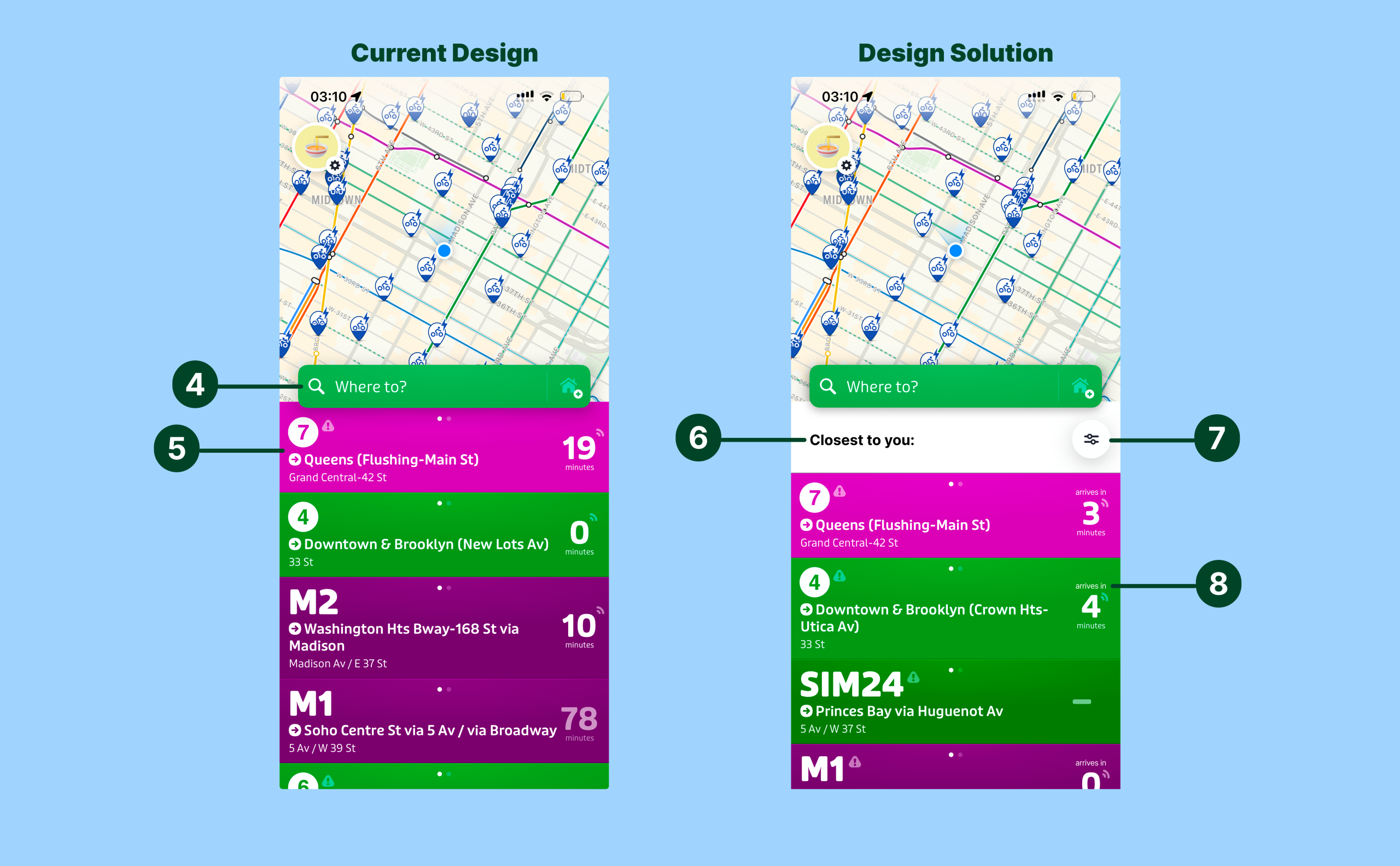
Transit’s home screen starts strong on discoverability and natural mapping. The large green “Where to?” search bar acts as a clear signifier for the user’s core task (find a route to work / college) and narrows the gulf of execution (4). The list of cards for nearby transport options below the search bar also leverage mapping well by using each line’s real-world color (e.g., the subway’s 7 line is purple and so the card for the 7 train is also purple) which supports quick recognition and shifts effort for the user from knowledge in the head to knowledge in the world (5).
Where the screen becomes confusing is interpreting how the list of cards are sorted. The card list seems to be sorted from transport options closest to the user’s location but there is no signifier to indicate this. Adding a simple headerlike“closest to you” above the card list would improve visibility and narrow the gulf of evaluation(6). Similarly, there is no option to filter the transport options by mode (e.g. uber, subway, bus) meaning users must scroll and manually sift through options under time pressure which widens the gulf of execution by making the next step less obvious (7). Lastly, the “X minutes” label on the cards is ambiguous, does this mean “arrives in X minutes” or “X minute walk”? Adding a signifier like “arrives in” to clarify what the time refers to could reduce the chance of slips and narrow the gulf of evaluation (8).
Selecting the trip destination
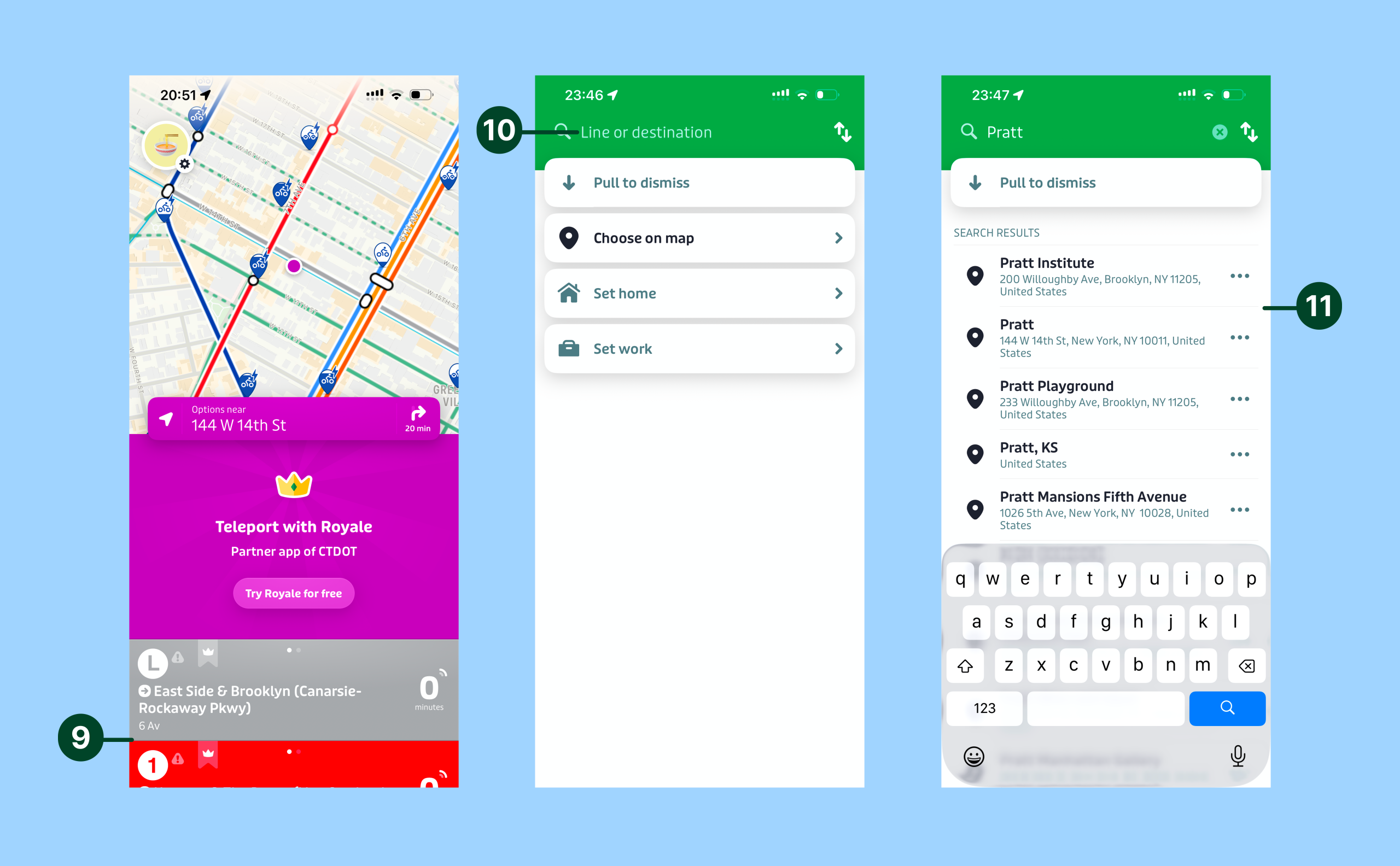
From the home screen Transit offers two main methods of selecting a trip destination – manually inputting where you want to go in the search bar or tapping a destination on the map. The biggest conceptual mismatch shows up on the map: a first-time user may tap a destination expecting the card list to show transport options to reach that destination, but the app returns transport options near the destination instead (9). This map interaction differs from users’ conceptual model of what they expect to happen when tapping a destination on a map, especially if they have used other map interfaces like Google Maps so this could be confusing for users. To prevent confusion after the map tap, two options “Routes to here” and “Transport near here” could be shown to the user and after the user selects one then the transport options can be shown accordingly. This would reduce the gulf of execution andevaluation, as the user would immediately know what action to take next and have relevant feedback after the interaction, hence they wouldn’t be forced to infer what the tap results mean.
Alternatively, the option to manually input the trip destination in the search bar is pretty straightforward. Once the user taps the search bar the interface requests them to type a “line or destination,” (10) and this instruction acts as a signifier by making it clear to the user what kind of things they can search. As the user is typing, the app populates search result options automatically (11) and this instant feedback narrows the gulf of execution by making the next selection fast and obvious.
Selecting a mode of transportation
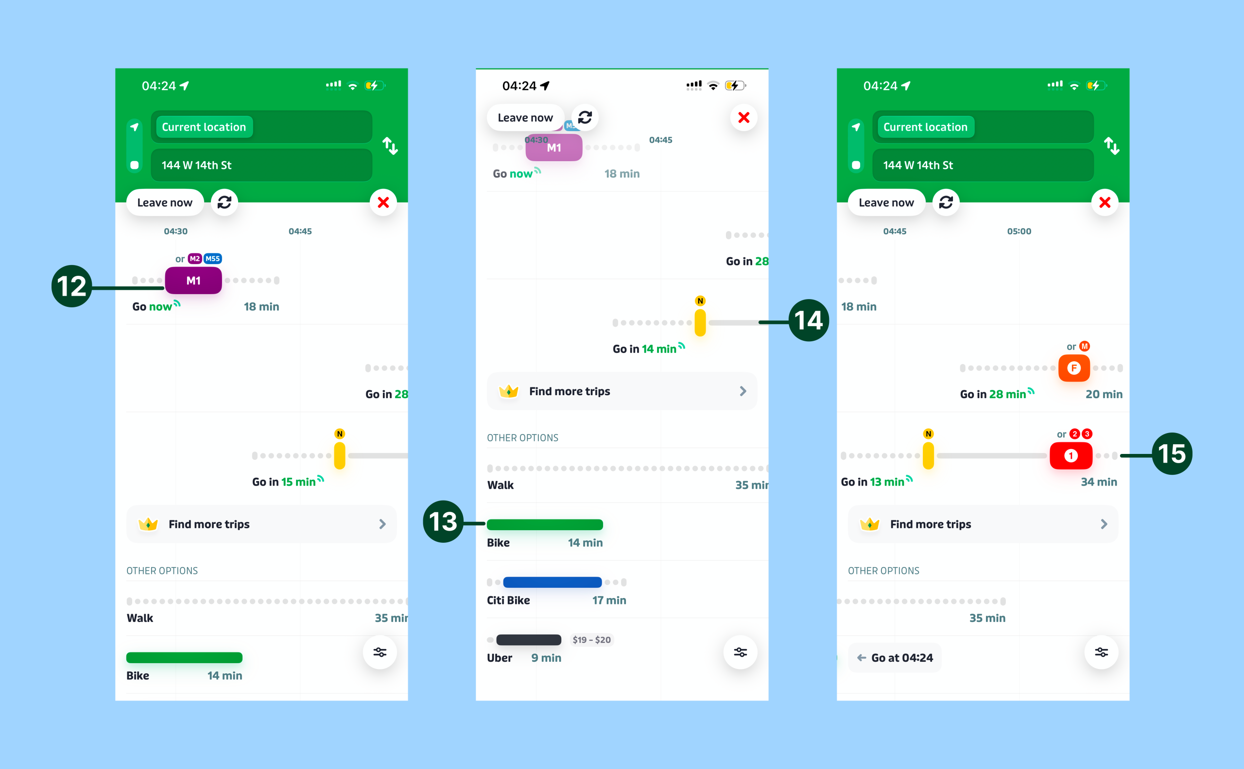
After a user selects a destination, Transit presents multiple transportation modes with bus and train routes prioritized on the top and other options like walking, biking, and Uber listed below. The mode buttons (12 & 13) are easy to spot and look clickable because they’re in bright colors and have colored drop shadows, which act as clear signifiers that support discoverability and reduce the gulf of execution. The bus/train options have a timeline layout (14) that communicates the sequence of the trip and the expected arrival time which supports the user’s conceptual model of travel itself: depart, ride, and arrive. Additionally, because the timeline is clipped by the screen boundary on the right, it signals that content is hidden and creates a strong perceived affordance for swiping left rather than forcing the user to guess (15).
Following the route
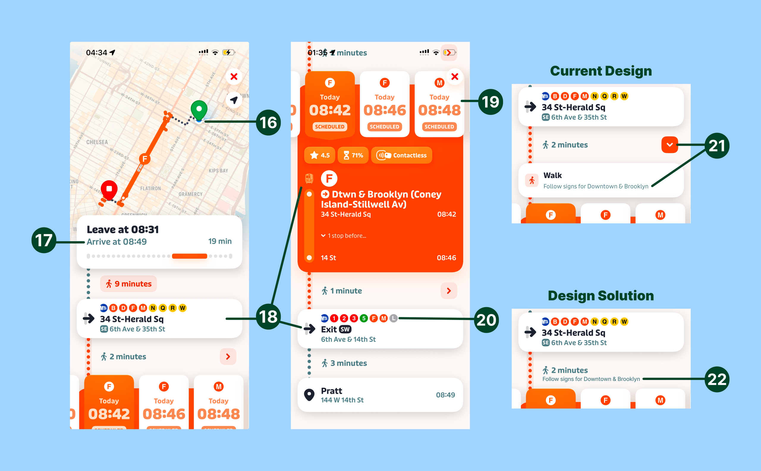
Once the user selects the mode of transportation, Transit presents a route screen that keeps critical information visible and easy to interpret under time pressure. The moving blue dot (representing the user) on the map (16) and the dynamically updated “arrive time” (17) provide strong feedback, narrowing the gulf of evaluation because users can quickly confirm they’re progressing along the route. While the user is traveling key details like entry/exit points, train details, and service information are always shown on screen which is great because the user doesn’t have to remember them, thus further reducing the gulf of evaluation by shifting knowledge in the head to knowledge in the world (18). The screen also designs for error by surfacing later departure times (19) in case the user misses the first train and the use of real subway entry/exit icons (20) is excellent mapping that helps users wayfind by matching what they see in the app to station station.
However, one issue in this screen is that the orange arrow buttons (21) reveal crucial wayfinding information (e.g. which signs to follow like “Downtown & Brooklyn”) and hiding this information behind a tap hurts discoverability and increases the gulf of execution and evaluation at exactly the moment users need rapid guidance. To fix this the station navigation hints could be mentioned directly under the in-station walking time and the arrow button could be removed entirely (22). This would improve visibility without requiring users to hunt for crucial navigation information.
Conclusion
Overall, Transit has many strong signifiers and clear mapping that help a novice commuter find and follow a route under time pressure. Still, a few ambiguous elements force users to guess at critical moments, which widens the gulfs of execution and evaluation. The recommendations above increase visibility and clarify information so the app better matches a novice user’s mental model.