Uber Ride is a location-based mobile service that allows users to request on-demand transportation. Riders input a destination, compare fare estimates, confirm pickup, and track their assigned driver in real time. The system manages identity verification, route monitoring, and digital payment from request to drop-off.
You open Uber. The ride costs $30.
You hesitate. “Maybe Lyft is cheaper.”
You switch apps. Lyft says $28. You consider it. You switch back to Uber. Now it’s $40.
You panic. You go back to Lyft. It’s $50.
Ten minutes later, you’re still standing on the sidewalk. You finally book Uber at $40. The driver arrives in 8 minutes, then cancels. The next driver is another 8 minutes away.
Now you’re late. And you’ve paid $10 more than you would have.
Eventually, the car arrives. You verify the license plate. You enter the four-digit PIN. The driver confirms it. The ride begins. The small vehicle model moves across the map behind the driver’s photo. The ETA updates in real time. You lean back, maybe even close your eyes, and safely reach your destination.
The experience feels smooth now.
Uber’s ride interface reveals both sophisticated design execution and structural friction.
1. Real-Time Tracking: Strong Mapping and Feedback
Uber’s live map is a strong example of natural mapping. The digital interface mirrors the physical world. When the driver turns, the icon turns. When traffic slows, the ETA adjusts.
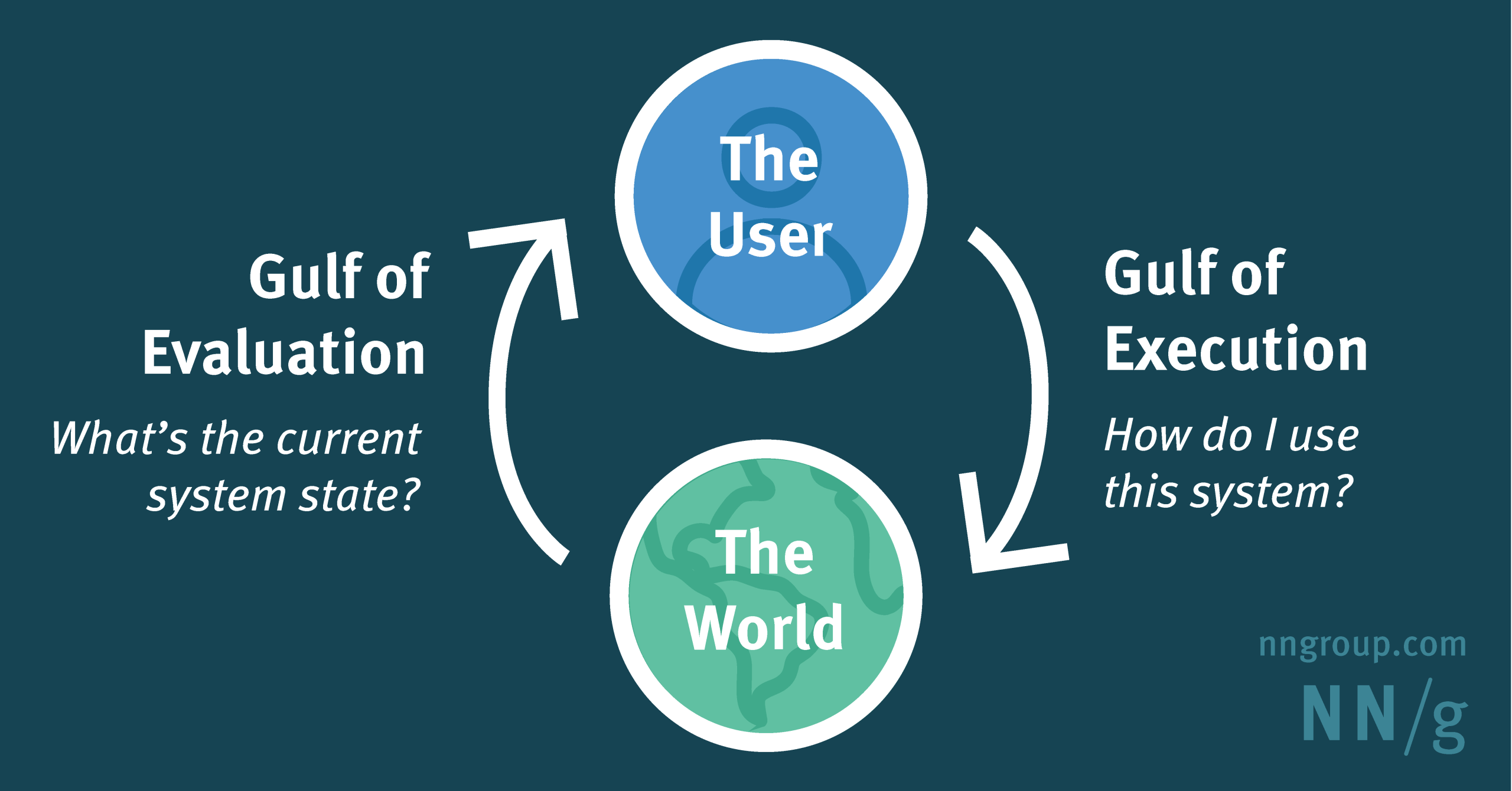
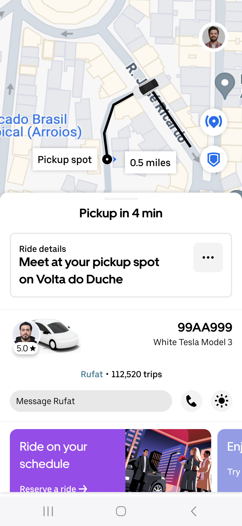
This continuous feedback narrows the Gulf of Evaluation. Users do not guess what is happening; they see it. The system image supports a clear conceptual model: the driver is physically navigating toward me.
2. Designing Trust: Signifiers, Constraints, and System Image
Ride-hailing is not just a transaction. It is a moment of interpersonal risk. You are entering a stranger’s car, especially you are in someplace away from MTA stations, crowds, and at night alone.
Uber addresses this through layered signifiers and constraints that construct trust before physical contact even occurs.
The interface shows:
- Driver photo
- Rating
- Vehicle model(3D model matching the real vehicle)
- License plate number
- A small car icon approaching in real time
They are signifiers that communicate legitimacy and reduce ambiguity. The moving vehicle icon reinforces spatial alignment: the car you see on the map corresponds to the car that will arrive.
When the driver arrives, the PIN verification functions as a forcing function. The ride cannot begin unless both parties confirm identity. This is a constraint that prevents a potentially dangerous slip, like getting into the wrong vehicle.
Constraints and visible system states reduce anxiety and narrow the Gulf of Execution. Uber’s trust system works precisely because it distributes knowledge into the environment.
3. Dynamic Pricing: A Breakdown in Conceptual Transparency
On the other hand, the pricing interaction tells a different story.
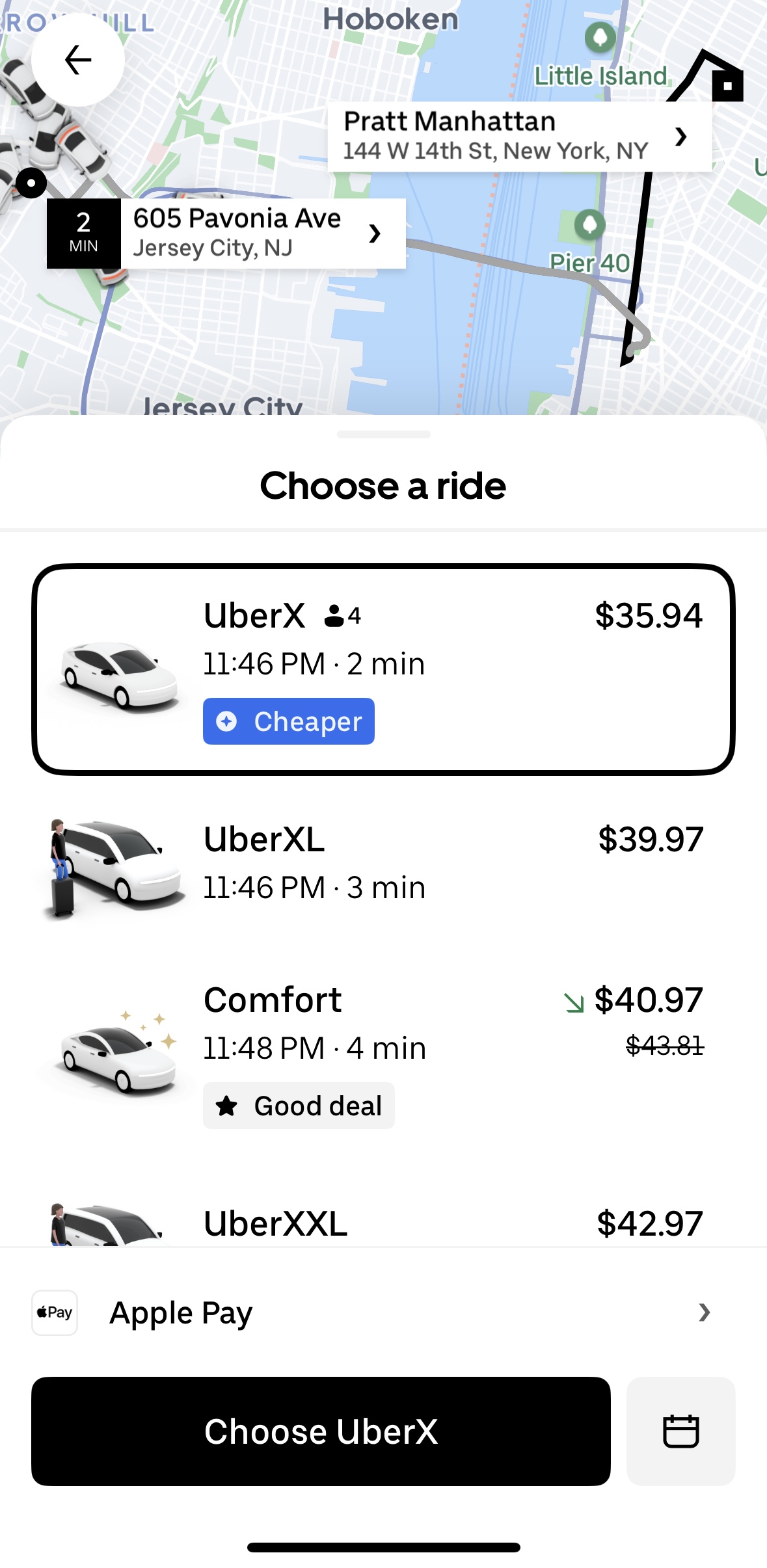
When the fare jumps from $30 to $40 within minutes, the system displays the result but not the reasoning. Surge indicators exist, but they do not meaningfully externalize the calculation.
Norman argues that knowledge should be visible in the world rather than inferred in the head. Here, users cannot evaluate:
- What portion is demand?
- What portion is distance?
- What changed during those ten minutes?
This widens the Gulf of Evaluation. The outcome is clear; the logic is opaque.
Nevertheless, a visible, pre-confirmation fare breakdown would reduce this gap and align the system image with user understanding. But will the effort to support this system get paid? Probably that is the trade-off.
Overall
As a designer, I would say that Uber’s ride flow is, in most cases, refined.
The vehicle model gliding across the map, the PIN as a forcing function, the continuous ETA feedback… these elements demonstrate mature interaction design. The mapping is intuitive. The feedback is immediate. The safety constraints are effective.
But before the ride begins, in moments of price volatility and cancellation, the system’s conceptual model weakens. The interface feels transparent spatially, yet opaque economically.
Uber narrows the gap between digital interface and physical movement. It widens the gap between the algorithm and user understanding. That tension defines the experience.