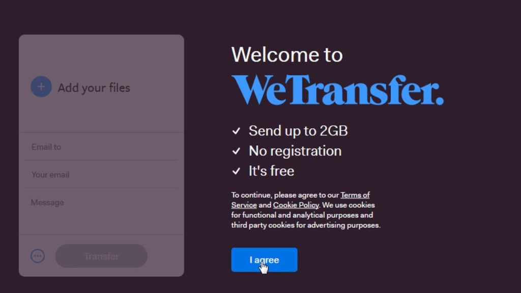
Introduction
The WeTransfer app has one main goal for all its users: “Send Large Files Fast.” I believe that it is because of this sole promise that the user interface people are presented with is very minimal. Users of this app are only here for one reason, so the app is designed in a way that focuses mainly on that – but is less always more? Let’s figure that out by comparing features of WeTransfer against core concepts from Don Norman’s The Design of Everyday Things (DOET).
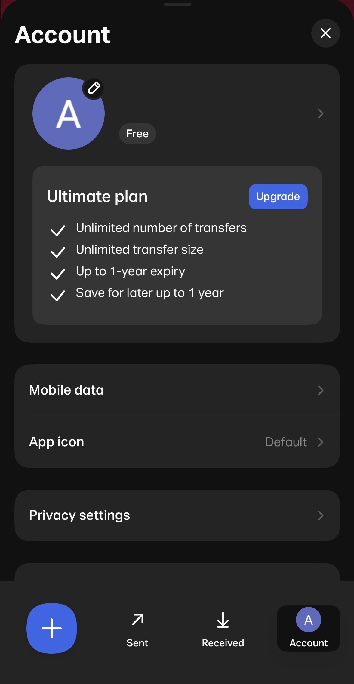
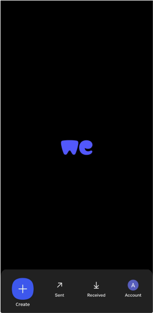
Handling the Homepage
Once signed in, users are brought to a primarily blank homepage with the app logo in the center and five features on a navigation bar at the bottom of the screen:
- The first and left-most button, a brand-colored plus sign
- The second button, an arrow pointing diagonally upward, with the word “Sent” underneath
- The third button, an underlined downward pointing arrow, with the word “Received” underneath
- The last and right-most button, an icon of the user’s profile with the word “Account” underneath
- A pull tab feature hovering behind the nav bar
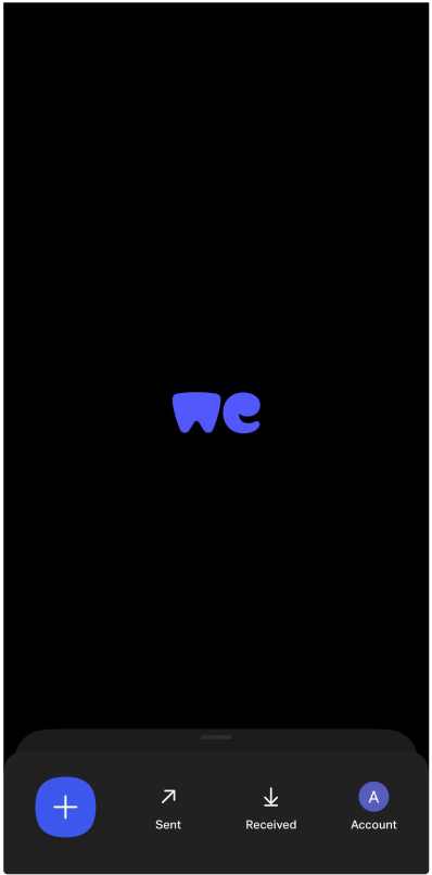
Right off the bat, the concepts of affordances and signifiers are on display, but only partially. The “Sent,” “Received,” and “Account” options are very clear in communicating that these are three actions you can take from the homepage. The user knows there are two more actions they can take, but those are not as clearly labeled/signified as the others.
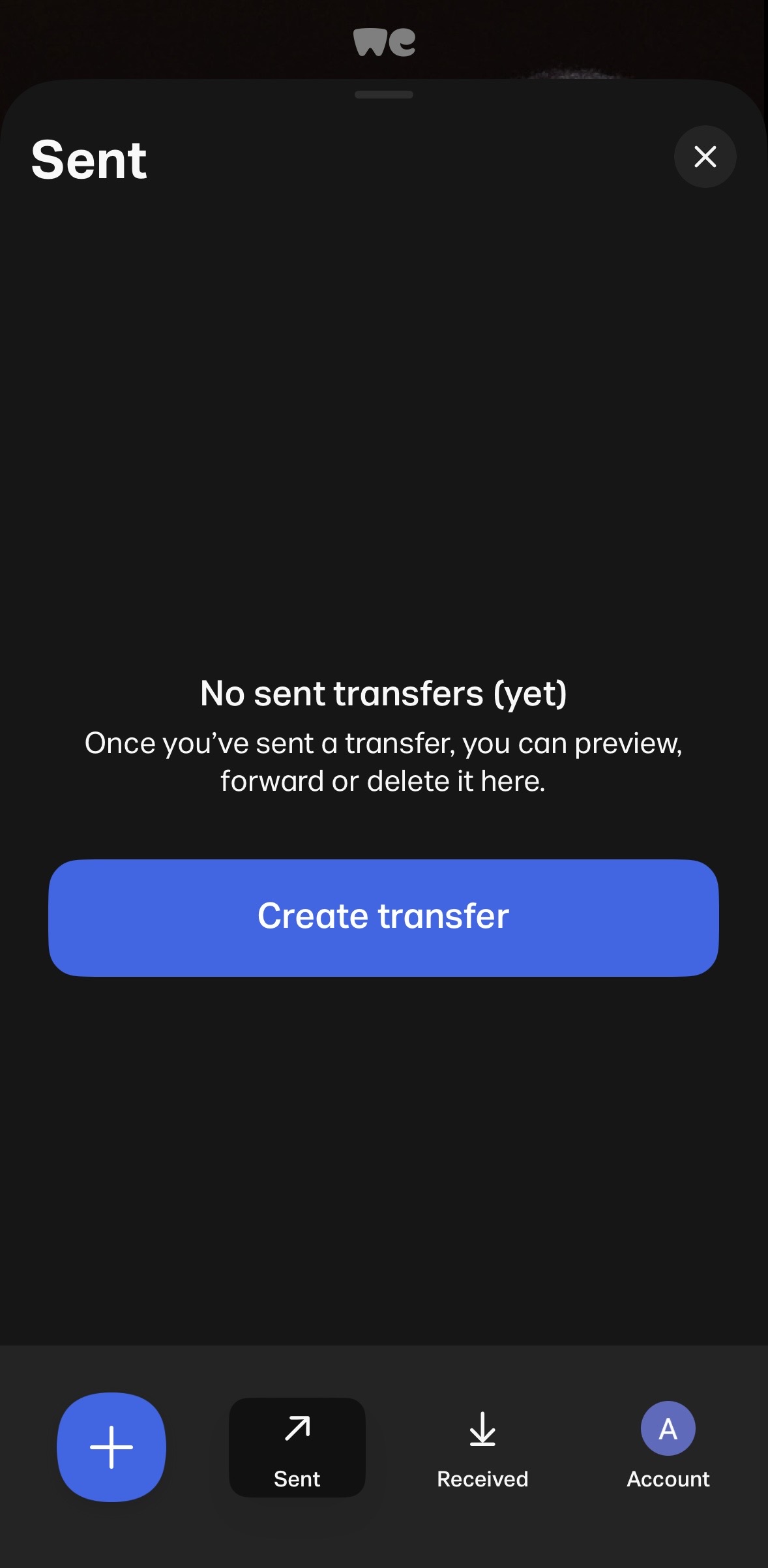
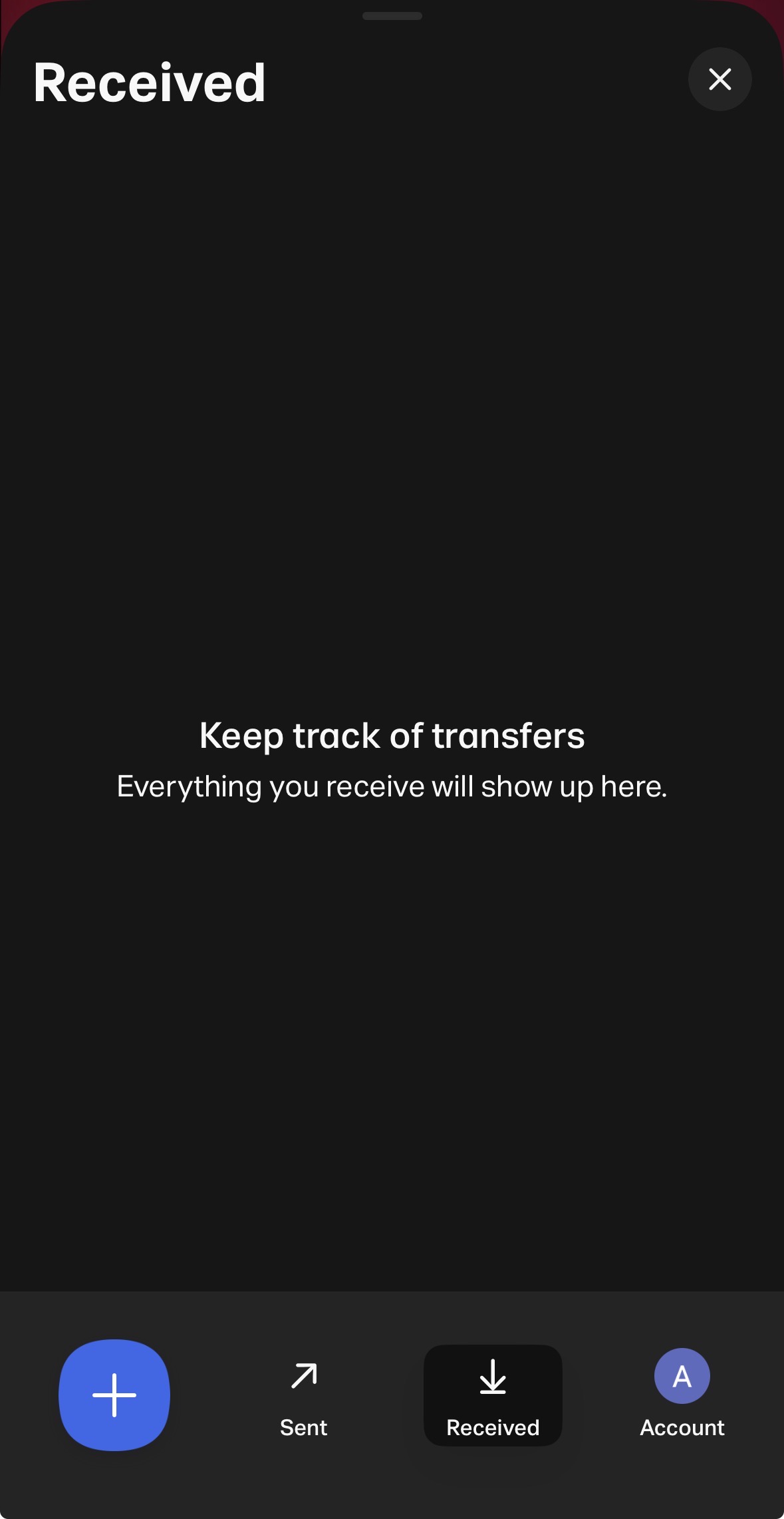
It is not until the user clicks that plus sign that they know this is where they can go to “Create a Transfer.” The user also has to interact with the “Sent” and “Received” options to know that either one of those activates the tab in the background – whichever option the user chooses will be what the tab shows when pulled up. There is the alternative option of interacting directly with the tab. When the user swipes up, it shows the corresponding screen to whichever of the two (“Sent” or “Received”) buttons the user selected last.
To ensure the app’s affordances are better understood, here’s what I would change:
- Remove the pull tab and allow for the “Sent” and “Received” buttons to open to a new page.
- Add the word “Create” underneath the plus sign, to provide a signifier for that affordance and have a sense of uniformity across the options.
See my mock-up below:
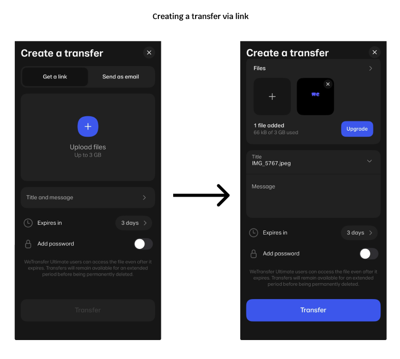
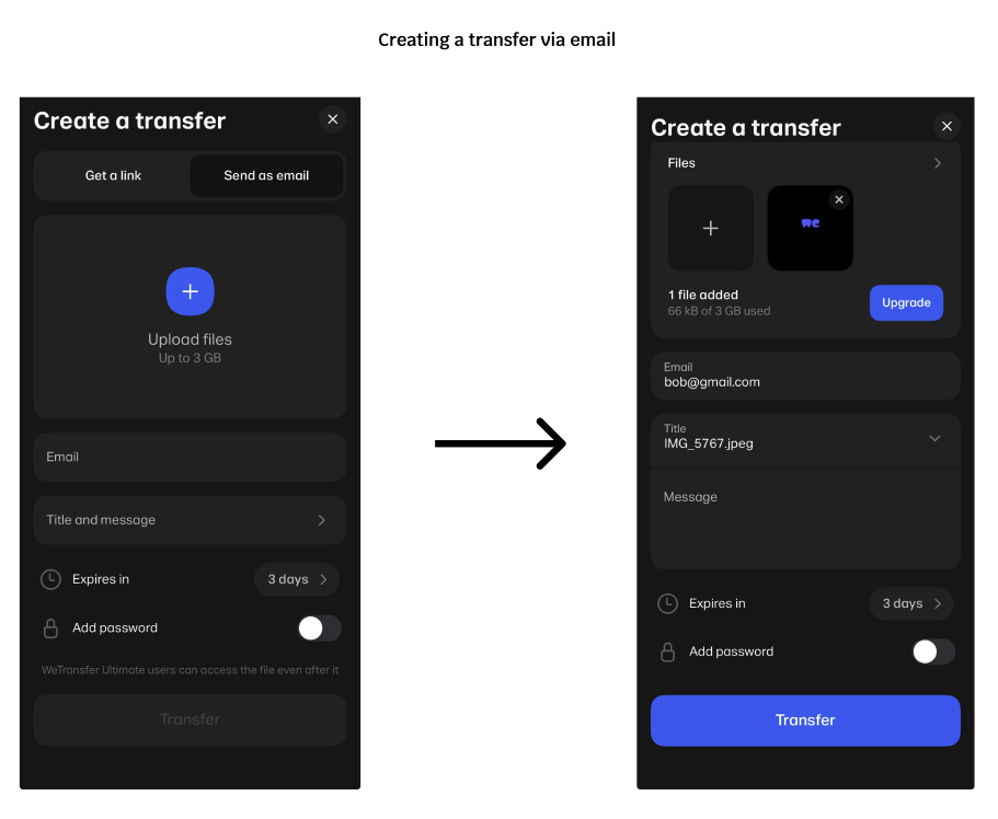
Clicking “Create”
The main feature of this app is creating a “transfer” to send to someone or to another device. On this screen, the user can choose to transfer files via link or email. When using the “Get a link” option, users can interact with all the elements needed for the transfer but they cannot send it until they choose a file. When using the “Send as email” option, the same rules apply with the addition of the email field needing to be filled out in order to send. Here, WeTransfer is showcasing a good example of a semantic constraint. It should make sense to the user that you cannot complete a file transfer without the file in question and that you cannot send an email without including an email address.
Stationary Stories
The rest of WeTransfer’s affordances are plain and straight to the point. “Sent” allows the user to access all the files they have sent (and prompts the user to send one if they haven’t yet). “Received” allows the user to access all the files they have received from other users. “Account” lets the user make any changes to the account they have with WeTransfer, the same as many other apps/sites that require a login. However, there is one more feature that I can’t quite seem to wrap my head around.
When the user is idle for too long, a carousel of stories appears on the screen, where the logo usually appears. Many of which have very little to do with the app itself. These are not how-to guides or FAQs but rather legit articles written by a team called “WePresent by WeTransfer.” Upon further research, I found out that WePresent is a platform provided by WeTransfer to shine a light on the backgrounds of the artists who worked there when it first launched. While this is a great way to support the arts, it evokes the concept of featuritis. Showing these articles does not aid the user in transferring files, but if selected, takes them to a new interface, entirely. This seems like the WeTransfer team added this feature simply because they can. It does not necessarily hinder the product but certainly does not help it. The only fix I have here would be to omit it completely and keep the app focused on its one goal: Send Large Files Fast.
Conclusion
The WeTransfer app offers a quick solution for users who want to move large files between different operating systems and/or without the use of a physical storage device. It works as intended but the developers could take a page out of Norman’s book and completely streamline the product for improved use across all experience levels.