What’s Cooking? is a mobile application created by Kraft Heinz designed to help food lovers discover, save, and cook recipes from curated food creators. The app emphasizes mood based recommendations, dietary preferences, short-form recipe content, and step to step cooking instructions to support engaging cooking memories.
1. Step by Step Cooking Mode.
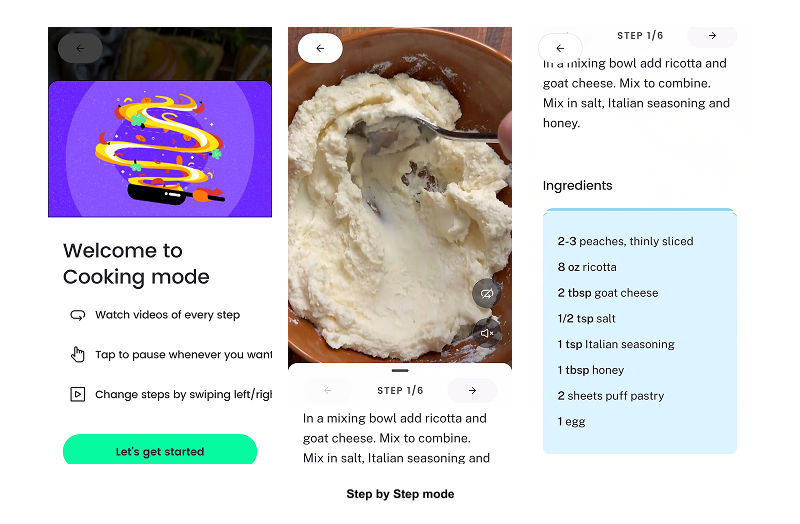
One of What’s Cooking?’s strongest features is its step by step cooking mode, which reduces the gulf of execution by clearly showing users what to do at each moment. Instead of pouring all the actions all at once, steps are shown one at a time with strong visual emphasis. This feature reflects how people naturally cook, making each task easier to complete. By guiding users through the process, users can focus on cooking with greater confidence instead of figuring out how to navigate the app.
2. Onboarding: Selecting Dietary Preferences & Restrictions.

Problem:
During onboarding, users are asked to personalize their experience through a selection of dietary preferences, meal habits, and favorite cuisines by region. However, several important categories are locked, missing, or inaccessible without clear explanation, and users are limited to 3 options. Additionally, there is no way to blacklist certain ingredients users may need to avoid. Therefore, users cannot easily determine what customizations are available or whether the app can support their needs.
This leaves room for improvement in showcasing discoverability. Due to limited constraints, users must rely on assumptions rather than being shown all of the app’s capabilities and limitations. Therefore, increasing the likelihood of uncertainty and cognitive effort during early and critical stages of the main user experience.
Solution:
To improve discoverability for users, I recommend displaying all supported and unsupported dietary preferences. Locked or unavailable options should be clearly labeled with explanations such as “Not available yet” or “Coming soon.” If certain preferences are limited due to a lack of creator recipes, that constraint should be clearly conveyed. These choices allow the system’s affordances to be communicated and help users form accurate expectations from the start.
3. Finding the “Right” Recipe.

Problem:
When browsing recipes, users may see content cards that look visually similar such, which could make it harder to quickly identify details such as cooking time, difficulty level, or nutritional indicators such as carb content. Because of this, users often have to open multiple recipes and sometimes even get far into the app’s step to step cooking mode before realizing that the recipe does not meet their constraints. This can lead to frustration and wasted effort.
This breakdown stems from the need for clear feedforward. Without previewing these key attributes, users cannot predict beforehand whether those recipes align with their cooking goals. This increases the likelihood of errors and increases the gulf of execution.
Solution:
To provide users with an even more personalized experience, I recommend displaying their key constraints that match with their food profile directly on the recipe cards. Providing this information before they start cooking would allow users to evaluate their options quickly, minimizing unnecessary steps and supporting more confident decisions while browsing the many options to choose from.
4. Favorites & Saved Content Organization
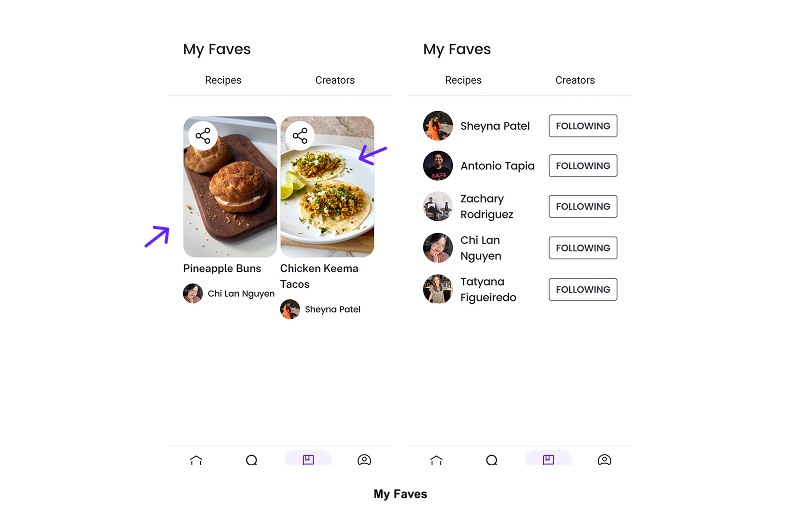
Problem:
While users can save their favorite recipes or creators, the “My Faves” section provides little contextual information over time. As saved content builds up, users may find themselves forgetting why a recipe was saved or whether it aligns with their dietary preferences/cooking goals. This forces users to rely on memory to interpret their past actions instead of visual signifiers.
Although this feature provides immediate feedback when the content is saved, it can benefit from ongoing feedback on what that saved state represents. Norman emphasizes the importance of feedback by helping users understand what happened and what it means.
Solution:
To keep the saved favorite’s relevancy and importance, the page should consider including visible contextual feedback such as dietary compatibility icons, ingredient warnings, or users’ custom tags. These kinds of features can ensure the system of this mechanic can continuously communicate the meaning of these saved states and reduce memory load, allowing users to quickly evaluate whether the recipe still aligns with their goals in the long run.
Conclusion.
Overall, What’s Cooking? offers many innovative features and content for users to get inspired and engage themselves in creating new and delicious recipes to add to their cooking experience. There are, however, many opportunities to enhance personalization and organization when examined through the lens of Norman design principles. By clearly communicating user constraints, surfacing critical information earlier, and reinforcing meaning over time, the app could better support food lover users across all stages of action.