
Luma is an event app aimed at connecting people with events in their area. Luma allows users to advertise, create, and explore event listings. For this critique, I will explore the app from the perspective of a user who is looking to create a new event listing. Using theories from The Design of Everyday Things and How Artifacts Afford, I will explore how Luma supports its users in their tasks.
Luma Homepage
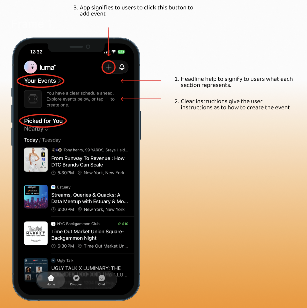
The Luma Homepage offers users the ability to either begin exploring or create their own event. Much as Don Norman explores in The Design of Everyday Things, the relationship between the gulf of evaluation and execution is bridged with the use of a clear hierarchy in order to instruct the user how to maneuver the page. The mental model of the page is established with the mapping and labels. Category headings allow users to quickly scan the screen and denote which events they have already registered for and which ones have been picked based on recorded preferences. (1) A signifier under the category “Your Events” communicates the next steps needed for users to create an event of their own (2).
To create a new event, users must press the “+” button to add a new listing. The button is highlighted at the top of the screen alongside the notification icon. The location and highlight of the button move the user to discover the button and understand that it can be pressed. Once the user presses the “+” button, they receive instant feedback (3). The app leads to a form that requires the user to provide information to make the page live.
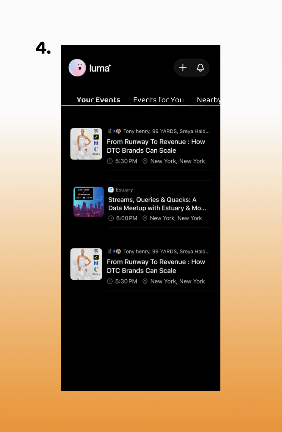
Though I believe that the app creates a clear hierarchy on its homepage, I think it could be organized in a more efficient way for users to sort through listings. The font of the headings makes it difficult for users to quickly gather the needed information. A navigation bar at the top of the page that allows users to filter between their own events, saved events, and nearby events might make it easier for your users to sort through their listings (4). I believe that this supports Norman’s idea of creating a system with errors in mind. Users might find it hard to distinguish between their own events and those being suggested. A clear signifier can help to organize their preferences.
Event Creation Page
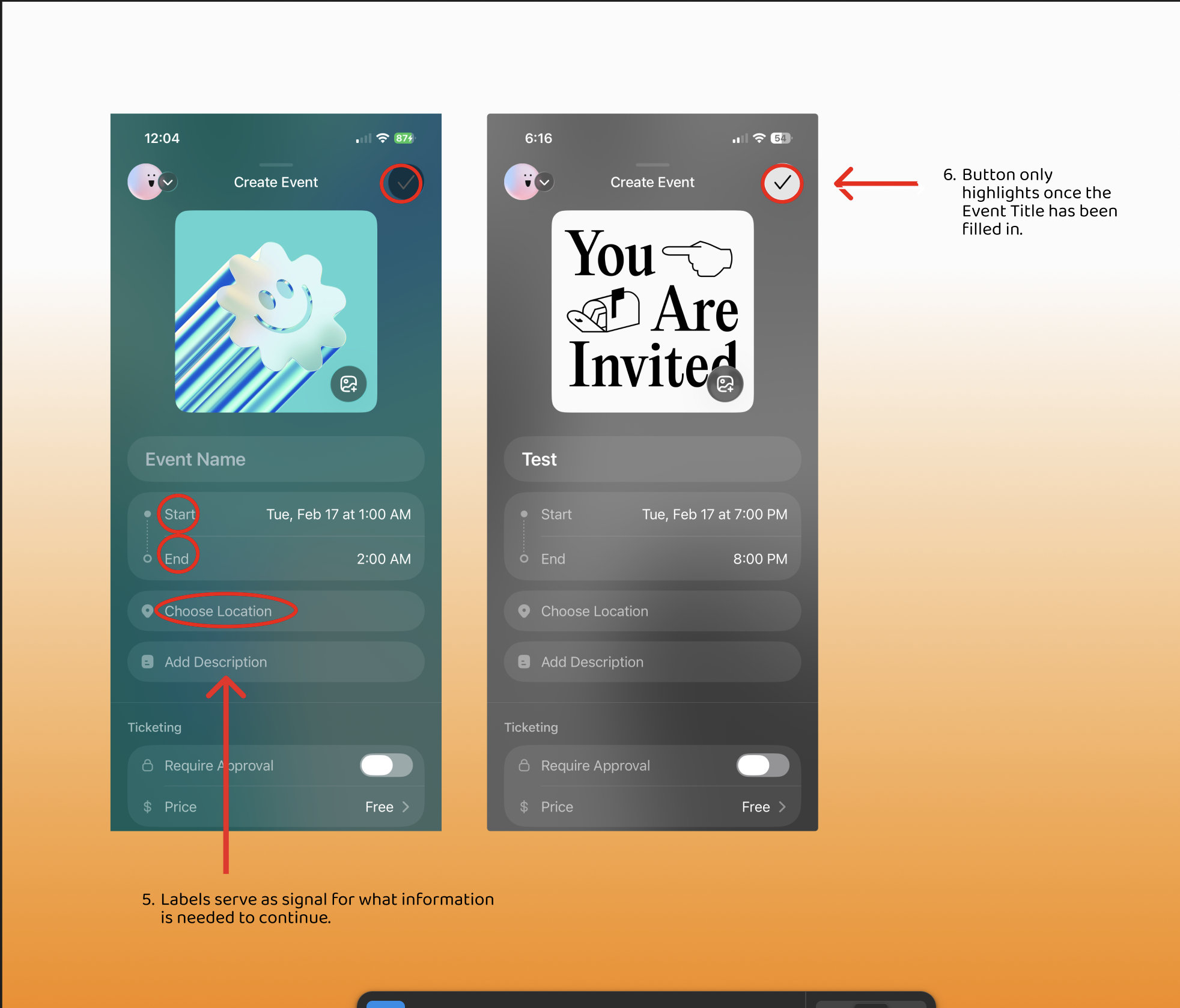
The event creation page is an example of good design as it has clear signifiers and constraints. The app wants it to be easier for users to understand the information needed to open their event page. A clear label denotes the information being requested, including “Event Name”, “Start, “End,” and “Location.” (5) The page establishes constraints with the gray check mark button at the upper right of the screen. The button remains grayed out until a name for the event has been written in (6). Although there is a clear distinction for when users can submit their event to be opened, there are no clear indicators as to how much information is needed to open the page.
This design relies on users’ knowledge of the world in front of them. Although there are labels to signify the various categories and details users will need to advertise, it does not offer a way for users to understand what is mandatory to continue. Competitor apps that have event creation tools like Luma, symbols such as ”*” are used to communicate the information that is being demanded to move forward.
Event Confirmation and Editing
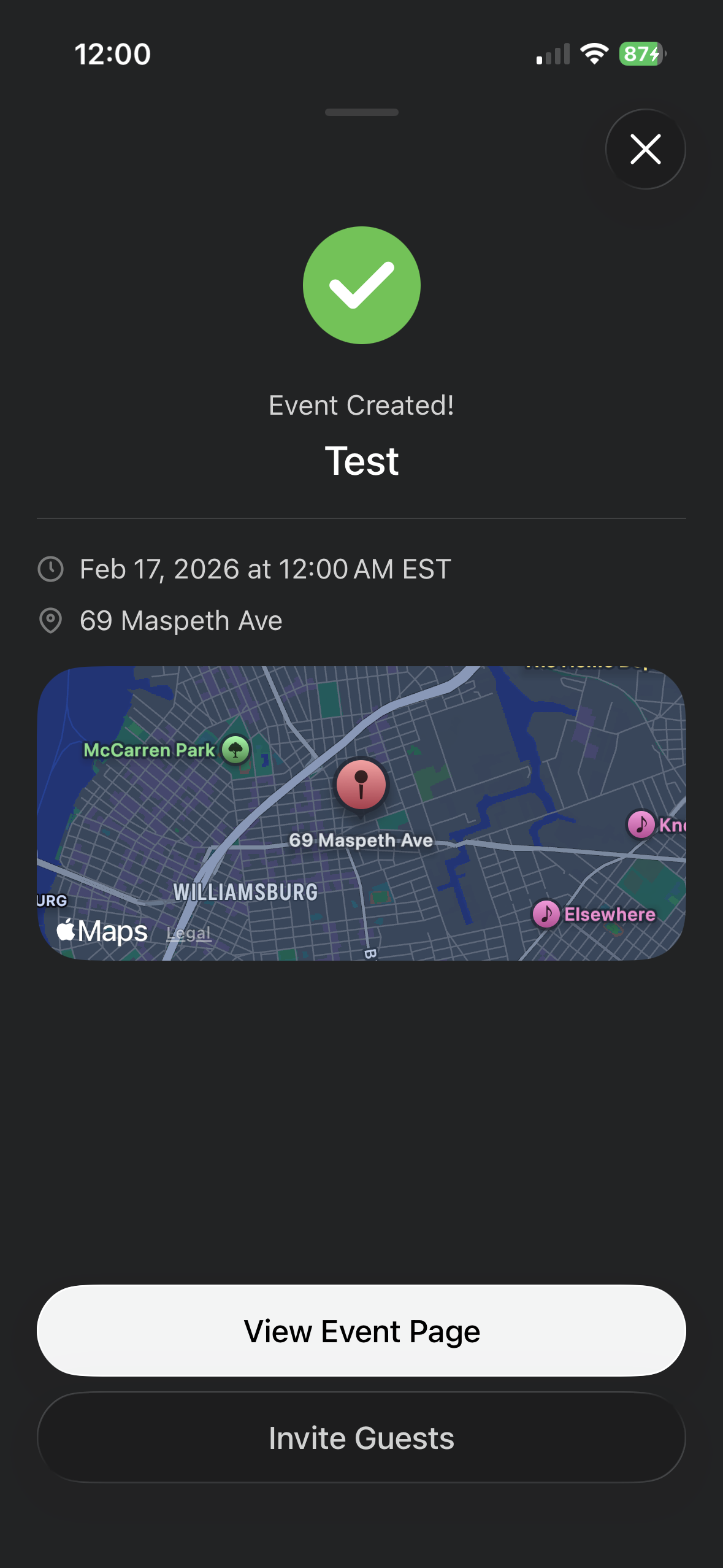
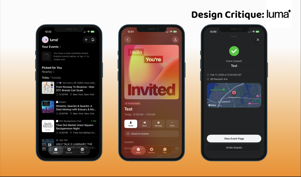
After users fill in the event information, a highlighted check mark signifies to users to press it. A confirmation page then appears, offering the user immediate feedback. A green check mark button and a message stating, “Event Created,” confirm to users that they have successfully created the event. The design then encourages users with two options: review the event page, Invite Guests, or exit the confirmation page. The app then immediately directs users to the option they have chosen as a response.
If a user chooses to edit their home page from the confirmation, Luma directly redirects them to the event page. Users are then allowed to either promote their event or edit any details. This helps to account for any mistakes caused by human errors. The event editing page serves as a page for users to communicate with guests, invite new guests, and edit details. Information about the event is clearly called out with the use of labeling.
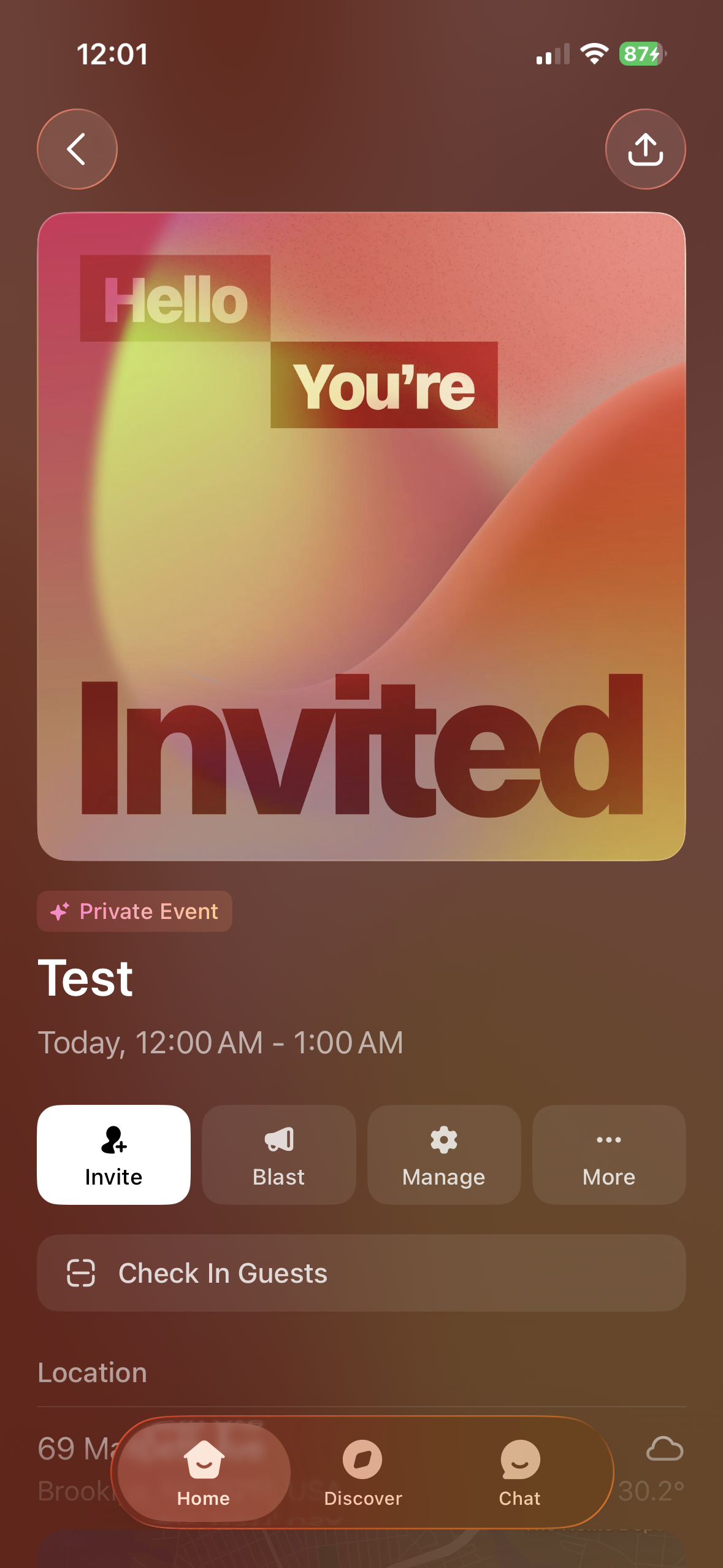
When users click on the “Manage” Icon, they can access a variety of settings options. Each setting has a small description for users to better understand which aspect of their event they are editing.
However, some labeling can be misleading, as Invite and Blast might be viewed as two separate methods to advertise a live event. I believe readjusting the title of the Blast icon to “Announce” may give the user a clear understanding of what will be coming on the next page. As that setting is meant to make announcements to guests who have registered for the event.
A clear home button on this page can also help to understand where users will redirect if they decide to leave the page.
Conclusion
The Luma app has many great instances of design that allow for a seamless process when creating an event. It builds upon established mental models from apps such as Partiful and MeetUp to ensure its users have a clear way of navigating the events they have created and discovering new events to attend. However, some organizational edits to the conceptual model of the app could create more opportunities for offerings to be accessible, and for users to have a better grasp of where to find their events.