TEAM
Harshita Dandu
Saniya Jain
Vasilios Nikolopoulos
Wendy Li
ROLES
UX Design
UI Design
Product Design
TOOLS
Figma
Figjam
Project Overview
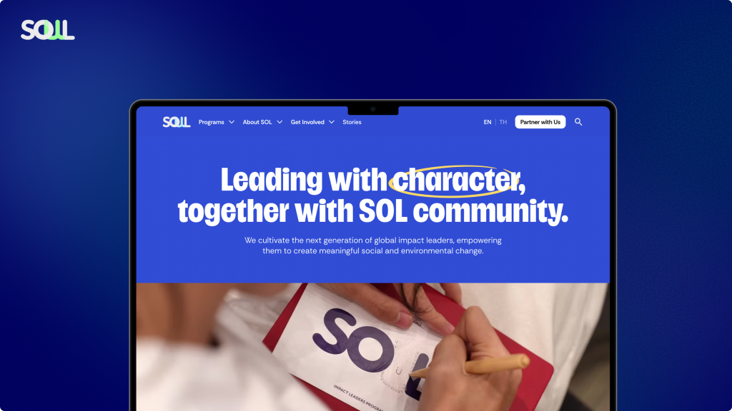
The School of Leadership is a non-profit organization dedicated to cultivating young impact leaders. Through real-world programs and cross-sector partnerships, SoL helps in building the character and capabilities required to lead social and environmental change. As part of a class project, we served as UX consultants, taking the lead in redesigning the School of Leadership website.
Scope
After our kickoff meeting with the client, who is the CEO of the School of Leadership, we identified our main goals for the project:
- Clarify SoL’s Narrative and Show Real Impact
Reflect the organization’s values and global ambition while highlighting student journeys and alumni success stories through design and storytelling. - Inspire Action through the Website
Motivate young people to see themselves as impact leaders (clarify what that means) and take the next step (apply, inquire, engage). - Expand Partnerships and Collaboration opportunities
Position SoL as a globally oriented leadership organization to attract corporate partnerships and funding.
Our Approach
Project Goals
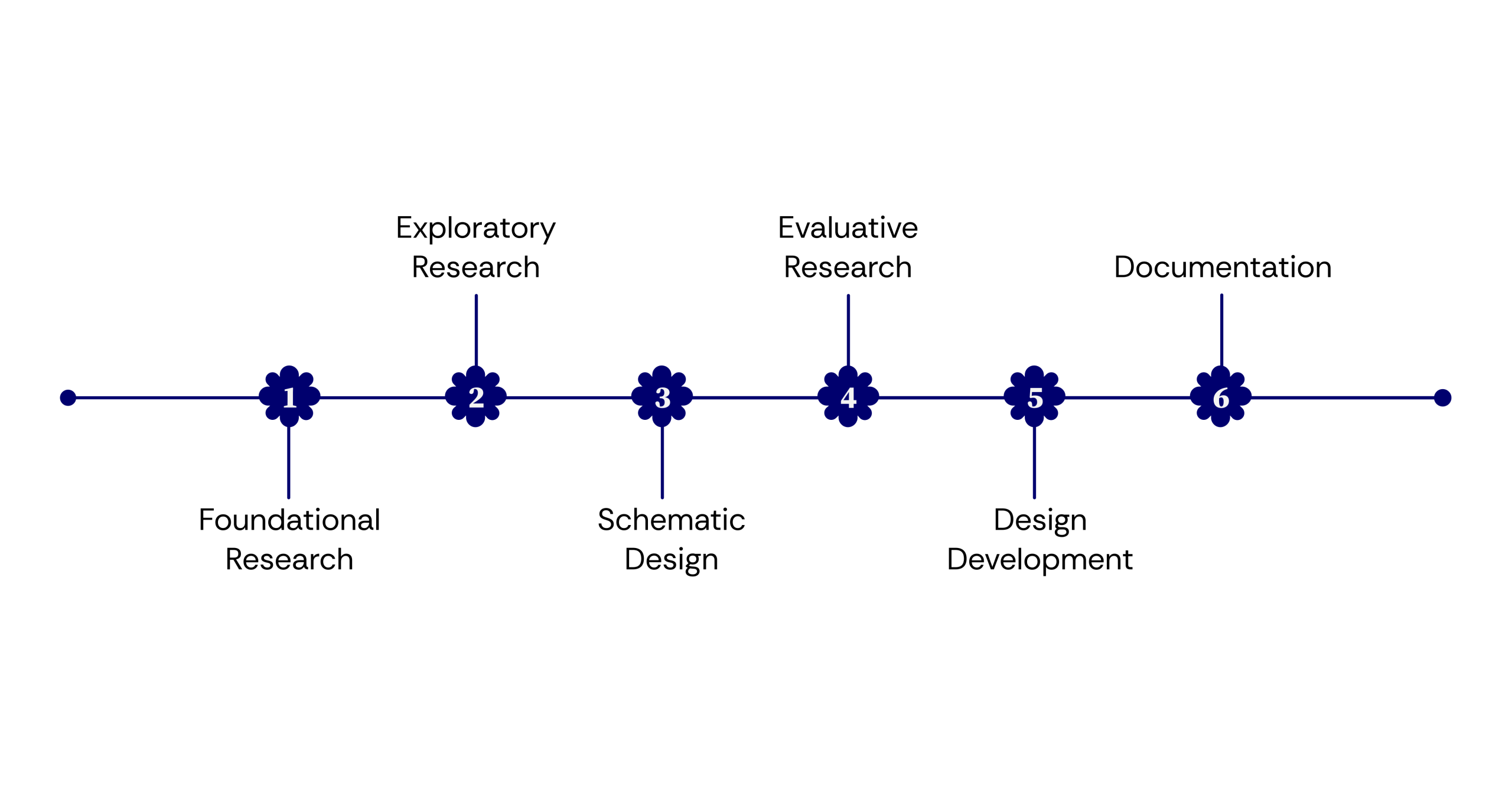
Exploratory Research
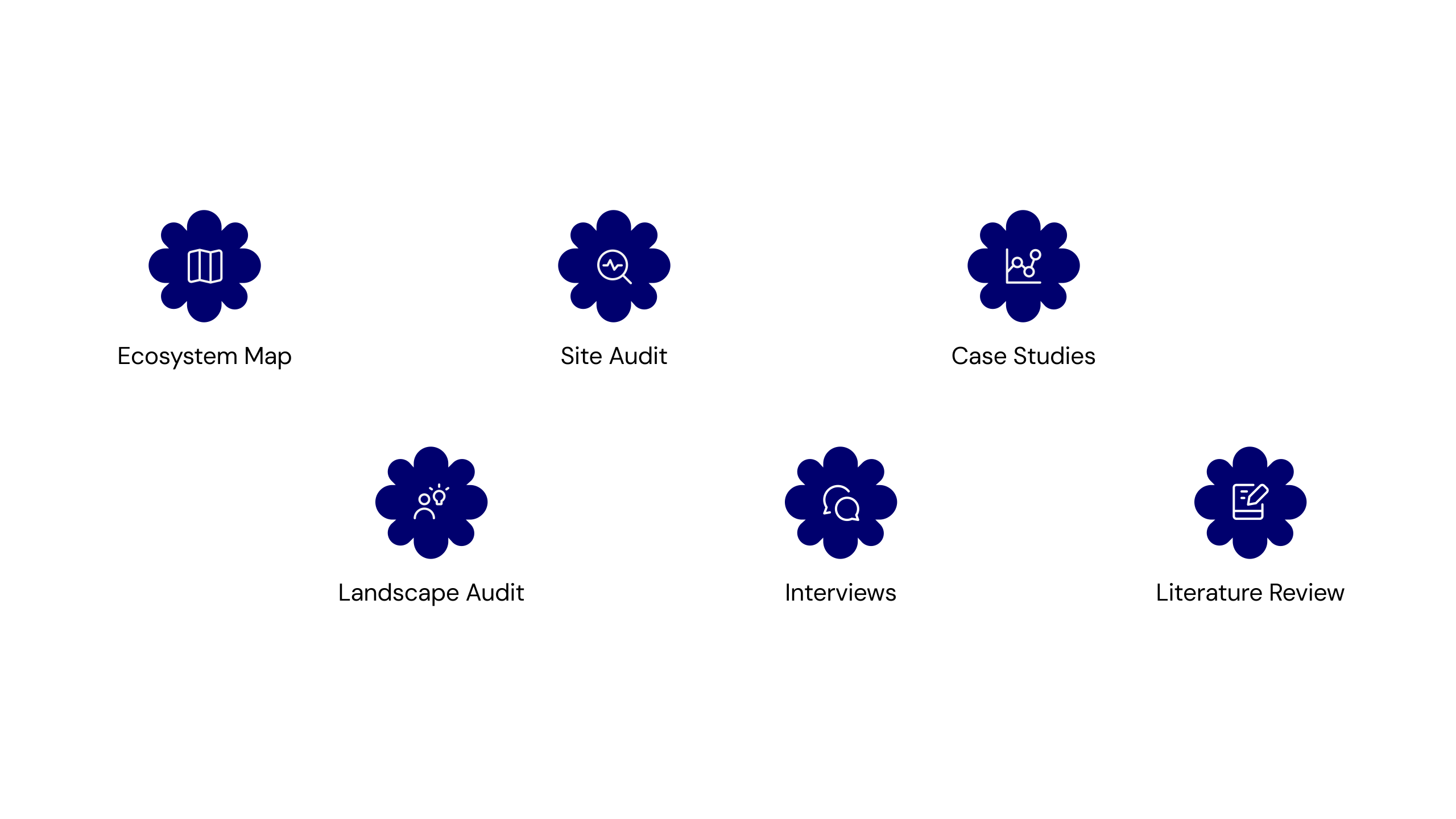
We used a mix of research methods to better understand the problem space and identify key opportunities in the experience. The insights gathered through this process helped guide our design decisions and ensured our solutions stayed grounded in real user needs.
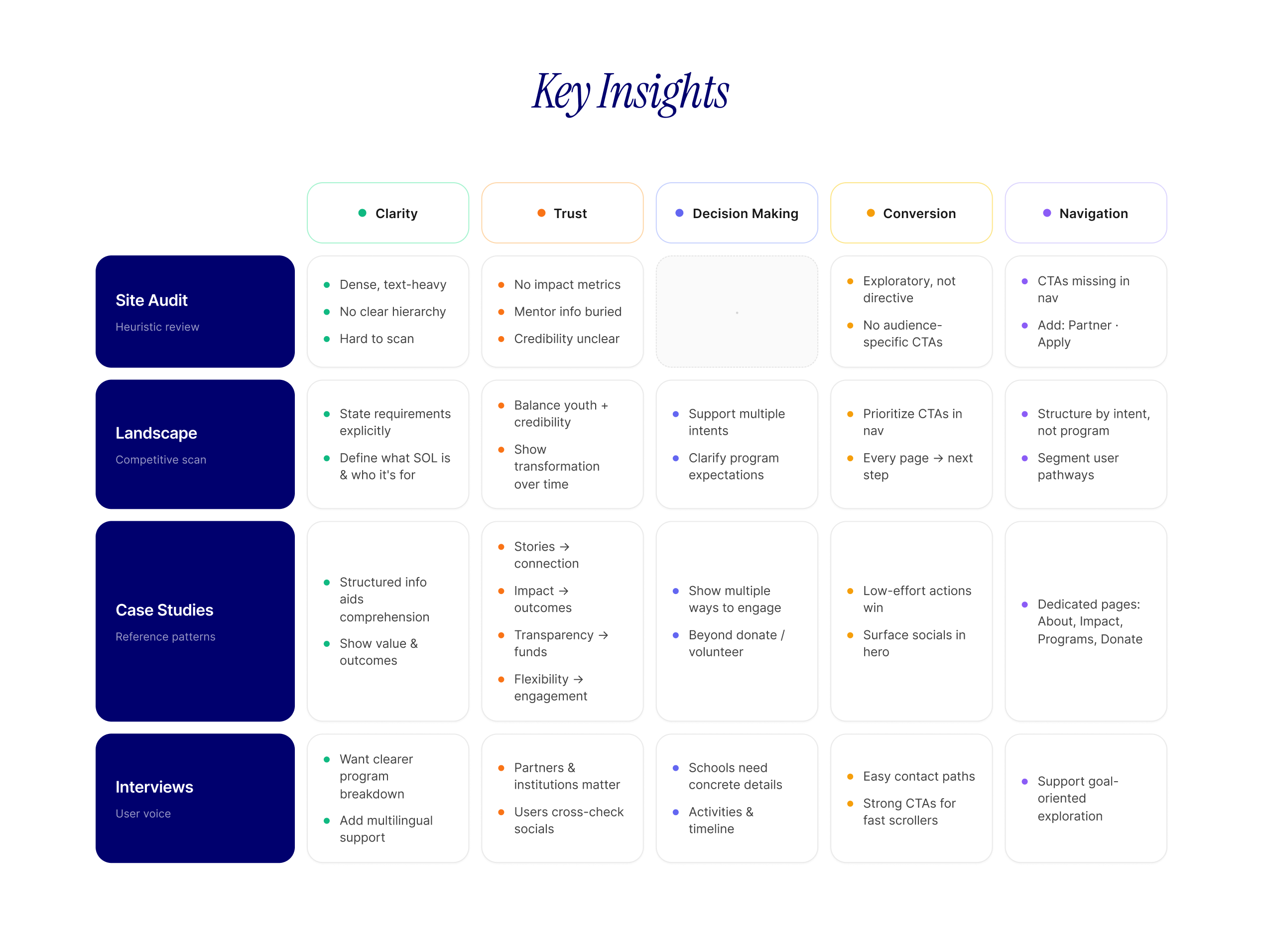
Key Insights
Who are the stakeholders?
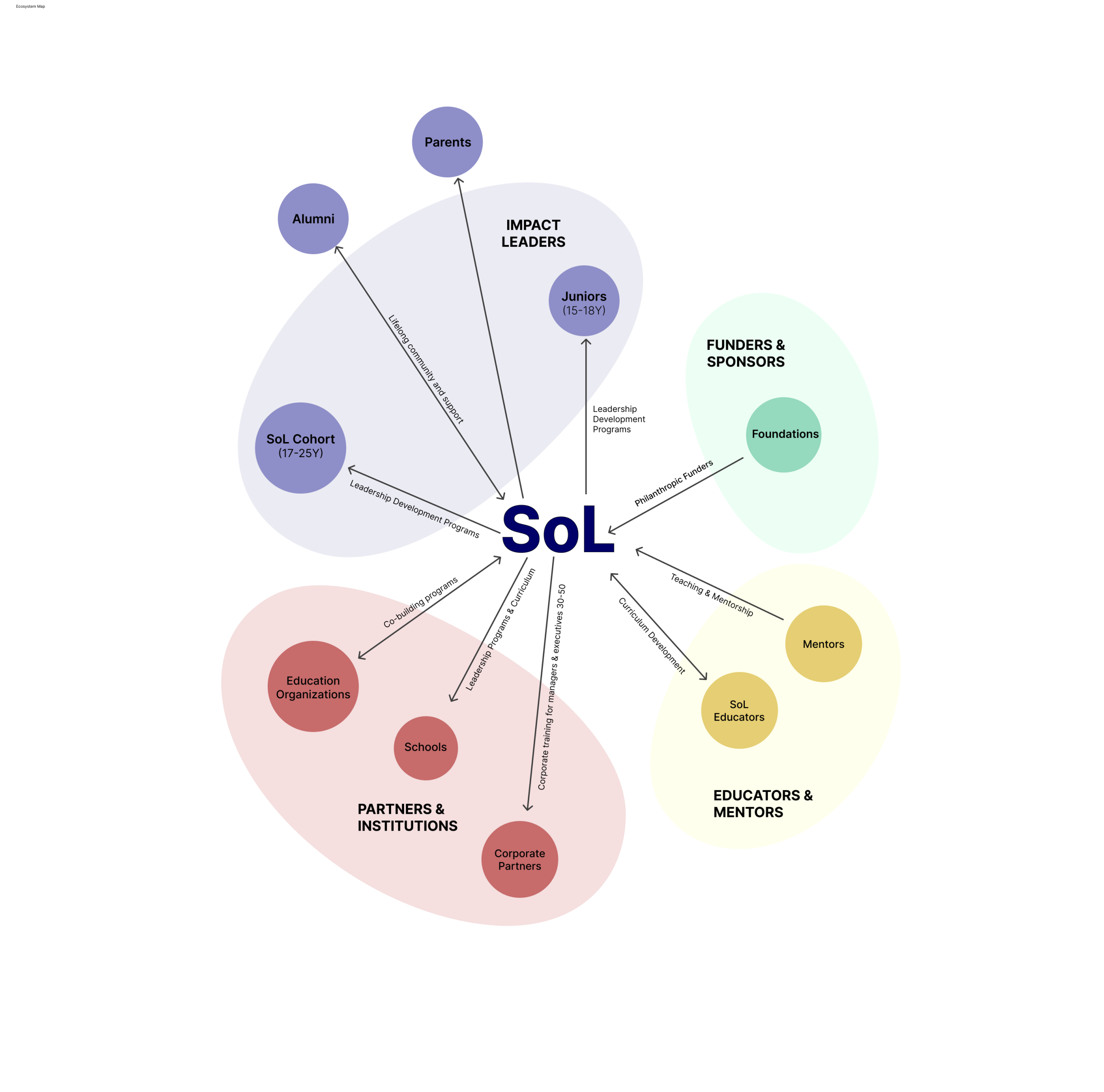
The ecosystem map was created to understand how SOL’s structure and network, including the core stakeholder groups, the relationships between them, and the different flows of value, support, and collaboration that sustain the ecosystem.
The current Website had its strengths and weaknesses
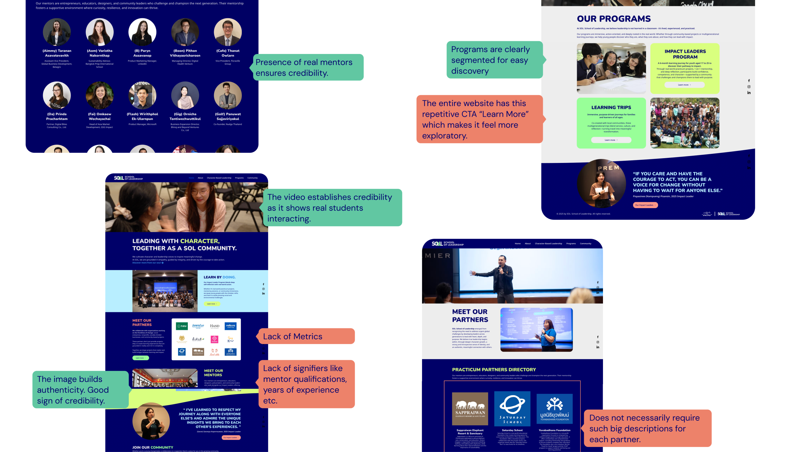
We started with a site audit of SoL’s existing platform. The audit revealed a paradox — SoL had strong credibility signals, like a robust mentor portal and clearly segmented programs. But the overall experience was built for exploration, not action. There were no clear partnership pathways, no trust metrics, and no strong CTAs for partners to engage. That mismatch became a critical early insight.
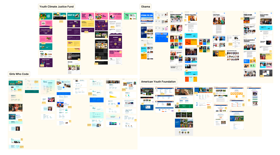
The best youth sites lead with story, not information.
We also conducted a landscape audit of four organizations whose digital presence reflects best practices in youth-facing, mission-driven web design. Across all four sites, we identified common patterns in clear value propositions, action-oriented calls to action, and strong storytelling as key benchmarks to guide SOL’s redesign.
User Interviews
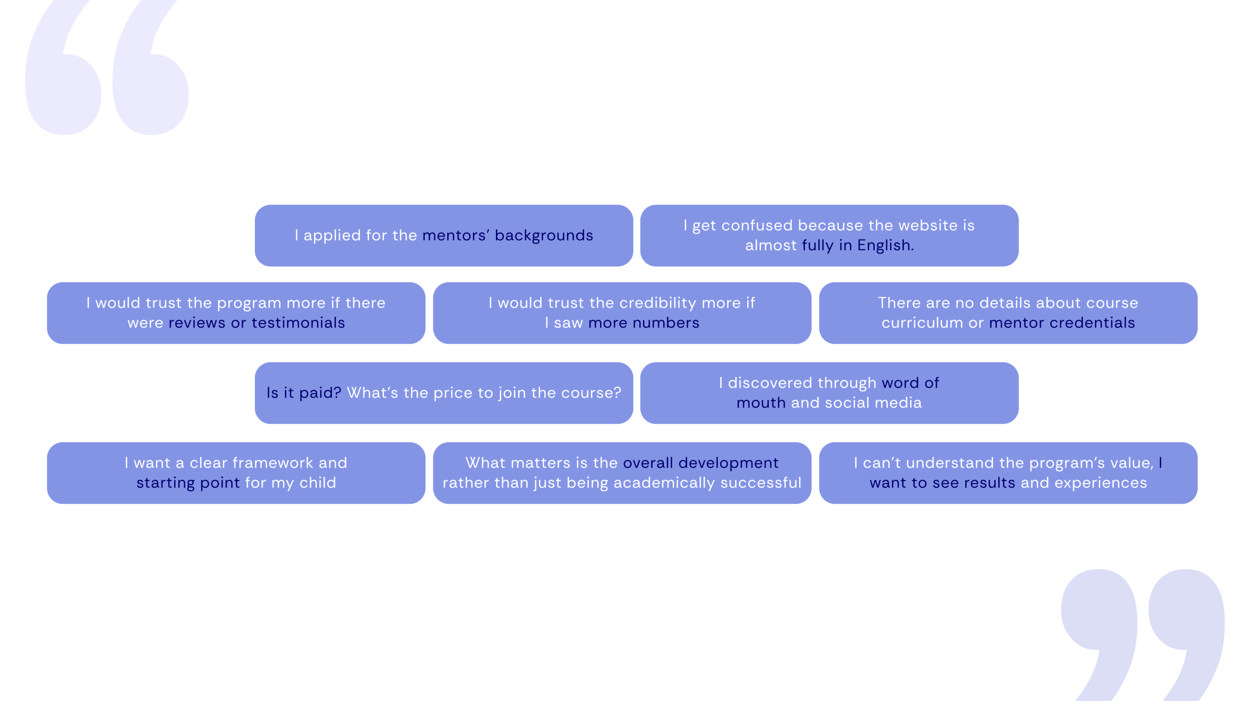
We conducted user interviews with 8 users across all four audience segments: corporate partners, high schoolers, parents, school partners, and funders. We observed them using the website in real time and noticed similar patterns across different users.
Literature review
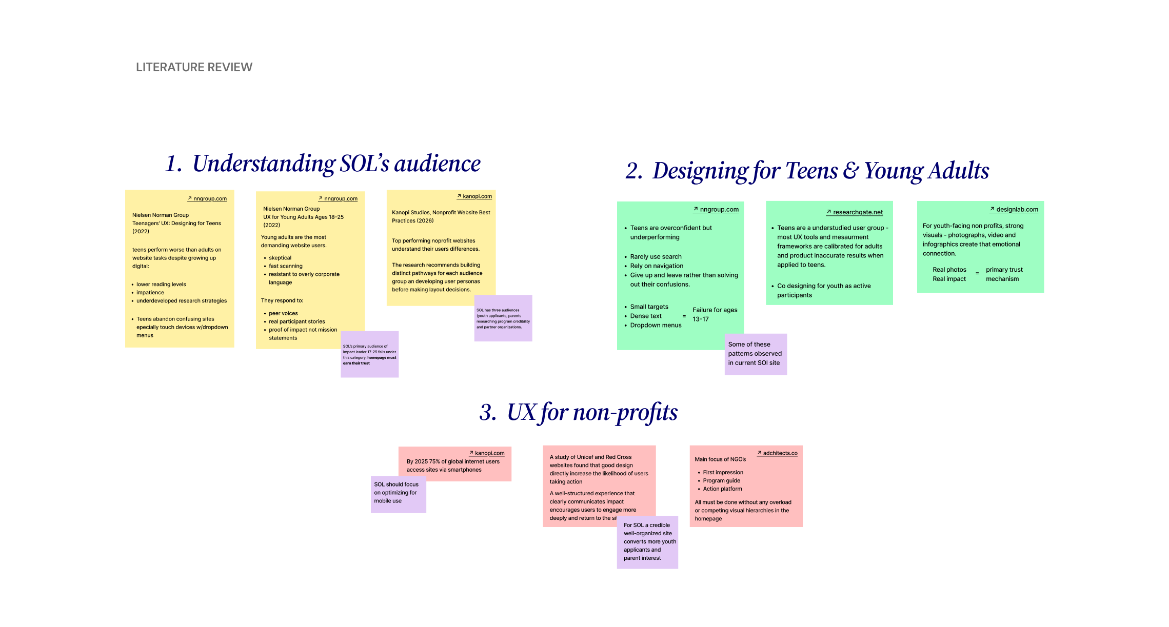
The literature review informed three core areas of SOL’s redesign:
- Understanding who is using the site
- how the navigation and information architecture should be structured
- designing for a youth audience
Understanding SOL’s Audiences
SOL serves different audiences including youth applicants, parents, partners and funders. Each of these groups arrive with different questions and expectations. Nielsen Norman Group’s research on young adults (18-25) finds that this group is highly skeptical and fast scanning. They consider an organization’s credibility within seconds based on peer voices and proof of impact rather than institutional language. Additionally, Kanopi Studios’ 2026 Nonprofit Website Best Practices report reinforces this, stating that top-performing nonprofit sites tailor the experience to each user segment rather than a single undifferentiated page. For SOL, this means youth applicants, parents researching program credibility, and partners evaluating collaboration potential all need clear pathways to what they are looking for without having to decode SOL’s internal terminology first.
Navigation and Information Architecture
Nonprofit websites face structural challenges according to Nielsen Norman Group’s 116-guidance reporton nonprofit website UX, based on usability testing across 60 nonprofit sites, the average bounce rate for nonprofit websites is 60%, which is 20 points higher than general websites. Common causes are unclear mission language and an inability to find program details. NN/G’s Information Architecture Study Guide (2024) identifies “information scent” as the main principle: navigation labels must clearly signify what lies behind them, or users will not click. Labels that carry internal meaning but lack clarity for visitors, which is a common pattern in mission driven organizations, are among the top contributors to bounce rates. Wired Impact’s Nonprofit Navigation Best Practices (2025) recommends keeping primary navigation to no more than 5-7 items and structuring labels around users’ perception of what they seek not what the organization wants to say.
Designing fo Youth Users
A 13 year research with 100 teenagers testing 210 websites, including nonprofit sites, finds that despite growing up digital, teens perform worse than adults on web tasks. They rely on navigation rather than search, give up quickly when something is unclear, and are likely to be on mobile devices where small tap targets and dropdown menus consistently fail. By 2025, Kanopi Studios reports that approximately 75% of global internet users access sites via smartphone only, making mobile-first design a baseline requirement for any youth-facing organization. A study of UNICEF and Red Cross by UI Group found that well-designed nonprofit experiences increase the chances of users taking action, applying, volunteering, or engaging. This reinforces the statement that design is not used explicitly for aesthetics but rather for functional purposes. Finally, ACM CHI research on teen UX (2014) argues that co-designing with youth as participants rather than viewing them as subjects produces more accurate results. In essence, involving current Impact Leaders in usability testing before launch would strengthen the redesign.
System Architecture
To begin structuring the experience, we developed a system architecture that organizes the platform around key user needs. Our approach revolves around this key structure: “Explore–> Evaluate –> Act”. So we identified the key components of the platform, and our user journey revolves around this framework.
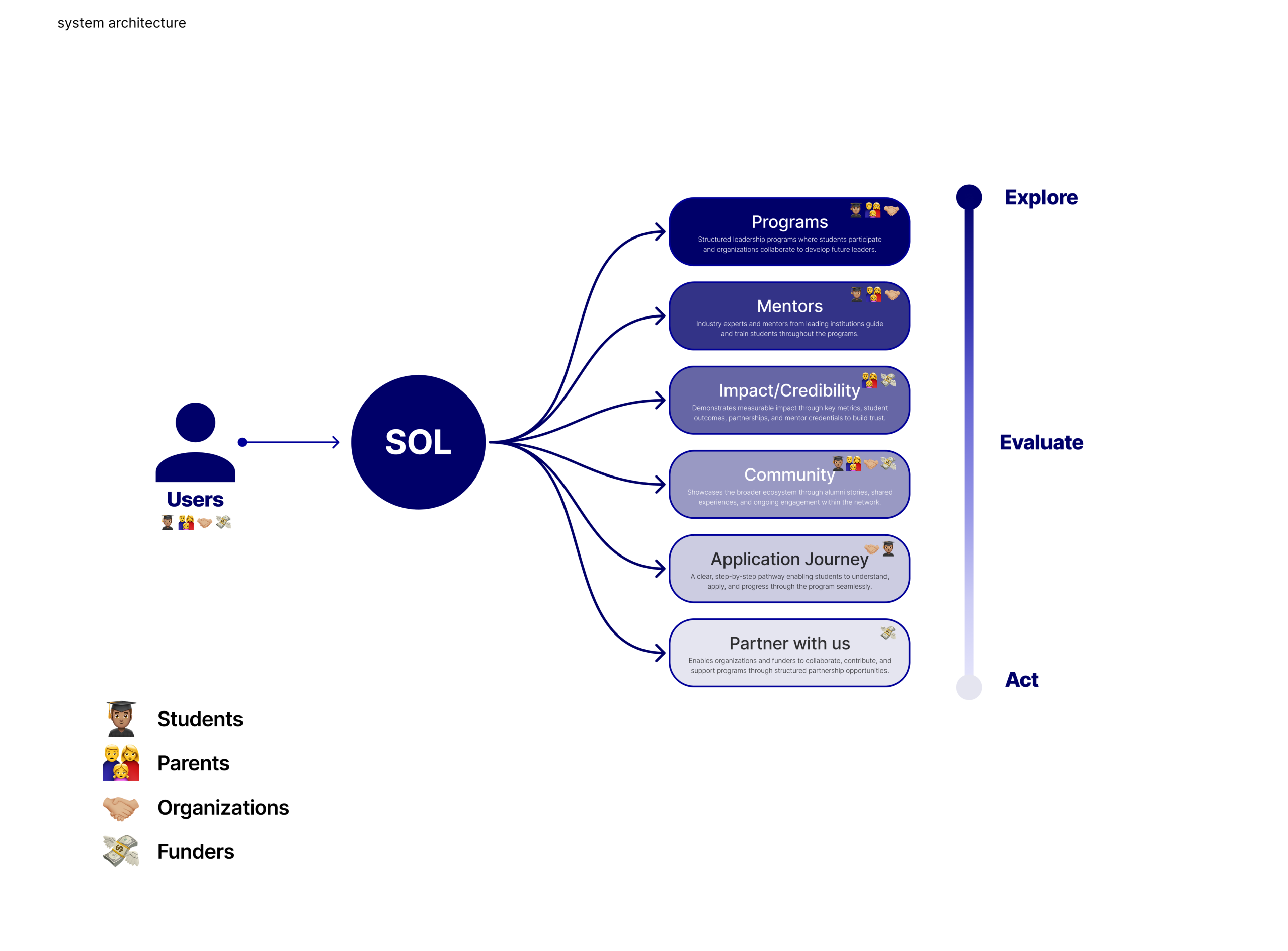
A site that grows with the organization.
With SOL’s growing ecosystem of programs, audiences, and partnerships, one of our earliest and most critical design challenges was structuring the site’s information architecture. We developed a four-item primary navigation structure — Programs, About SOL, Get Involved, and Stories — each anchored by a mega menu that surfaces relevant sub-pages and contextual highlights.
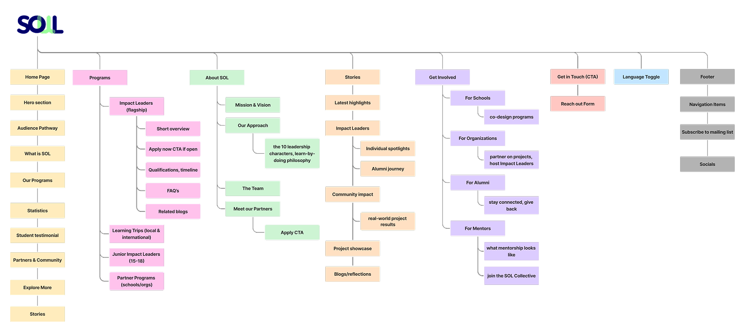
This approach allowed us to serve multiple audiences simultaneously while maintaining a unified, coherent narrative at the top level. The IA also prioritized SOL’s partnership and growth goals, ensuring that calls to action for collaboration and inquiry were surfaced early and consistently across the site rather than buried in secondary pages.
Key Workflows
We created key workflows mapping out the step-by-step journeys for important visitors of the site. For example, users exploring SOL’s mission could move from the homepage into deeper organizational context through multiple entry points, while corporate partners were guided through a more intentional collaboration journey, from initial interest to program exploration and partnership inquiry.
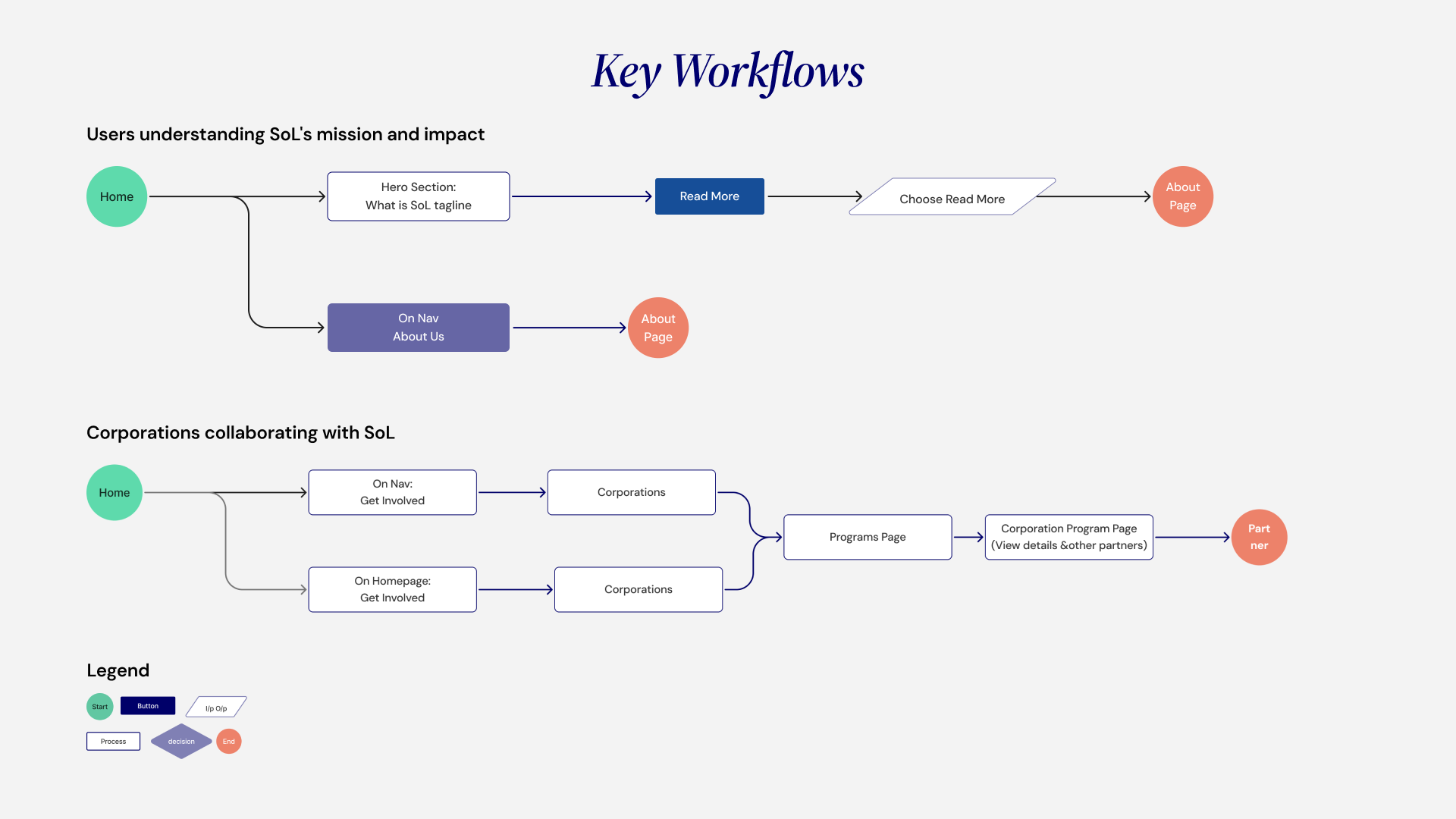
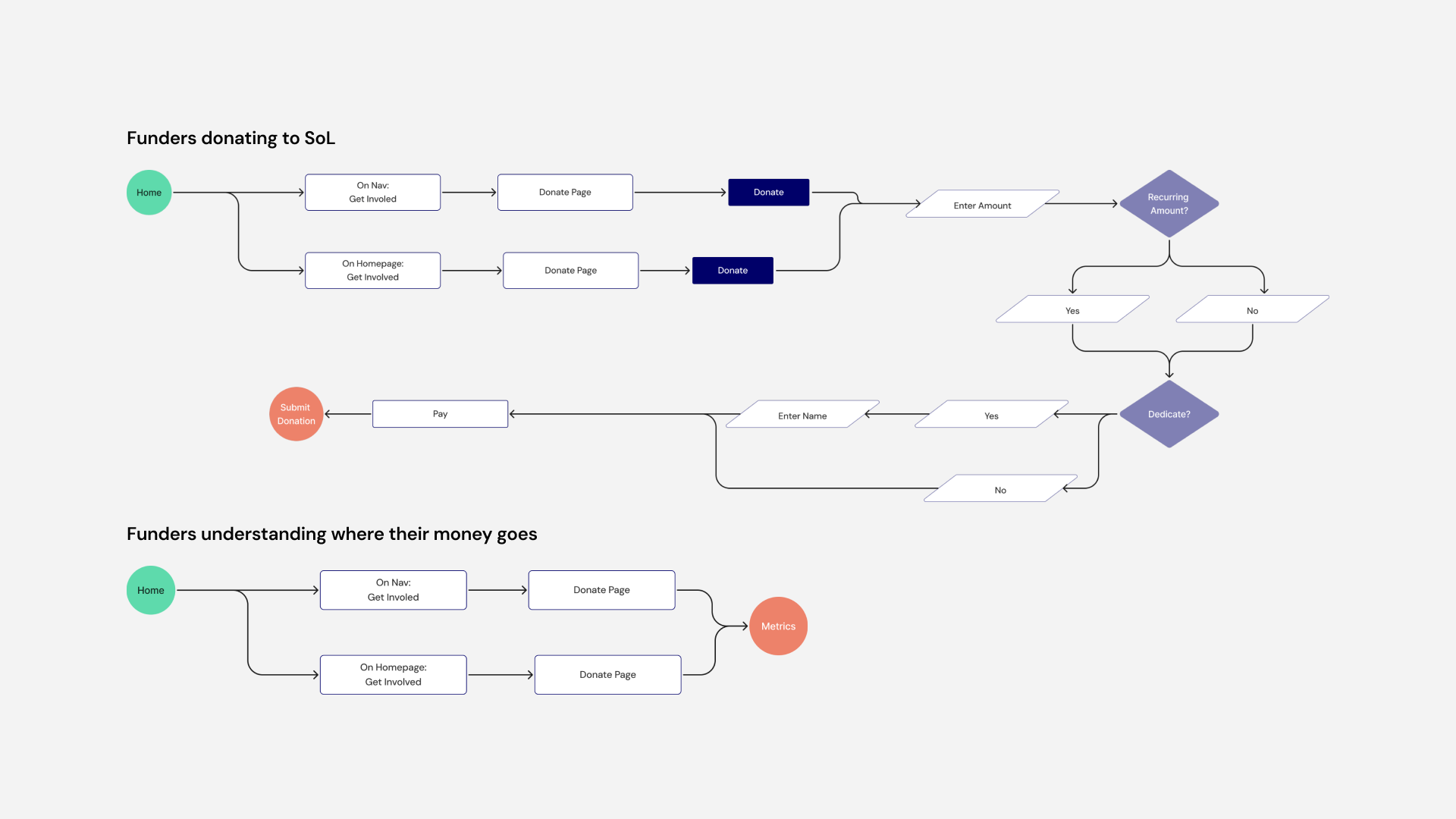
By visualizing these flows early, we were able to identify critical navigation moments, surface calls to action more strategically, and ensure that the experience remained intuitive even as the site architecture became more complex. The workflows also reinforced SOL’s broader goals of accessibility, partnership-building, and storytelling by creating pathways that felt guided rather than overwhelming.
Structure first, style later.
Next, we moved into low-fidelity wireframing to explore layout, hierarchy, and content flow across key pages before committing to any visual direction. Our wireframes focused on the homepage, program pages, the stories page, and the partnerships section, which are the four areas most critical to serving SOL’s diverse audiences and communicating its global scope. At this stage, our primary focus was on structure over style: testing how content blocks could be sequenced to guide different users through the site naturally and ensuring that calls to action were positioned at the right moments in each user’s journey.
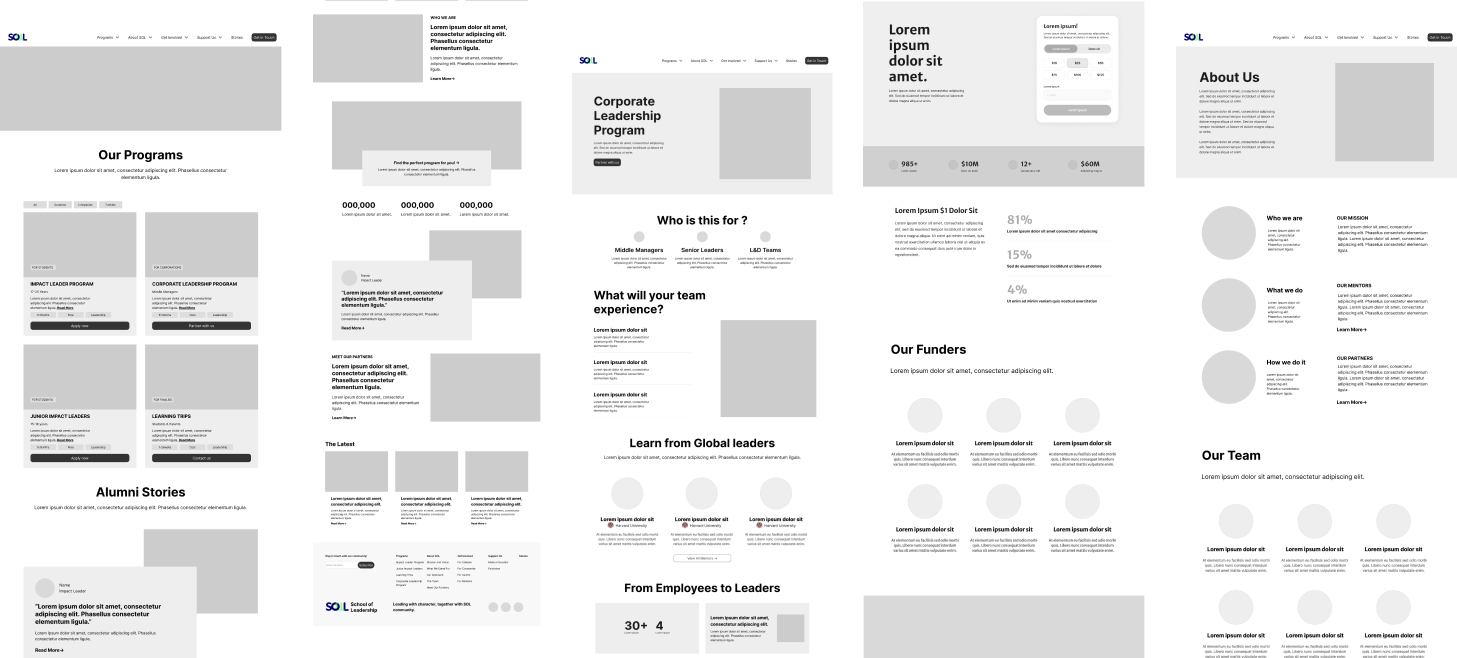
After presenting this to our client, we got aligned with the website’s overall structure and began to think about iterating to higher fidelities.
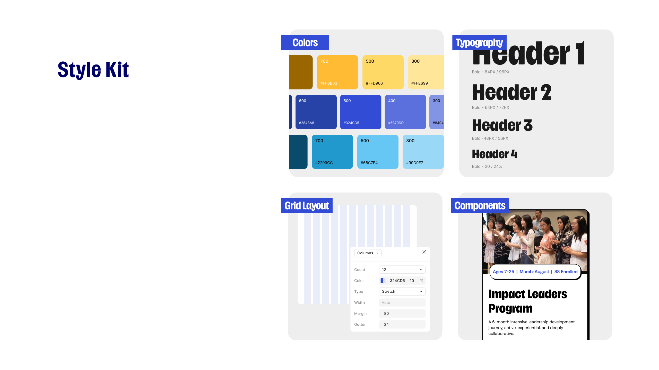
Style Kit
What’s Next?
- Measure User Engagement & Conversion: Track post-launch performance to validate design decisions and identify friction points through:
- Partner inquiry submissions
- CTA click-through rates
- Application completion rates
- Drop-off points in user journeys
- Validate Business Impact:
Analyze how the redesign contributes to:
- Increased partnership interest
- Higher application conversions
- Stronger trust and credibility perception
- Integrate LMS & AI-Driven Learning Support : Explore integration of a centralized Learning Management System (LMS) and AI-powered features into the designs and IA
By focusing on continuous iteration, data-driven optimization, and future integrations such as LMS and AI-powered learning systems, the School of Leadership can evolve into a scalable and user-centric platform that empowers students, mentors, and partners through meaningful and accessible leadership experiences.
Usability Insights
We tested the mid-fidelity prototype with four graduate students to gather usability insights and identify what might have gone wrong with our progress across key user journeys. Participants were asked to navigate through the homepage, programs and contact page while thinking aloud.
The sessions revealed :
- Homepage: there was no clear “call-to-action” button for the different audience cards causing confusion. Users excepted an action to occur with options like “Apply Now” or Explore Programs”
– “What happens when I click on “Learn More”
– “It’d be nice to see an “Apply Now” button.
- Programs page: there was a positive response for the program cards, The cards made the information clear and scannable.
– “I like the cards, I can see what each program is about straight away”
- Corporate Leadership page: appreciation of the four-step process. The visual structure helped users understand how SOL works. “
– “This is clean”
– “Really like the “program overview and four-step cars”
- About Us: credibility ensured trust of users but card design for most sections was overwhelming. One would prefer to see numbers in the homepage.
– “Nice to see numbers since they build trust but wouldn’t it make sense if they were on the homepage?”
– “I think what we stand for would look better without the cards
- Impact Leaders: positive responses to the application timeline. One user stated that they would like to see the cost of the program.
– “I would want to see the cost of the program.”
- Get In Touch: the advisory box was well received. However, the content seem to cause negativity with the long list of No’s.
– “The yellow box made me feel like I wasn’t supposed to use the form”
– “This form feels defensive”.