Introduction
Netflix is a membership-based subscription platform for streaming movies and TV dramas. It was founded in 1997. It profited solely by renting DVDs at the beginning, but today it is focusing more on providing online video streaming services. Netflix’s earliest subscription system began in 1999, and users could choose to pay different price subscription fees to rent DVDs; Later, it also slowly began to develop online viewing video platforms while trying to shoot and produce original film and television dramas.
From 2010 to 2016, Netflix was officially launched in Japan, Taiwan, South Korea, Hong Kong, and other regions. So far, Netflix’s streaming platform has been provided almost “all over the world.” For copyright reasons, the film and TV show resources provided by Netflix in different regions will be slightly different. Netflix is bound to gain a place among its competitors because of its outstanding products, services, and design. As a Netflix user, I will analyze the pros and cons of its design by combining my personal experience with the book by Mr. Don Norman.
1. Viewing Activity
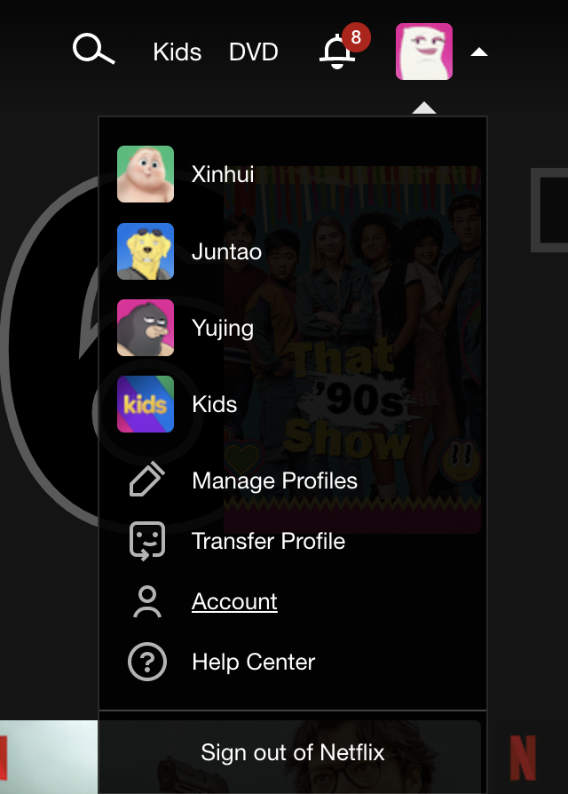
As a Netflix user for many years, I recently figured out how to find my watching history. Users usually default their watching history to personal accounts, but Netflix places it in a place that makes it hard to find. The user needs to click the avatar in the upper right corner to open the drop-down box and click “Account.” (Figure 1)
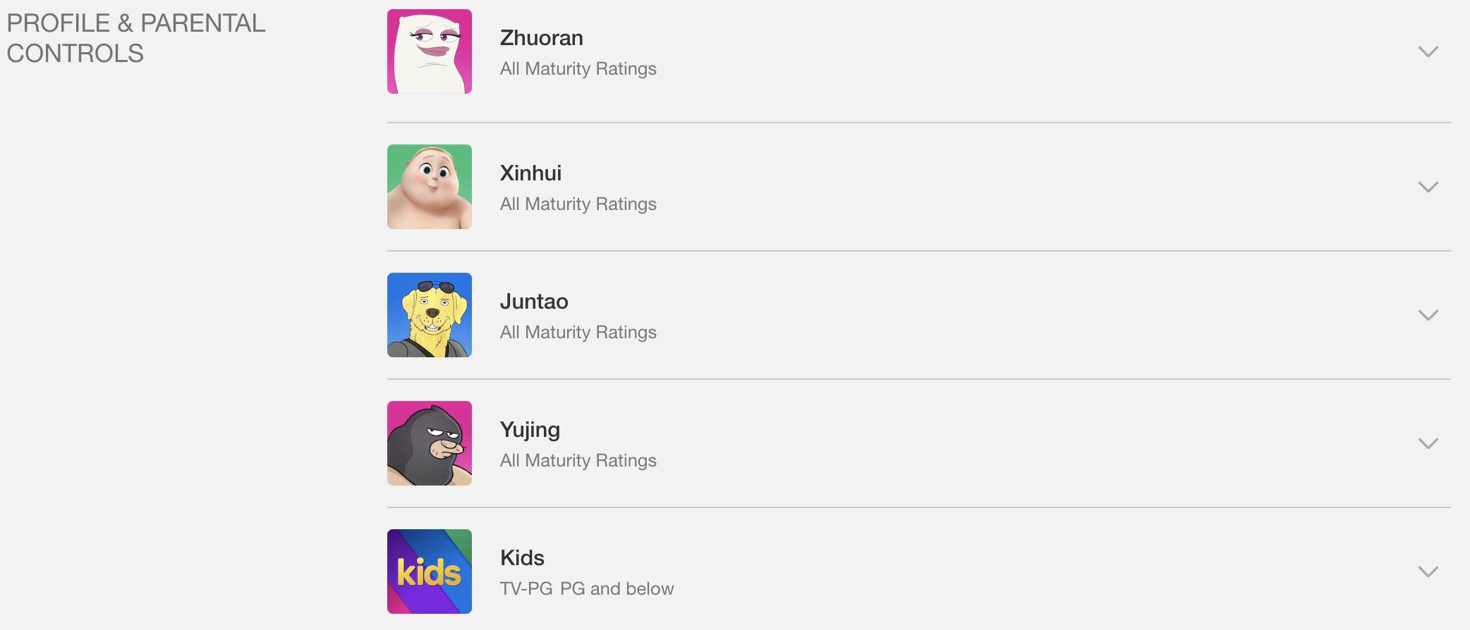
At this point, the user gets good feedback because it opens a new page. All family members’ account avatars and names are clearly displayed on the page. This section is also the first thing that caught my eye when this page opened because the user’s avatar is colorful. The visuals of this part are well done. The obviousness of Visibility can give users a good orientation. (Figure 2)
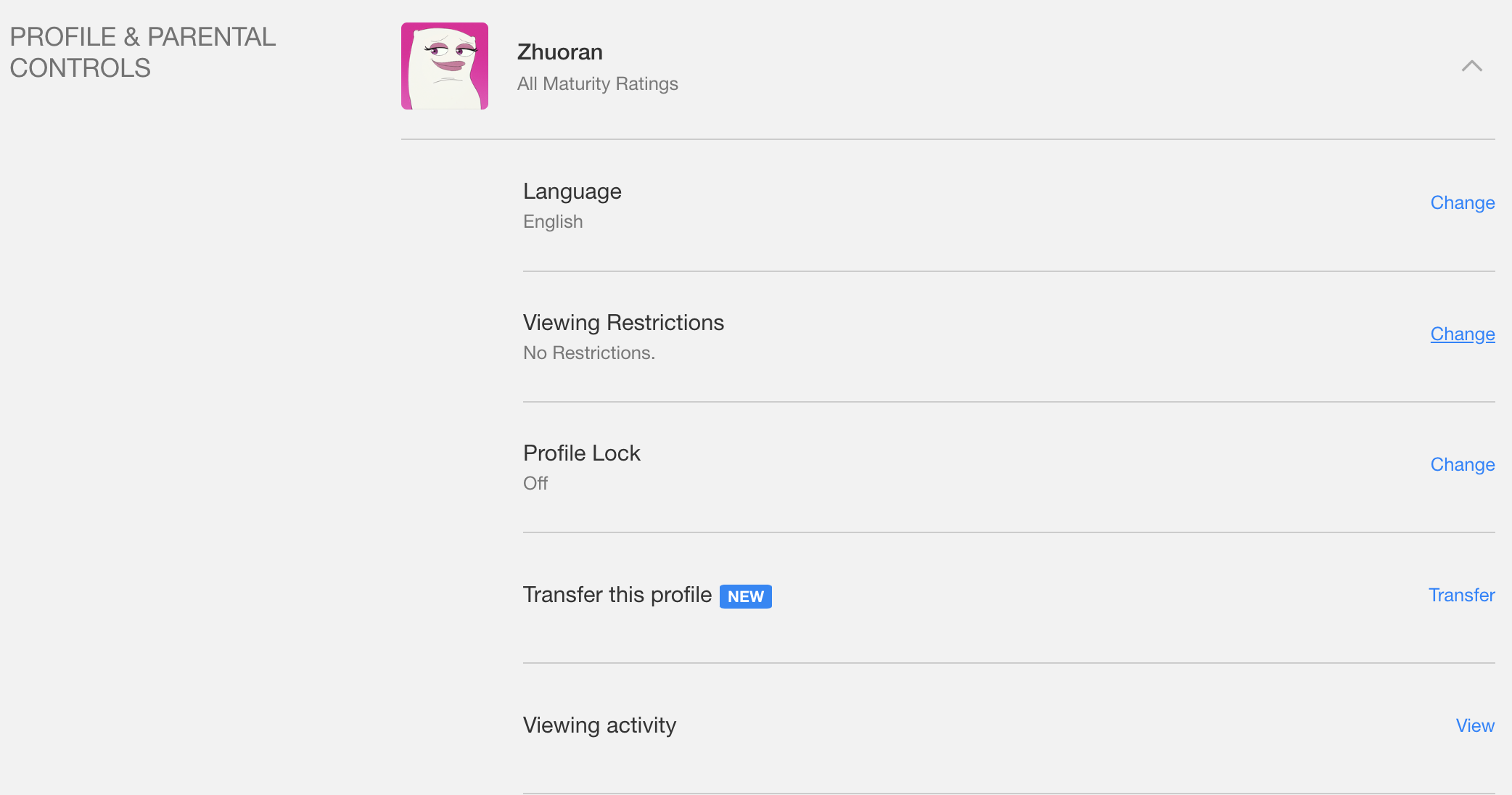
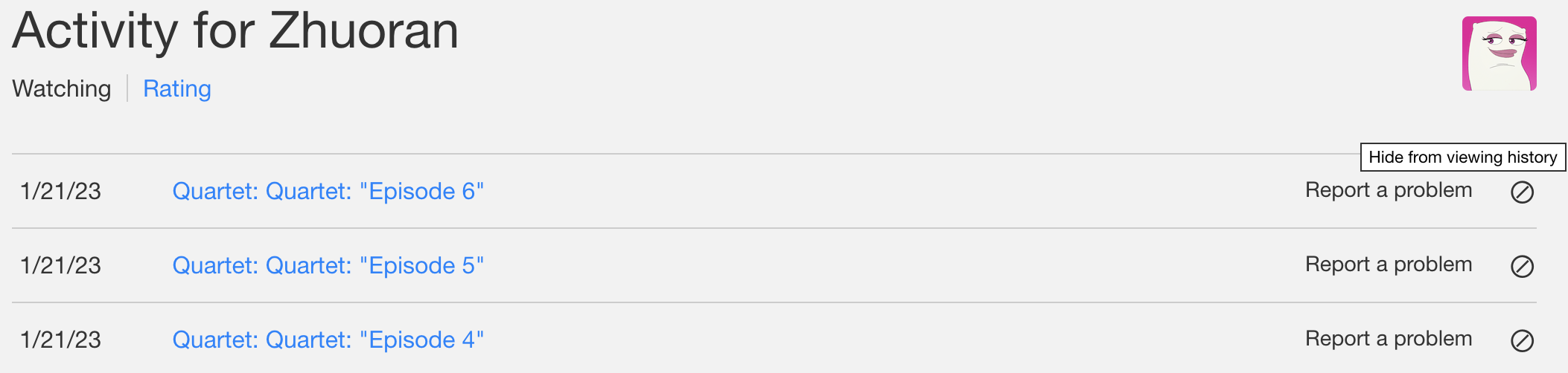
Users need to continue to click on their avatar to expand more options. On this page, “viewing activity” appears. Some users’ first reaction was to click on the text, but there was no response, and then they tried to click the blue font “View”. Finally, users can successfully obtain their viewing history. (Figure 3)
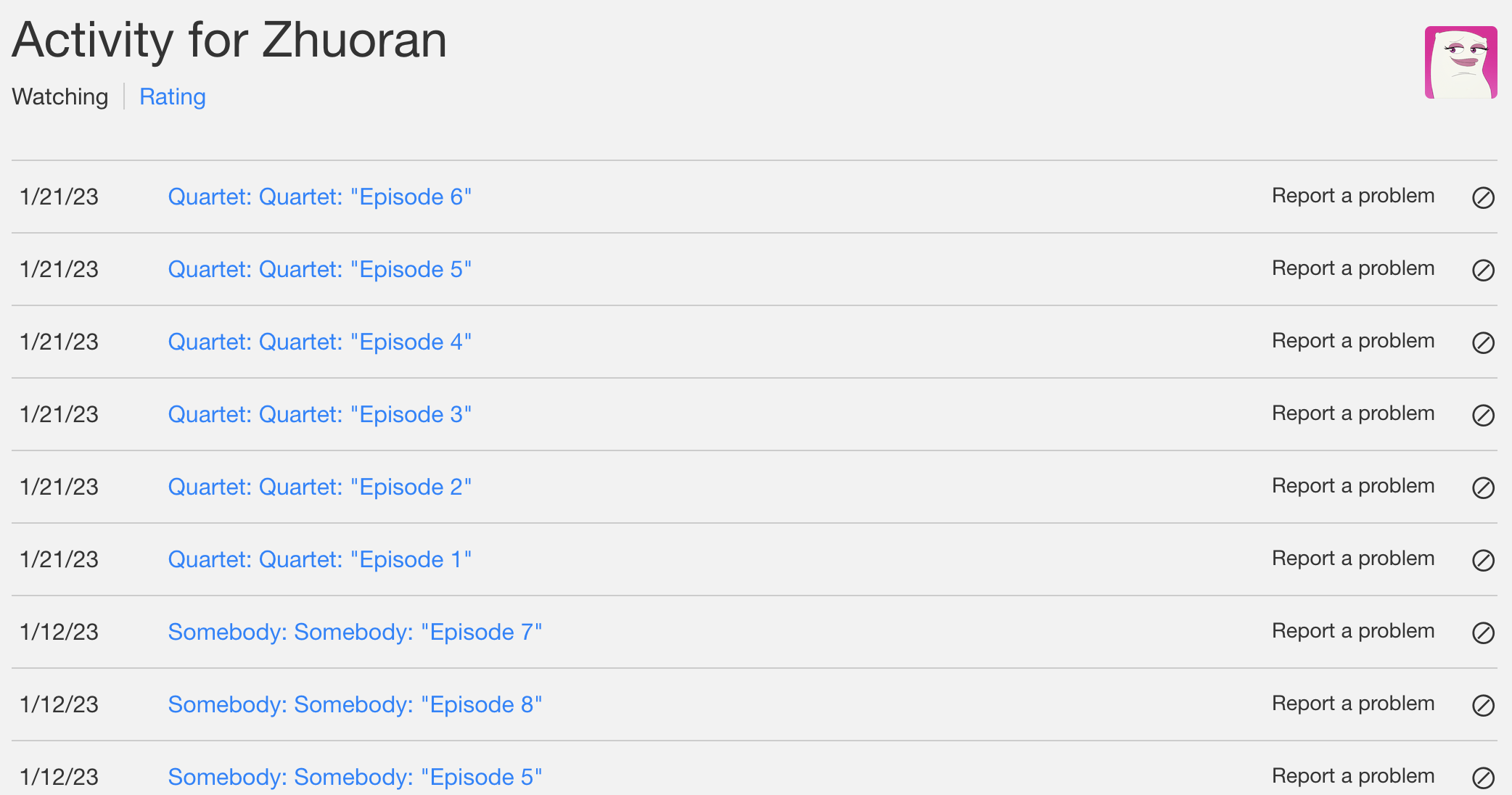
The viewing history interface provided by Netflix is very similar to the interface of the mailbox, and YouTube is more concise and consistent with Mr. Don Norman mentioned in this regard than the way Netflix is presented. Because the Netflix interface is full of various TV show series and movies with covers and frames. On the viewing record screen, all text is used instead. It could summarize the viewing history directly in the personal account and add some video covers in front of the text episode title; it would make users feel clearer and easier to use. (Figure 4)
Another pain point that users cannot stand is that the viewing record cannot be deleted and can only be hidden. This problem can be improved by adding an option to delete playback recordings. (Figure 5)
2. The cover of the film and TV shows tries to match users’ preferences
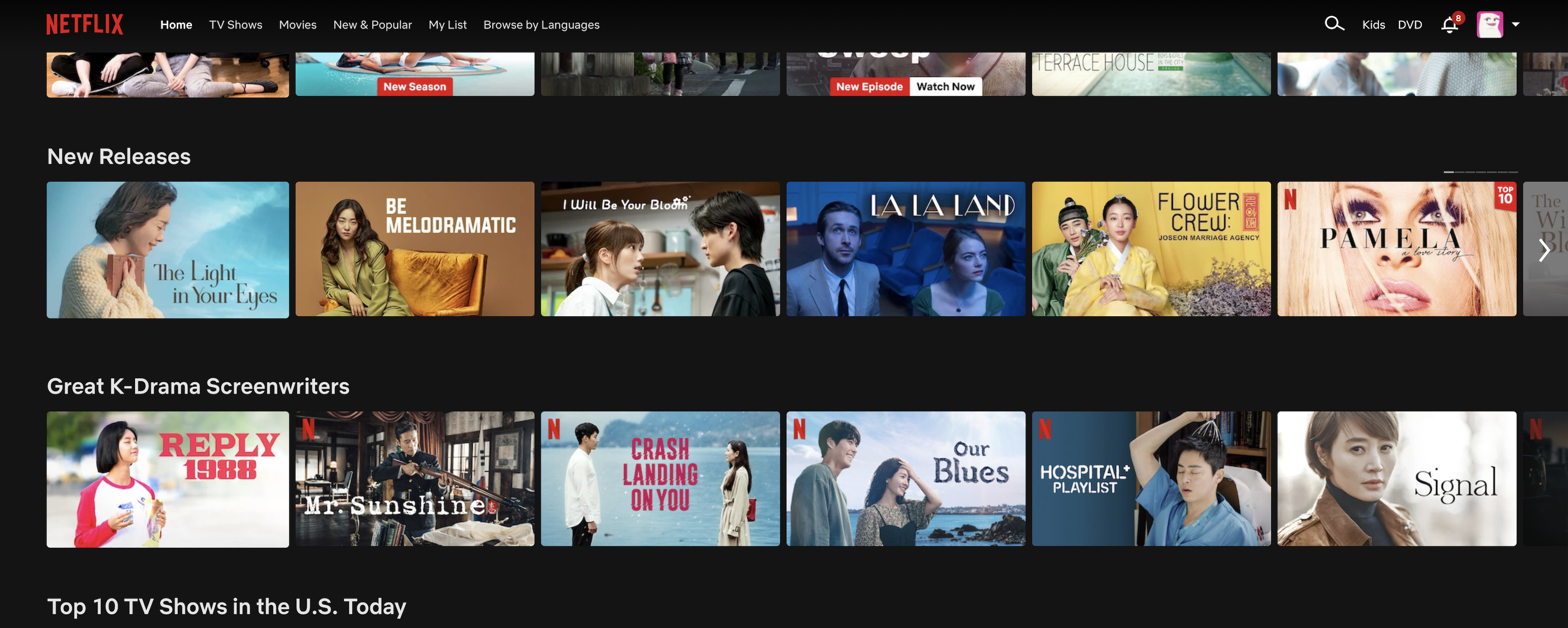
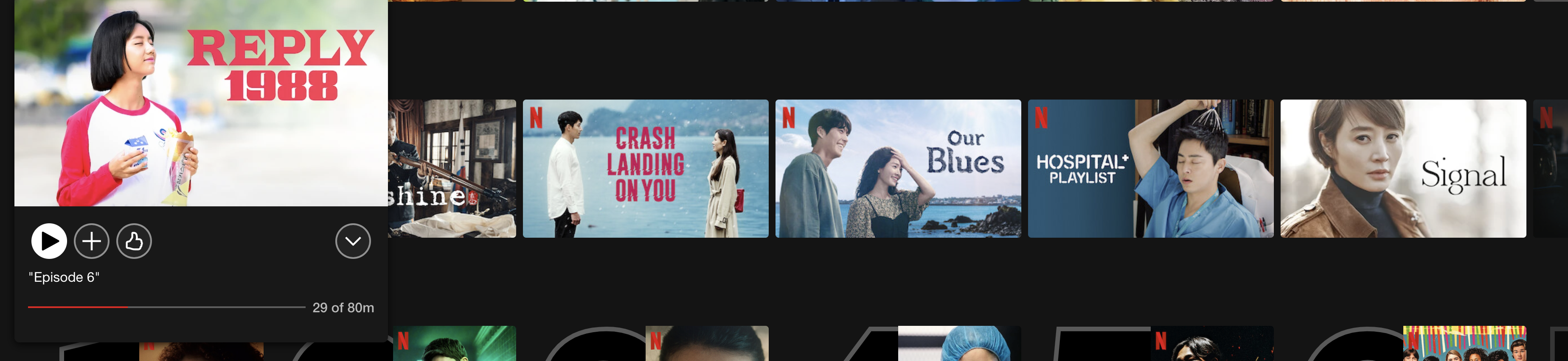
The layout of the Netflix website is straightforward and clean, which fits Mr. Don Norman, that says good design should be easy to use. After subscribing, you can use the same subscription plan for the whole family, but each person can have a different account. As a result, the user’s data is collected and analyzed separately. When I use my account and occasionally switch to my family’s account, I find that although the types of movies and TV shows we watch are not the same, we occasionally watch videos together. Therefore, some of the same videos will be left on our account. Even for the same video, Netflix designed different covers for them. (Figure 6)
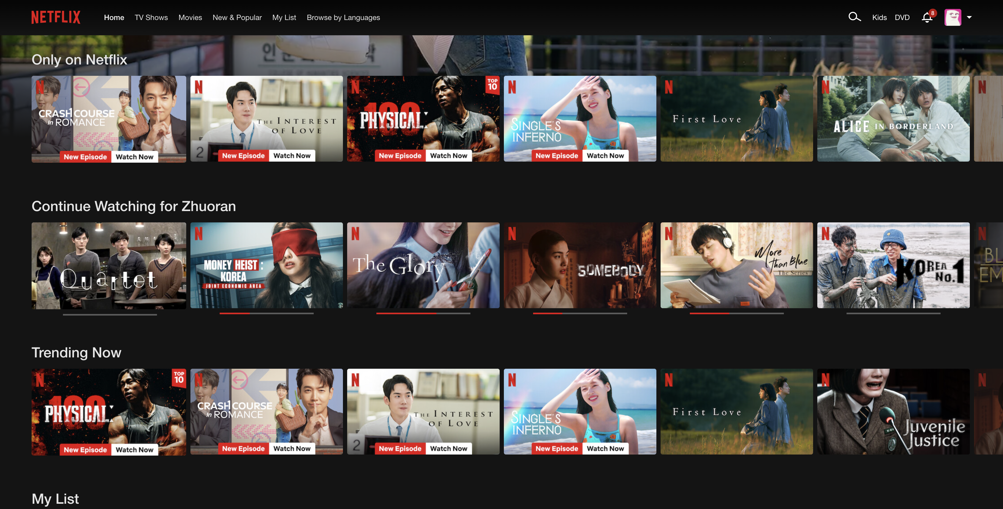
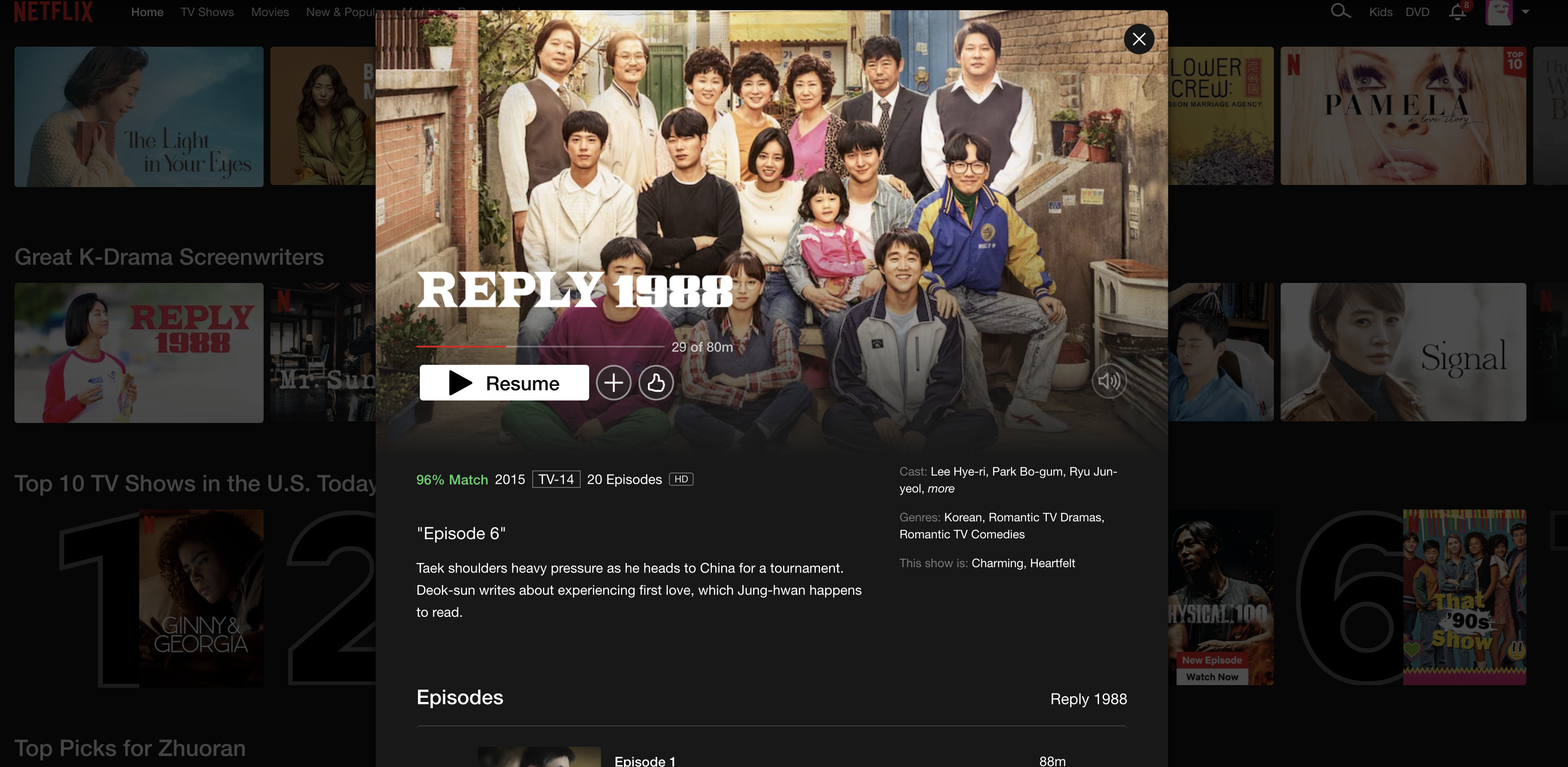
People will see a cover that better matches your preferences. Figure 7 is me, and Figure 8 is one of my family members. Open the interface of two different users simultaneously and see that the same TV series, “Rely 1988,” appears on the home page, but the cover is entirely different. I am usually more interested in women’s subjects, while my family user likes relationship-related genres like anime, adventures, or friendships. Personalizing the cover may increase the likelihood that a user will watch an episode or movie. This design is in line with Visibility. The more visible the elements, the more likely users are to know and will to clicking them.
After attracting the user’s attention by showing them a cover that matches their usual viewing habits, the user may be interested in that video, so they will move their mouse over the target cover and get great hover feedback. At the same time, because the user sees this enlarged cover and the play button, they can tell that it is obviously clickable in Figure 9.
After clicking, users get more obvious feedback, i.e., a pop up interface that covers more detailed information. It does a great job, from attracting user interest to final feedback. (Figure 10)
3. My list
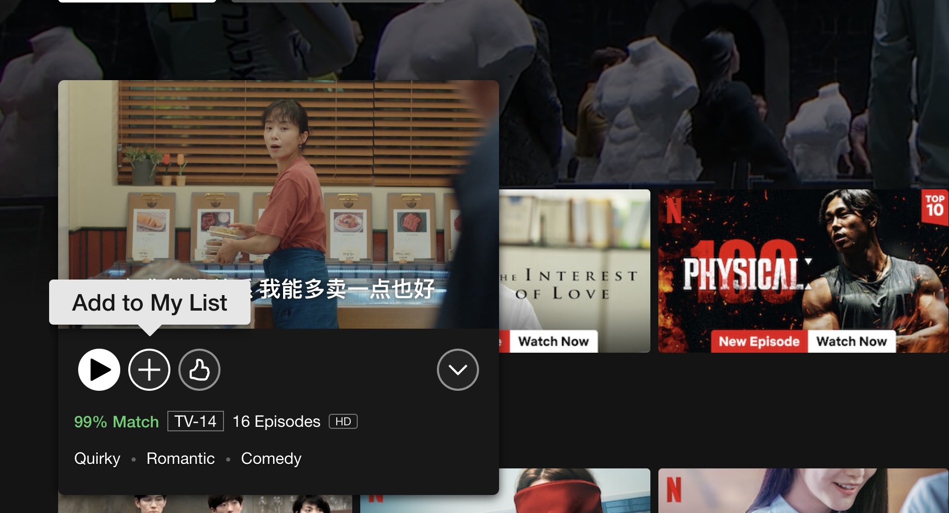
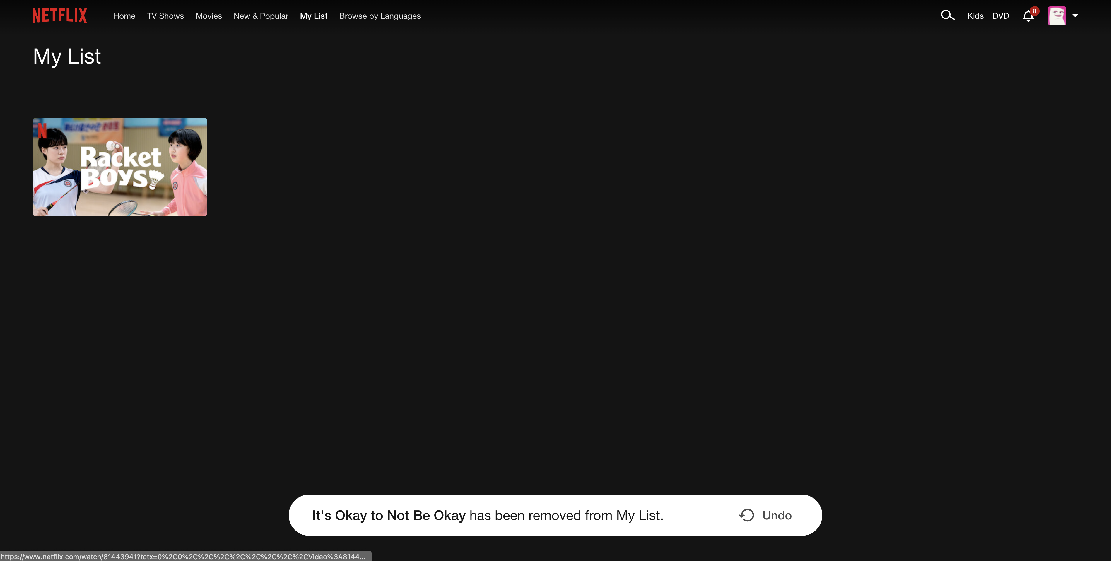
The keys used by users to add movies to “My list” on Netflix are highly discoverable and easy to operate. Users who want to view the videos they have added to the list only need to click “My List” in the navigation bar. However, the location of the “Add to my list” button may cause the user to click it by mistake, and the user will unknowingly add videos to the list. This step is confusing because of the lack of mapping. In “My list,” the user must use the same button to move the video out. (Figure 11 & 12)
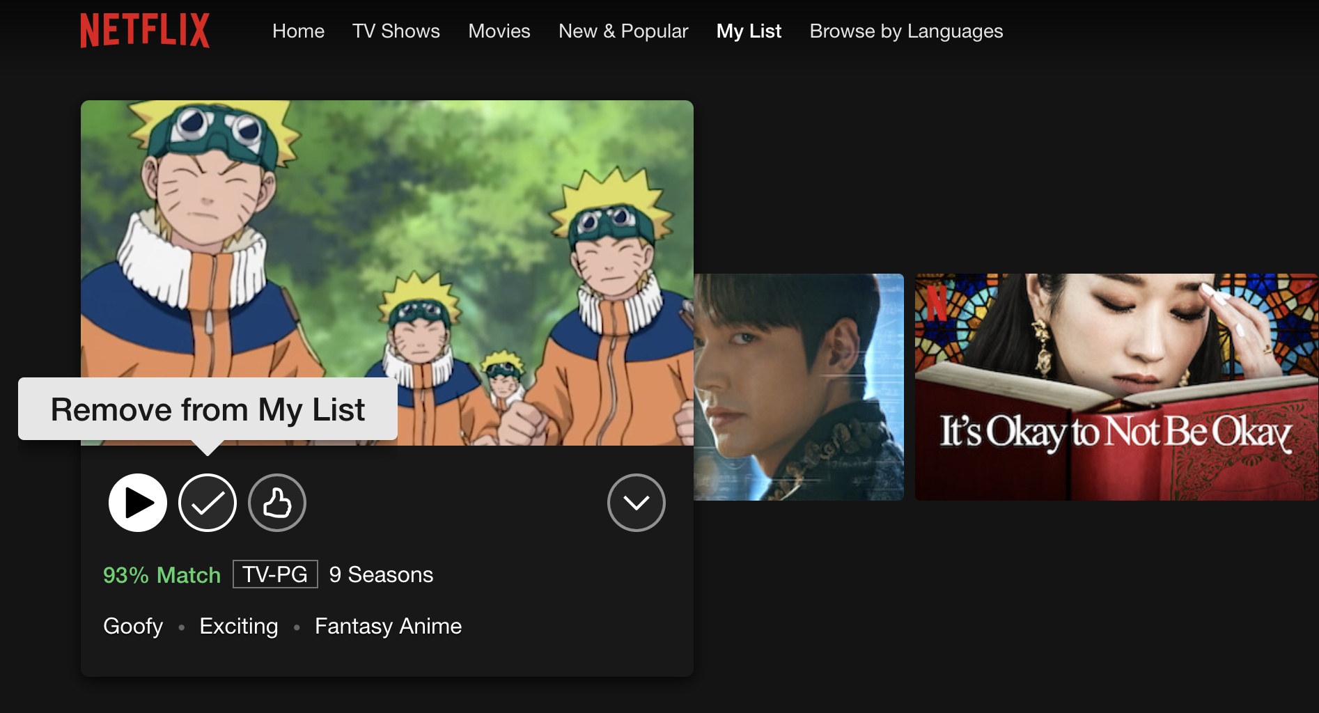
After choosing to remove it, a small pop-up window will show up at the bottom of the screen and ask the user if they want to choose to undo the removal action. Netflix encourages users to use “My list” because this collection can help them better analyze user preferences. If designers could move the “Add to my list” button, they might avoid many unnecessary actions, at least by pulling it wider away from the play button. (Figure 13)
Conclusion
Netflix is already a mature and well-designed digital interface, but it still has room for improvement. The differences and commonalities of individual users deserve constant scrutiny and allow designers to interact better.