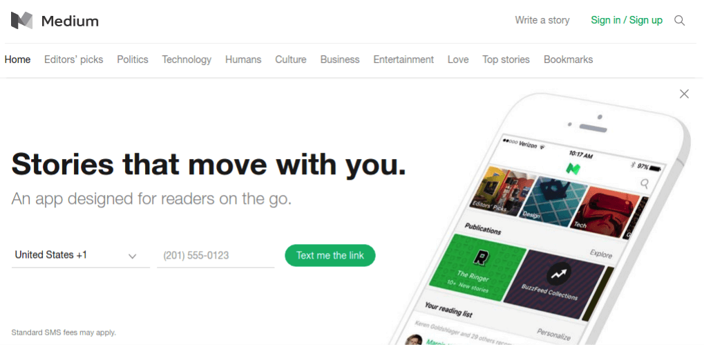
Medium is an online publishing platform launched in August 2012, having a mass of amateur and professional people and publications writing blog posts on it. The clean design quickly differentiates it from other publishing platforms and aggregates many professionals. This article is going to assess the design of medium IOS app using Don Norman’s concepts and principles in his book: The Design of Everyday Things.
Great Signifiers and Mappings
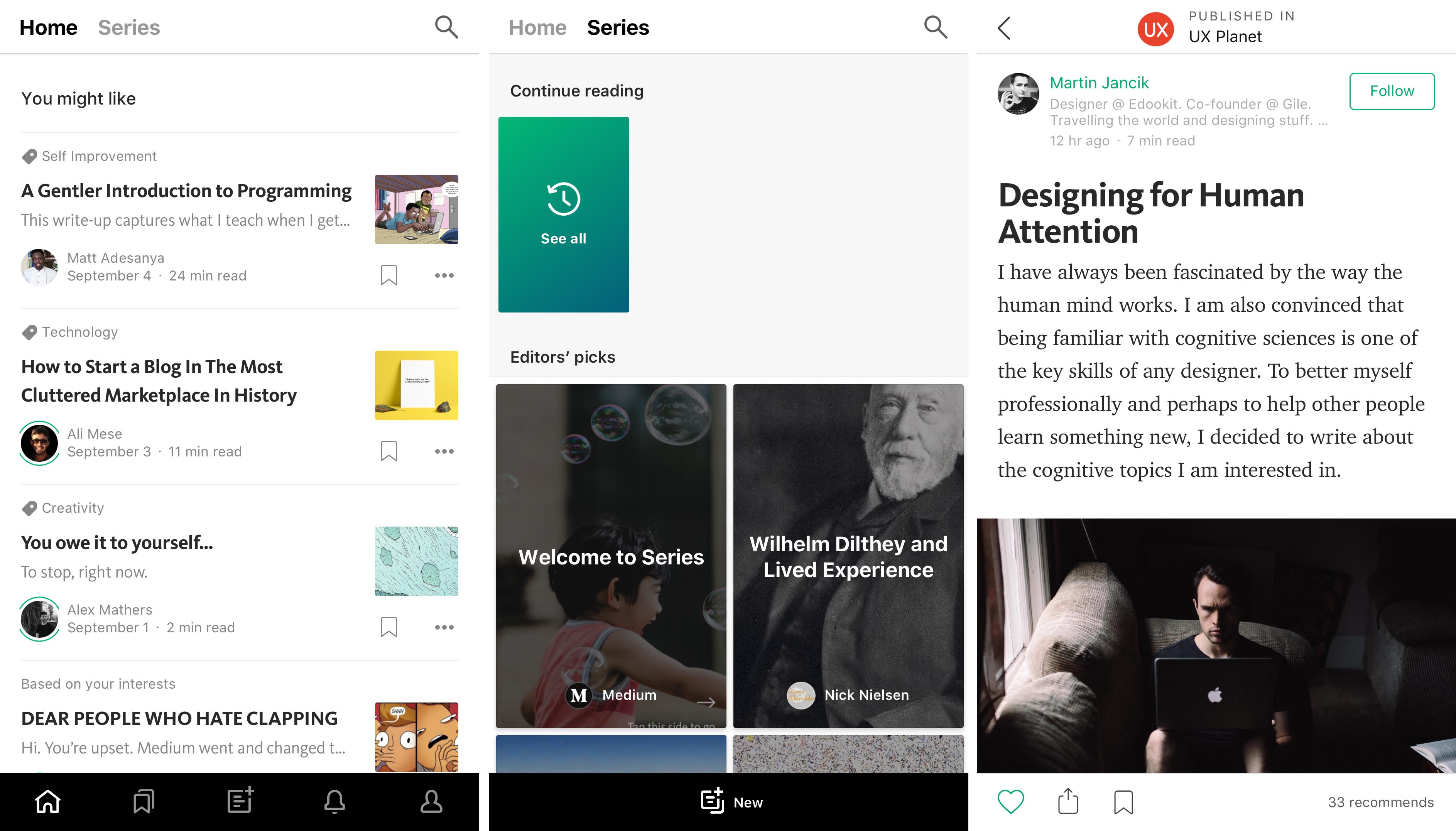
The Medium app uses clear labels and icons to inform users the functions or content on the platform, which is, as the theory of Don Norman, signifiers. For navigation bar, it has icons with a thicker thickness to show the major features of the platform. For articles, it has icons with a thinner thickness for functions of “Like”, “Share” and “Save”. No matter in the list or single article page, it displays great detail of the articles: the author, publish date, estimated reading time and topic label, fully informing readers the related information.
The title, content, and actions also match very well. “Home” and “Series” are the two type of stories available on the platform, users can swipe the screen to switch between the two.
Delicate Feedbacks Design
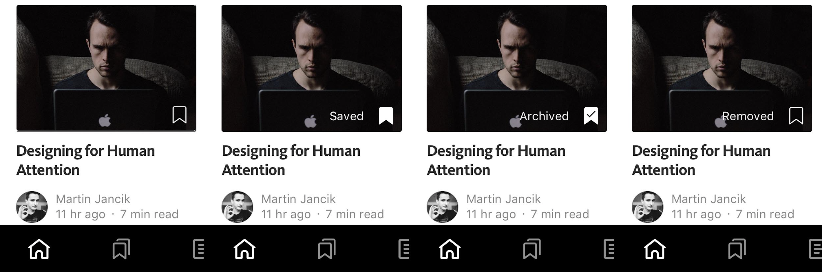
For the “Save” features, the design of feedbacks is very delicate. It not only instantly changes the status of the icon, but also flash the text explanation of user’s actions, avoiding potential confusion.
Innovative Conceptual Model
(from Medium)
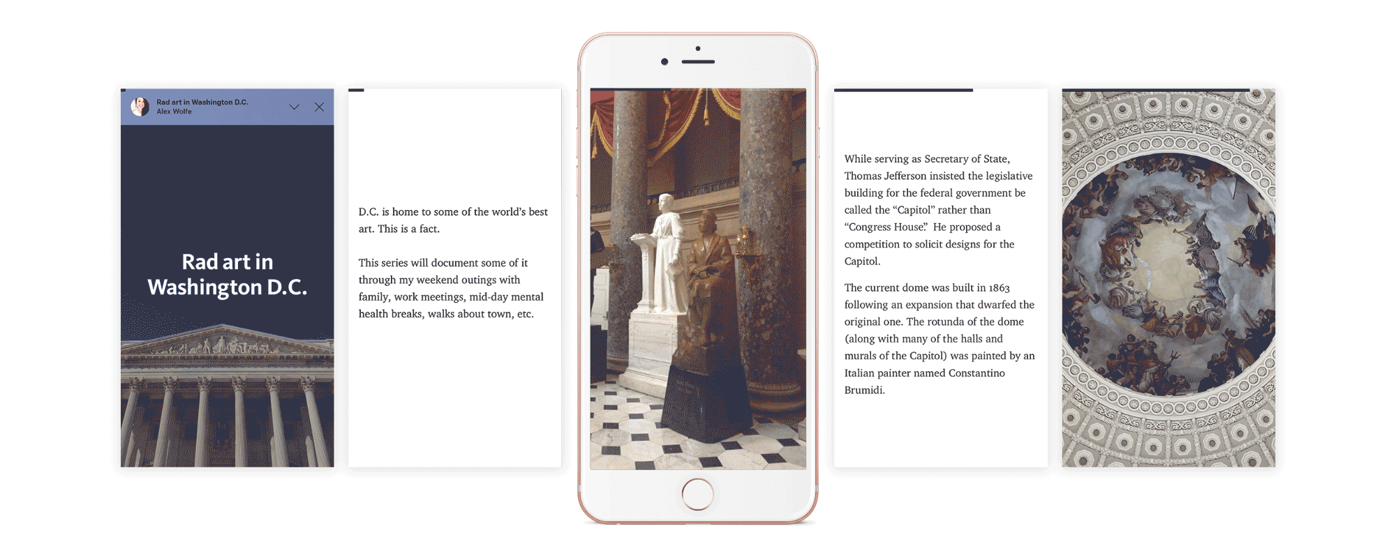
Besides regular blog post, Medium has a new type of story just for mobile users – Series. Series display stories by card, and the card can be added to over time and unfold. The usual conceptual model for reading blog post is scrolling vertically. But for “Series”, the conceptual model is swiping horizontally, and the author will decide how many words readers should read on one screen.
A problem is there is no page number (signifier) on the screen for “Series” story. There is a progress bar on the top of the screen, but users can’t tell how many pages left. I will suggest adding a page number at the bottom the screen, so users are better informed and able to estimate the time for reading.
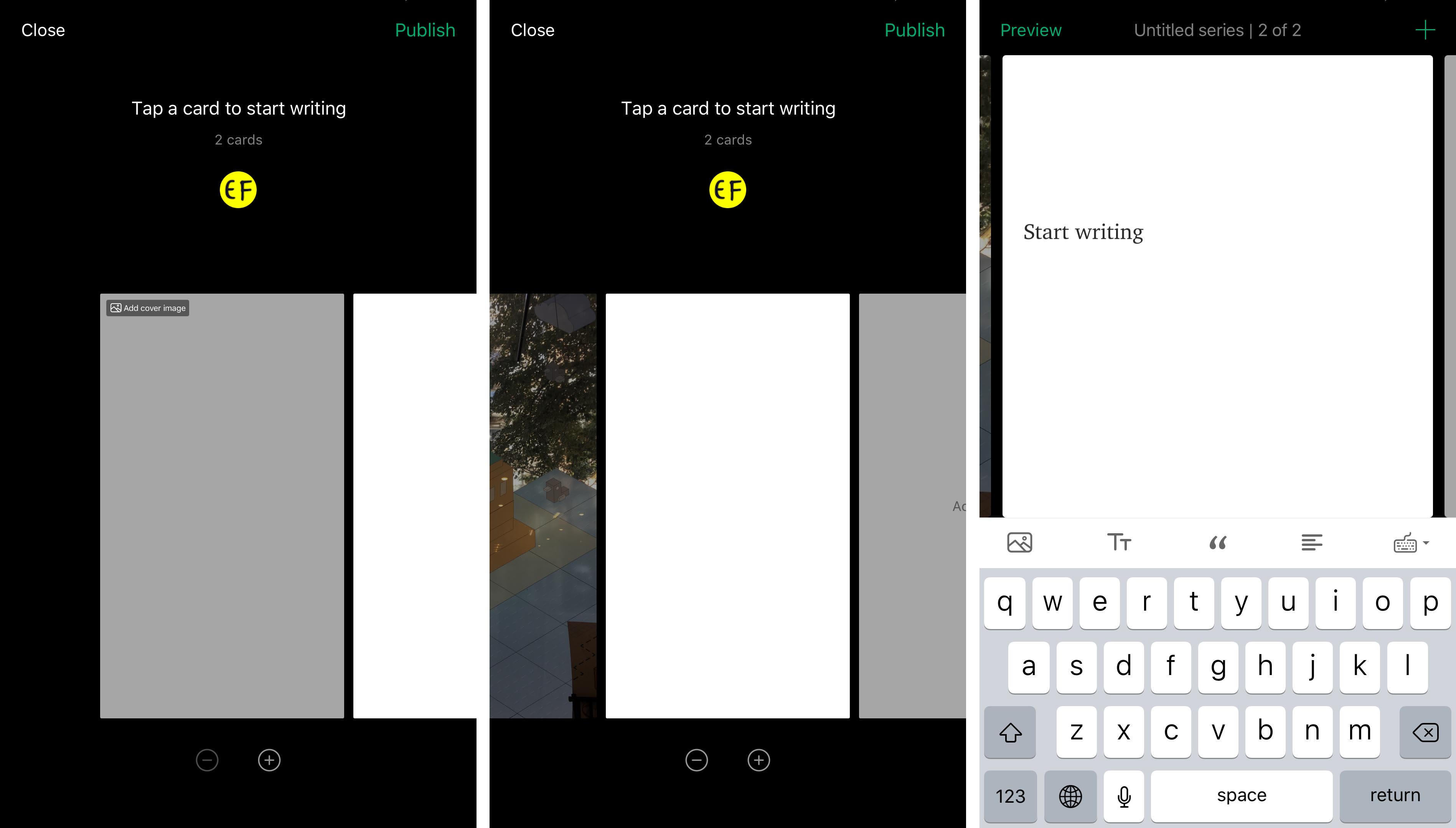
The design for “writing series” feature also successfully implies the conceptual model of how to navigate the interface and start writing – swipe and tap, which is cool and innovative.
Space for “Knowledge in the World”
Don Norman introduces the concepts of “knowledge in the head” versus “knowledge in the world”. “Knowledge in the head” is efficient to use while requiring considerable amounts of learning. Inversely, “knowledge in the world” requires no learning and helps us store information we otherwise would forget, but it is difficult to use. Both of them are essential for human’s daily functioning, but they have a negative correlation. It means if you choose the advantage of one, then you will lose the advantage of the other.
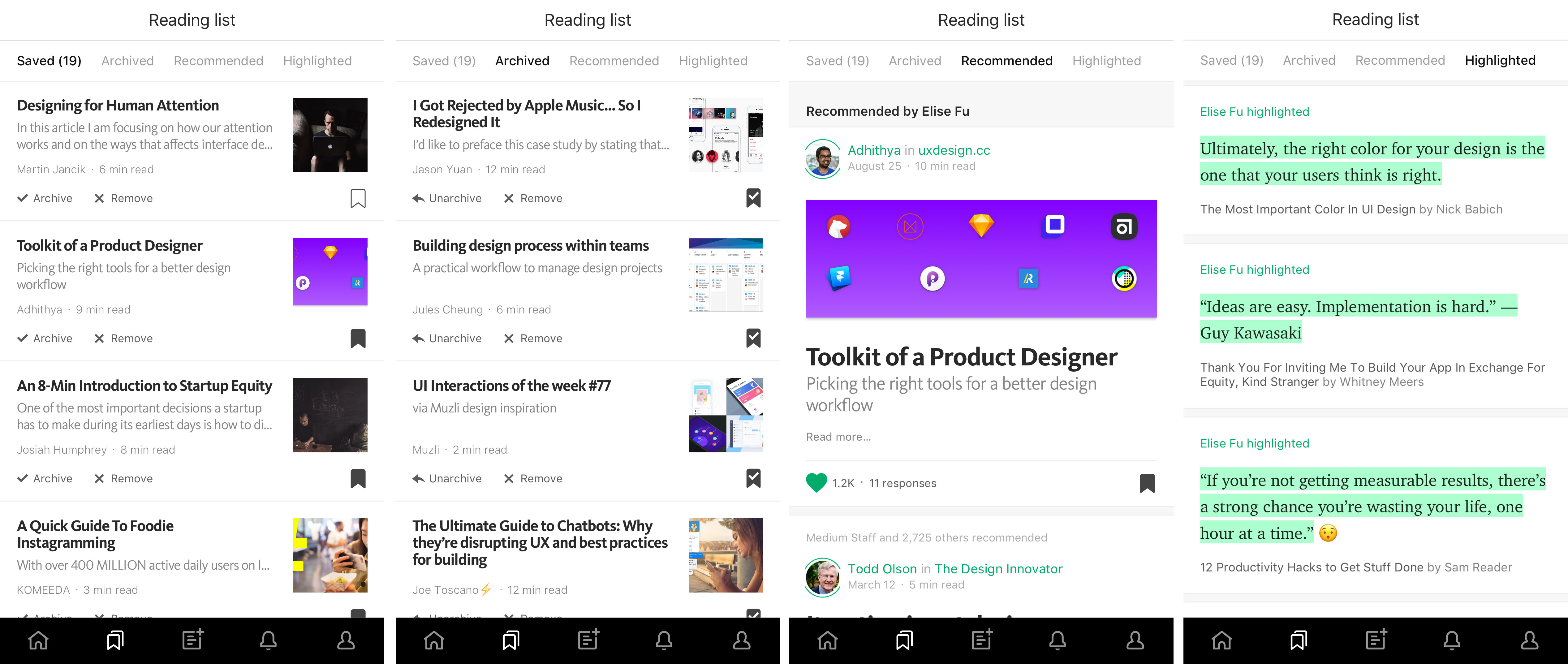
As information explodes, relying on “knowledge in the world” is becoming necessary. Good design as Medium can help us minimize its disadvantage. In the personalized reading list, Medium offers four buckets for users to store useful articles or information: Saved, Archived, Recommended, Highlighted. It makes these “knowledge in the world” easier to use.
To make it even better, it will be helpful to add features allowing users tag or categorize the articles they save, or the system automatically helps users complete the categorization. It would improve the accessibility of this knowledge, and enable users to find the information they want quickly.
To sum up, the design of Medium platform satisfies the design principles by Don Norman: clear signifiers, delicate feedbacks, and well-display conceptual model. With the considerations of human and environment factors, its IOS app has mobile-only features which is a great example of human center design.