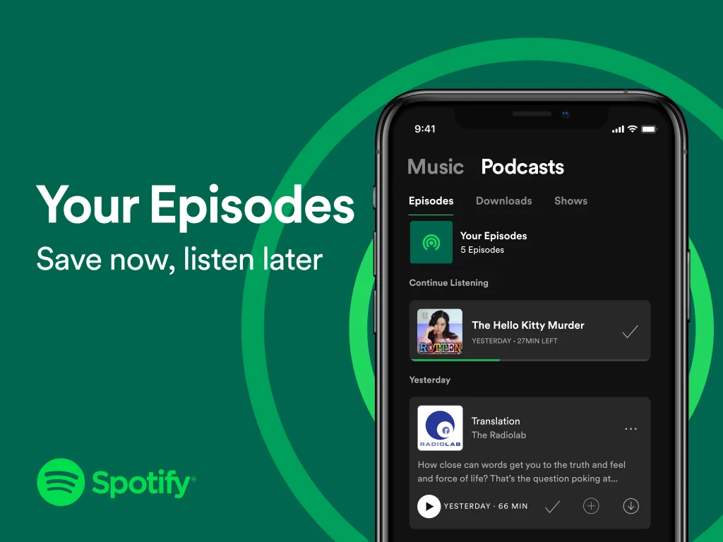
Assistive Technology: Spotify Podcast (iOS App)
In this post, we’ll look at Spotify’s podcast features, using the popular show “Anything Goes with Emma Chamberlain” as a case study. We’ll analyze these features not as mere enhancements, but as essential design solutions when viewed through the lens of the Social and Functional Solutions models of disability.
Assistive Technology: Spotify Podcast (iOS App) Read More »