Design Critiques

What makes some designs good and others bad? Why do some designs work while others don’t? Posts in this category offer thoughtful design critiques of modern digital interfaces, with commentary inspired by Don Norman’s “The Design of Everyday Things.”

Design Critique: Chipotle App

Chipotle is a fast-casual restaurant that serves build-your-own Mexican inspired meals, including burritos, tacos, bowls, and quesadillas; and the app is designed to recreate the in-person ordering experience digitally. Don Norman, in his book, The Design of Everyday Things, argues that good design goes beyond aesthetics. An interface should have clear mapping of what a

Design Critique: Chipotle App Read More »

Design Critique: Canvas

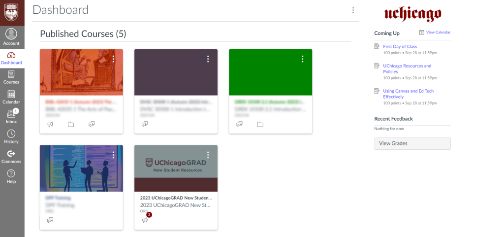
Canvas is one of the top learning management platforms used by schools and institutions. With over 30 million users worldwide, Canvas helps organize digital classrooms and support online learning. It serves as a central hub where students and teachers communicate and manage coursework, including assignments, quizzes, and grades. Image Source: University of Chicago Academic Technology Solutions, “Five Tips for Using Canvas as a Student.”

Design Critique: Canvas Read More »

Youtube TV logo

Design Critique: YouTube TV (Web Interface)

When you move away from traditional cable, switching to a web-based live TV service should feel simple and intuitive. For YouTube TV, a good desktop experience should make it easy to find and play a channel while clearly showing what’s playing or recording. YouTube TV brings familiar TV conventions into a clean digital interface, but a few design choices make basic actions more difficult than they need to be.

Design Critique: YouTube TV (Web Interface) Read More »