Swiggy is a food-delivery app providing seamless food ordering and delivery on-the-go in the Indian market currently. The user/customer is allowed to make a purchase of food through the app from the restaurants available and open near them (or atleast in the range of the delivery guy).
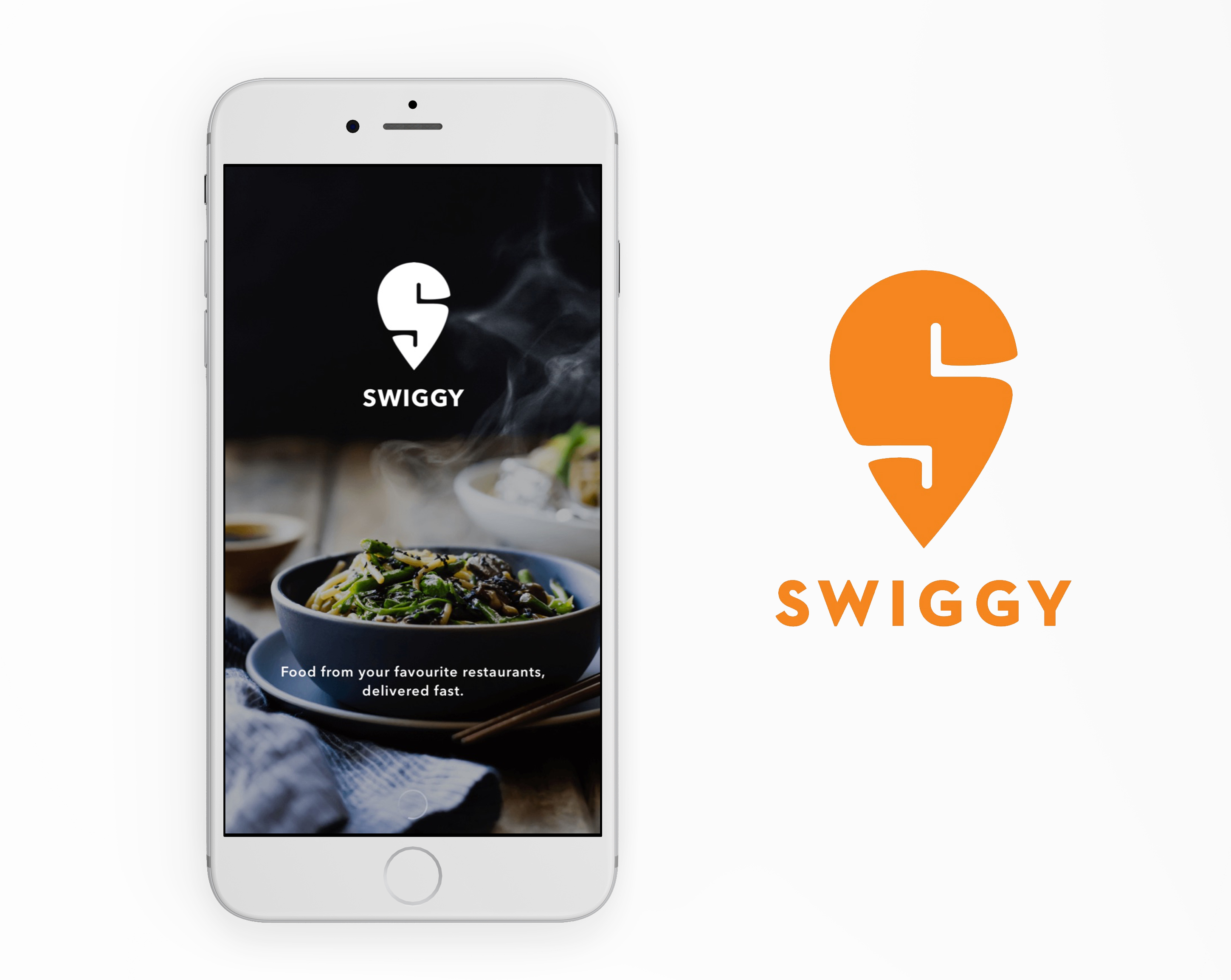
The branding is primarily focussed around the colour “orange” & their logo, which quite resembles the icon for a “location/delivery”.
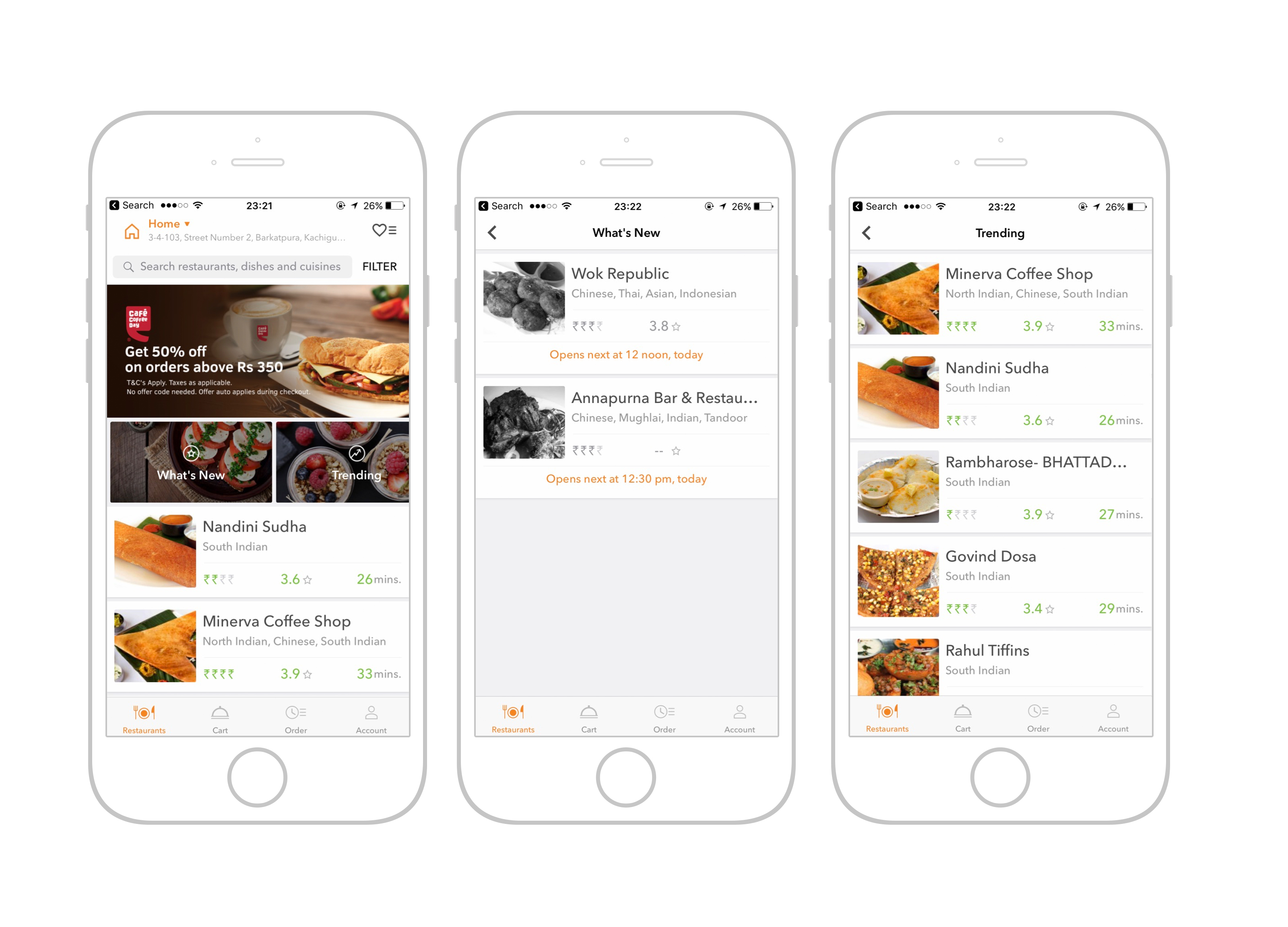
Fig 1.1 shows the view through the home screen of the app, “whats new” & “trending” restaurants around.
 Overview – Good discoverability and understandability
The Swiggy app is quite easy to understand. You don’t need to sign up until you are trying to place an order. The app shows up the available restaurant for the specific location (using GPS) with the time it takes for the delivery (which is very accurate).
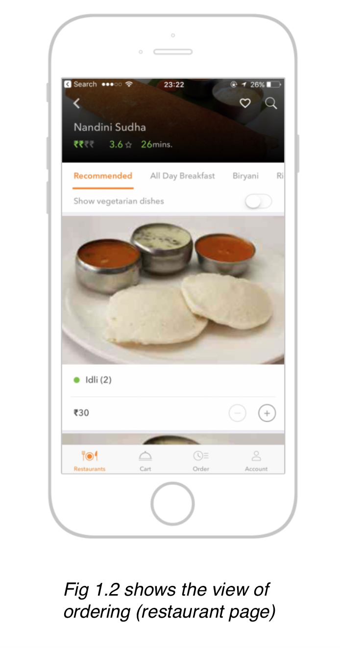
Ordering Page – Good discoverability
After the user chooses the restaurant available to them, they are redirected to the product ordering page. It gives a glimpse of a huge image of the product along with its pricing (as expected), but could have been quite better if it was in a grid form as the current design is eating up the whole space which definitely is a con. It is definitely easy to discover the process of adding the product to the cart.
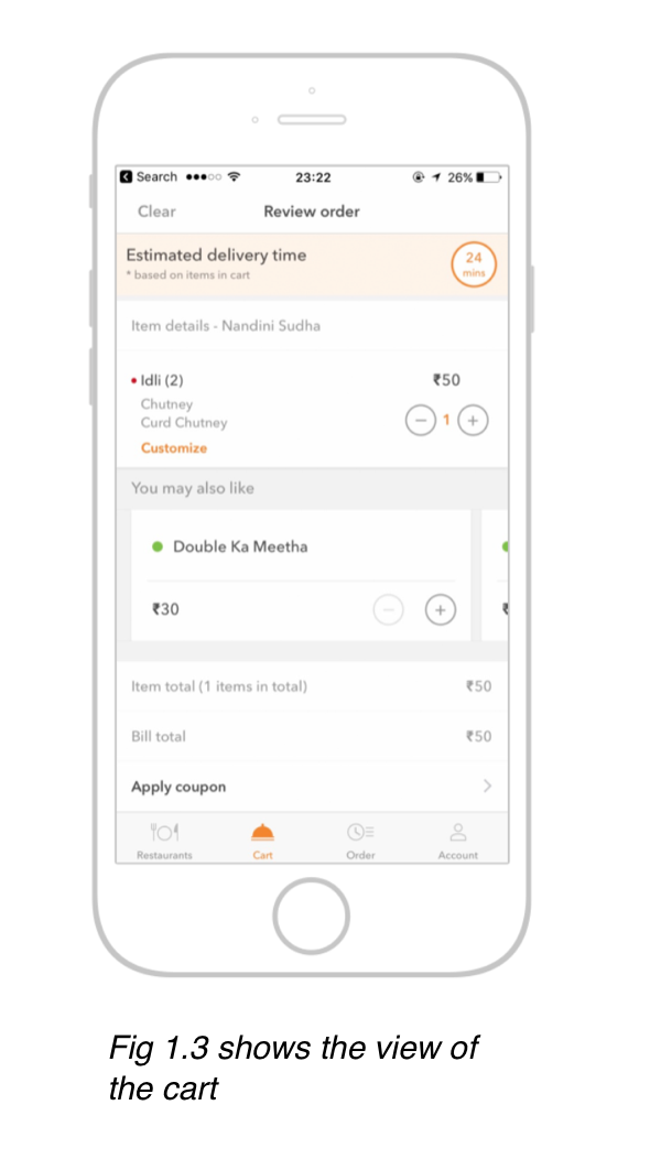 Cart Page
The cart page allows the user to complete the order by finalising the quantities, adding the add-ons for their orders and completing the payment. It has simple & minimal view, but it could have been better if they utilised the screen’s resources in a better and optimised way.
After the Orders page, there comes a page for the tracking of the order which again has great User Interface following the same trend of the brand.
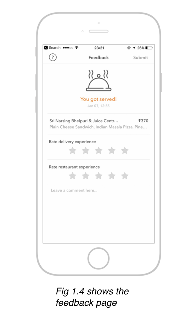
Feedback page
The feedback page for the order received, gives a simplistic approach that goes great with discoverability. The conversion rate for the feedback would definitely be at a good, since it gives a orange colour (which also goes with the branding) for each star when selected.
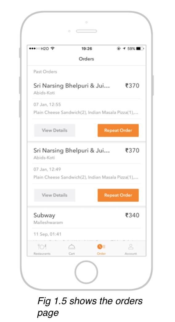
Orders Page
The orders page, i.e. the previous orders list has a simple approach again, following the same trend of Swiggy’s branding.
The “Repeat Order” button allows the user to repeat the same order with a click of a button.
Overall, Swiggy has a great User Interface and Branding. But I believe they should improve their User Experience by optimising the screen usage, i.e. using the screen’s resources to the fullest and adding the transitional effects around the app experience, which allows the user to be engaged and rememberable.