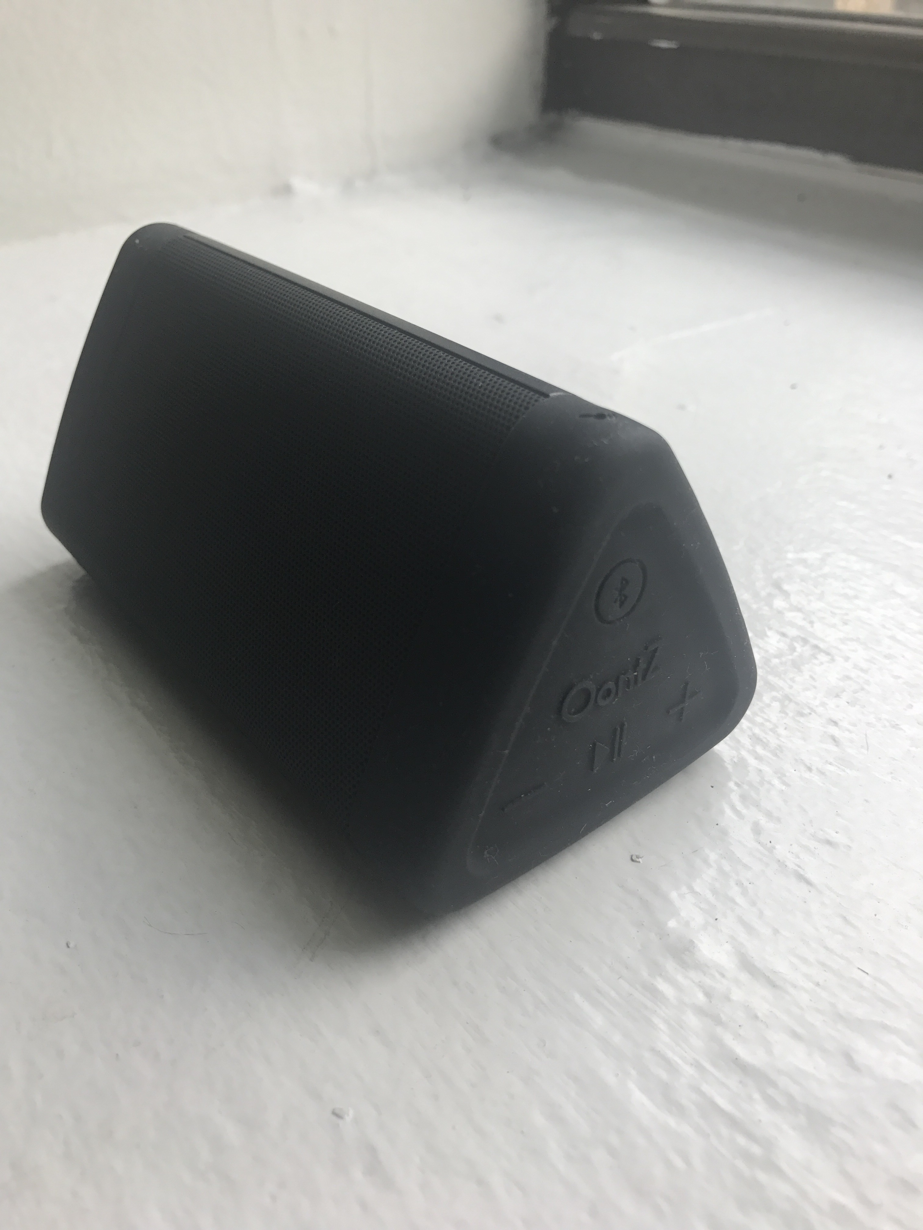
The shape of the Oontz wireless speaker is similar to that of a triangular block—with its exterior made out of plastic and rubber. The speaker is an audio output for electronic device to connect by Bluetooth or AUX input. The three basic functions of controlling the audio are: volume up, volume down and pause.
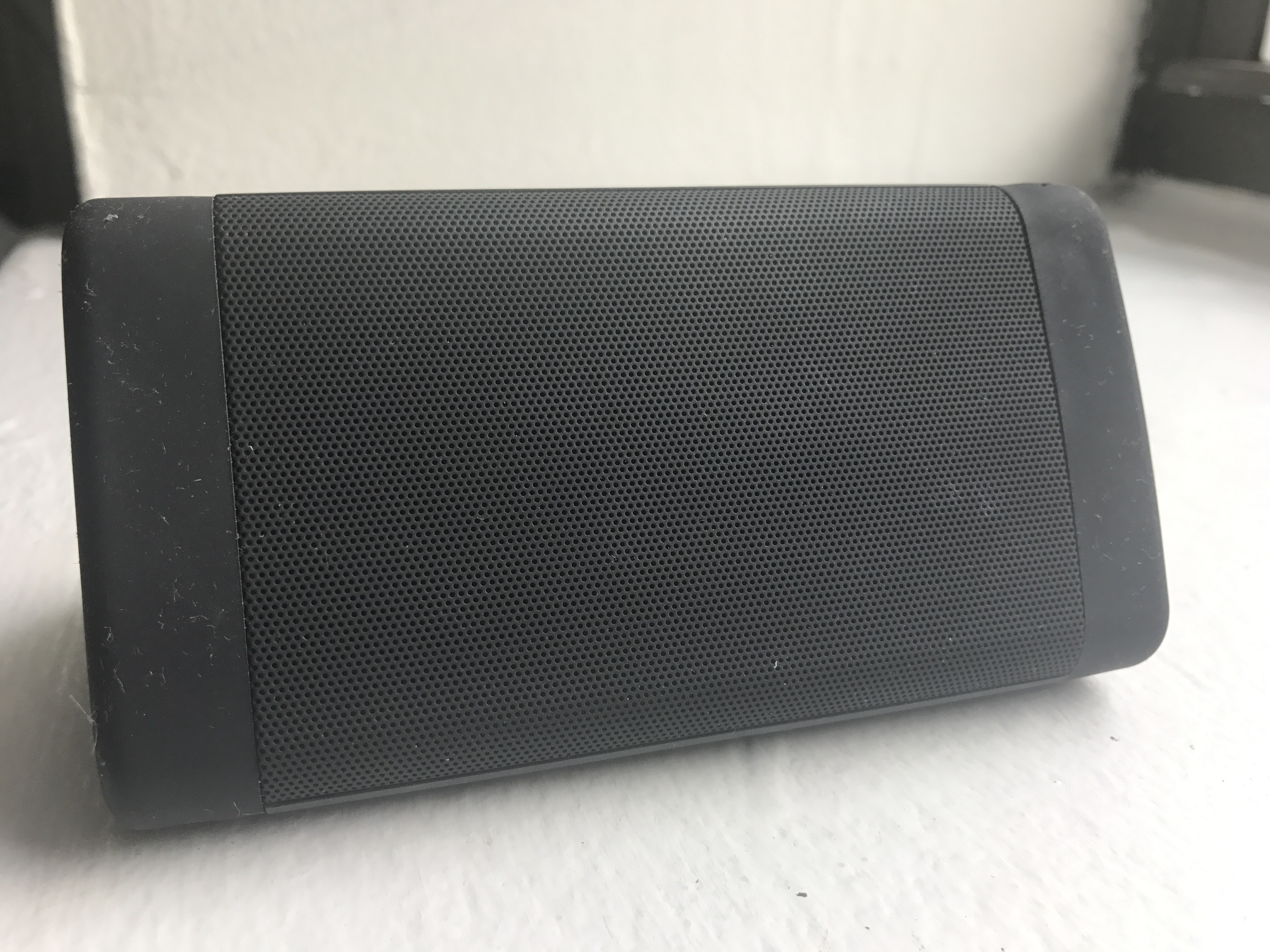
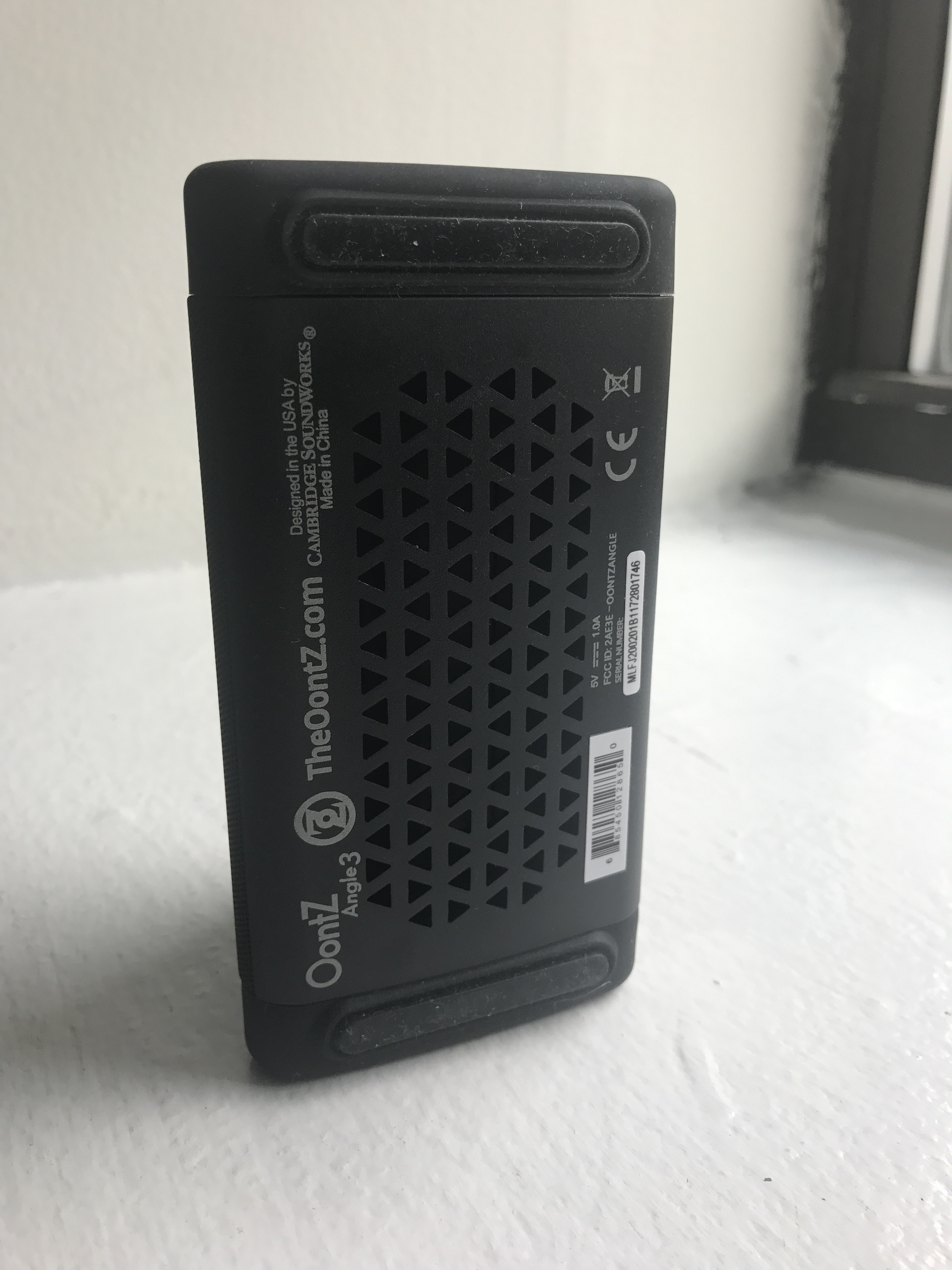
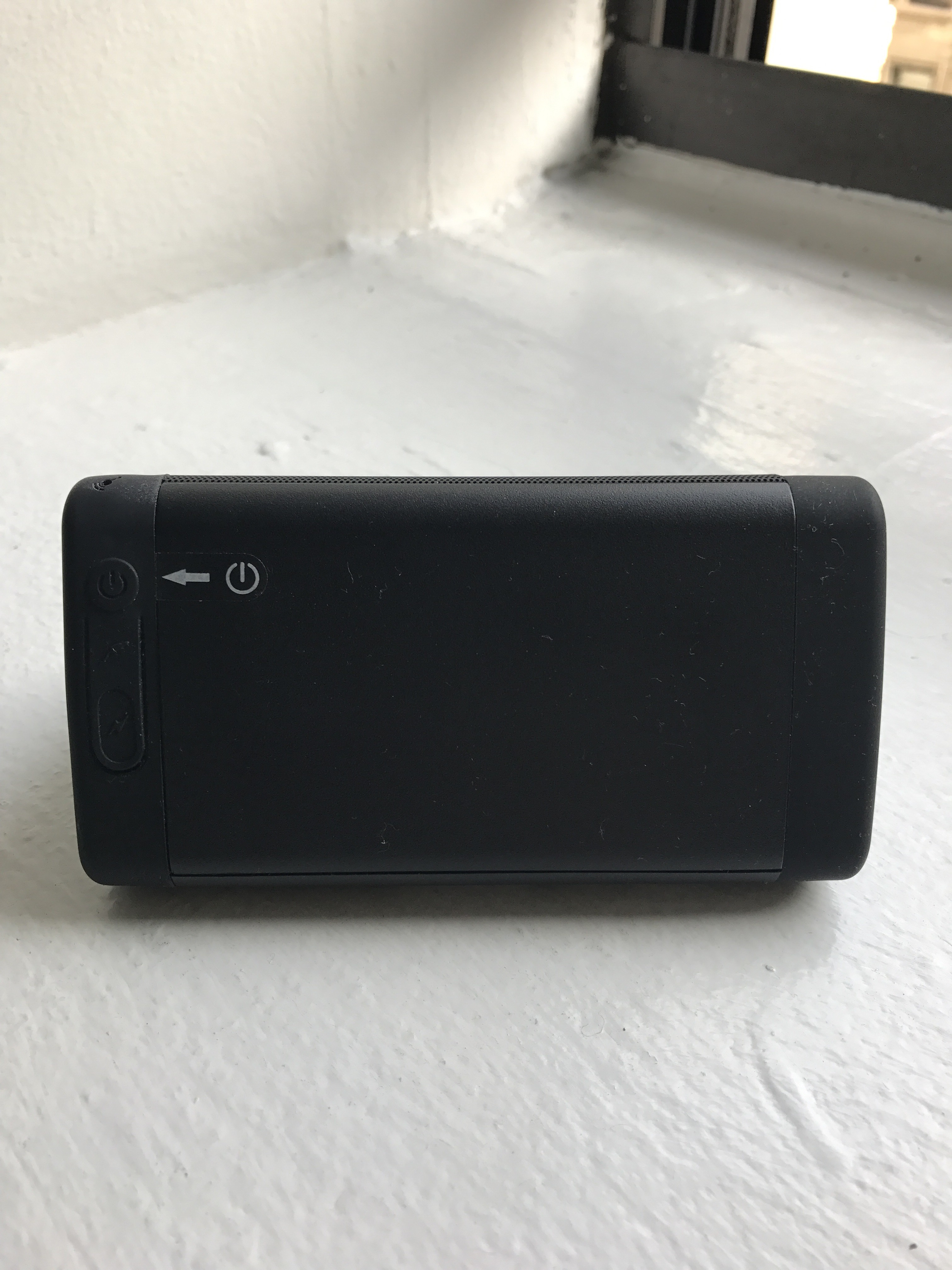
The Oontz wireless speaker has five flat surfaces, three of them are rectangle, two of them are triangle, which all could afford to stand. When the orientation of the speaker is horizontal, there are two non-slip strips located on one of the rectangular surface that signifies the bottom of the speaker. On the other two rectangular surfaces, one side has many pinholes and the other side is solid. The visible pinholes afford the passage of sounds waves, which also indicates to the user the front side of the speaker.
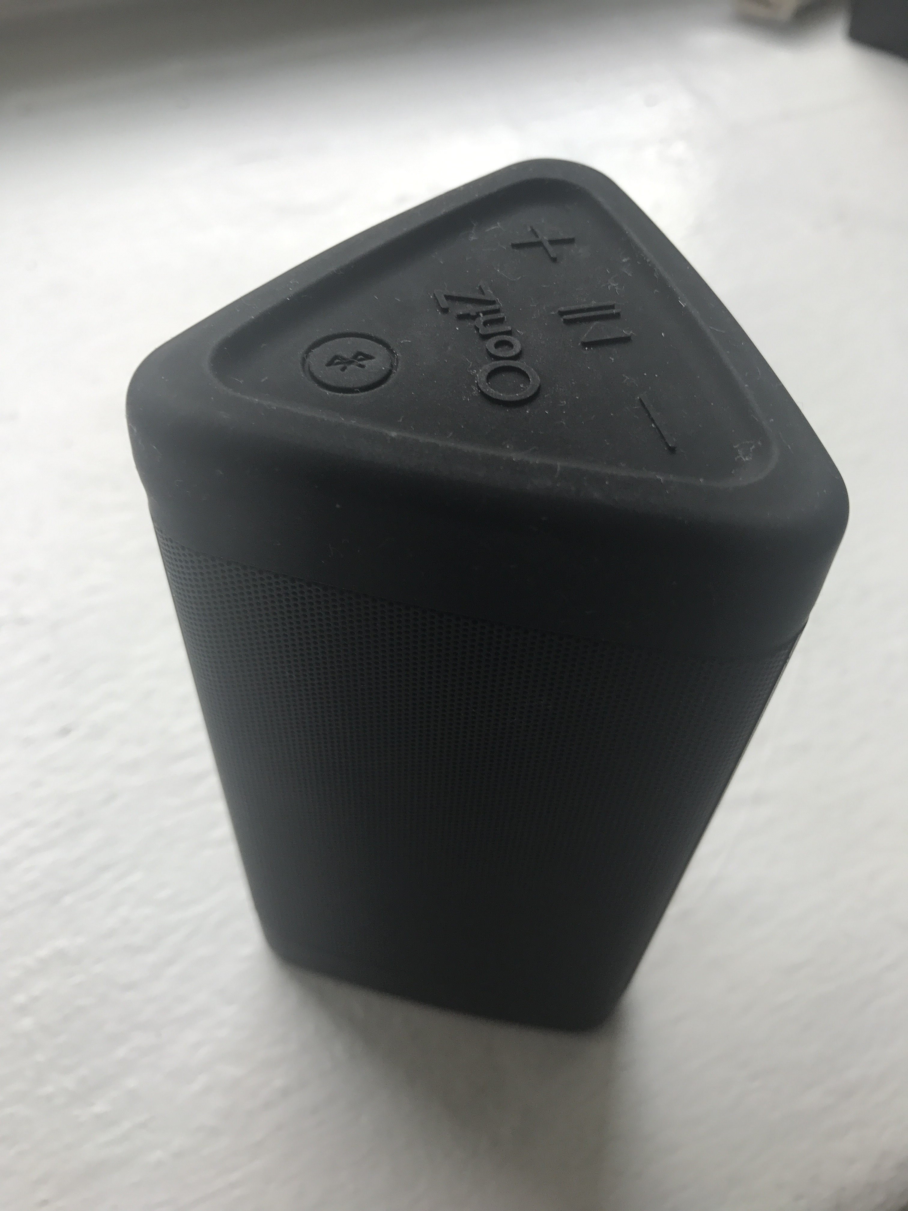
When the orientation of the speaker is vertical, meaning when the speaker is standing on one of the triangular surfaces, there are 4 buttons located on one of the triangular side of the speakers. The discoverability of these buttons is obvious. These buttons are represented by the symbol of corresponding function. The functions include turning the speaker on or off, pausing or resuming play, adjusting the volume up or down, and pairing to Bluetooth. These buttons are strong signifiers—the protruding shape of each symbol shows what actions are possible. All of the buttons provide immediate feedback of a clicking sound, as well as corresponding functional feedback to confirm the action is complete.
Feedback is prioritized in the speaker. The red LED light disappears 4 seconds after the speaker has turned on. The blue LED light would then start to flash to indicate the Bluetooth is ready to pair. Once an external device is paired through Bluetooth, the speaker makes a pleasing notifying sound and the blue LED light turns solid. This immediate feedback is done well after the proper action to show different stages of the device’s functions.
Similarly for the red LED light, a solid light indicates the speaker is turned on, while flashing means the speaker is in low power mode. While charging the device, red LED flashing indicates charging is in process, and a solid red LED light means it is fully charged.
To turn on the speaker, the user needs to locate the power button on the back of the speaker. A sticker with a power symbol and an arrow pointing to the button aids first time users to locate the button. Once the speaker is turned on, Bluetooth remains active, which is observed by the flashing or solid pattern of the blue LED light placed directly above the Bluetooth button.
Furthermore, the conceptual model of the buttons is done well. Of the two ways that the speaker can be oriented, when the pinhole side is facing the user, the volume control buttons suggests corresponding operation of turning up and down the volume. The pause button being placed in the middle of the volume controls shows good mapping.
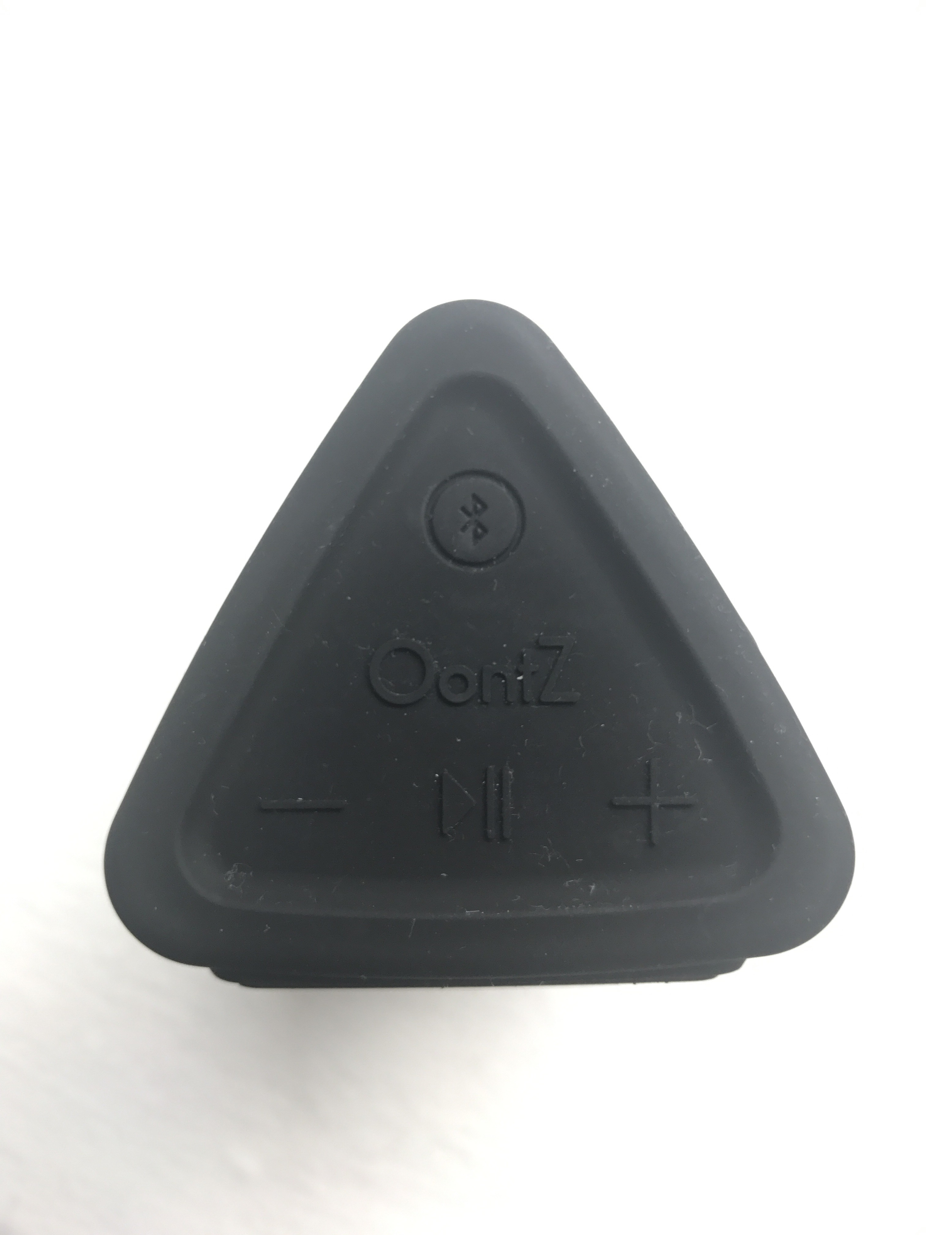
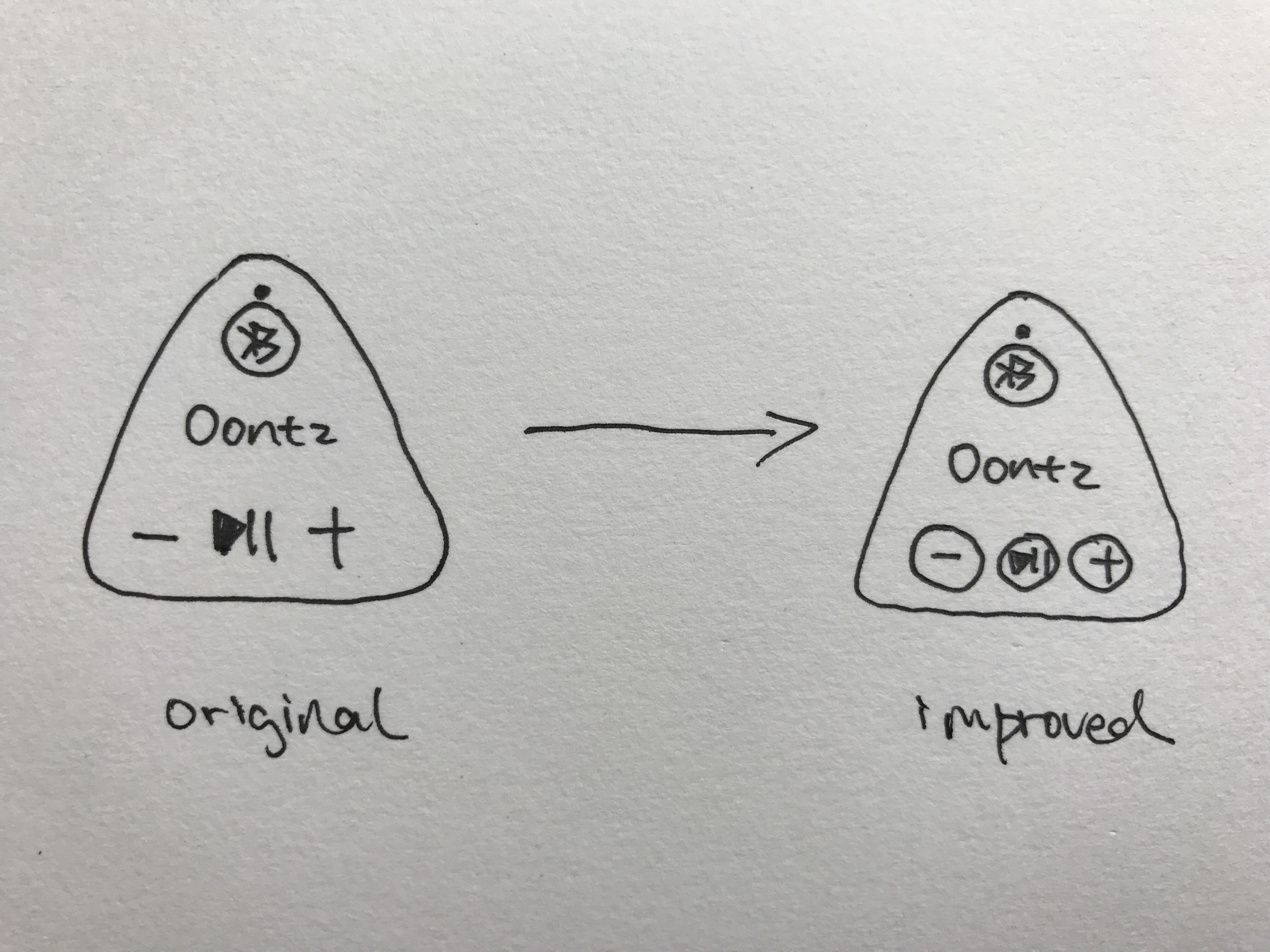
However, because the Logo has the same protruding design as functional buttons, it might cause users to make a mistake by assuming that it is also a functional button. The user would then learn it is only the logo when there is no feedback returns after the action—it doesn’t make the same clicking sound as other functional buttons. Either adding constrains to the logo or adding signifiers to the buttons would solve this confusion. A plastic logo sticker would constrain the pressing action. Adding circles to each of the functional button adds clarity to the signifiers. This would not only solved confusions caused by the same protruding design of the logo, but unified the button design as the one that the Bluetooth button already has.
To use this speaker, it mostly requires knowledge in the world; each buttons tells the user exactly what it does. The design model and the user model have successfully aligned, which is an essential element of good design. With minor changes, there can be improvements to what is already considered as good designed.