
With 178 million users, Snapchat has surprised the world with the success of its counter-intuitive design. Going against core principles of discoverability and understandability, it has garnered millions who have learned and adapted its unique language. However, its glory may now be short-lived, as universally-designed competitors have considerably surpassed Snapchat’s numbers.
Snapchat initially prided itself with its unique design. Evan Spiegel, CEO, joked about the controversial interface, stating that “This is by design. We’ve made it very hard for parents to embarrass their children.” The app proved to be a booming success among the younger, more tech-savvy generation. As of 2016, 81% of Snapchat users were below the ages of 35, 37% of them being between the ages of 18 to 24.
Understanding its language requires trial and error, as there are no affordances, signifiers and constraints on the main interface. The lack of these design elements obstructs and prolongs the 7 Stages Of Action (Norman 2013). To learn the app, users execute their assumptions, evaluate them, and create new assumptions until they reach their desired outcome.Snapchat’s learnability makes the Gulfs of Execution (Plan, Specify, Perform) and Evaluation (Compare, Interpret, Perceive) a longer process. As a result, it affects the time it takes to learn the app. It does not harbor user-friendliness, as Don Norman insists that poor design exists when “new learning is required” due to lack of consistency. To the public’s surprise, it’s “snob appeal” has successfully enticed the millennial generation to continue using it.
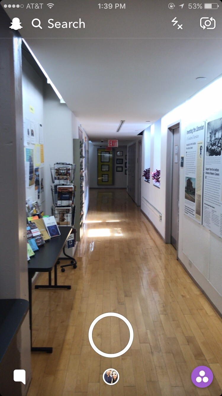
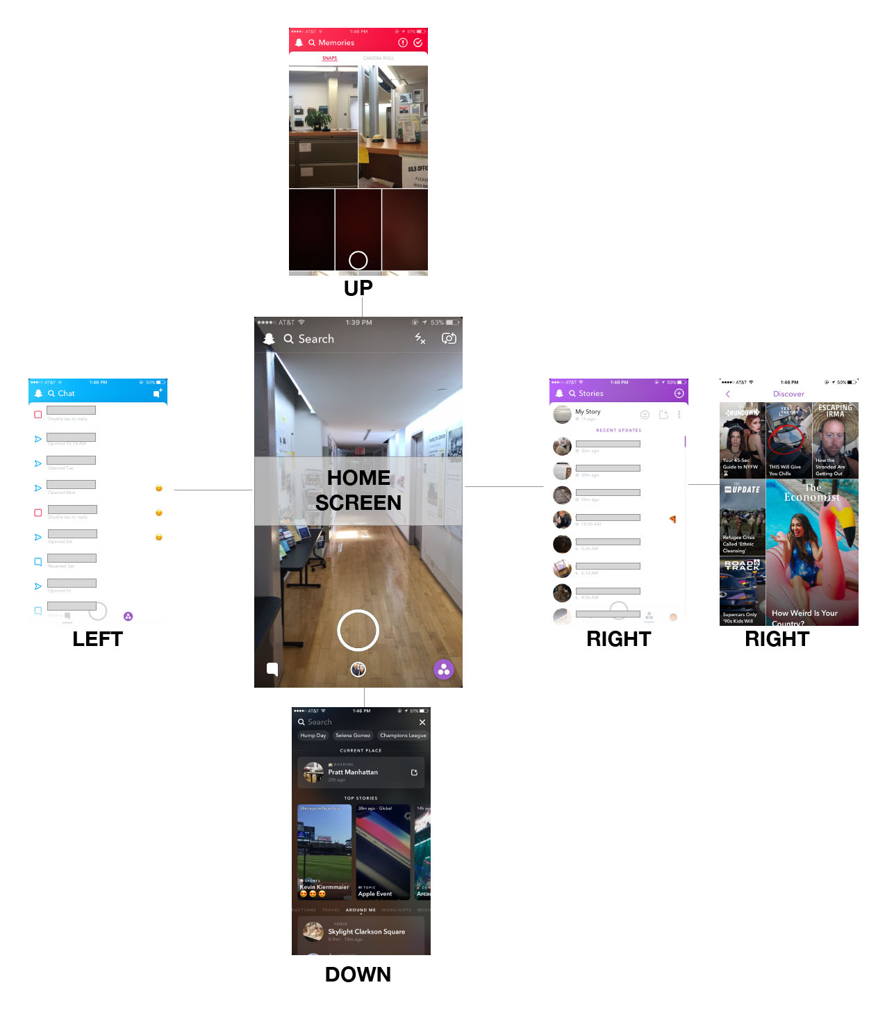
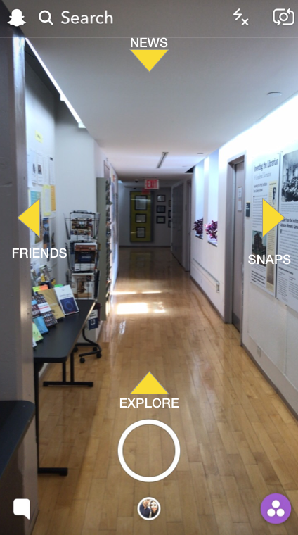
When the Snapchat application is initially opened, users can choose to either sign up or log-in. A main camera screen then appears, consisting of familiar camera options. From here, users are given the freedom to swipe in all four directions. Each direction leads opens different features of the app. The navigational affordances are not apparent, as there are also no signifiers to inform users what to expect.
Below is a diagram of the Snapchat user flow. An upwards swipe (directed towards the North) opens a user’s saved snaps or cameral roll files. A downward swipe (towards the South) leads users to a newsfeed of different news articles, an option to quickly add other friends, and a user’s contact list. When swiped left (towards the West) from the main interface, the user’s contact list is also displayed. Swiping right (towards the East) opens an interface that showcases friends’ Snapchat stories. When swiping right twice from the main screen, a sponsored Snapchat newsfeed appears.
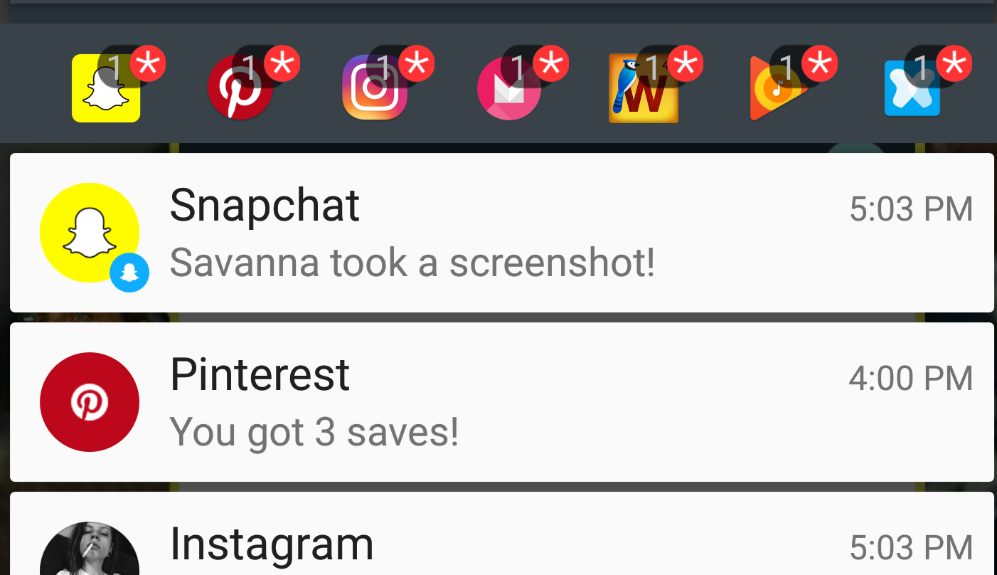
The great feature about Snapchat, aside from its interactive filters, is its impeccable feedback. When a user takes a screenshot of another user’s story, the creator of the story is immediately notified. This ensures users that their privacy is being monitored. When a user is typing a message to another user, the potential receiver is immediately notified with a phone notification such as “Jimmy is typing a message…” This is a great example of real-time, immediate feedback.
However, Snapchat has been losing its edge as its numbers have significantly missed its targets, and advertisements have dropped. Instagram, its main competitor, has adapted Snapchat’s story-sharing capabilities. It has improved on Snapchat’s design model by incorporating tried and tested principles of good design. It follows intuitive design through linear constraints. There are less options, less buttons, and one navigational path. Users open the camera, take or upload a photo, enhance it with three options, then share it to their timeline or to their friends. It is understandable and discoverable. It is universally designed to be user-friendly. As a result, it has surpassed Snapchat’s daily user count to over 250 million.
On November 2017, Snap Inc. admitted that “Snapchat is difficult to understand or hard to use, and our team has been working on responding to this feedback. As a result, we are currently redesigning our application to make it easier to use.” Without reassurance that their re-design will succeed among its loyal fanbase, Snapchat declared that they are willing to take the risk.
If Snapchat were to appeal to a broader audience, it might benefit from following a more usable design approach. Three recommendations could significantly alter their interface and promote user-friendliness:
- Devise a more linear approach by eliminating North, South, East or West swiping to navigate. If not, create a user-friendly menu page
- Follow a more consistent grouping pattern (ex. all news found only when you swipe left)
- Improve signifiers and make use of actual words, given the amount of icons users are left guessing (ex. arrows with interactive icons or captions)
The story of Snapchat proves that universally good design triumphs over the short lived glory of counter-intuitive design mavericks.
References: