![]()
Discovering music has never been easier now that people can carry millions of songs in their pockets using apps like Spotify, a digital streaming service that allows users to search, discover and play songs. Although Spotify’s iOS app can be used effectively, it has room to improve its usability and discoverability.
Song-Specific Menus
Spotify’s song-specific menus give users good discoverability through mapping and effective feedback. Users can click on the three, horizontal dots to the right of a song and pull up it’s corresponding menu. The menu affords specifying actions, such as saving to library, adding to a playlist, or sharing via social media (Figure 1).
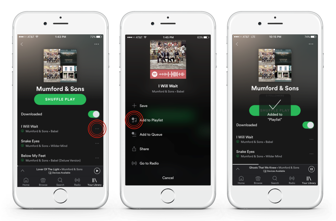
Spotify takes advantage of spatial analogies to create a clear, natural map, by placing the set of dots to the right of every song. The menu lists the possible actions a user can select, providing discoverability of what a user can do with the song. After the user selects an action, such as “Add to Playlist”, she receives immediate feedback through a visible notification. Such feedback provides reassurance that the action has been completed; it bridges a possible Gulf of Evaluation, making it easy for the user to determine the success of her action.
The menu’s discoverability through effective mapping and feedback reduces possible Execution and Evaluation Gulfs. This holds true for all existing menu options, except one that is noticeably absent—“Delete from Playlist”.
Deleting Songs From Playlists
As mentioned above, the Spotify song menu does not provide a “Delete from Playlist” option. Instead, a user has to go to the general playlist menu, click edit and then select the song she wants to delete (Figure 2). This design flaw demonstrates poor mapping, disconnects between the user model and system image, and a Gulf of Execution that leads to rule-based mistakes.
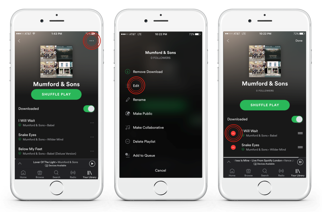
A rule-based mistake occurs due to disconnects between a user’s conceptual model and the system image—a product’s available information. Due to established analogies regarding song-specific menus, a user may formulate the wrong plan to delete a song. Because the system image does not map the “delete” action to the corresponding song, but instead to the entire playlist, users experience a Gulf of Execution—becoming confused by how something operates. Knowledge in the head might fail, causing users to experience learned helplessness and decide that a song cannot be deleted at all.
Simply adding a “Delete from Playlist” option to the song-specific menu could solve the above problem (Figure 3). Doing so would naturally map the “delete” option to the corresponding song, making the system image consistent with the user’s model and eliminating the Gulf of Execution.

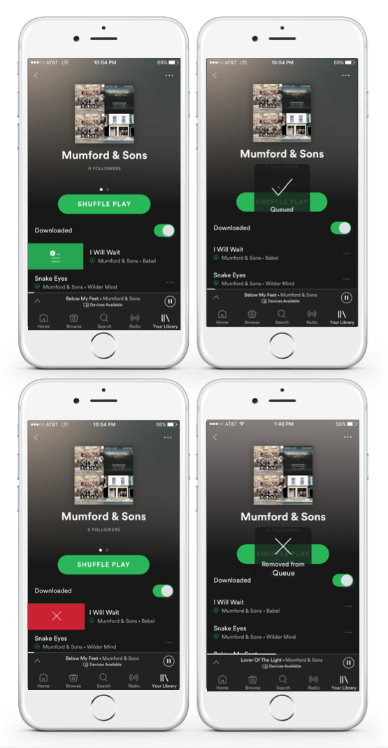
Swiping Songs to Add to Queue
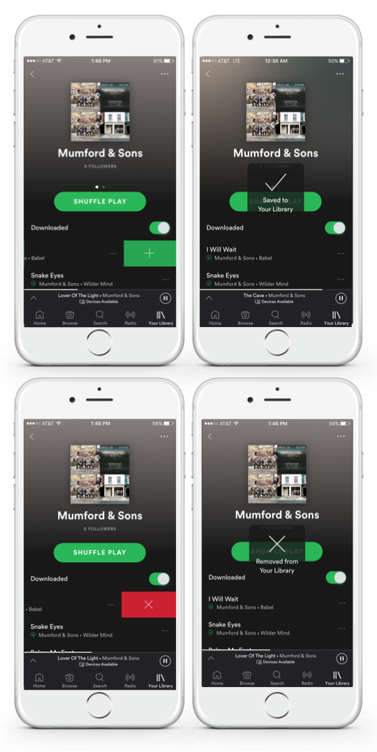
Users may also swipe songs left and right to perform certain actions. Swiping a song to the left adds that song to the main library and doing so again removes it (Figure 4).
Alternatively, swiping a song to the right adds it to the queue, but if the user swipes right again, the song is not removed from the queue. Instead, it is added to the queue a second time (Figure 5).
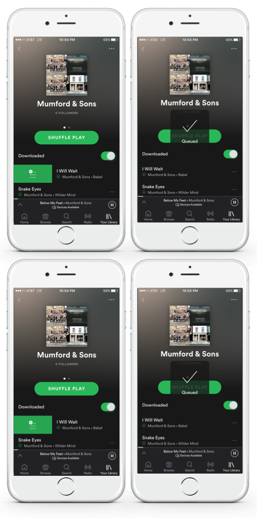
This design inconsistency within the system image may cause the user to become frustrated and confused at the visceral level of processing. If the user accidentally swipes right and adds a song to the queue, her behavioral response could be to swipe right again, adding the song to the queue a second time. This could create a Gulf of Execution, leaving the user wondering how to remove the song from the queue.
Applying an analogous rule—swiping left a second time to remove a song—signifies that the user committed a rule-based mistake when trying to remove the song from the queue. The designers can use these analogous rules when trying to solve the problem. Because swiping left twice affords two different actions, a second swipe to the right could be added to delete the song from the queue (Figure 6).
Overall, Spotify successfully provides a revolutionary streaming service, allowing millions of people to search decades of music. By applying some of Don Norman’s design concepts, Spotify could transform its interphase into a more intuitive and understandable platform that drives users to seamlessly interact with their vast music library.