Designers can utilize usability principles to create products that may greatly enhance our everyday lives. From smart phone apps to non-Norman Doors, the application of usability principles has given us wonderful tools, games, and digital interfaces. But what about the dark, deceptive uses of these principles?
In a previous post, I explored ways in which online notices for terms and conditions are often designed in ways to be deceptive to internet users (that post can be found by clicking here). In this post, I focus on a few methods that data visualizers sometimes utilize to mislead users about research findings. For each method, I highlight the signifiers that are manipulated to promote an unrealistic understanding of the visualized data. I concentrate on examples of three areas in which data visualizations can be misleading: size, segmentation, and graph type.
Size
Size signifies quantity, or the volume, number, or degree, of variables within a data visualization. The appropriate use of size can promote a realistic understanding of quantities discovered in a study. Two ways in which this signifier is manipulated to deceive users are the use of a truncated axis and depicted radius as quantity.
Truncated Axis
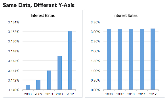
Figure 1.0: Example of a truncated axis (Source: https://blog.heapanalytics.com/how-to-lie-with-data-visualization/).
The graphs in Figure 1.0 above depict an exaggerated form of a truncated axis. In this image, the y-axis from the graph to the right is cut when transcribed onto the graph to the left. The result is a line graph that seems drastically different. A data visualization makes use of visual signifiers to show users trends and highlights in data, but the significant difference in size of the bars in the graph on the left suggest to a user that interest rates have increased drastically from 2008 to 2012 – a misinterpretation that is avoided in the graph on the right. Both graphs show the same data, but the one on the left represents the data in a misleading fashion.
Radius as Quantity
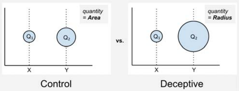
Figure 2.0: Example of using radius as quantity (Source: https://medium.com/@Infogram/study-asks-how-deceptive-are-deceptive-visualizations-8ff52fd81239).
When depicting points on a scatter plot, it is often helpful to manipulate the size the points to represent differing values of a variable that is not represented on the x and y axes. Since size typically signifies quantity, it is best to stick to a one-to-one mapping between the area of points and the actual values (https://medium.com/@Infogram/study-asks-how-deceptive-are-deceptive-visualizations-8ff52fd81239). A deceptive designer, however, may utilize radii to represent quantities. Since users typically view size as a signifier of quantity, the differences in quantity between points on such a scatter plot would appear more dramatic than they should be, as seen in Figure 2.0 above.
Segmentation
Segmentation, or the separation of elements into parts, can signify categories, domains, or ranges within a chart. The careful use of segmentation in a data visualization may enhance a user’s understanding of the data. However, deceptive uses of segmentation can lead users to incorrect conclusions about a visualized set of data. Binning and using a limited scope are two ways that segmentation can be misused in a deceptive manner.
Binning
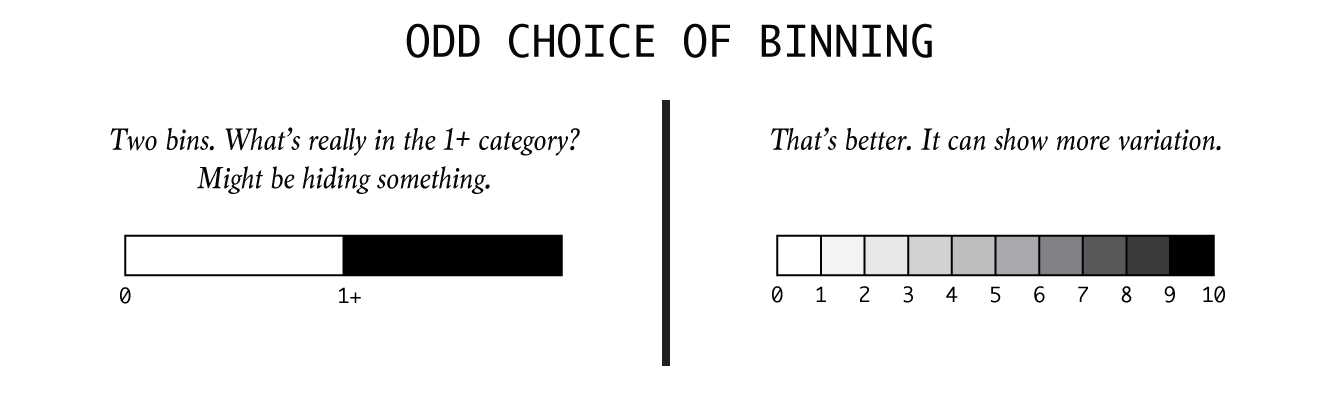
Figure 3.0: Example of the manipulation of binning (Source: https://flowingdata.com/2017/02/09/how-to-spot-visualization-lies/).
Binning is a tool often used in choropleth and heat maps to categorize values by colors across geographic regions. Binning limits the range of colors into a specific number of options deemed appropriate by the map’s designer. If done ethically, binning can aid a user’s ability to discover values on a map by allowing for easy referencing to a legend included with the map. If done in a deceptive manner, a map designer can limit the number of color bins too much, making very different values seem as if they are the same. Figure 3.0 shows an example of this with a deceptive instance of binning given in the legend on the left.
Limited Scope
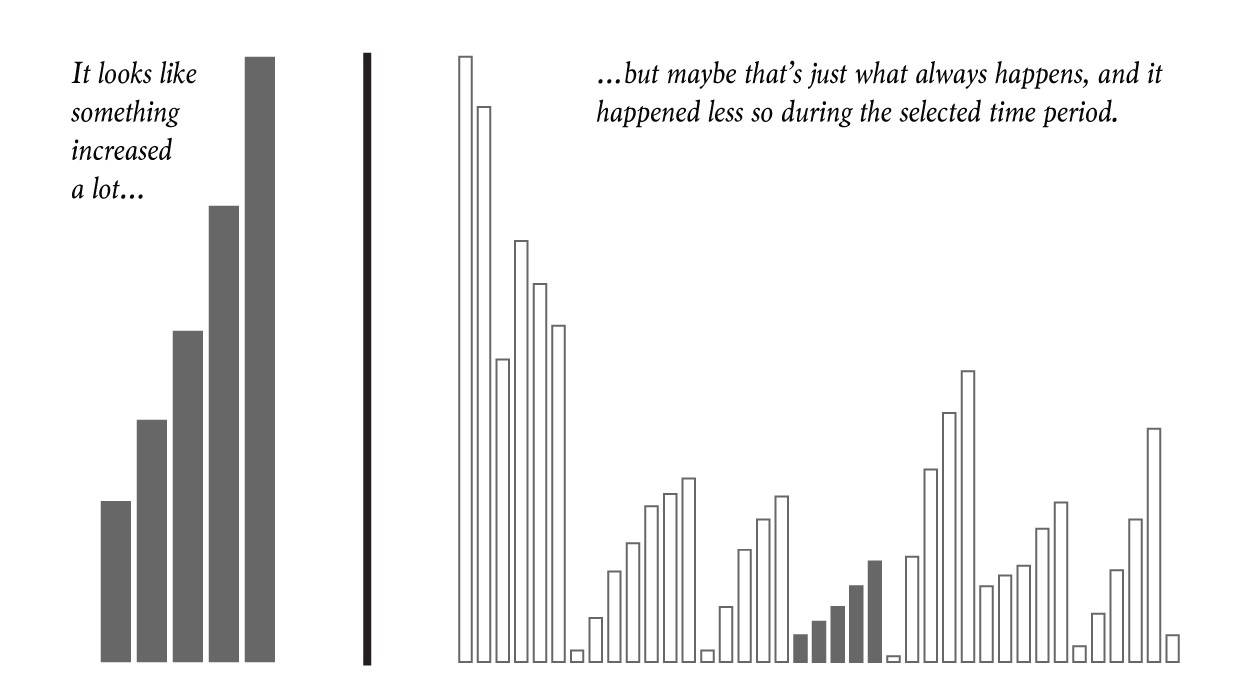
Figure 4.0: Example of providing a limited scope (Source: https://flowingdata.com/2017/02/09/how-to-spot-visualization-lies/).
Sometimes quantities rise and fall naturally with something that is cyclical. In Figure 4.0, the graph to the left shows values that are rising, but the graph to the right reveals that it is part of a much larger graph that shows values which rise and fall at fairly regular intervals. Variables such as profit may rise and fall seasonally, or with each fiscal quarter, depending on the times of peak sales periods. A deceptive designer could use a limited scope to criticize a sales team for seemingly poor performance during a low season, even though the performance might be normal when viewed on a larger scale. The limits of a y-axis signify a complete range to a user, and so anything falling outside of that range is not likely considered at all by users (and is quite literally invisible).
Graph Types
Types of graphs can be used to manipulate a user’s ability to understand a data set. It is important when visualizing data to choose a graph type that most appropriately aids a user’s visual interpretation of complex data. Two graph types that are often misused are pie charts and maps; I will briefly explore these graph types below.
Pie Charts & Difficult Comparisons
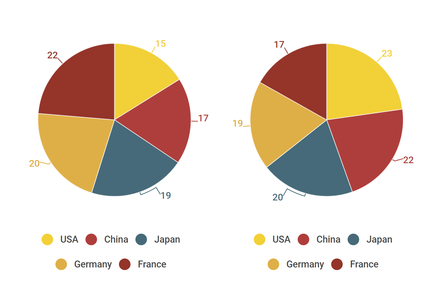
Figure 5.0: Example of the misuse of pie charts (Source: https://infogram.com/blog/4-common-missteps-that-lead-to-deceptive-data-visualizations/).
Pie charts are notorious for their inability to be compared accurately to one another. When striving for an accurate portrayal of values, they should be avoided. This can be seen in Figure 5.0 above: a user of these pie charts would likely have a very difficult time comparing the values from each chart if it weren’t for the numbers given for each slice of the two pies. Since size signifies quantity in most charts, it is best utilized in charts where sizes are more easily comparable, like in bar charts or even scatter plots.
Maps & Population Density
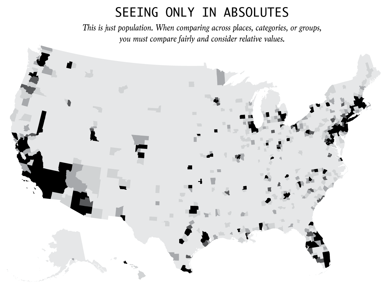
Figure 6.0: Example of a map that includes human-dependent spatial data without accounting for population density (Source: https://flowingdata.com/2017/02/09/how-to-spot-visualization-lies/).
A good rule of thumb in spatial data analysis is to always account for population density when visualizing values that are person-dependent. On a choropleth or heat map, where color signifies quantity, a user will be drawn to the colors that a legend indicates are most extreme. In Figure 6.0, areas that are darkest are simply the most population-dense regions of the United States. Without accounting for population density, your newly created map may look the same as hundreds of maps bearing a striking resemblance to Figure 6.0, which are falsely considered informative and are regularly shared across social media sites.
Discussion
The purpose of this post is not to encourage the use of these deceptive practices. To the contrary, my aim is to raise awareness of their existence so that the average user may be better able to identify misleading data visualizations. It is important to note here that many of these practices may not be deceptive when used appropriately (e.g. truncating a y-axis when a small change in value has significant real-world consequences, such as in global temperature changes related to climate change). With a greater understanding of usability principles and data literacy programs that apply these principles to the interpretation of data visualizations, users can better protect themselves from being misled about data. Many data visualizers are perpetrators of these deceptive acts accidentally, so an awareness of these techniques could also encourage the creation of more accurate and ethical data visualizations from those willing to learn. The utilization of purposeful user testing, through the asking of questions that require users to find values or make conclusions based on a graph, could also help ethical data visualizers to avoid the unintentional inclusion of these deceptive data visualization elements.
References
Krystian, M. (2016, February 17) Watch Out! 4 Common Missteps that Lead to Deceptive Data Visualizations. Retrieved December 4, 2017, from https://about.infogr.am/blog/4-common-missteps-that-lead-to-deceptive-data-visualizations/
Parikh, R. (2014, April 14). How to Lie with Data Visualization. Retrieved December 4, 2017, from https://blog.heapanalytics.com/how-to-lie-with-data-visualization/
Study Asks, How Deceptive are Deceptive Visualizations? (2016, October 11). Retrieved December 4, 2017, from https://medium.com/@Infogram/study-asks-how-deceptive-are-deceptive-visualizations-8ff52fd81239
Yau, N. (n.d.). How to Spot Visualization Lies | FlowingData. Retrieved December 4, 2017, from https://flowingdata.com/2017/02/09/how-to-spot-visualization-lies/