
Introduction
Square Cash, known simply as Cash on iPhone iOS, is a service that allows US debit card users to send and receive payments in US dollars. Users do not necessarily create an account with a username. Instead, new users are prompted to enter their existing debit card information and email address. Cash will pull debits from and push credits to the bank account tied to the debit card. Users also have the option to personalize a Cash Card—you can use your Cash Card like an ATM/debit card—and now you can buy and sell Bitcoin.
A Breakdown of Human Cognition and Emotion Present in the Interface and Experience of Cash
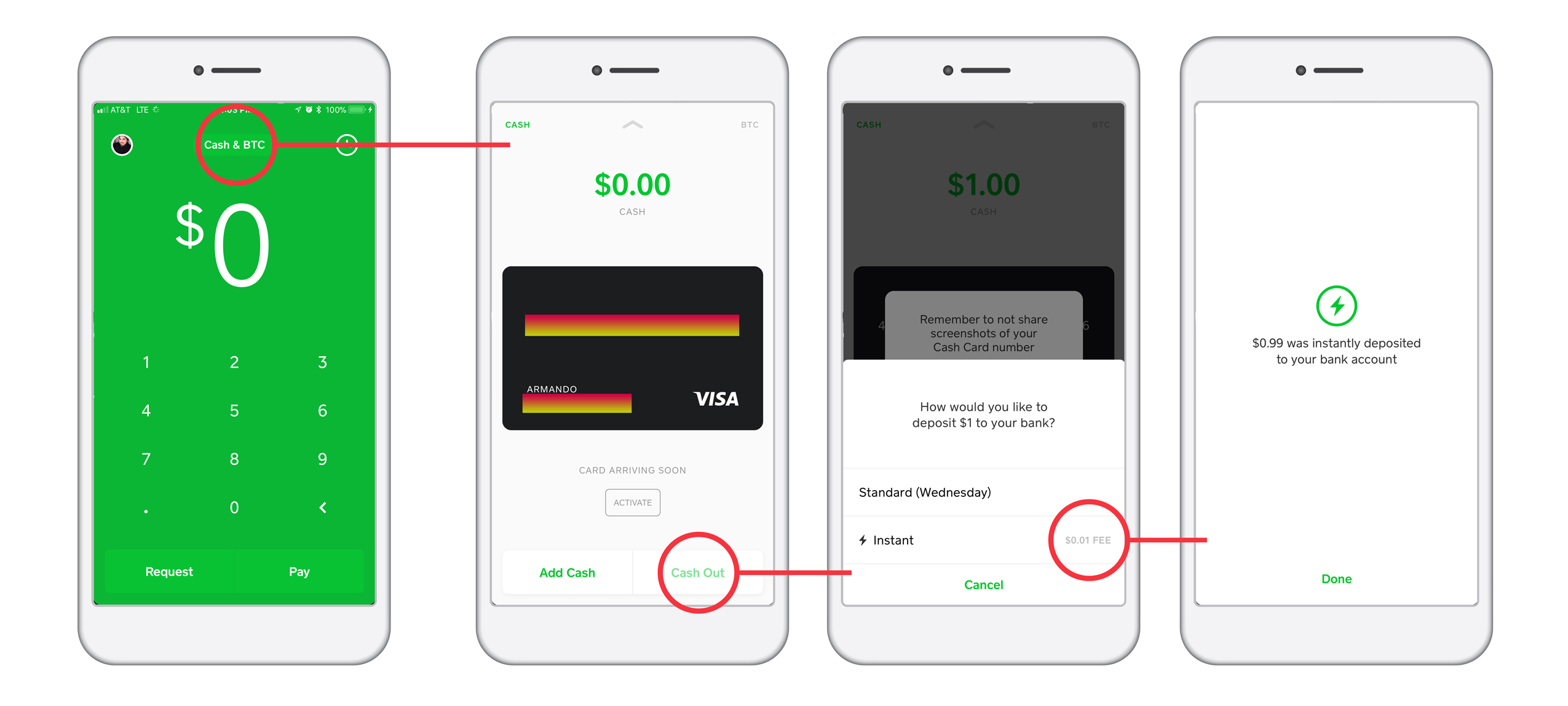
Cash successfully toggles between the visceral and behavioral levels of a user. Signifiers, like arrows and ‘x’ marks, lead the way and act as breadcrumbs to easily map your way. Equally, confirmation screens double-up on reassuring users of their decisions. Even sensibility checks in the form of pop ups that block secure information come through as you traverse the application and move between screens.
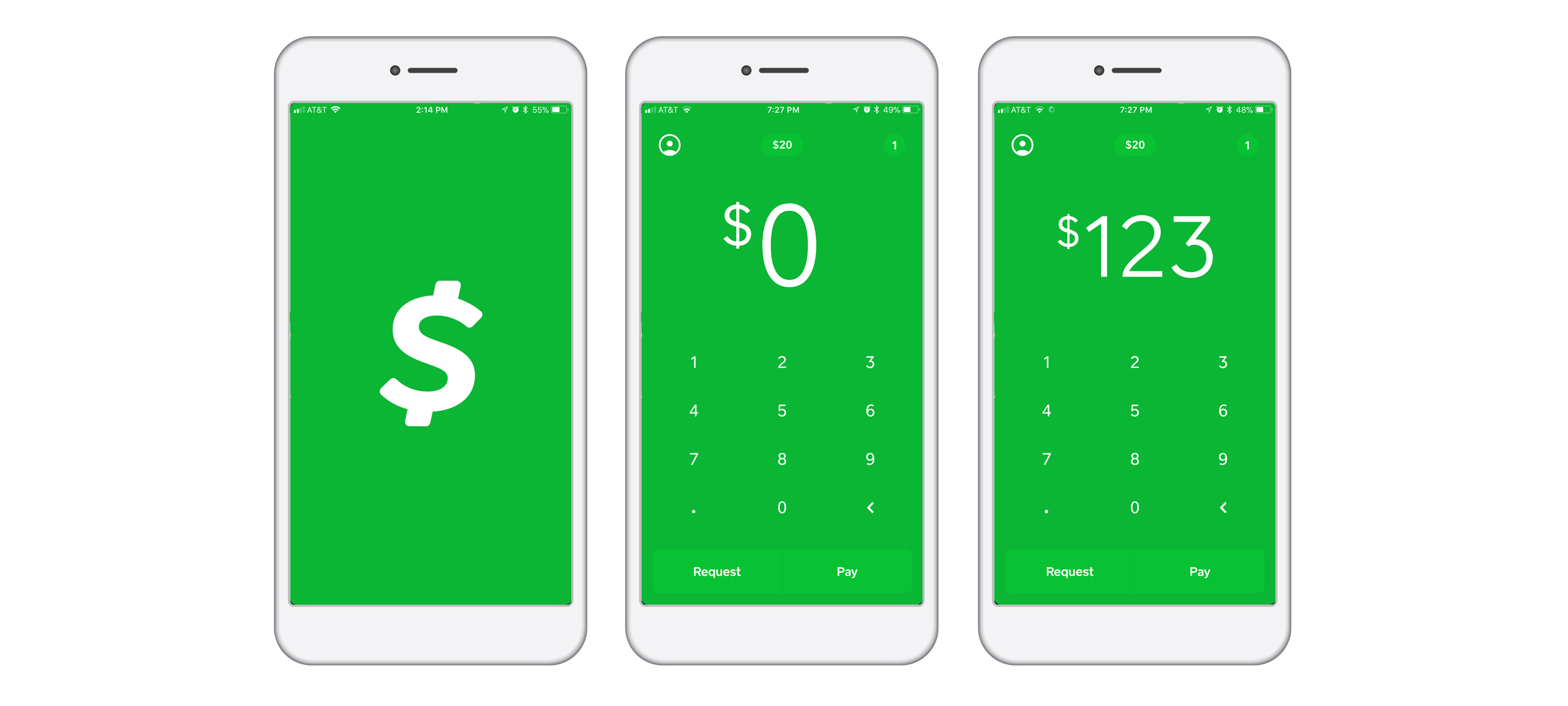
Although a clear map is not initially apparent, Cash gives feedback from the minute it loads the home screen. Users have immediate access to typing in numbers in a calculator keyboard. Buttons sit in the footer and other screens are accessible at the top. That’s it. There is no menu tucked away in a hamburger icon. It’s as if there’s nothing to hide. The home screen really allows users to easily fill in the conceptual model of the software by applying a personal user model and map.
Enforcing Semantic Structure to Assist Behavioral Actions
In going from a visceral to a behavioral level, the software provides a seamless transition by applying a cultural constraint then applying a semantic constraint. Visually, there are no cues of this transition, unless you count the open screen lag before the calculator screen populates. Immediately, users can jump from their perception of what they are about to do, to specifying and interpreting those actions into a real-life transaction.
Diminishing Learned and Taught Helplessness
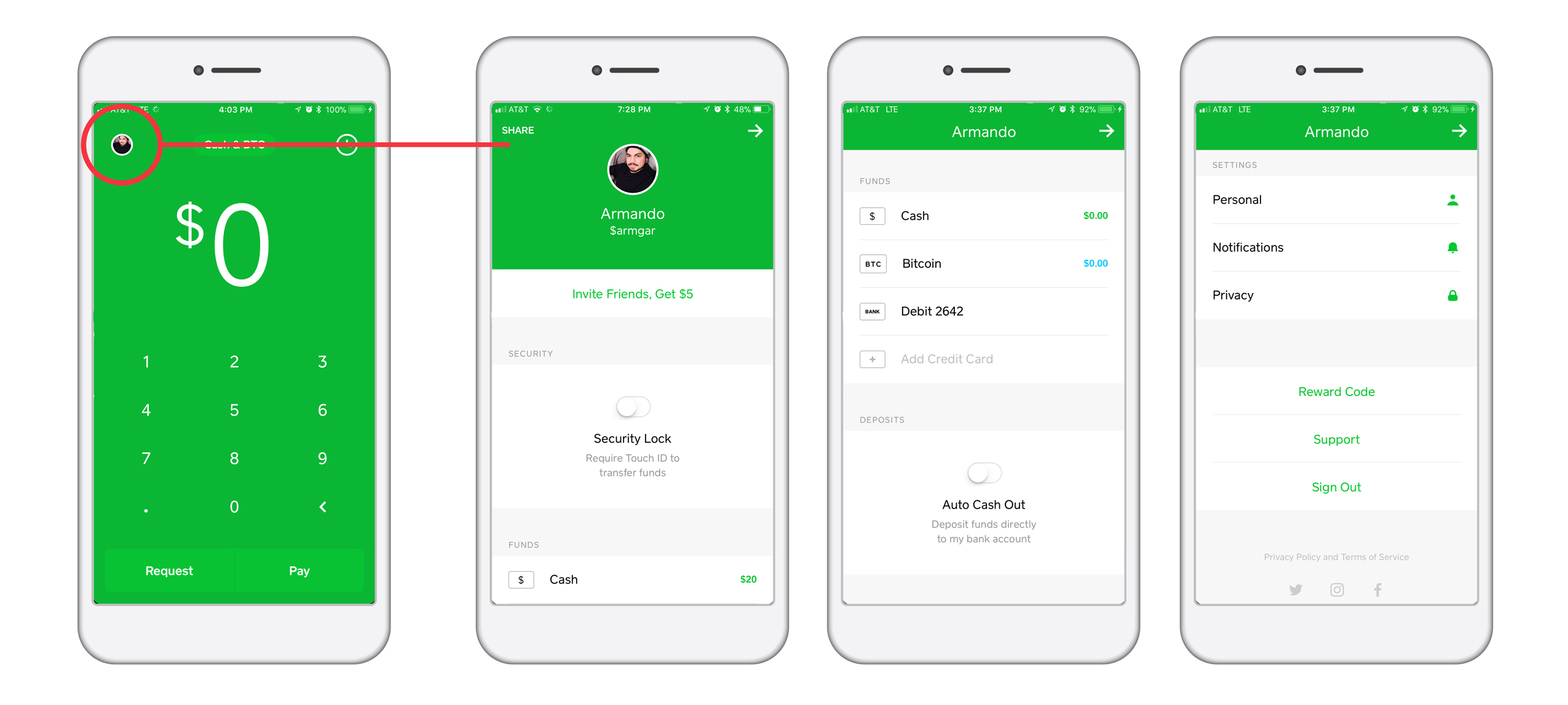
Unlike applications like Venmo, Cash does not require you to create a profile attached to a username. There is no news or social feed where friends gather to divulge.
The absence of a social media feed can alleviate the anxiety that some people face in sharing their information on-line. Going without a social feed, in this instance, does not render the application less relevant. While a social feed is an attribute that can result in positive psychological feedback for some users—that results in them coming back to use the app more often than other users—it can also be a disadvantage to another base of users. In fact, going without a social media feed that publishes your activity and exchange of money can help to alleviate and diminish the phenomenon of learned helplessness. Users don’t have to worry about publicly announcing their monetary exchanges. While the product already involves a form of mathematics, a phobia of some, the task at hand is clear, and users do not have to spend time and attention on other aspects that exacerbate phobias about using online software and publicly sharing information.
I believe this particularly important decision is an exercise of a favorable, cultural constraint to impose on users. Specifically, as a US consumer, I am not too keen on publicly sharing my purchases and other transactions that have a price tag assigned to them. Intuitively, I am able to use the app for two, sensitive instances: send and/or receive money. I don’t have to think about any other behavior. Thus, cultural constraints and conventions are satisfied, and I can focus on the flow and features of the software.
Recommendation: Upgrade to Reflect
Visually, the semantic constraints to only feature the amount paid or received, time-stamp and the name of the recipient or sender, makes all the info easy to digest. Users can process information quickly and effectively, so that we can discern between being paid, sending money, or cashing out. In this case, Cash decides that adding a description note is secondary information, unless you are the sender and remember to input a description before you send the money. On the other hand, it also adds an extra step, in attempting to determine, for example, when and why cashed out.
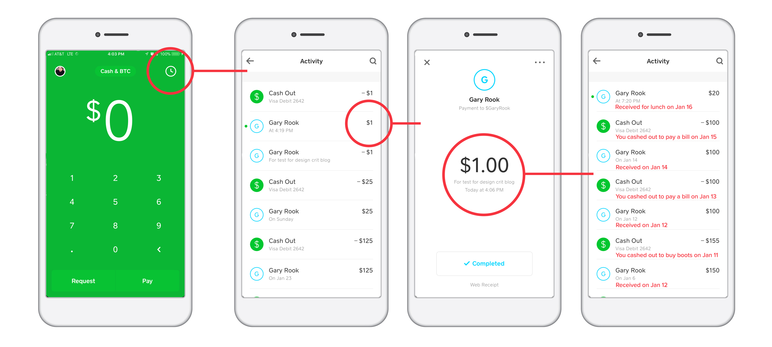
I suggest that Cash app incorporate a short descriptor in the activity feed, so that users avoid the additional step to secure that information. A simple application can become overwhelming when more screens are added to our mental mapping of the UI. Adding the suggested descriptor line to the activity feed will diminish the need to populate another screen. Users can jump into the window that displays each transaction details separately on their own accordance. This not only alleviates extra steps, but it also creates a simpler map for users who are not invested in the details.
Conclusion
Overall, the strategies that Cash uses in their interface fulfills the seven stages of action. As mentioned in the recommendations, allowing for alternative sequences can give the user more flexibility in their actions when moving between screens. Allotting control, where designers may have not given the user enough, can alleviate some of the frustration that comes with having a broad range of users.