
Goodreads.com is a site that allows users to keep track of books they have read as well as books they want to read. It also allows them to see what their friends are reading and offers the user recommendations to other titles based on what they have already read. Goodreads is also available as an app for phones and tablets, with the iOS version is what I plan to critique. The four aspects I will be reviewing are: the home page, the recommendations feature, the explore feature and the search feature. Concepts for this critique come from some of Don Norman’s concepts explained in The Design of Everyday Things.
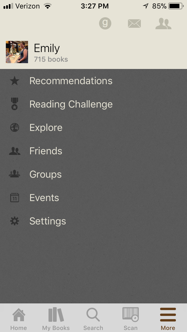
Homepage with Newsfeed:
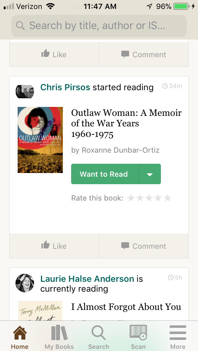
Overall the homepage and newsfeed are a clean design showing a user what their friends have been reading, as well as recommendations, what’s popular or new from the user’s frequently read genres. The icons at the bottom are good for discoverability and clearly state what function each icon does. There is one for the home screen, one for the users bookshelves, one for search, a scan feature, and a menu icon for more options. There is also a search bar at the top of the page. The homepage is clean and not too cluttered and is perfect as is, though it could possibly do away with the extra search bar at the top.
Searches:
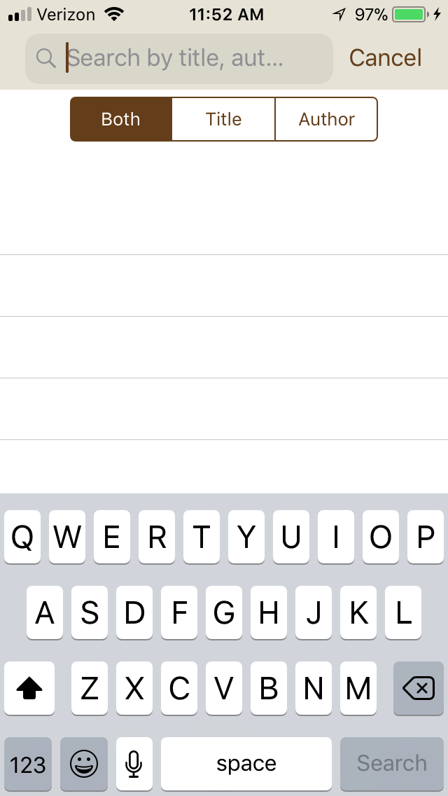
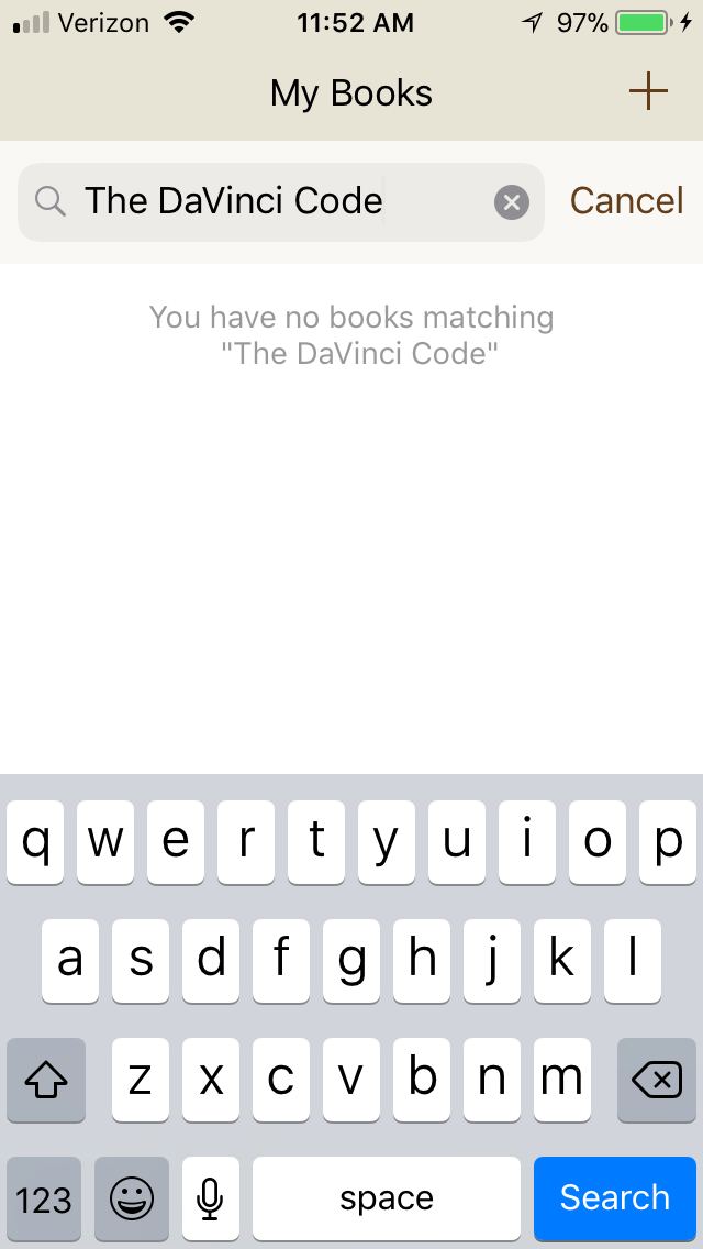
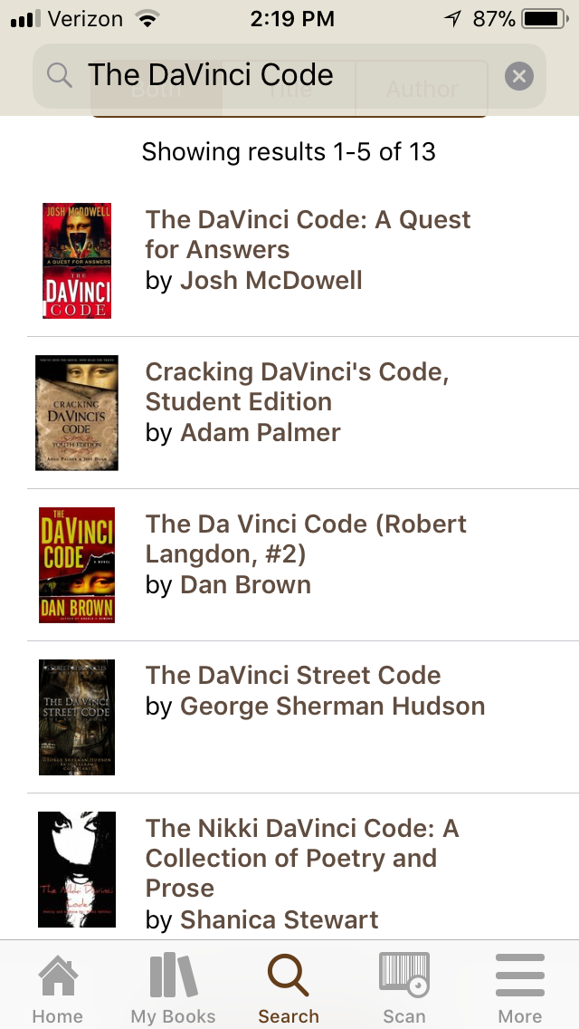
The signifier for the main search feature is a magnifying glass at the bottom center of the screen. The search feature allows the user to search for books by title, author, or subject, and this feature is accessed in one of three areas of the app, at the tope of the home page, or the magnifying glass at the bottom center of the app, and one under “My Books”. However the user has to be careful which search feature they use, as the search feature under “My Books” searches only through books on the user has already marked as “Read”. It is good that for this specific search, it does say “search books on your shelves”, but it doesn’t have anything like that in the other search areas.
An improvement that could be made is to only keep the main search signifier (the magnifying glass) and get rid of the others to narrow down confusion. The main one is clearly identifiable and accessible anytime within the app, and it includes books the user has already read within its searches.
Explore Page:
The “explore” feature is accessed from the “more” menu on the lower right of the app. The “more” menu is signified by three bars on the lower right hand corner of the screen, to show that there are more options to choose from. “Explore” allows the user to explore books in various genres for when they are browsing for something new to read. When the user picks a genre, a list of the most popular books in that genre shows up, and they can browse and see which one appeals to them.
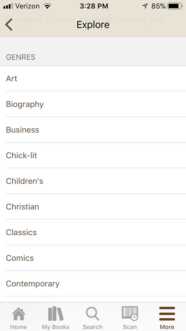
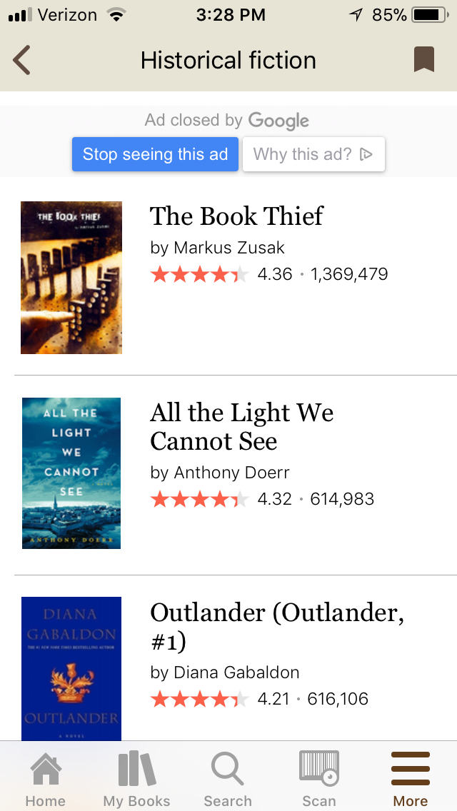
A recommendation to improve this specific feature would be to have an area within the genre the user chooses to have the option to narrow the list down by subgenre. This feature is available on the full website, but not the app. The list rarely changes, and it is very overwhelming as well. If the user is in the mood for a historical fiction novel taking place in the Middle Ages, they would have to click each title and read the summery to see when the book takes place. With an option to explore by subgenre, a user could choose “historical fiction” and then “Middle Ages” from a list of subgenres. While the discoverability of finding this feature is fairly simple, the discoverability of exploring items related to a specific interest is not.
Recommendations Page:
The recommendations feature gives recommendations of books to users based on what they have already read. The feature is in the part of the “More” menu on the bottom right of the app. This feature allows the user to see recommendations based on genres they choose, or based on one of user’s shelves. What is nice about the feature is that the titles appear larger and are easier to see the cover, and the user can swipe to the side to see all the options, which are limited to fifty items per genre, as opposed to a long list.
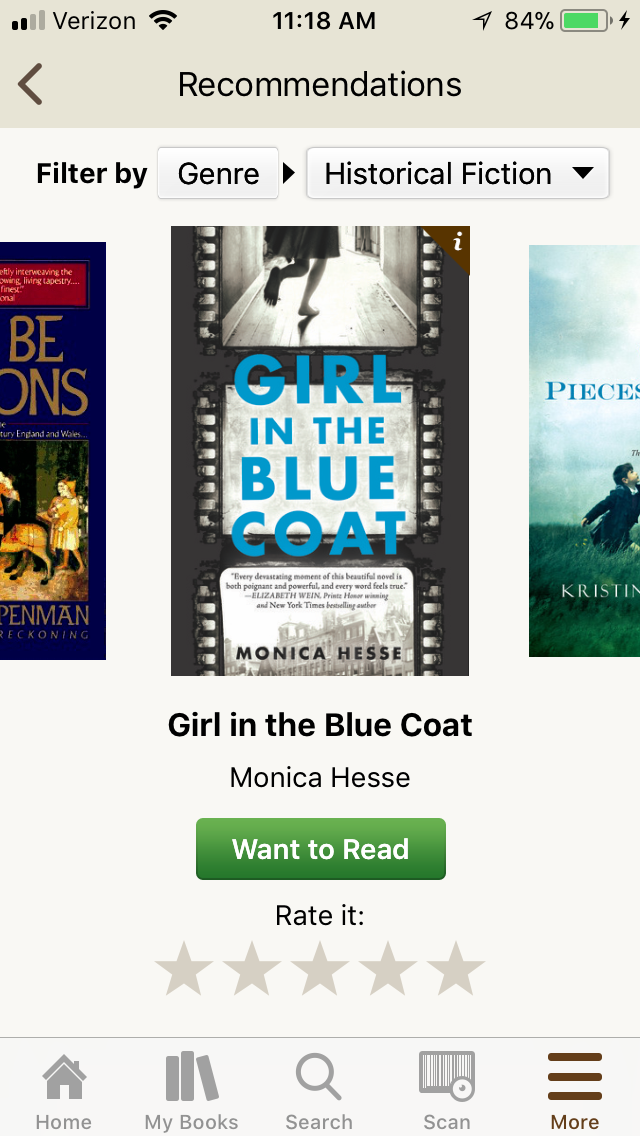
A recommendation to improve this feature is to try and update the recommendations more regularly. Particularly for an avid reader, it is annoying to see the same recommendations all the time. Granted, a user could use the similar “explore” feature, but it is good to have the option to get ideas of what to read next, based on one’s particular tastes. The other thing to improve is for the choice to filter by shelf or genre, one has to click on the icon itself and it will change. It would be helpful to have it appear as a drop down menu with a small arrow indicator, as it does when the user can pick a genre, to let the user know there is more than one option there.
In Conclusion
Overall, Goodreads is a very helpful and easy to use app for avid readers. It has clear signifiers, and fairly straightforward discoverability for the most frequently used functions. While the app is quite good now, a few minor improvements would make for an even better user experience.