
Insight Timer is the most widely used meditation app in the world and offers many features to support an online community practice. The platform connects thousands of global teaching practitioners with millions of meditators by providing access to free uploads of a variety of sessions. This app is for seasoned and novice meditators who seek tech tools to enhance their mindfulness experience.
The following critique evaluates several features of the Insight Timer app using the concepts defined by Don Norman in The Design of Everyday Things.
Home Page-Getting Started
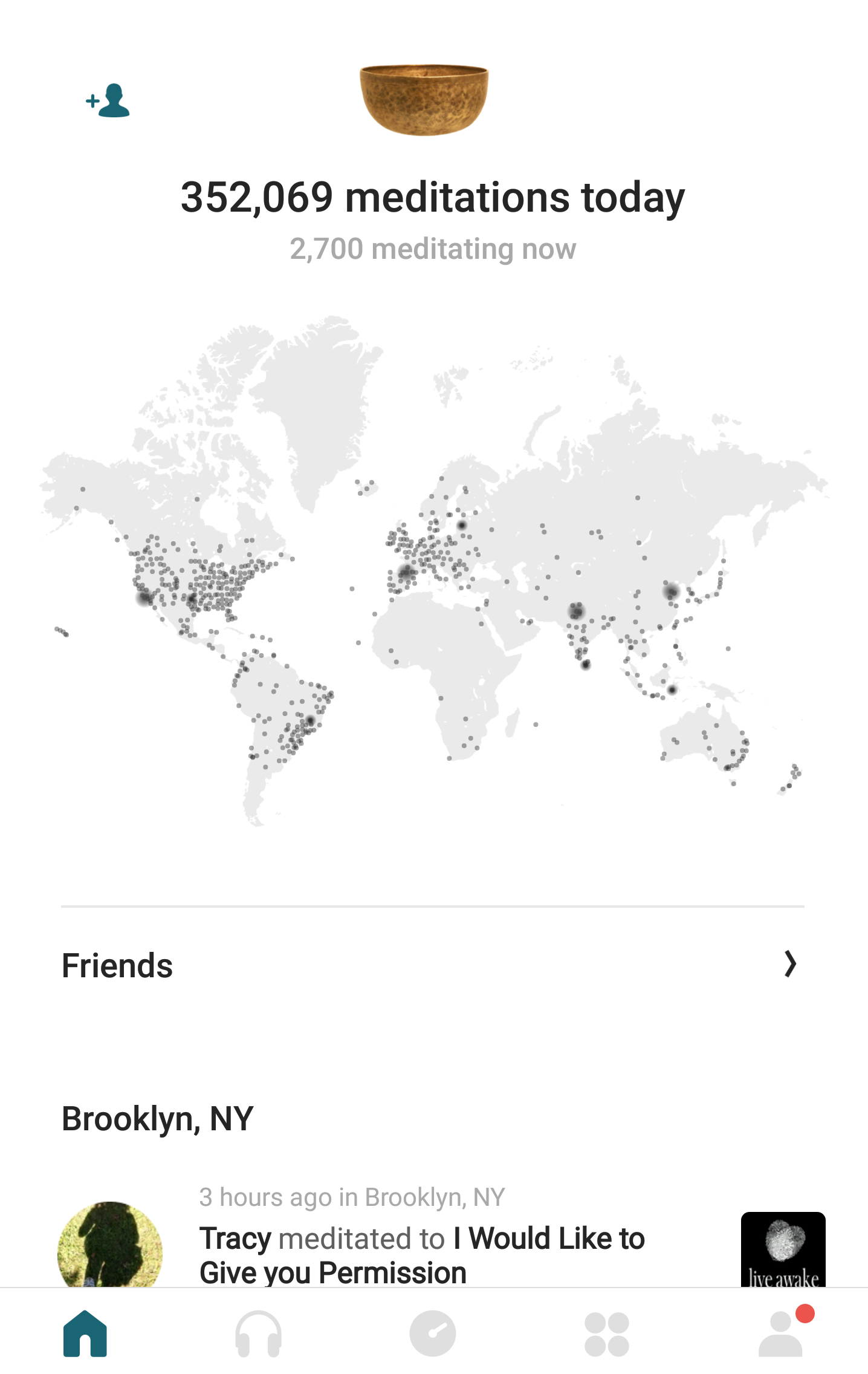
Figure 1: Home Page
The opener image on Insight Timer’s home screen (Figure 1) is an appealing, real-time world map that highlights geographic locations of users currently meditating with this app. The branding logo for Insight Timer is a Tibetan “singing bowl,” placed above the pulsing map. The visual impact is appropriately calm and attractive, in sync with the topic of meditation.
Along the bottom of this home screen are four signifiers. The icons are examples of good mapping, as each button provides a logical visual cue to a corresponding screen. Strong mapping leads to efficient user navigation. However, the discoverability of these icons is weak. The signifiers are a pale grey color, blending into the page. Furthermore, the ghosted look of the signifiers reflects knowledge in the head that the tools may be unavailable or inactive. Therefore, the impulse to click them is diminished.
The branding image of the singing bowl at the center top of the screen is the most eye-catching part of the page. Because the shape is dark and round, it is a perceived affordance for pressing, when, in fact, nothing happens when you touch the icon. This creates a gulf of execution for the user who will likely attempt to press this spot first.
Design Suggestions for Home Page:
Darken the navigation buttons to improve discoverability.
Activate the singing bowl icon to link the user directly to the meditation “Explore” page where they may select and begin a session.
Explore, Category, Selection Pages – Selecting and Beginning a Meditation
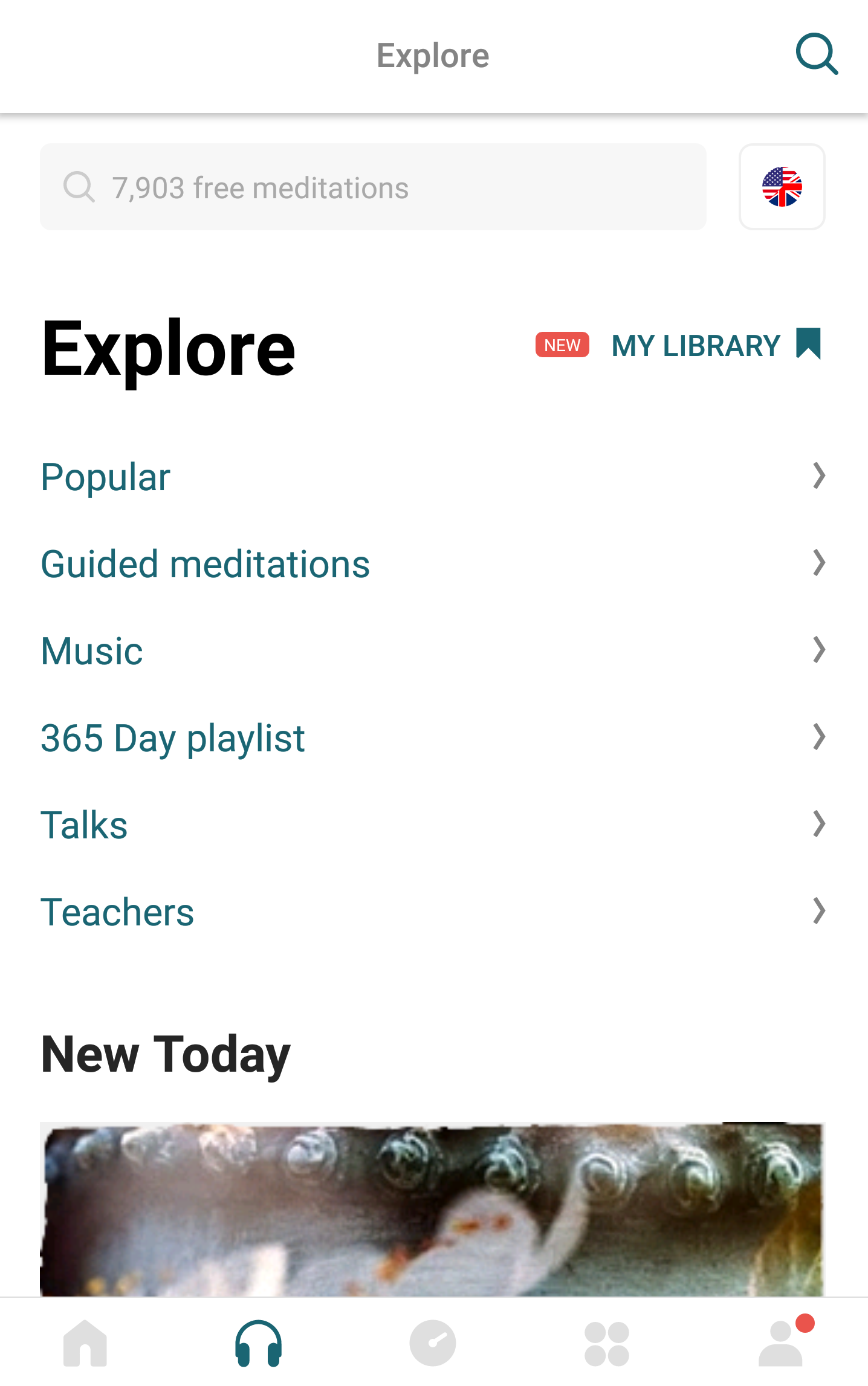
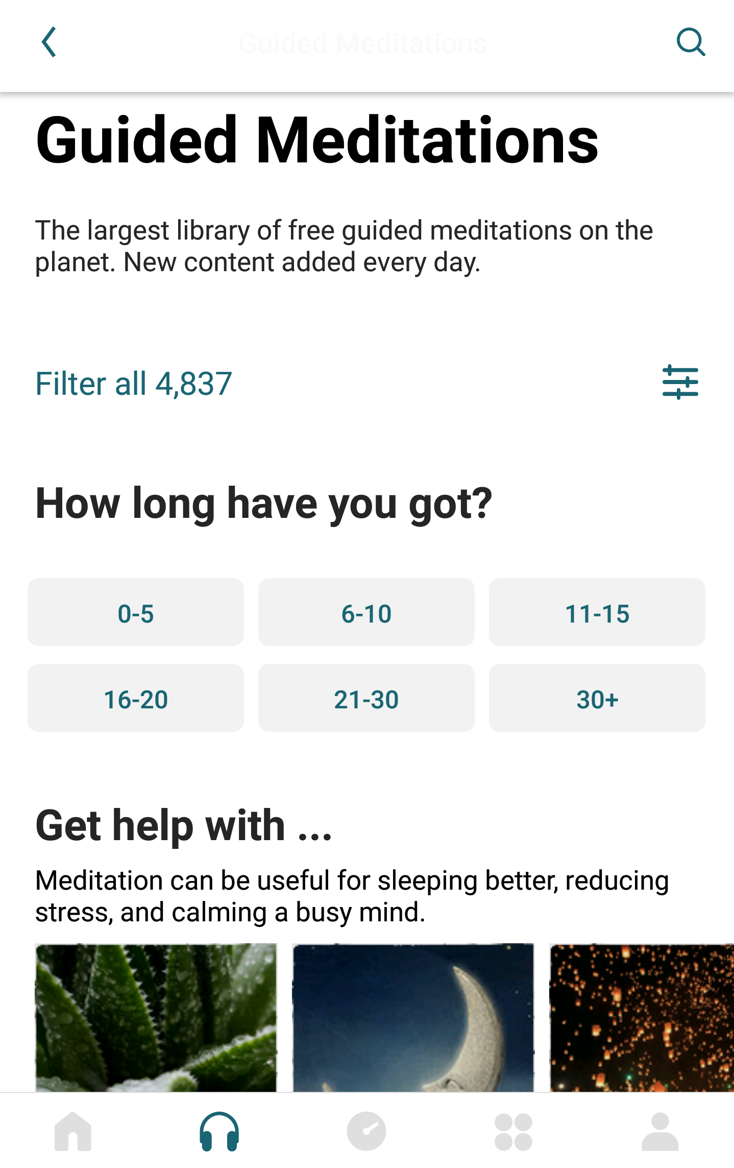
Figure 2: Explore Meditations Figure 3: Meditation Category
The goal for users of Insight Timer is to meditate. Goal-driven behavior will lead to the Explore page (Figure 2). The Explore page offers helpful constraints in the form of labeled categories: Popular, Guided Meditations, etc. If you don’t know what you are looking for, these buckets will narrow your search to certain segments of content. The image at the bottom of the page is only partially visible. This provides a signifier that the user may scroll down to see the rest of the “New Today” offerings. The arrows on the right are good signifiers that clicking here will bring you to a new page view (Figure 3). The constraints provided by the time frame buttons ensures that the user will find results. Without these pre-set constraints, a user might enter a random number of minutes (i.e. “23”), potentially returning “0” meditations and increasing the gap of execution.
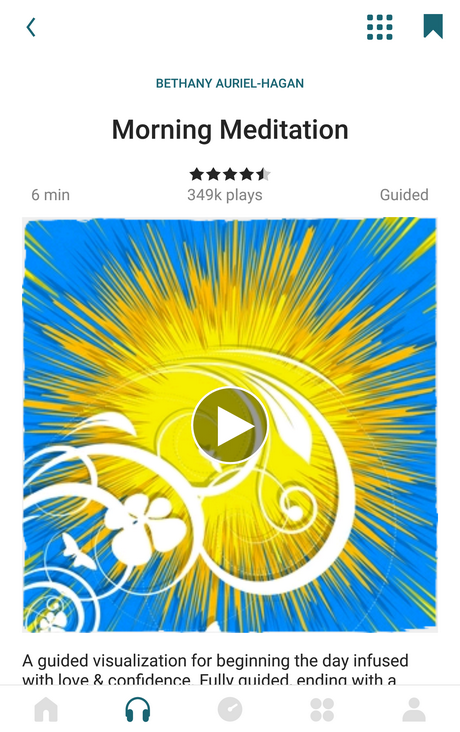
Figure 4: Meditation Selection
With each click on signifiers in Figures 2, 3, and 4, there is immediate feedback. The play button on the meditation selection screen (Figure 4) is easily discoverable and provides rapid feedback by starting the meditation session. There is essentially no gulf of evaluation using these pages and low risk of slips.
Design suggestions for Explore, Category, and Selection Pages:
None.
Messages Page – Notifications Feedback
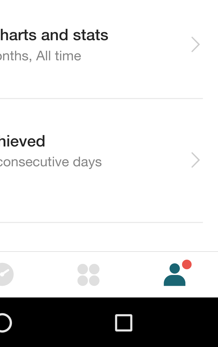
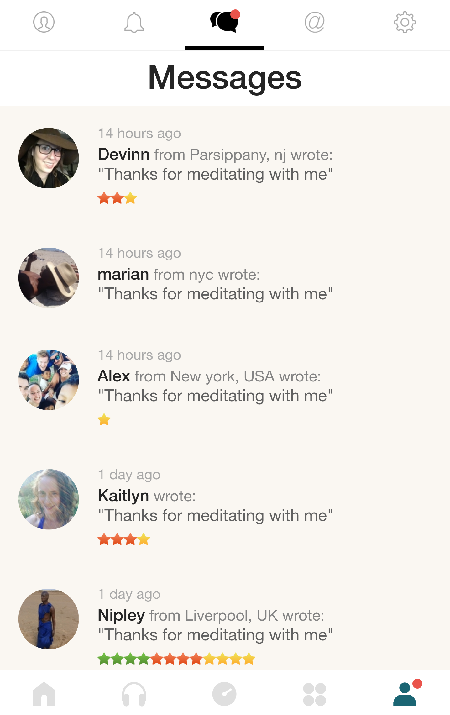
Figure 5: Notification Feedback Figure 6: Messages
A red dot next to the person icon is Insight Timer’s message notification signifier (Figure 5). In addition to this visual signifier, there is a quiet, pleasing bell tone, a sound signifier, when new messages are received from other meditators on the app. After users meditate, the app offers the option of sending a default note to others who meditated at the same time: “Thanks for meditating with me.” Scrolling down the messages screen shows the messages (Figure 6), but in order for the red dot to go away, the user must click and open each individual message. This creates a gap of evaluation. Even though you have seen the messages, feedback is not reflected until you take this extra step. Frustration may lead to simply ignoring the red dot signifier altogether, rendering its purpose useless.
Design Suggestions for Messages Page:
Make feedback more direct. Allow the scrolling on the Messages page to trigger that the messages have been read, and eliminate the red dot immediately following that action. An option to disable messages from other meditators could further eliminate distractions for those who dislike these messages.
Summary:
The Insight Timer app mostly offers complexity without confusion. Meditators have many options for sourcing mindfulness sessions and tools. The home screen signifiers should be revisited to enhance discoverability and the branding icon could be an activated link to increase efficiency in the user’s execution action cycle. The messaging page should provide direct and rapid feedback when messages have been read. The high level goal for users of this app is to meditate. Connecting with other users to participate in the community is more likely a subgoal. A task analysis of the messaging and friending features could expose how users actually perform. It is possible that the social features create wider gulfs of execution or evaluation, or a mismatch of design for some individuals altogether.