 Appy Couple is a wedding organization and notification app for hosts and their guests. It allows for live updates and has interactive features like a guest book, photo sharing, travel options and planning, guest lists & rsvp as well as event scheduling. Wedding invites have evolved from snail mail to E-vites and entire digital platforms like Zola, Appy Couple or The Knot’s Wedding Planner. This is beneficial from a cost savings standpoint. It also consolidates the necessary information in one place for all parties involved which removes stress and reduces the potential for overwhelming communications/questions leading up to a big event. Potential negatives of this evolution, as with most traditions turning digital, are the loss of sentimentality found in tangible aspects of an invite- like heavy stock paper with hand pressed lettering or any tangible decorative frills for a special occasion (the introduction of Kindle is an example of this division).
Overall, when exploring Appy Couple app specifically as a guest, the experience is a positive one. It provides a one stop shop for all necessary event information which is engaging and convenient. However, there are some discoverability issues that create hiccups in the user experience. Some actions are counter-intuitive and could be resolved with strong signifiers and appropriate mapping. Below are a few positive and negative examples.
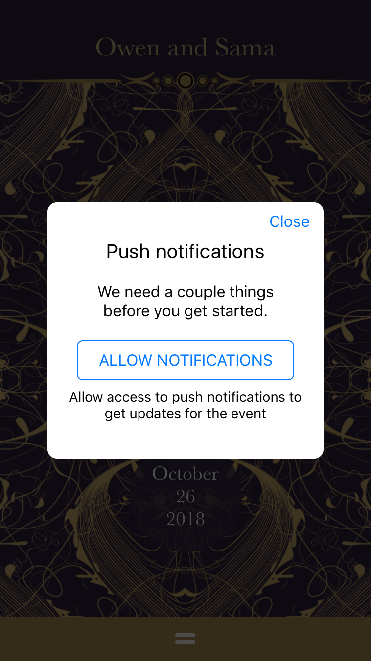
Fig. 1 – Push Notification Pop-Up
The first example is Fig. 1 depicting a repetitive pop-up constraint to permit notifications. When installing the app, the user is asked to set their permissions. When opening up the app thereafter, in this instance, the user didn’t want notifications but the app is interrupting the flow and using strong language (“need”) to imply its importance. A more considerate approach to this constraint could be a pop up limitation, appearing once and then not again, accepting user’s decision.

Fig. 2 – Homepage
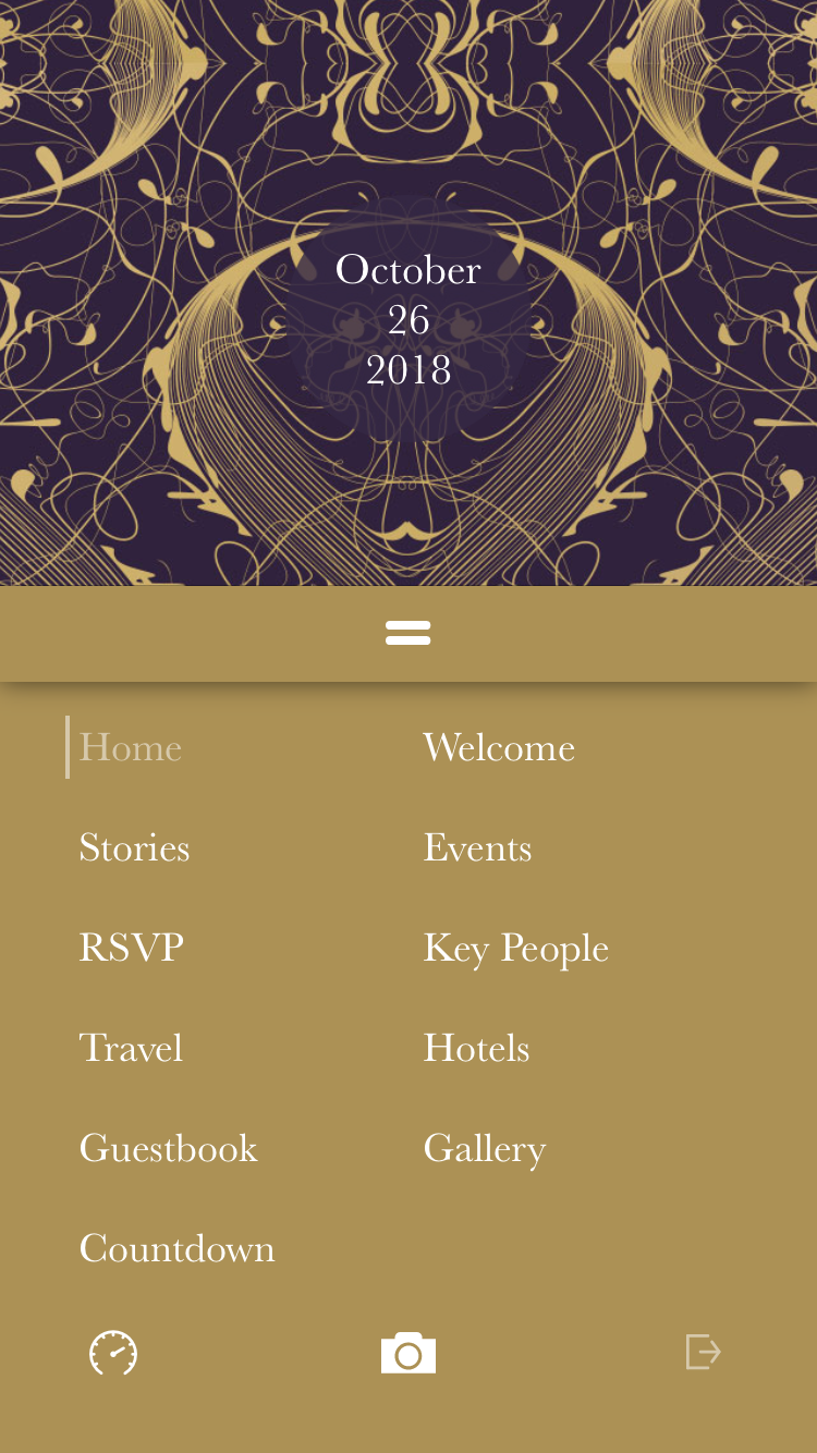
Fig. 3 Navigation Menu
Once the notification request is accepted or denied, the homepage, Figure 2, loads and depicts the name of the couple at the top and the wedding date at the bottom. The background and the text is editable for the host and is specific to their tastes. At the bottom of the welcome screen is a partial signifier, hamburger menu with two instead of three dashes. Clearly labeling this portion “Menu” could make it more accessible. The conceptual model is confusing as the next step, once arriving to the homepage, isn’t immediately clear with those two dashes. Another option is removing the step to click-in and making Fig. 3 the initial home screen and adding the couple’s name to the top for personalization.


Fig. 4 & Fig. 5 – Key People section
A positive experience is the system image shown in Fig. 4 and Fig. 5. To view the key people, the user scrolls down, and to know how far or how much is left to view, there are four dots at the top of the screen locating their place in the album. It also provides the option to select a dot and be taken to that specific section. It’s an example of positive discoverability and understanding.
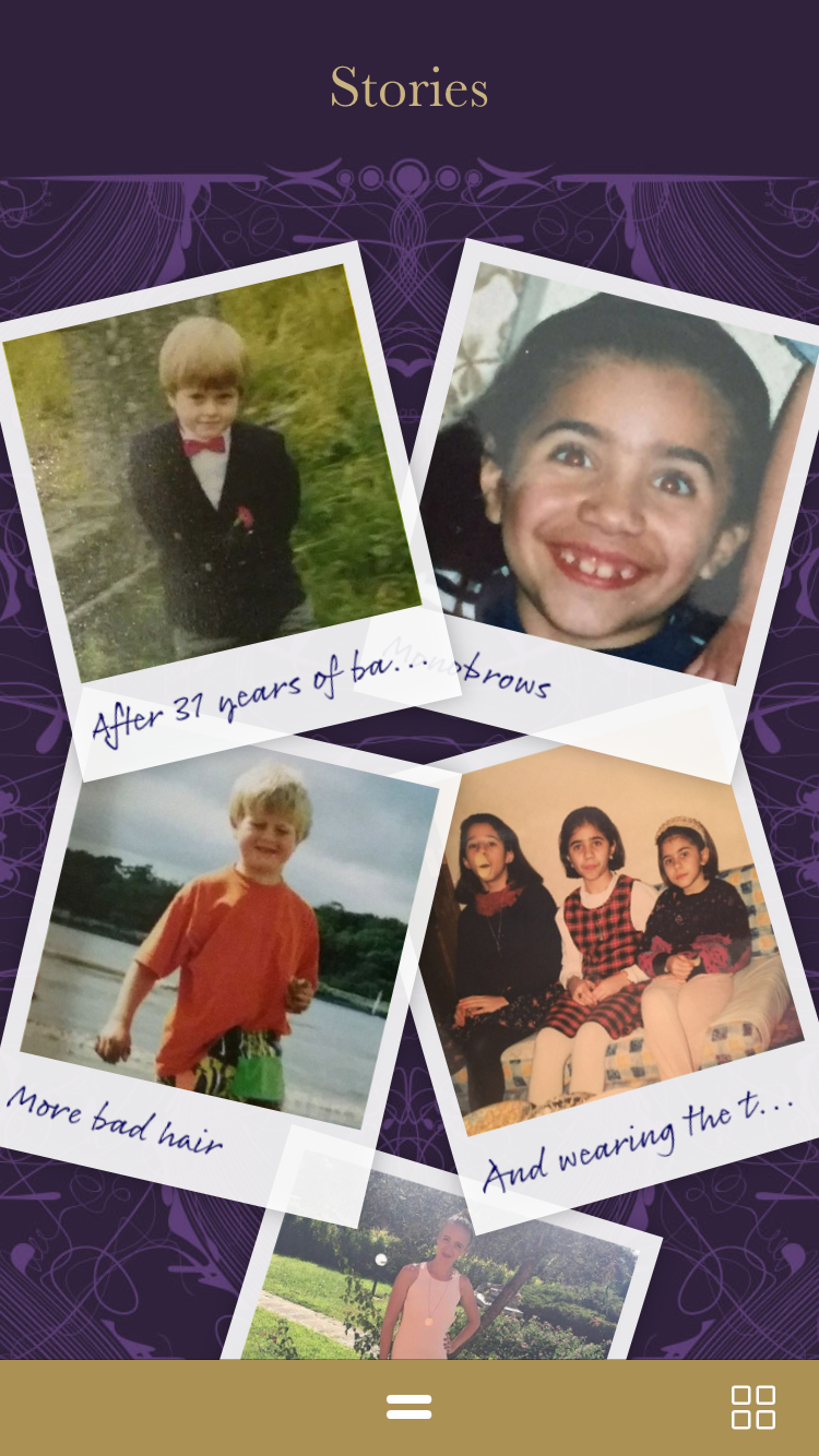
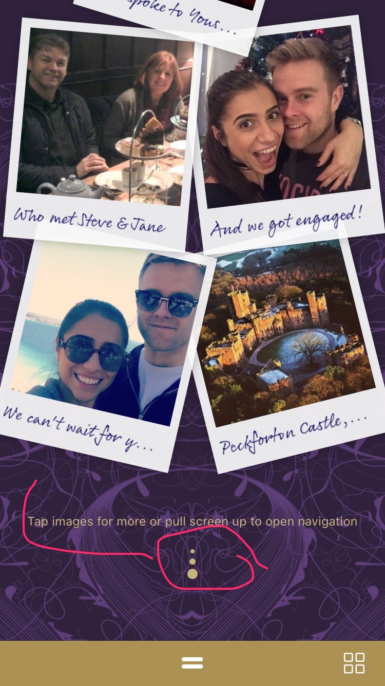
Fig. 6 & Fig. 7 – Stories section
The Stories section in Fig. 6 and Fig. 7 depicts a wedding couple story in the form of a digital scrap book. It’s personable and sweet, however, direction on how to utilize a key feature- “tap images for more or pull screen up to open navigation” is placed at the bottom of the page once the user has finished scrolling. The user would then have to repeat the action to explore the page and click into the photos the way it was intended. Placing this signifier at the top of the page or formatting the images in such a way that they afford clicking would avoid this redundancy.
Also, the direction to pull screen up to open navigation is one the user would have had to already figure out to access the Stories page. More productive placement for this direction would be the homepage or the menu alternative explained previously for Figure 1 & 2. Finally, there are three vertical dots at the bottom of Figure 7 that mimic the hamburger menu or a back to top of page arrow button, but it isn’t actually actionable. Subconsciously, this incites a visceral response to press this section when the intention may have been to denote the end of the page. Removing this little feature could alleviate future misinterpretations.
Appy Couple is handy tool that provides guests with the information they need for stress-free event preparation especially where travel is involved. These observations are a handful of small edits that could positively address the app overall.