The operation systems are very common and deeply influence our daily life. As we known, computer operation systems like Microsoft PC, Apple Mac; the mobile phone like iPhone and Google phone; even recorders, radios, watches have their own operation system. Good operation system will largely enhance our working efficiency. But bad operation systems will make us crazy.

I encounter many problems when I am using my desktop display to adjusting my desktop screen’s attributes (Brightness, Contract, etc.). Before I read <The Design of Everyday Things>, I thought that was my problem for some wrong operations. However, after this book taught me the systematic methods to evaluate design or user experience, I think the problem is the Usability of the screen’s operation system itself.
There are 3 mainly usability problems of this screen, I use the methodology from Don Norman to correct the design problems after I make some mistakes.
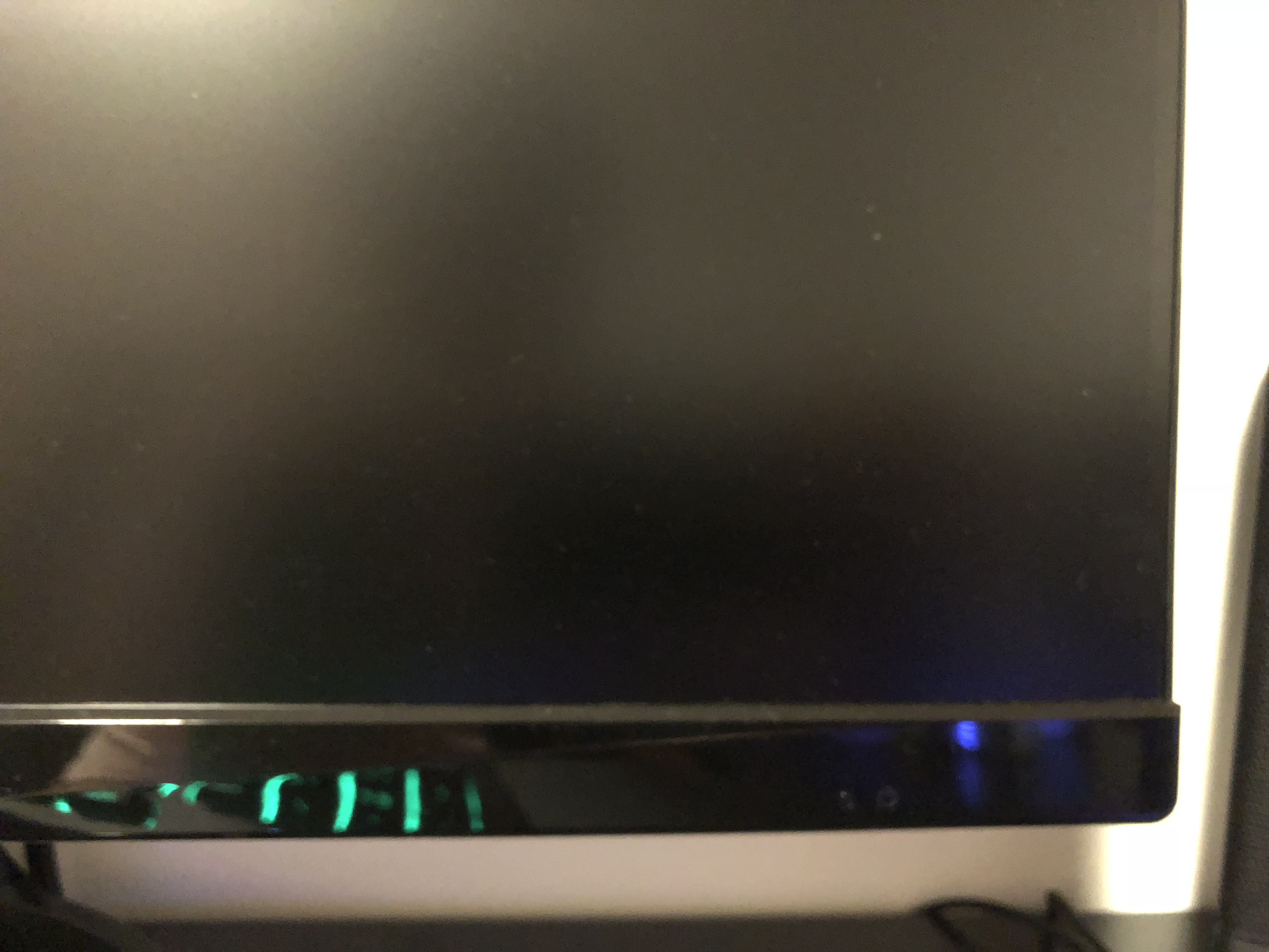
First of all, the problem is about visibility. When I wanted to turn on my screen first time, I could not find the power button to turn on the screen (P1). That very frustrating experience, because I couldn’t see any obvious signal to notice me where is a trigger to turn on, I could just touch everywhere of the screen to find the power switch. Finally, I found that the button, it was at the bottom of the screen (P2), And there are also few unknown buttons paralleled with the turn-on button on the left side. The problem of this product is people cannot recognize where the buttons are, which deviates the visibility principle.

The second problem is the mapping of the operations. When I wanted to adjust the brightness of the display, I had to randomly press the bottom of screen to activate the adjusting interface(P3). Only one specific button was available(P2), but I don’ know which button is the right one. The bottom of interface on the screen shows some icons(P4), but I cannot understand well the meaning of that (I even thought that is touchable). I could only try to press the buttons and guess that that icon’s meaning. I try for about 5 times to figure out which button matched to which operation. Actually, the meaning of each button is the alignment relationship between icons and buttons. The alignment is inaccurate so I often do wrong operation. The whole operation process was full of my mistakes and complains.
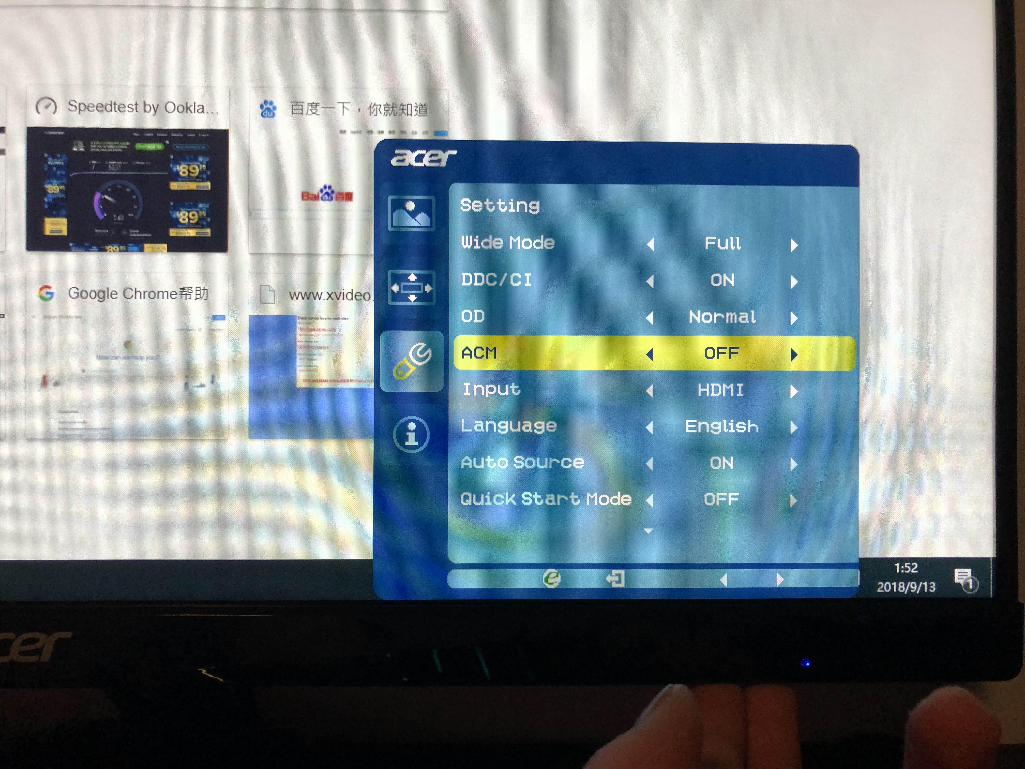

The last problem is constraints. I often press a wrong button because the bad alignment between icons and buttons below. Many buttons are still unavailable when it doesn’t align to a icon. In P4, you may see my finger is going to press the position of “down” command, but the actual button is “off”. So if I mistakingly press the “off” button, the screen will suddenly turn off and the operation interrupts. This experience is very bad because I have to reopen the screen and operate again.
The first recommendation for the screen design is to add some more obvious signal to show where is the power switch. The fluorescence material button can be used in the front of the screen. If there is a luminescent button in the front, user may more easily know how to turn on the screen. The second recommendation for the screen is to move the other button to another place where is relatively far away the power button. This change may decrease the possibility of interruption from suddenly turning off. The third recommendation is to move the buttons to visible place that can help user to recognize the meaning of each button and align the icons. Last but not least, I think some design detail like the alignment problem and the distance between each button, should be reconsidered.
Reference:
<The Design of Everyday Things> Don Norman