As UX Designers, we have the power to design a product that can be interacted with million people on the internet. It is our obligation to make sure users can successfully access our website. This means all the users include who have visual impairments, color blind, hearing, cognitive disabilities or problems, who use different devices to access a website, and who uses an old operating system. Yes, there are still people never use a smartphone and don’t know how to use computer.
Ony of the keys to success is enhanced color accessibility so that all the users are able to understand the meaning and information that the color assigned to it.
There are mainly three roles to design color on an interface to help users identify information.
Contrast
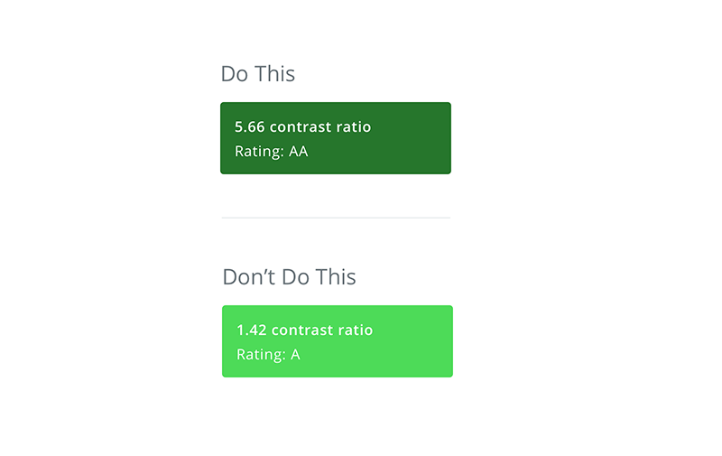
Source 1. Image from Invision
The effect of contrast on the visual effect is very important. Generally speaking, when the contrast is large, the image is more clear and conspicuous, and the color is more bright and vivid; while the contrast is small, the whole picture is grayed out. Many websites always have the issue with color contrast. It increases the difficulty of low vision people to read and reduce their cognitive abilities. According to W3C’s color contrast rating, it should be 4.5 to 1. This guideline helps users to see and read text on the screen.
Here are some common Issues can always be seen on the websites:
Light Objects on a Light Background
There is an issue on the internship page of Urban Outfitters(Figure 1). The heading is too light on a light background so the text is not really readable.
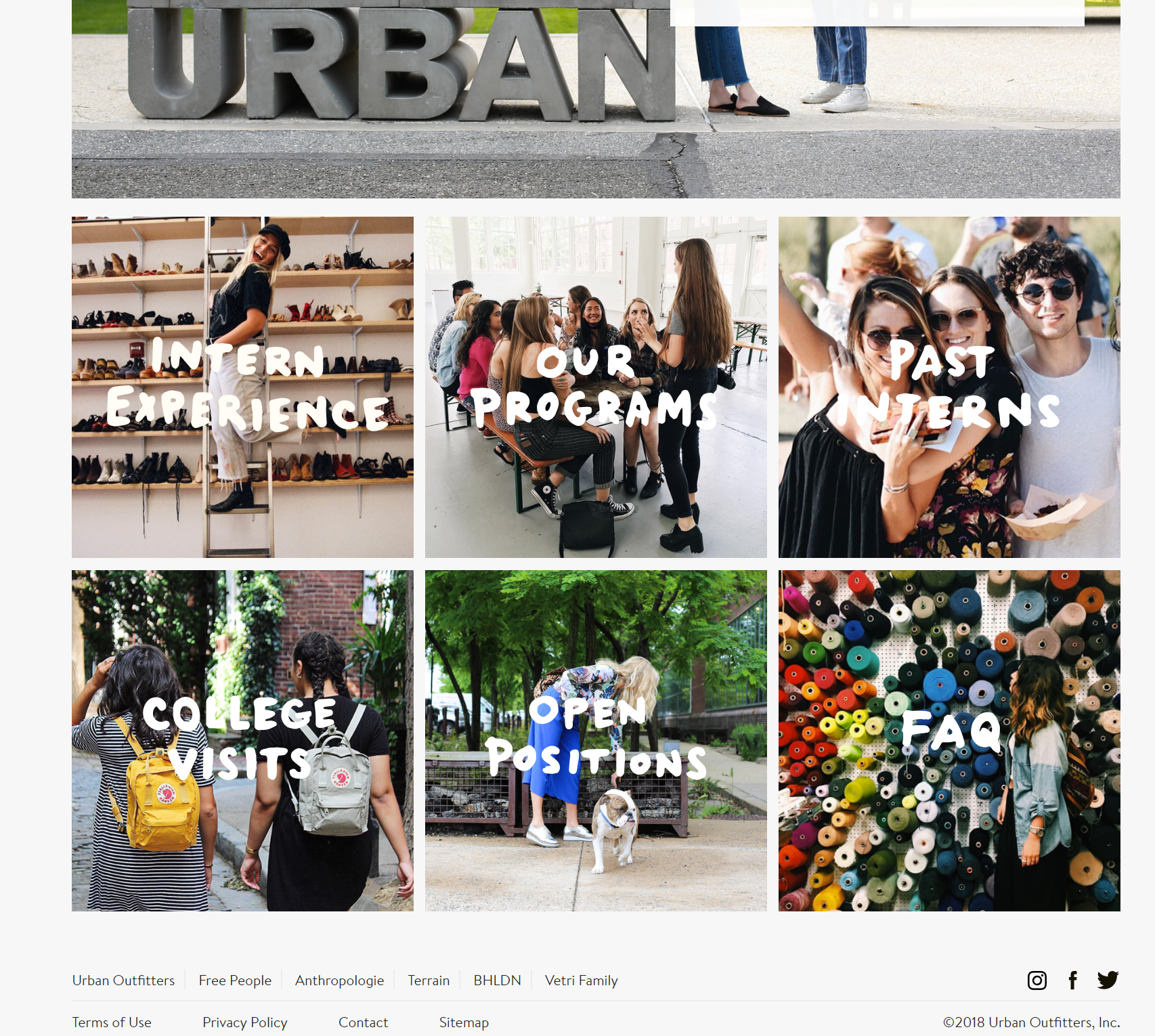
Figure 1. Urban Outfitter Internship Page
Color Combination is Too Bright
When choosing the color too bright it will make users look away because the color is very glaring(Figure 2). A bright color usually uses at the button, important layout, alerts, navigation in order to grab users’ attention. Reading this website is no longer enjoyable.
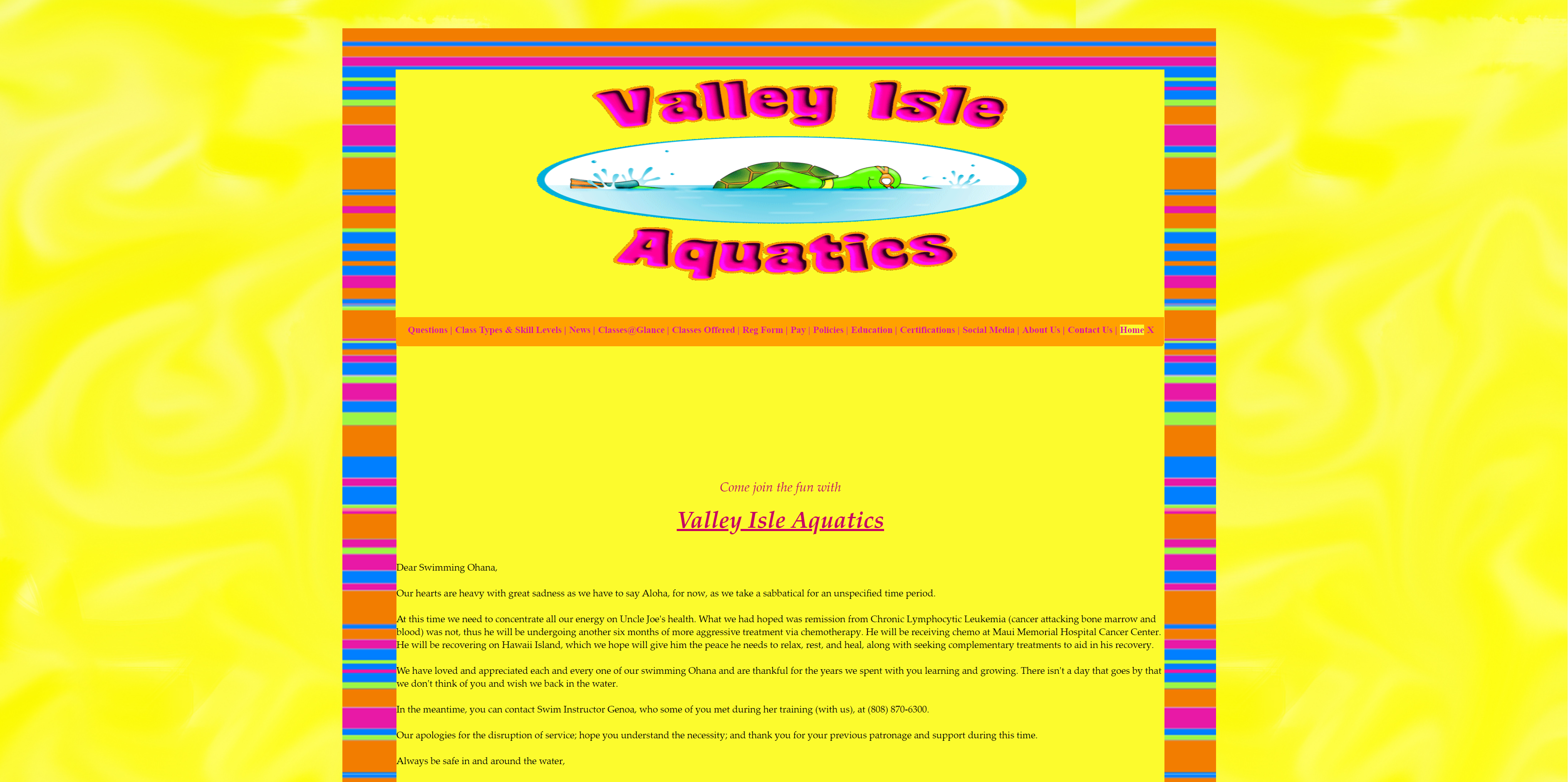
Figure 2. Valley Isle Website
It is also important to remember it is always good to pick two or three base color to give users a good emotion. Here is an example of overusing color:

Figure 3. Ling’s Cars
Highlight
Color can not only use on visual but also can use on conveying information. Proper use of highlights can attract users’ attention. It helps users locate or receive important information so they won’t miss it. This also helps users who cannot or hard to distinguish one color from another due to vision problems.
According to Figure 4, users can only tell there is an entry error on the first field from the circle with the exclamation mark that tells them something is wrong.
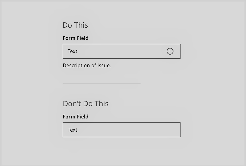
Figure 4.
From Figure 5, because two fields had highlighted, even the second field doesn’t have circle alert, users can easily tell the two fields both have issues.
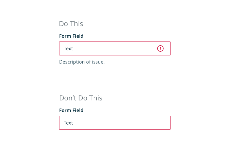
Figure 5.
Here is another good example of using a highlight on the right side of the image(Figure 6). It uses the highlight to tell users where to find the CVC number, which is very helpful for people who use a credit card to shop online for the first time, most of them do not know what and where is a CVC code.
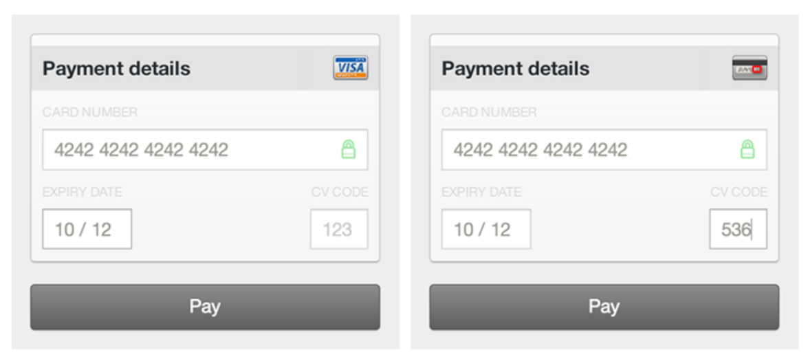
Figure 6. Credit Card Fields
Pattern and Texture
While using graphs or charts, people with color blindness can not rely on the color to understand or memorize data. Adding texture, patterns, or icons can make sure these people can distinguish data without having to worry about the color that affects their perception(Figure 7 & Figure 8).
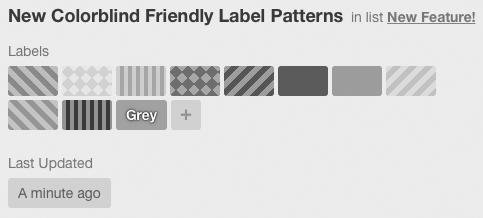
Figure 7. Colorblind Friendly Label Pattern by Trello Website
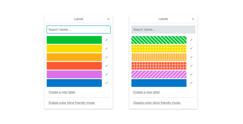
Figure 8. Colorblind Friendly Label Pattern by Trello Website
Good Example
Smashing Magazine
This is a very good example of a website has good color accessibility. The website use three main base colors. Red, white, and dark grey. The ratio is 4.59 to 1. Meanwhile, red is the color grabs the most attention from people. Designers use it as a background color for navigation to tell users where it contains important information they don’t want to miss. The designer also highlights the latest articles heading to grab users attention with red highlight. Since red is already used as a highlight, after finishing reading the navigation, the dark grey will be considered as a second priority by users. The whole design is clean and organized which gives users a clear direction to look for the right information.

Figure 9. Smashing Magazine Website
Maximizing accessibility is our responsibility. Designers not only design product based on their preferences, but to show our respect to our users by making it usable to all of them.
https://www.w3.org/TR/UNDERSTANDING-WCAG20/visual-audio-contrast-contrast.html
https://www.invisionapp.com/inside-design/color-accessibility-product-design
http://littlebigdetails.com/tagged/google
https://www.business2community.com/marketing/10-colors-that-increase-sales-and-why-0366997