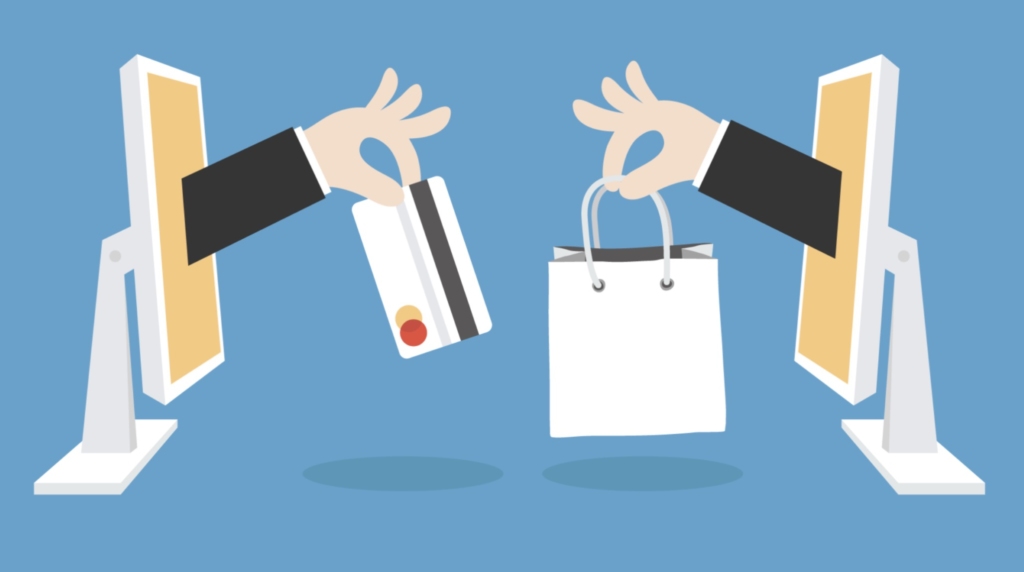
Talking about Amazon, my friends and I all have bad experiences before. We give up selecting a specific product because of thousands of options on Amazon with all kinds of feedback evaluation, and finally, go to Ikea or Target grab one. What’s wrong with Amazon? It gives us choices as more as they can, but why doesn’t it make Amazon competitive? Here is a common belief in our subconscious that more choice is always better. However, is it the truth especially in online sales?
Two researchers: Sheena Iyengar and Mark Lepper conducted an experiment to find out the psychology of choice and how the number of options would influent us. They set up a jam tasting booth in Draeger’s, which is an upscale grocery store in Menlo Part, California. They displayed 24 different flavors of jam in half of the time, and they showed 6 flavors in the rest of the time. They collect two data in particular in this research.
– Stop and sample some jam
– Buy a jar of jam
Then give a result that in which scenario people were more likely to do the two things above.
Here is the counter-intuitive result: in the circumstances that were showing 24 flavors of jam, 60% of people stopped there, and 3% of those who stopped bought a jar. Compared with the circumstances that were showing six flavors of jam, only 40% of people sopped, but 30% of them purchased a jar. Therefore, even though people were more attracted to the place providing more choices at first when they came to consider buying, customers were at least six times more likely to buy from fewer options place than more choices place.
Why would fewer choices lead to a better selling performance in sales? Because when people are facing many choices and have to choose one of them, they begin to be nervous and feel hard to make a decision (the chance to make a wrong decision is higher than before). Thus, the more options you offer people, they are more likely to spend a huge of time to decide, which also means have more chance to give up and quit form this potential purchase. Besides, more options platform makes a higher opportunity cost. People need to understand more information about these goods and compare it with more other competitors. It is not strange to give up by thinking in this way.
Psychologists call this phenomenon choice overload, which belongs to cognitive overload. So what can we do with this phenomenon?
“Getting in the way of a speeding freight train usually doesn’t end well. It takes much effort to shift the course of something with that much momentum. Rather than forcing people to divert their attention from their primary task, come to where they are.”
–Luke Wroblewski, Product Director at Google
Therefore, we should give users the appropriate number of choices or use a perfect way to hide some of them to make users feel easy to finish this option choosing. Let them find where they are by themselves.
So how to increase both the usability in the online sale and the online purchase? It will be discussed particularly by three stages: register, become a paid member and make a purchase.
Register
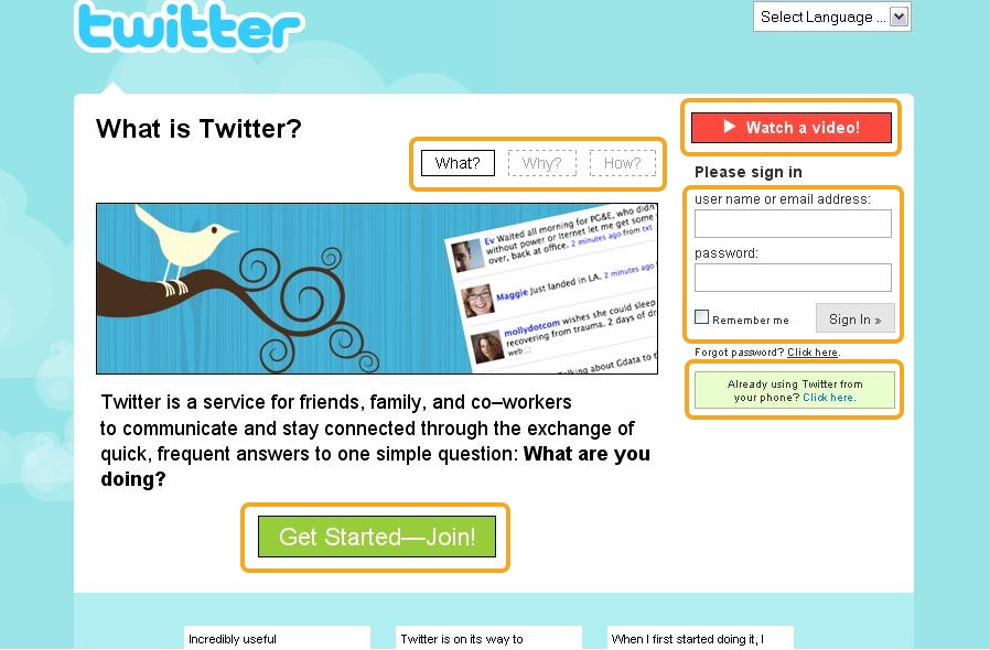
Let’s take a look at how Twitter’s register page looked like in 2009:
How it looks like today:
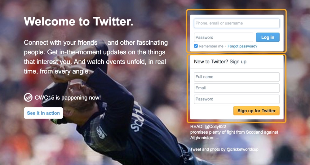
There were five things you could do in the 2009 version, but only sign in and sign up today. People will never get so much distraction again. Here are also some great register page.
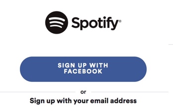
Spotify give users the option to sign up with social media account, which is a very convenient way with less hesitation. Also users can sign up with email as well. Simple and clear.
Become a Paid Member
Next, become a paid member. It is always happened in the paid App, like Spotify, Grammarly, and Amazon Prime, or some B2C products. Here are some worse, bad, good, and perfect examples.
Worse: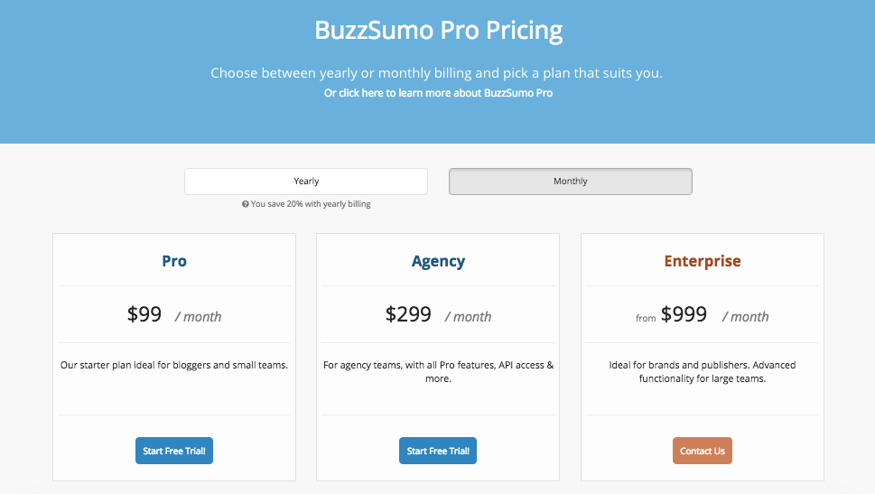
The “Start Free Trail” button is so small, and it doesn’t make sense that these free trail button is in the “Pro” and “Agency” part. I believe BuzzSumo wants users to try free trail very much, because just few people would like to pay at least 99 dollars per month without trying. Therefore, these blue buttons should be more distinct and these choices should be more logical.
Bad: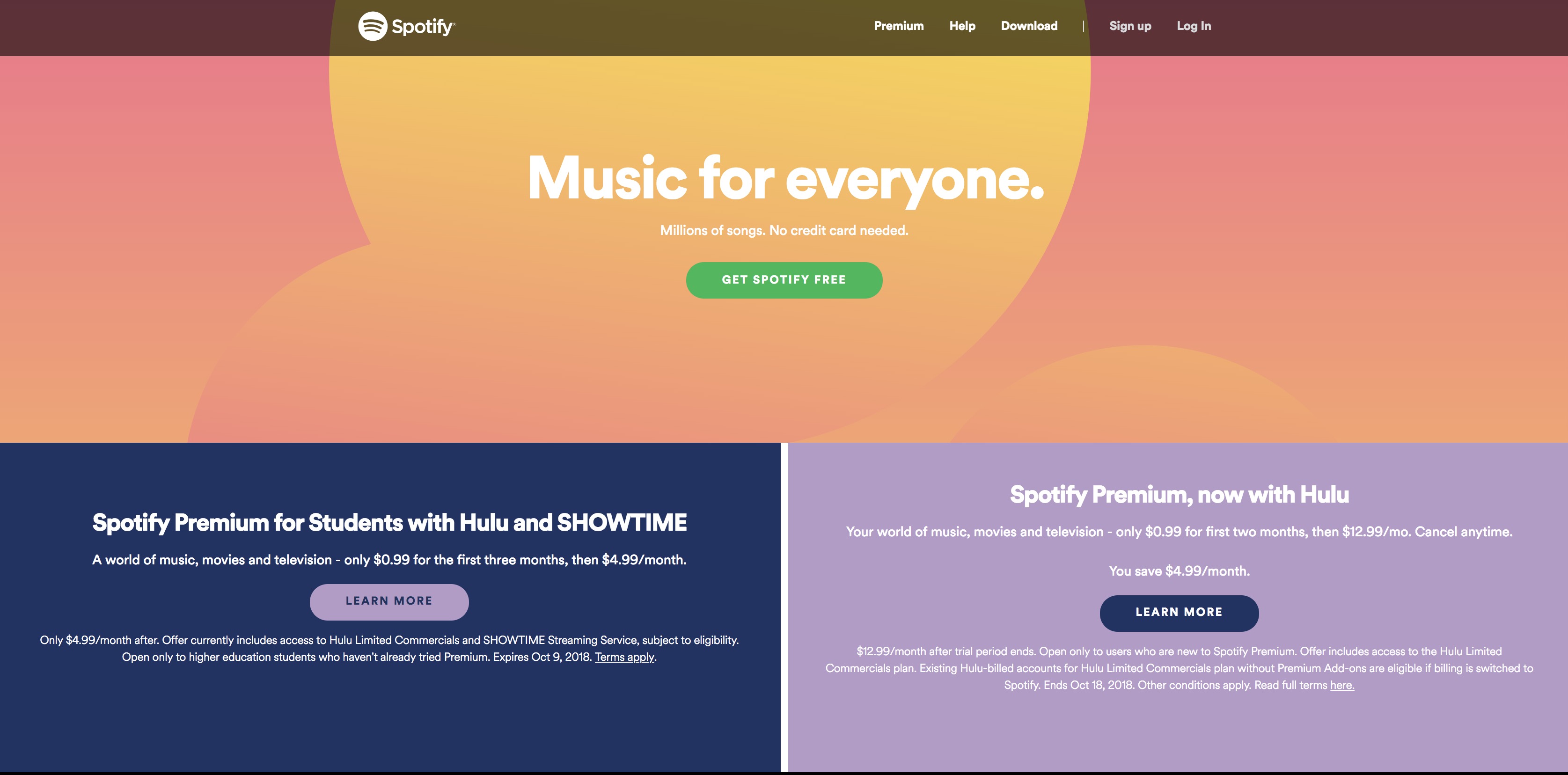
This Spotify’s premium plan page is not clear at all. What I could get is the free choice on the top, 0.99 dollars or 4.99 dollars some choices on the left and right. It should be more logical and user friendly by only showing crucial information and laying out like the next one.
Good: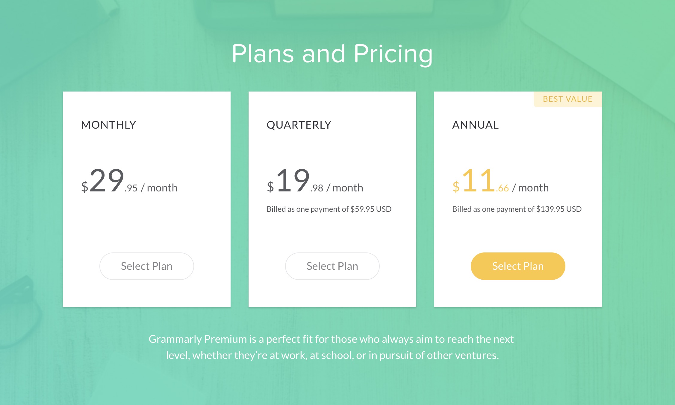
This page from Grammarly is much better! Users could easily understand how different between these three types of plan. Besides, the “Best Value” one is colored yellow, which makes it distinct, and it makes sense because it is the cheapest one.
Perfect:
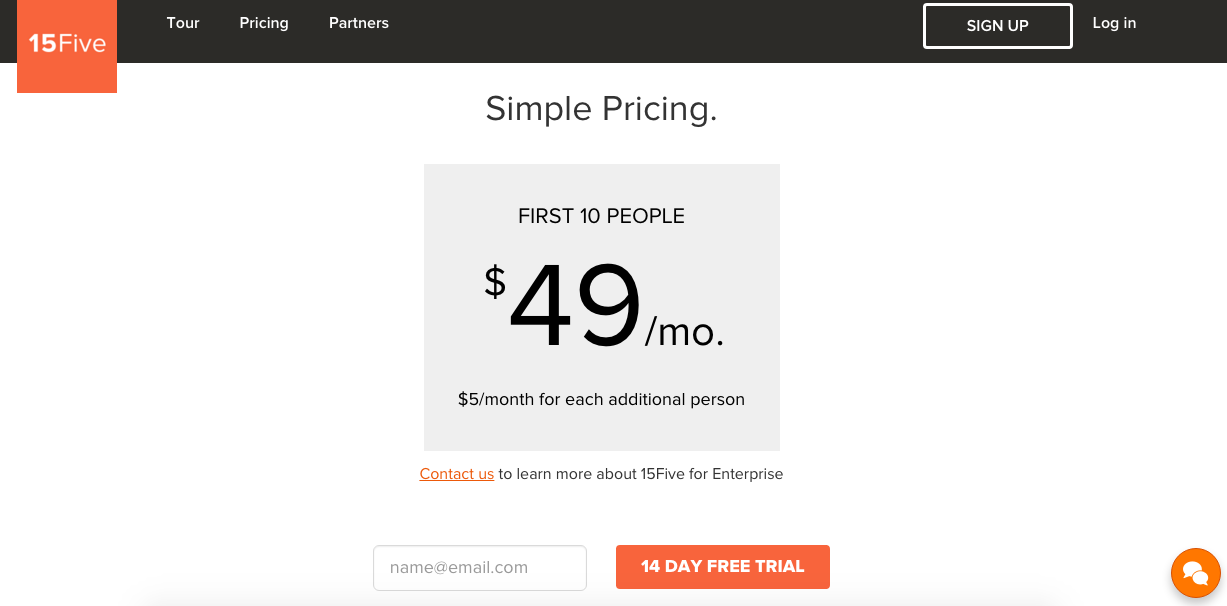
15 Five only have one option for users, so there is no comparing work need to be done. I am not to say one option is the best solution, but it deserved our attention to think about simplifying.
Make a Purchase
Finally, make a purchase. We still take Amazon for instance, because even it had too many products, it has some movement to make it better.
Here are two screenshots showing how Amazon list the products you probably be interested in.
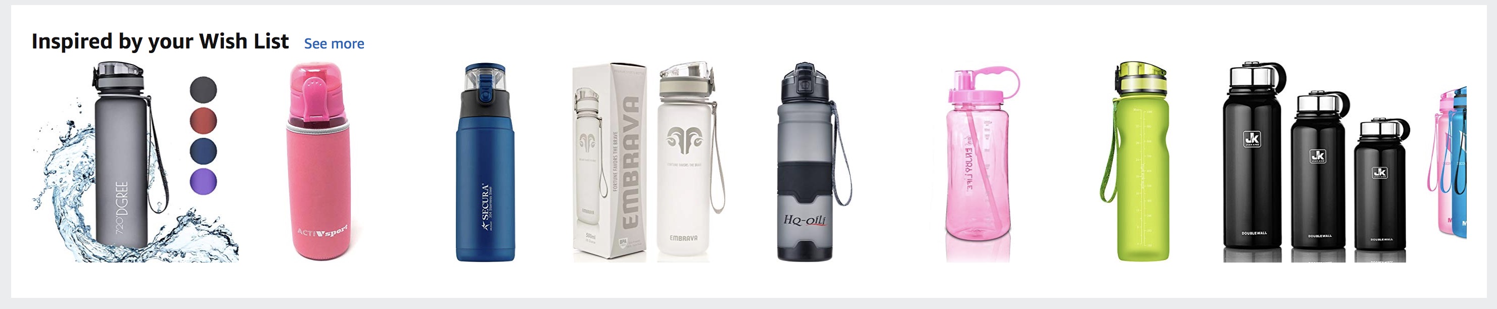
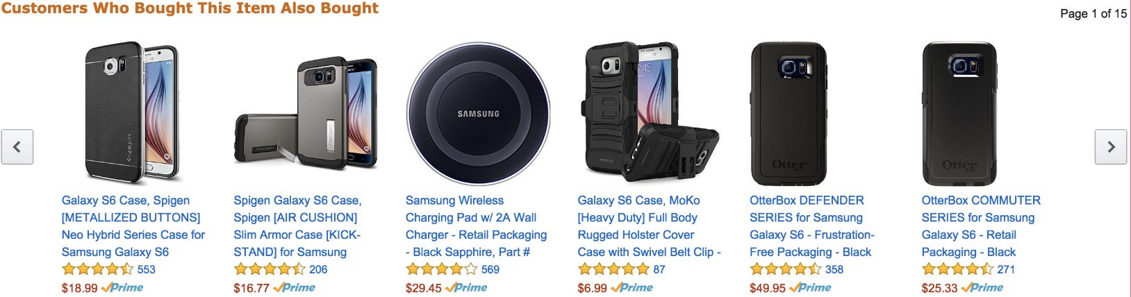
Amazon shows only six or seven of them instead of everything, and if you are interested more, you can click “next” button to check. It is smart and also do not bother users.
To conclude, using psychology knowledge of cognitive overload can help us improve usability in online sales. Less is more. However, there is no “magic number” for getting the best sales. It depends on different products, industry, platform, and users. The best way is to experiment and figure out the best number for your own product.
Sources:
Iyengar S S, Lepper M R. When choice is demotivating: can one desire too much of a good thing?[J]. Journal of Personality & Social Psychology, 2000, 79(6):995-1006.
[https://www.youtube.com/watch?v=lDq9-QxvsNU&feature=youtu.be&t=22s]
[https://www.youtube.com/watch?v=VO6XEQIsCoM&feature=youtu.be&t=24s]
[https://www.jiemian.com/article/1001407.html]
[https://usabilitygeek.com/5-registration-form-usability-guidelines/]
[https://www.smashingmagazine.com/2016/09/reducing-cognitive-overload-for-a-better-user-experience/]
[https://conversionxl.com/blog/eliminating-distractions/]